---
title: "Comparison of NBA Stars' Shooting Efficiency (2023-2024)"
subtitle: "Inspired by Florence Nightingale's 1858 rose diagrams that revolutionized statistical visualization"
description: "A Florence Nightingale-inspired rose diagram visualizing shooting efficiency metrics across four categories for NBA stars Joel Embiid, Nikola Jokic, and Stephen Curry. This visualization compares Field Goal %, 3-Point %, Free Throw %, and True Shooting % using the hoopR package for the 2023-2024 NBA season data."
author: "Steven Ponce"
date: "2025-04-06"
categories: ["30DayChartChallenge", "2025"]
tags: [
"ggplot2",
"NBA statistics",
"hoopR",
"sports analytics",
"polar coordinates",
"Florence Nightingale",
"rose diagram",
"shooting efficiency",
"data visualization",
"basketball",
"comparative analysis",
"Stephen Curry",
"Nikola Jokic",
"Joel Embiid"
]
image: "thumbnails/30dcc_2025_06.png"
format:
html:
toc: true
toc-depth: 5
code-link: true
code-fold: true
code-tools: true
code-summary: "Show code"
editor_options:
chunk_output_type: inline
execute:
freeze: true
cache: true
error: false
message: false
warning: false
eval: true
# filters:
# - social-share
# share:
# permalink: "https://stevenponce.netlify.app/data_visualizations/30DayChartChallenge/2025/30dcc_2025_06.html"
# description: "Day 6 of #30DayChartChallenge: A Florence Nightingale-inspired rose diagram comparing shooting efficiency among NBA stars Embiid, Jokic, and Curry. See who leads in Field Goal %, 3-Point %, Free Throw %, and True Shooting % for the 2023-2024 season. #rstats #dataviz #NBA"
# twitter: true
# linkedin: true
# email: true
# facebook: false
# reddit: false
# stumble: false
# tumblr: false
# mastodon: true
# bsky: true
---
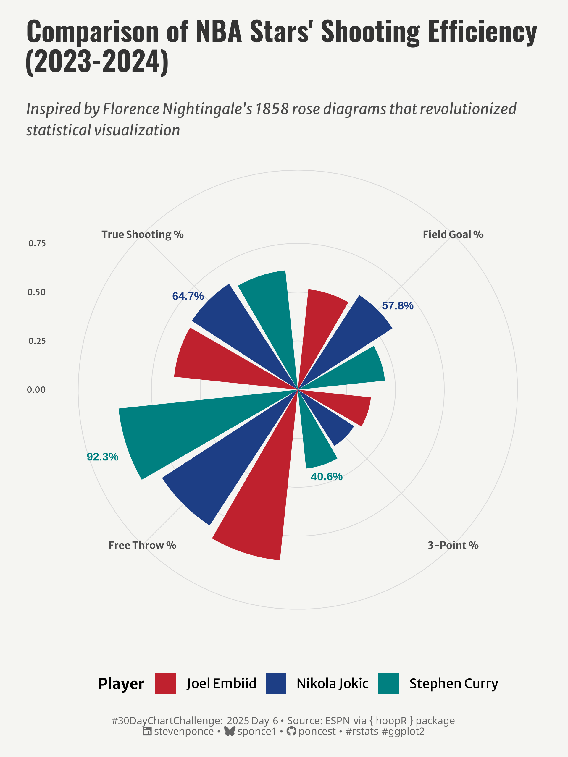{#fig-1}
### <mark> **Steps to Create this Graphic** </mark>
#### 1. Load Packages & Setup
```{r}
#| label: load
#| warning: false
#| message: false
#| results: "hide"
## 1. LOAD PACKAGES & SETUP ----
suppressPackageStartupMessages({
pacman::p_load(
  tidyverse,      # Easily Install and Load the 'Tidyverse'
  ggtext,         # Improved Text Rendering Support for 'ggplot2'
  showtext,       # Using Fonts More Easily in R Graphs
  janitor,        # Simple Tools for Examining and Cleaning Dirty Data
  skimr,          # Compact and Flexible Summaries of Data
  scales,         # Scale Functions for Visualization
  lubridate,      # Make Dealing with Dates a Little Easier
  hoopR,          # Access Men's Basketball Play by Play Data
  ggrepel,        # Automatically Position Non-Overlapping Text Labels with ggplot2
  camcorder       # Record Your Plot History
)
})

### |- figure size ----
gg_record(
    dir    = here::here("temp_plots"),
    device = "png",
    width  = 6,
    height = 8,
    units  = "in",
    dpi    = 320
)

# Source utility functions
suppressMessages(source(here::here("R/utils/fonts.R")))
source(here::here("R/utils/social_icons.R"))
source(here::here("R/utils/image_utils.R"))
source(here::here("R/themes/base_theme.R"))
```
#### 2. Read in the Data
```{r}
#| label: read
#| include: true
#| eval: true
#| warning: false
# Get player stats for the 2023-2024 NBA season
nba_players <- load_nba_player_box(seasons = 2024)
```
#### 3. Examine the Data
```{r}
#| label: examine
#| include: true
#| eval: true
#| results: 'hide'
#| warning: false
glimpse(nba_players)
skim(nba_players)
```
#### 4. Tidy Data
```{r}
#| label: tidy
#| warning: false
### |- Tidy ----
# Select our 3 players
selected_players <- c("Joel Embiid", "Nikola Jokic", "Stephen Curry")

# Calculate player stats
player_stats <- nba_players |>
  filter(athlete_display_name %in% selected_players) |>
  group_by(athlete_display_name) |>
  summarize(
    games = n(),
    across(
      .cols = c(
        field_goals_made, field_goals_attempted,
        three_point_field_goals_made, three_point_field_goals_attempted,
        free_throws_made, free_throws_attempted,
        points
      ),
      .fns = ~ sum(.x, na.rm = TRUE),
      .names = "{.col}_sum"
    ),
    fg_pct = field_goals_made_sum / field_goals_attempted_sum,
    three_pct = three_point_field_goals_made_sum / three_point_field_goals_attempted_sum,
    ft_pct = free_throws_made_sum / free_throws_attempted_sum,
    total_pts = points_sum
  ) |>
  mutate(
    true_shooting = total_pts / (2 * (field_goals_attempted_sum + 0.44 * free_throws_attempted_sum))
  ) |>
  select(athlete_display_name, fg_pct, three_pct, ft_pct, true_shooting)

# rose diagram data
nightingale_data <- player_stats |>
  pivot_longer(
    cols = -athlete_display_name,
    names_to = "stat",
    values_to = "value"
  ) |>
  mutate(
    stat_label = case_when(
      stat == "fg_pct" ~ "Field Goal %",
      stat == "three_pct" ~ "3-Point %",
      stat == "ft_pct" ~ "Free Throw %",
      stat == "true_shooting" ~ "True Shooting %"
    ),
    # Set factor levels to control order
    stat_label = factor(
      stat_label,
      levels = c("Field Goal %", "3-Point %", "Free Throw %", "True Shooting %")
      )
  )

label_data <- nightingale_data |>
  filter(
    (athlete_display_name == "Nikola Jokic" & stat_label == "Field Goal %") |
      (athlete_display_name == "Nikola Jokic" & stat_label == "True Shooting %") |
      (athlete_display_name == "Stephen Curry" & stat_label == "3-Point %") |
      (athlete_display_name == "Stephen Curry" & stat_label == "Free Throw %")
  ) |>
  mutate(
    # Format percentage for label
    label = paste0(round(value * 100, 1), "%")
  )
```
#### 5. Visualization Parameters
```{r}
#| label: params
#| include: true
#| warning: false
### |- plot aesthetics ----
colors <- get_theme_colors(palette = c(
  "Joel Embiid" = "#BF212E",
  "Nikola Jokic" = "#1D3E85",
  "Stephen Curry" = "#008080"
  )
)

### |-  titles and caption ----
# text
title_text    <- str_wrap("Comparison of NBA Stars' Shooting Efficiency (2023-2024)",
                          width = 50)
subtitle_text <- str_wrap("Inspired by Florence Nightingale's 1858 rose diagrams that revolutionized statistical visualization",
                          width = 80)

# Create caption
caption_text <- create_dcc_caption(
  dcc_year = 2025,
  dcc_day = 06,
  source_text =  "ESPN via { hoopR } package"
)

### |-  fonts ----
setup_fonts()
fonts <- get_font_families()

### |-  plot theme ----

# Start with base theme
base_theme <- create_base_theme(colors)

# Add weekly-specific theme elements
weekly_theme <- extend_weekly_theme(
  base_theme,
  theme(
    # Text styling
    plot.title = element_text(face = "bold", family = fonts$title, size = rel(1.14), margin = margin(b = 10)),
    plot.subtitle = element_text(family = fonts$subtitle, face = "italic", color = colors$text, size = rel(0.78), margin = margin(b = 20)),

    # Axis elements
    axis.title.y = element_text(color = colors$text, size = rel(0.8),
                              hjust = 1, vjust = 0.95, angle = 0),
    axis.title.x = element_blank(),

    axis.text.x = element_text(color = colors$text, face = "bold", size = rel(0.7)),
    axis.text.y = element_text(color = colors$text, size = rel(0.57)),

    # Grid elements
    panel.grid.major = element_line(color = "gray85", linewidth = 0.25),
    panel.grid.minor = element_blank(),

    # Legend elements
    legend.position = "bottom",
    legend.title = element_text(family = fonts$text, face = "bold", size = rel(0.8)),
    legend.text = element_text(family = fonts$text, size = rel(0.7)),

    # Plot margins
    plot.margin = margin(t = 10, r = 10, b = 10, l = 10),
  )
)

# Set theme
theme_set(weekly_theme)
```
#### 6. Plot
```{r}
#| label: plot
#| warning: false
### |-  Plot ----
p <- ggplot() +
  # Geoms
  geom_col(data = nightingale_data,
           aes(x = stat_label, y = value, fill = athlete_display_name),
           position = position_dodge(width = 0.9), width = 0.8) +
  # Annotate
  annotate(  # Nikola Jokic FG% label
    "text",
    x = 1,
    y = 0.61,
    label = "57.8%",
    hjust = 0,
    size = 3,
    fontface = "bold",
    color = colors$palette[2]
    ) +
  annotate( # Stephen Curry 3PT% label
    "text",
    x = 2,
    y = 0.6,
    label = "40.6%",
    hjust = 2.2,
    vjust = 1,
    size = 3,
    fontface = "bold",
    color = colors$palette[3]
    ) +
  annotate( # Stephen Curry FT% label
    "text",
    x = 3,
    y = 0.96,
    label = "92.3%",
    hjust = 2.5,
    vjust = -8,
    size = 3,
    fontface = "bold",
    color = colors$palette[3]
    ) +
  annotate( # Nikola Jokic TS% label
    "text",
    x = 4,
    y = 0.68,
    label = "64.7%",
    hjust = 1,
    size = 3,
    fontface = "bold",
    color = colors$palette[2]
    ) +
  # Scales
  scale_y_continuous(
    limits = c(0, 1),
    breaks = c(0, 0.25, 0.50, 0.75)
  ) +
  scale_fill_manual(
    values = colors$palette
  ) +
  coord_polar(clip = 'off') +
  # Labs
  labs(
    title = title_text,
    subtitle = subtitle_text,
    caption = caption_text,
    x = NULL,
    y = NULL,
    fill = "Player"
  ) +
  # Theme
  theme(
    plot.title = element_text(
      size = rel(1.5),
      family = fonts$title,
      face = "bold",
      color = colors$title,
      margin = margin(t = 5, b = 5)
    ),
    plot.subtitle = element_text(
      size = rel(0.8),
      family = fonts$subtitle,
      color = colors$subtitle,
      lineheight = 1.2,
      margin = margin(t = 15, b = 5)
    ),
    plot.caption = element_markdown(
      size = rel(0.55),
      family = fonts$caption,
      color = colors$caption,
      lineheight = 0.65,
      hjust = 0.5,
      halign = 0.5,
      margin = margin(t = 10, b = 5)
    ),
  )
```
#### 7. Save
```{r}
#| label: save
#| warning: false
### |-  plot image ----

save_plot(
  p,
  type = "30daychartchallenge",
  year = 2025,
  day = 06,
  width = 06,
  height = 08
  )
```
#### 8. Session Info
::: {.callout-tip collapse="true"}
##### Expand for Session Info
```{r, echo = FALSE}
#| eval: true
#| warning: false
sessionInfo()
```
:::
#### 9. GitHub Repository
::: {.callout-tip collapse="true"}
##### Expand for GitHub Repo
The complete code for this analysis is available in [`30dcc_2025_06.qmd`](https://github.com/poncest/personal-website/blob/master/data_visualizations/TidyTuesday/2025/30dcc_2025_06.qmd).
For the full repository, [click here](https://github.com/poncest/personal-website/).
:::
#### 10. References
::: {.callout-tip collapse="true"}
##### Expand for References
1. Data Sources:
- ESPN via { hoopR } package: [hoopR](https://github.com/sportsdataverse/hoopR)
:::
