---
title: "Mass Deportations Would Devastate Employment Across Multiple States"
subtitle: "Projected employment impacts 2025-2029 vs. 2024 baseline"
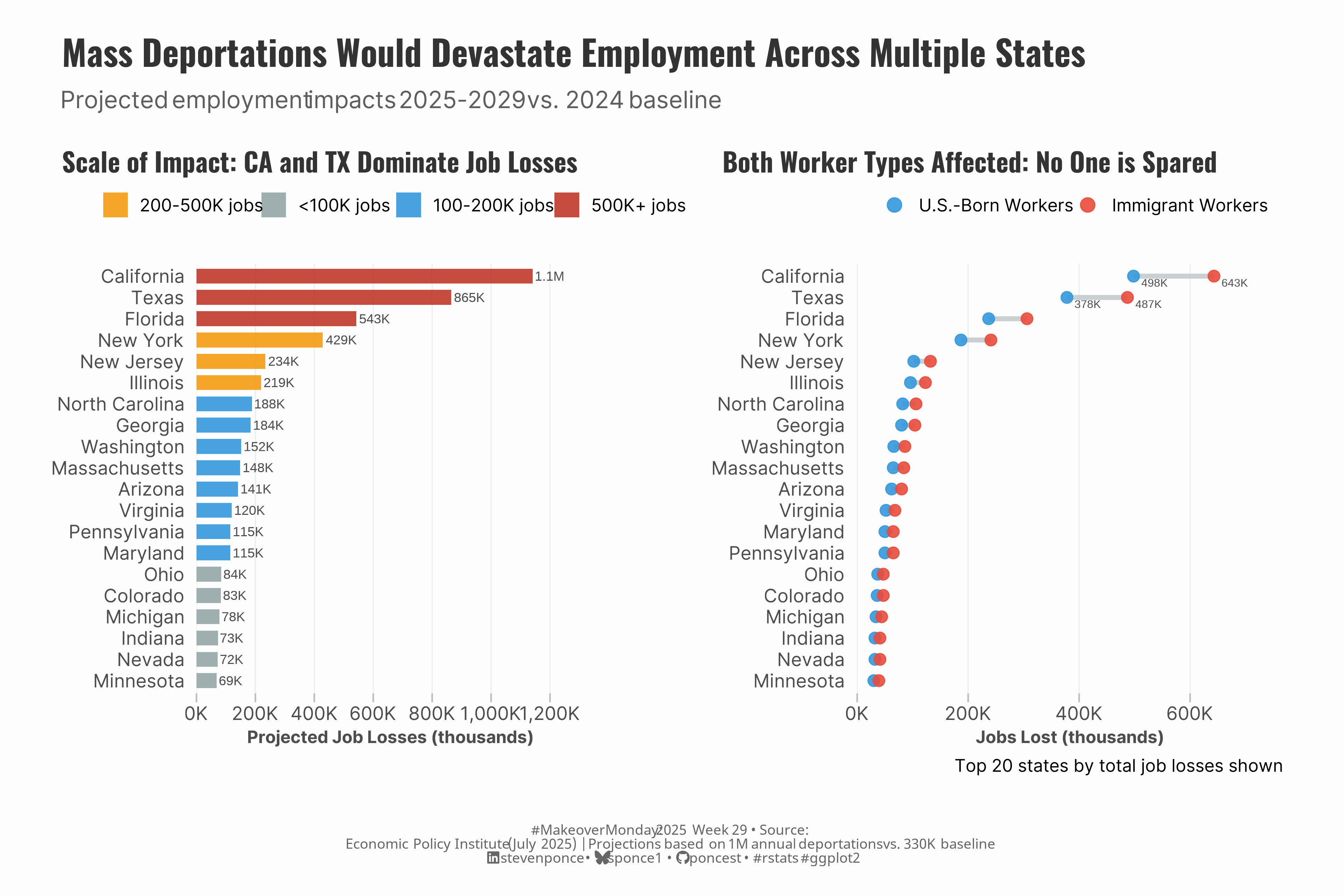
description: "A MakeoverMonday data visualization reimagining the Economic Policy Institute's analysis of projected employment impacts from mass deportations. Using R and ggplot2, I transformed a basic heat map into a compelling two-chart story showing both the scale of job losses by state and the impact on different worker types. Features include color-coded impact tiers, strategic labeling, and unified design system for publication-ready visualizations."
author: "Steven Ponce"
date: "2025-07-15"
categories: ["MakeoverMonday", "2025"]
tags: [
"employment",
"deportations",
"immigration policy",
"economic analysis",
"ggplot2",
"patchwork",
"data storytelling",
"bar charts",
"dumbbell charts",
"choropleth alternative",
"Economic Policy Institute",
"labor market",
"policy visualization",
"state-level data",
"worker demographics"
]
image: "thumbnails/mm_2025_29.png"
format:
html:
toc: true
toc-depth: 5
code-link: true
code-fold: true
code-tools: true
code-summary: "Show code"
editor_options:
chunk_output_type: inline
execute:
freeze: true
cache: true
error: false
message: false
warning: false
eval: true
---
```{r}
#| label: setup-links
#| include: false
# CENTRALIZED LINK MANAGEMENT
## Project-specific info
current_year <- 2025
current_week <- 29
project_file <- "mm_2025_29.qmd"
project_image <- "mm_2025_29.png"
## Data Sources
data_main <- "https://data.world/makeovermonday/2025wk-29-trumps-deportations-will-reduce-employment"
data_secondary <- "https://www.epi.org/publication/trumps-deportation-agenda-will-destroy-millions-of-jobs-both-immigrants-and-u-s-born-workers-would-suffer-job-losses-particularly-in-construction-and-child-care/"
## Repository Links
repo_main <- "https://github.com/poncest/personal-website/"
repo_file <- paste0("https://github.com/poncest/personal-website/blob/master/data_visualizations/MakeoverMonday/", current_year, "/", project_file)
## External Resources/Images
chart_original <- "https://raw.githubusercontent.com/poncest/MakeoverMonday/refs/heads/master/2025/Week_29/original_chart.png"
## Organization/Platform Links
org_primary <- "https://www.epi.org"
org_secondary <- "https://data.world/makeovermonday"
# Helper function to create markdown links
create_link <- function(text, url) {
paste0("[", text, "](", url, ")")
}
# Helper function for citation-style links
create_citation_link <- function(text, url, title = NULL) {
if (is.null(title)) {
paste0("[", text, "](", url, ")")
} else {
paste0("[", text, "](", url, ' "', title, '")')
}
}
```
### Original
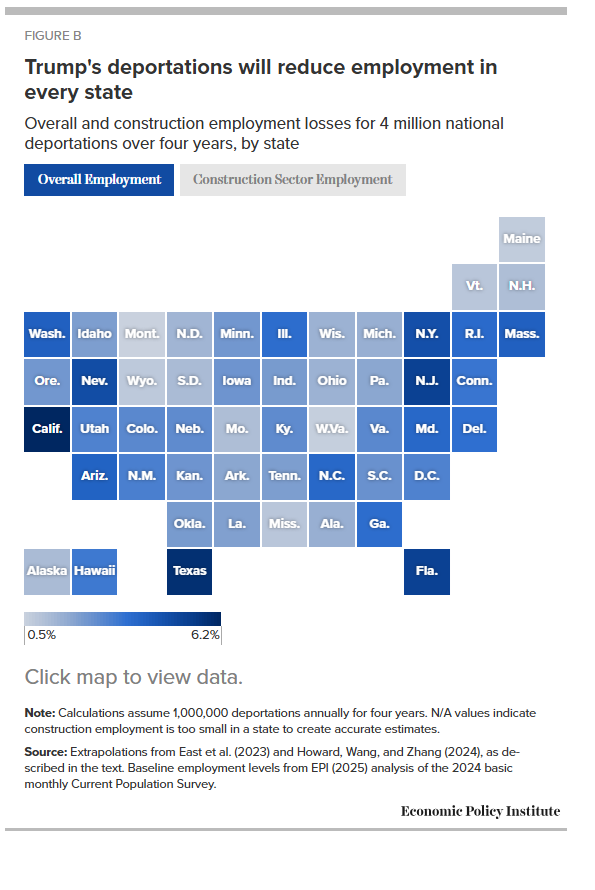
The original visualization Figure B, **Trump's deportations will reduce employment in every state. Overall and construction employment losses for 4 million national deportations over four years, by state** comes from `r create_link("Economic Policy Institute", data_secondary)`

### Makeover
{#fig-1}
### <mark> **Steps to Create this Graphic** </mark>
#### 1. Load Packages & Setup
```{r}
#| label: load
#| warning: false
#| message: false
#| results: "hide"

## 1. LOAD PACKAGES & SETUP ----
suppressPackageStartupMessages({
  if (!require("pacman")) install.packages("pacman")
  pacman::p_load(
  tidyverse,      # Easily Install and Load the 'Tidyverse'
  ggtext,         # Improved Text Rendering Support for 'ggplot2'
  showtext,       # Using Fonts More Easily in R Graphs
  scales,         # Scale Functions for Visualization
  glue,           # Interpreted String Literals
  patchwork       # The Composer of Plots
  )
})

### |- figure size ----
camcorder::gg_record(
    dir    = here::here("temp_plots"),
    device = "png",
    width  =  12,
    height =  8,
    units  = "in",
    dpi    = 320
)

# Source utility functions
suppressMessages(source(here::here("R/utils/fonts.R")))
source(here::here("R/utils/social_icons.R"))
source(here::here("R/utils/image_utils.R"))
source(here::here("R/themes/base_theme.R"))
```
#### 2. Read in the Data
```{r}
#| label: read
#| include: true
#| eval: true
#| warning: false
#|
deportations_raw <- readxl::read_excel(
  here::here('data/MakeoverMonday/2025/Trump Deportations.xlsx')) |>
  janitor::clean_names()
```
#### 3. Examine the Data
```{r}
#| label: examine
#| include: true
#| eval: true
#| results: 'hide'
#| warning: false

glimpse(deportations_raw)
skimr::skim(deportations_raw)
```
#### 4. Tidy Data
```{r}
#| label: tidy
#| warning: false

deportations <- deportations_raw |>
  filter(state != "United States") |> # Remove national totals
  mutate(
    impact_tier = case_when(
      total_level >= 500000 ~ "mega",
      total_level >= 200000 ~ "high",
      total_level >= 100000 ~ "medium",
      TRUE ~ "lower"
    )
  )

### |-  Plot 1 Data ----
barchart_data <- deportations |>
  top_n(20, total_level) |>
  mutate(state = fct_reorder(state, total_level))

### |-  Plot 2 Data ----
# Get the same top 20 states as P1 in the same order
p1_states_ordered <- deportations |>
  top_n(20, total_level) |>
  arrange(desc(total_level)) |>
  pull(state)

dumbbell_data <- deportations |>
  filter(state %in% p1_states_ordered) |>
  mutate(state = factor(state, levels = rev(p1_states_ordered))) |> # rev() for ggplot ordering
  pivot_longer(cols = c(u_s_born, immigrant), names_to = "worker_type", values_to = "jobs_lost") |>
  mutate(
    worker_type = case_when(
      worker_type == "u_s_born" ~ "U.S.-Born Workers",
      worker_type == "immigrant" ~ "Immigrant Workers"
    )
  )
```
#### 5. Visualization Parameters
```{r}
#| label: params
#| include: true
#| warning: false

### |-  plot aesthetics ----
# Get base colors with custom palette
colors <- get_theme_colors(palette = list(
  # Scale tiers for bar chart
  mega = "#c0392b", # mega impact (500K+)
  high = "#f39c12", # high impact (200-500K)
  medium = "#3498db", # medium impact (100-200K)
  lower = "#95a5a6",

  # Worker types for dumbbell
  immigrant = "#e74c3c", # immigrant workers
  us_born = "#3498db", # US-born workers
  connector = "#bdc3c7" # connecting lines
))

### |-  titles and caption ----
title_text <- paste0("Mass Deportations Would Devastate Employment Across Multiple States")
subtitle_text <- paste0("Projected employment impacts ", current_year, "-", current_year + 4, " vs. ", current_year - 1, " baseline")

# Create caption
caption_text <- create_mm_caption(
   mm_year = current_year,
  mm_week = current_week,
  source_text = paste0("<br>Economic Policy Institute (July ", current_year, ") | Projections based on 1M annual deportations vs. 330K baseline")
)


### |-  fonts ----
setup_fonts()
fonts <- get_font_families()

### |-  plot theme ----

# Start with base theme
base_theme <- create_base_theme(colors)

# Add weekly-specific theme elements
weekly_theme <- extend_weekly_theme(
  base_theme,
  theme(
    plot.title = element_text(
      size = rel(1.2), family = fonts$title, face = "bold",
      color = colors$title, lineheight = 1.1,
      margin = margin(t = 5, b = 10)
    ),
    plot.subtitle = element_markdown(
      size = rel(0.9), hjust = 0.5, family = fonts$subtitle,
      color = alpha(colors$subtitle, 0.9), lineheight = 0.9,
      margin = margin(t = 5, b = 20)
    ),

    # Legend formatting
    legend.position = "top",
    legend.direction = "horizontal",
    legend.box.margin = margin(b = 10),
    legend.margin = margin(b = 5),
    legend.title = element_text(face = "bold"),

    # Axis formatting
    axis.ticks.y = element_blank(),
    axis.ticks.x = element_line(color = "gray", linewidth = 0.5),
    axis.ticks.length = unit(0.2, "cm"),
    axis.title.x = element_text(face = "bold", size = rel(0.85)),
    axis.title.y = element_text(face = "bold", size = rel(0.85)),
    axis.text = element_text(size = rel(0.85), family = fonts$subtitle, color = colors$text),

    # Legends

    # Grid lines
    panel.grid.major = element_line(color = "#ecf0f1", linewidth = 0.4),
    panel.grid.minor = element_blank(),

    # Margin
    plot.margin = margin(20, 20, 20, 20)
  )
)

# Set theme
theme_set(weekly_theme)
```
#### 6. Plot
```{r}
#| label: plot
#| warning: false

### |-  Plot 1  bar chart ----
p1 <- barchart_data |>
  ggplot(aes(x = total_level, y = state, fill = impact_tier)) +
  # Geoms
  geom_col(alpha = 0.9, width = 0.7) +
  geom_text(
    aes(label = case_when(
      total_level >= 1000000 ~ paste0(round(total_level / 1000000, 1), "M"),
      total_level >= 1000 ~ paste0(round(total_level / 1000, 0), "K"),
      TRUE ~ scales::comma(total_level)
    )),
    hjust = -0.1,
    size = 3,
    color = "gray30"
  ) +
  # Scales
  scale_x_continuous(
    labels = comma_format(suffix = "K", scale = 1 / 1000),
    expand = c(0, 0, 0.15, 0), # More space for labels
    breaks = scales::pretty_breaks(n = 5)
  ) +
  scale_fill_manual(
    values = colors$palette,
    labels = c(
      "mega" = "500K+ jobs",
      "high" = "200-500K jobs",
      "medium" = "100-200K jobs",
      "lower" = "<100K jobs"
    ),
    name = NULL
  ) +
  # Labs
  labs(
    title = "Scale of Impact: CA and TX Dominate Job Losses",
    subtitle = NULL,
    x = "Projected Job Losses (thousands)",
    y = NULL
  ) +
  # Theme
  theme(
    panel.grid.major.y = element_blank(),
  ) +
  guides(fill = guide_legend(
    title.position = "top",
    title.hjust = 0.5,
    nrow = 1,
    override.aes = list(alpha = 0.9)
  ))

### |-  Plot 2  dumbbell chart ----
p2 <- dumbbell_data |>
  ggplot(aes(y = state)) +
  # Geoms
  geom_segment(
    data = deportations |>
      filter(state %in% p1_states_ordered) |>
      mutate(state = factor(state, levels = rev(p1_states_ordered))),
    aes(x = u_s_born, xend = immigrant, y = state, yend = state),
    color = colors$palette[7],
    linewidth = 1.5,
    alpha = 0.8,
    inherit.aes = FALSE
  ) +
  geom_point(aes(x = jobs_lost, color = worker_type), size = 3.2, alpha = 0.9) +
  geom_text(
    data = deportations |>
      filter(state %in% c("California", "Texas")) |>
      select(state, u_s_born, immigrant) |>
      pivot_longer(cols = c(u_s_born, immigrant), names_to = "worker_type", values_to = "jobs_lost") |>
      mutate(
        state = factor(state, levels = rev(p1_states_ordered)),
        label = paste0(round(jobs_lost / 1000), "K")
      ),
    aes(x = jobs_lost, y = state, label = label),
    hjust = -0.3,
    vjust = 1.4,
    size = 2.5,
    color = "gray30"
  ) +
  # Scales
  scale_x_continuous(
    labels = comma_format(suffix = "K", scale = 1 / 1000),
    expand = c(0.05, 0, 0.2, 0),
    breaks = scales::pretty_breaks(n = 5)
  ) +
  scale_color_manual(
    values = c(
      "U.S.-Born Workers" = colors$palette$us_born,
      "Immigrant Workers" = colors$palette$immigrant
    ),
    breaks = c("U.S.-Born Workers", "Immigrant Workers"),
    name = NULL
  ) +
  # Labs
  labs(
    title = "Both Worker Types Affected: No One is Spared",
    subtitle = NULL,
    x = "Jobs Lost (thousands)",
    y = NULL,
    caption = "Top 20 states by total job losses shown"
  ) +
  # Theme
  theme(
    panel.grid.major.y = element_blank(),
  ) +
  guides(color = guide_legend(
    title.position = "top",
    title.hjust = 0.5,
    nrow = 1,
    override.aes = list(size = 4)
  ))

### |-  combined plot ----
# Create an invisible spacer plot
spacer <- ggplot() +
  theme_void()

# Use it between charts
combined_plots <- (p1 + spacer + p2) +
  plot_layout(widths = c(1, 0.2, 1.1))

combined_plots <- combined_plots +
  plot_annotation(
    title = title_text,
    subtitle = subtitle_text,
    caption = caption_text,
    theme = theme(
      plot.title = element_text(
        size = rel(1.6),
        family = fonts$title,
        face = "bold",
        hjust = 0.,
        color = colors$title,
        lineheight = 1.1,
        margin = margin(t = 5, b = 5)
      ),
      plot.subtitle = element_markdown(
        size = rel(1.1),
        hjust = 0,
        family = fonts$subtitle,
        color = alpha(colors$subtitle, 0.9),
        lineheight = 0.9,
        margin = margin(t = 5, b = 0)
      ),
      plot.caption = element_markdown(
        size = rel(0.65),
        family = fonts$caption,
        color = colors$caption,
        hjust = 0.5,
        margin = margin(t = 10)
      )
    )
  )
```
#### 7. Save
```{r}
#| label: save
#| warning: false

### |-  plot image ----
save_plot_patchwork(
  plot = combined_plots,
  type = "makeovermonday",
  year = current_year,
  week = current_week,
  width = 12,
  height = 8
  )
```
#### 8. Session Info
::: {.callout-tip collapse="true"}
##### Expand for Session Info
```{r, echo = FALSE}
#| eval: true
#| warning: false
sessionInfo()
```
:::
#### 9. GitHub Repository
::: {.callout-tip collapse="true"}
##### Expand for GitHub Repo
The complete code for this analysis is available in `r create_link(project_file, repo_file)`.
For the full repository, `r create_link("click here", repo_main)`.
:::
#### 10. References
::: {.callout-tip collapse="true"}
##### Expand for References
1. Data:
- Makeover Monday `r current_year` Week `r current_week`: `r create_link("Figure B, Trump's deportations will reduce employment in every state", data_main)`
2. Article
- `r create_link("Economic Policy Institute: Trump's deportation agenda will destroy millions of jobs", data_secondary)`
:::