---
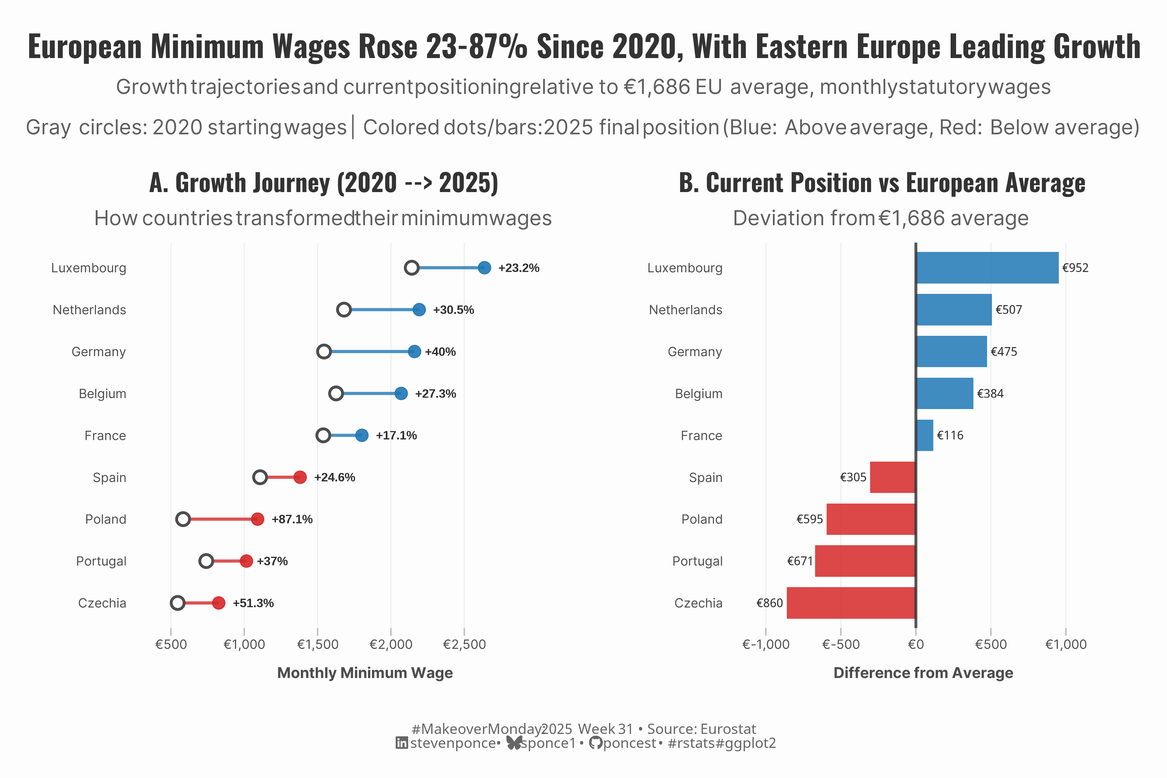
title: "European Minimum Wages Rose 23-87% Since 2020, With Eastern Europe Leading Growth"
subtitle: "Growth trajectories and current positioning relative to €1,686 EU average, monthly statutory wages"
description: "Analysis of European minimum wage changes 2020-2025 using improved dual-panel visualization. Eastern European countries led growth (Poland: 87%, Czechia: 51%) while Western nations maintain positions above €1,686 EU average."
author: "Steven Ponce"
date: "2025-07-29"
categories: ["MakeoverMonday", "2025"]
tags: [
"minimum-wage",
"european-union",
"economic-policy",
"wage-growth",
"data-transformation",
"ggplot2",
"dumbbell-chart",
"diverging-bars",
"comparative-analysis",
"policy-visualization",
"eastern-europe",
"western-europe",
"economic-inequality",
"makeover-monday-2025",
"dual-panel-charts"
]
image: "thumbnails/mm_2025_31.png"
format:
html:
toc: true
toc-depth: 5
code-link: true
code-fold: true
code-tools: true
code-summary: "Show code"
editor_options:
chunk_output_type: inline
execute:
freeze: true
cache: true
error: false
message: false
warning: false
eval: true
---
```{r}
#| label: setup-links
#| include: false
# CENTRALIZED LINK MANAGEMENT
## Project-specific info
current_year <- 2025
current_week <- 31
project_file <- "mm_2025_31.qmd"
project_image <- "mm_2025_31.png"
## Data Sources
data_main <- "https://data.world/makeovermonday/2025-week-31-wages-across-europe"
data_secondary <- "https://www.datawrapper.de/blog/low-wages-europe"
## Repository Links
repo_main <- "https://github.com/poncest/personal-website/"
repo_file <- paste0("https://github.com/poncest/personal-website/blob/master/data_visualizations/MakeoverMonday/", current_year, "/", project_file)
## External Resources/Images
chart_original <- "https://raw.githubusercontent.com/poncest/MakeoverMonday/refs/heads/master/2025/Week_31/original_chart.png"
## Organization/Platform Links
org_primary <- "https://ec.europa.eu/eurostat/databrowser/explore/all/popul?lang=en&subtheme=labour.earn.earn_minw&display=list&sort=category&extractionId=earn_mw_cur"
org_secondary <- "https://data.world/makeovermonday"
# Helper function to create markdown links
create_link <- function(text, url) {
paste0("[", text, "](", url, ")")
}
# Helper function for citation-style links
create_citation_link <- function(text, url, title = NULL) {
if (is.null(title)) {
paste0("[", text, "](", url, ")")
} else {
paste0("[", text, "](", url, ' "', title, '")')
}
}
```
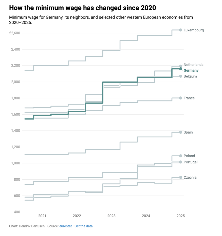
### Original
The original visualization **Low wages across Europe** comes from `r create_link("Datawrapper", data_secondary)`
<!--  -->
### Makeover
{#fig-1}
### <mark> **Steps to Create this Graphic** </mark>
#### 1. Load Packages & Setup
```{r}
#| label: load
#| warning: false
#| message: false
#| results: "hide"

## 1. LOAD PACKAGES & SETUP ----
suppressPackageStartupMessages({
  if (!require("pacman")) install.packages("pacman")
  pacman::p_load(
  tidyverse,      # Easily Install and Load the 'Tidyverse'
  ggtext,         # Improved Text Rendering Support for 'ggplot2'
  showtext,       # Using Fonts More Easily in R Graphs
  scales,         # Scale Functions for Visualization
  glue,           # Interpreted String Literals
  patchwork       # The Composer of Plots
  )
})

### |- figure size ----
camcorder::gg_record(
    dir    = here::here("temp_plots"),
    device = "png",
    width  =  12,
    height =  10,
    units  = "in",
    dpi    = 320
)

# Source utility functions
suppressMessages(source(here::here("R/utils/fonts.R")))
source(here::here("R/utils/social_icons.R"))
source(here::here("R/utils/image_utils.R"))
source(here::here("R/themes/base_theme.R"))
```
#### 2. Read in the Data
```{r}
#| label: read
#| include: true
#| eval: true
#| warning: false
#|
eu_wages <- read_csv(
  here::here('data/MakeoverMonday/2025/wages.csv')) |>
  janitor::clean_names()
```
#### 3. Examine the Data
```{r}
#| label: examine
#| include: true
#| eval: true
#| results: 'hide'
#| warning: false

glimpse(eu_wages)
skimr::skim(eu_wages)
```
#### 4. Tidy Data
```{r}
#| label: tidy
#| warning: false

# Custom euro formatting function
format_euro <- function(x) {
  paste0("€", scales::comma(x, accuracy = 1))
}

# Data tidying
eu_wages_long <- eu_wages |>
  mutate(date = dmy(date)) |>
  pivot_longer(
    cols = -date,
    names_to = "country",
    values_to = "wage"
  ) |>
  mutate(
    country = str_to_title(country),
    year = year(date),
    wage_euros = wage,
    wage_thousands = wage / 1000
  ) |>
  arrange(country, date)

# Calculate additional metrics
eu_wages_summary <- eu_wages_long |>
  group_by(country) |>
  summarise(
    start_wage = first(wage_euros),
    end_wage = last(wage_euros),
    total_change = end_wage - start_wage,
    pct_change = (end_wage - start_wage) / start_wage * 100,
    avg_wage = mean(wage_euros),
    .groups = "drop"
  ) |>
  arrange(desc(end_wage))

# Calculate average
current_avg <- mean(eu_wages_summary$end_wage)

# Dumbell data
dumbell_data <- eu_wages_summary |>
  mutate(
    country = fct_reorder(country, end_wage),
    above_avg = end_wage > current_avg
  )

# Diverging data
diverging_chart_data <- eu_wages_summary |>
  mutate(
    diff_from_avg = end_wage - current_avg,
    country = fct_reorder(country, diff_from_avg),
    above_avg = diff_from_avg > 0
  )
```
#### 5. Visualization Parameters
```{r}
#| label: params
#| include: true
#| warning: false

### |-  plot aesthetics ----
# Get base colors with custom palette
colors <- get_theme_colors(palette = list(
  above_avg = "#1f77b4",
  below_avg = "#d62728",
  start_point = "#ff7f0e",
  end_point = "#2ca02c",
  connection = "#7f7f7f",
  text_dark = "#2f2f2f",
  text_light = "#666666"
))

### |-  titles and caption ----
title_text <- str_glue("European Minimum Wages Rose 23-87% Since 2020, With Eastern Europe Leading Growth")

subtitle_text <- str_glue(
  "Growth trajectories and current positioning relative to €1,686 EU average, monthly statutory wages<br><br>",
  "Gray circles: 2020 starting wages | Colored dots/bars: 2025 final position (Blue: Above average, Red: Below average)"
)

# Create caption
caption_text <- create_mm_caption(
  mm_year = current_year,
  mm_week = current_week,
  source_text = paste0("Eurostat")
)

### |-  fonts ----
setup_fonts()
fonts <- get_font_families()

### |-  plot theme ----

# Start with base theme
base_theme <- create_base_theme(colors)

# Add weekly-specific theme elements
weekly_theme <- extend_weekly_theme(
  base_theme,
  theme(
    plot.title = element_text(
      size = rel(1.2), family = fonts$title, face = "bold",
      color = colors$title, lineheight = 1.1, hjust = 0.5,
      margin = margin(t = 5, b = 10)
    ),
    plot.subtitle = element_text(
      size = rel(0.9), hjust = 0.5, family = fonts$subtitle,
      color = alpha(colors$subtitle, 0.9), lineheight = 0.9,
      margin = margin(t = 5, b = 20)
    ),

    # Legend formatting
    legend.position = "plot",
    legend.box.margin = margin(b = 10),
    legend.margin = margin(b = 5),
    legend.title = element_text(face = "bold"),

    # Axis formatting
    axis.ticks.y = element_blank(),
    axis.ticks.x = element_line(color = "gray", linewidth = 0.5),
    axis.ticks.length = unit(0.2, "cm"),
    axis.title.x = element_text(
      face = "bold", size = rel(0.85),
      margin = margin(t = 10)
    ),
    axis.title.y = element_text(
      face = "bold", size = rel(0.85),
      margin = margin(r = 10)
    ),
    axis.text.x = element_text(
      size = rel(0.85), family = fonts$subtitle,
      color = colors$text
    ),
    axis.text.y = element_text(
      size = rel(0.85), family = fonts$subtitle,
      color = colors$text
    ),

    # Grid lines
    panel.grid.major = element_line(color = "#ecf0f1", linewidth = 0.4),
    panel.grid.minor = element_blank(),

    # Margin
    plot.margin = margin(20, 20, 20, 20)
  )
)

# Set theme
theme_set(weekly_theme)
```
#### 6. Plot
```{r}
#| label: plot
#| warning: false

### |-  Plot 1  Dumbbell Chart (The Journey) ----
p1 <- dumbell_data |>
  ggplot(aes(y = country)) +
  # Geoms
  geom_segment(aes(x = start_wage, xend = end_wage,
                   color = above_avg),
               linewidth = 1.1, alpha = 0.8) +
  geom_point(aes(x = start_wage),
             color = "gray30", fill = "white",
             size = 3.5, shape = 21, stroke = 1.5) +
  geom_point(aes(x = end_wage, color = above_avg),
             size = 4, alpha = 0.9) +
  geom_text(aes(x = end_wage,
                label = paste0("+", round(pct_change, 1), "%")),
            hjust = -0.35, size = 3.2, fontface = "bold",
            color = colors$palette$text_dark) +
  # Scales
  scale_color_manual(
    values = c("TRUE" = colors$palette$above_avg,
               "FALSE" = colors$palette$below_avg),
    guide = "none"
  ) +
  scale_x_continuous(
    labels = format_euro,
    expand = expansion(mult = c(0.1, 0.25)),
    limits = c(500, 2800),
    breaks = seq(500, 2500, 500)
  ) +
  # Labs
  labs(
    title = "A. Growth Journey (2020 --> 2025)",
    subtitle = "How countries transformed their minimum wages",
    x = "Monthly Minimum Wage",
    y = NULL
  ) +
  # Theme
  theme(
    plot.title = element_text(
      size = rel(1.3),
      family = fonts$title,
      face = "bold",
      hjust = 0.5,
      color = colors$title,
      lineheight = 1.1,
      margin = margin(t = 5, b = 5)
    ),
    plot.subtitle = element_markdown(
      size = rel(1.1),
      hjust = 0.5,
      family = fonts$subtitle,
      color = alpha(colors$subtitle, 0.9),
      lineheight = 0.9,
      margin = margin(t = 5, b = 10)
    ),
    panel.grid.major.y = element_blank(),
    panel.grid.minor = element_blank(),
  )

### |-  Plot 2 Diverging Bar Chart (Current Position) ----
p2 <- diverging_chart_data |>
  ggplot(aes(x = country, y = diff_from_avg, fill = above_avg)) +
  # Geoms
  geom_col(width = 0.75, alpha = 0.85) +
  geom_hline(yintercept = 0, color = colors$palette$text_dark,
             size = 1, alpha = 0.8) +
  geom_text(
    aes(label = format_euro(abs(diff_from_avg)),
        hjust = ifelse(diff_from_avg > 0, -0.15, 1.15)),
    size = 3.2, fontface = "bold",
    color = colors$palette$text_dark
  ) +
  # Scales
  scale_fill_manual(
    values = c("TRUE" = colors$palette$above_avg,
               "FALSE" = colors$palette$below_avg),
    labels = c("Below Average", "Above Average"),
    name = NULL
  ) +
  scale_y_continuous(
    labels = format_euro,
    breaks = scales::pretty_breaks(n = 6),
    limits = c(-1100, 1200)
  ) +
  coord_flip() +
  # Labs
  labs(
    title = "B. Current Position vs European Average",
    subtitle = paste0("Deviation from ", format_euro(round(current_avg)), " average"),
    x = NULL,
    y = "Difference from Average"
  ) +
  # Theme
  theme(
    plot.title = element_text(
      size = rel(1.3),
      family = fonts$title,
      face = "bold",
      hjust = 0.5,
      color = colors$title,
      lineheight = 1.1,
      margin = margin(t = 5, b = 5)
    ),
    plot.subtitle = element_markdown(
      size = rel(1.1),
      hjust = 0.5,
      family = fonts$subtitle,
      color = alpha(colors$subtitle, 0.9),
      lineheight = 0.9,
      margin = margin(t = 5, b = 10)
    ),
    panel.grid.major.y = element_blank(),
    panel.grid.minor = element_blank(),
  )

### |-  combined plot ----
# Create an invisible spacer plot
spacer <- ggplot() +
  theme_void() +
  theme(plot.margin = margin(0, 0, 0, 0))

combined_plots <- (p1 + spacer + p2) +
  plot_layout(
    widths = c(1.2, 0.01, 1)
  )

combined_plots <- combined_plots +
  plot_annotation(
    title = title_text,
    subtitle = subtitle_text,
    caption = caption_text,
    theme = theme(
      plot.title = element_text(
        size = rel(1.6),
        family = fonts$title,
        face = "bold",
        hjust = 0.5,
        color = colors$title,
        lineheight = 1.1,
        margin = margin(t = 5, b = 5)
      ),
      plot.subtitle = element_markdown(
        size = rel(1.1),
        hjust = 0.5,
        family = fonts$subtitle,
        color = alpha(colors$subtitle, 0.9),
        lineheight = 0.9,
        margin = margin(t = 5, b = 0)
      ),
      plot.caption = element_markdown(
        size = rel(0.75),
        family = fonts$caption,
        color = colors$caption,
        hjust = 0.5,
        margin = margin(t = 10)
      )
    )
  )
```
#### 7. Save
```{r}
#| label: save
#| warning: false

### |-  plot image ----
save_plot_patchwork(
  plot = combined_plots,
  type = "makeovermonday",
  year = current_year,
  week = current_week,
  width = 12,
  height = 8
  )
```
#### 8. Session Info
::: {.callout-tip collapse="true"}
##### Expand for Session Info
```{r, echo = FALSE}
#| eval: true
#| warning: false
sessionInfo()
```
:::
#### 9. GitHub Repository
::: {.callout-tip collapse="true"}
##### Expand for GitHub Repo
The complete code for this analysis is available in `r create_link(project_file, repo_file)`.
For the full repository, `r create_link("click here", repo_main)`.
:::
#### 10. References
::: {.callout-tip collapse="true"}
##### Expand for References
1. Data:
- Makeover Monday `r current_year` Week `r current_week`: `r create_link("Low wages across Europe", data_main)`
2. Article
- `r create_link("Low wages across Europe", data_secondary)`
:::