---
title: "Coachella's lineup cuts landed on Saturday and Sunday"
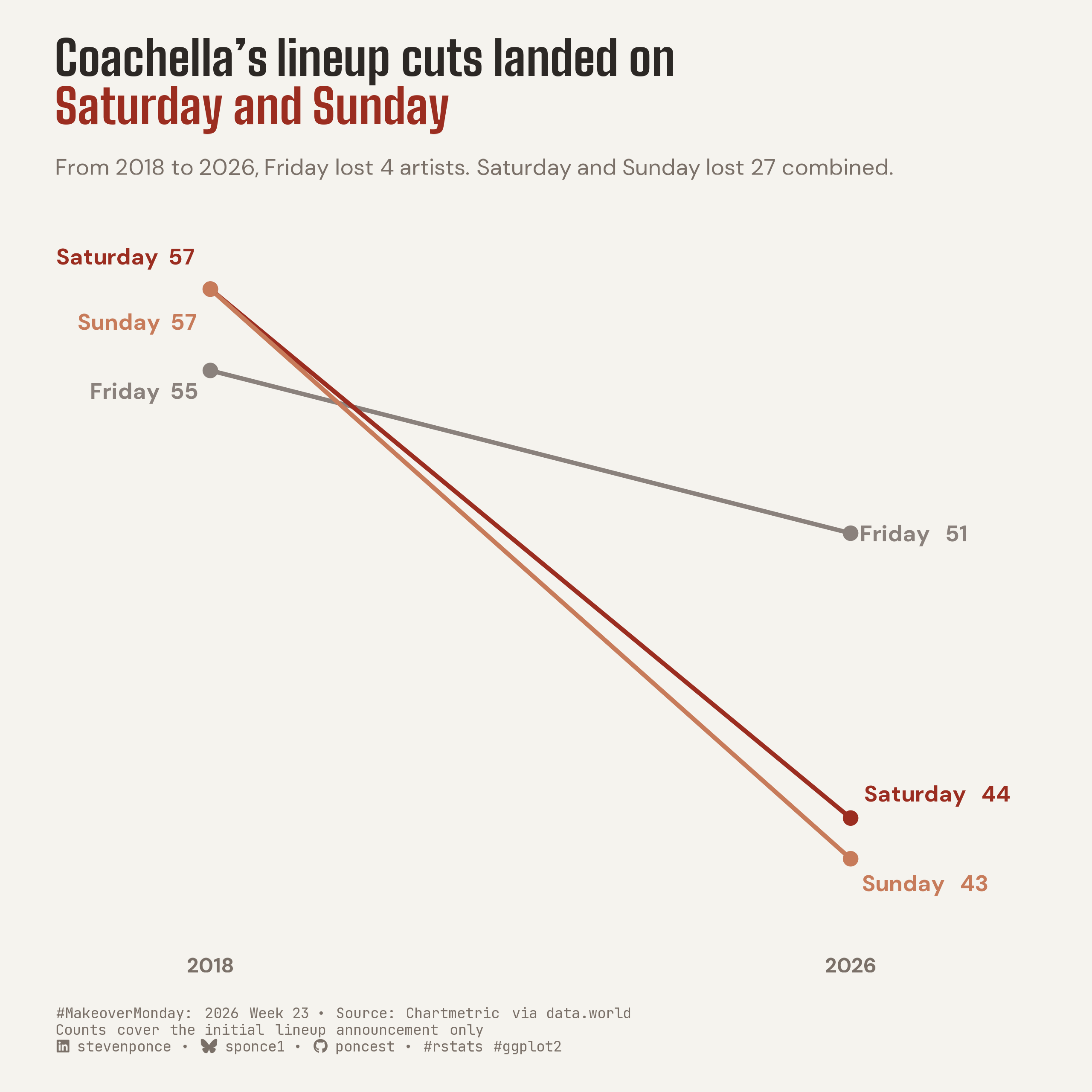
subtitle: "From 2018 to 2026, Friday lost 4 artists. Saturday and Sunday lost 27 combined."
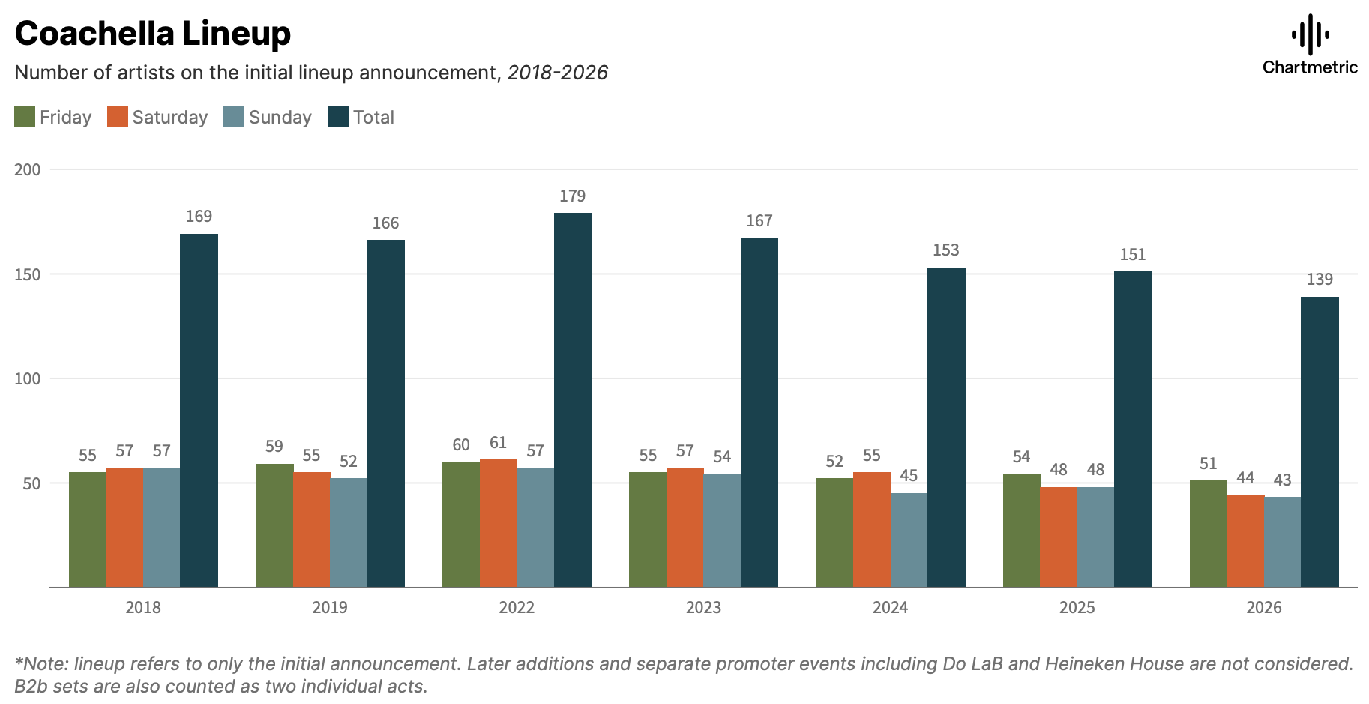
description: "A slope chart showing that Coachella's shrinking initial lineup contracted almost entirely on the weekend: Saturday and Sunday lost 27 acts between 2018 and 2026 while Friday lost just 4. It reframes the original's grouped day-by-day bars as a two-point comparison that isolates where the cuts landed. Built in R with ggplot2."
date: "2026-06-08"
author:
- name: "Steven Ponce"
url: "https://stevenponce.netlify.app"
citation:
url: "https://stevenponce.netlify.app/data_visualizations/MakeoverMonday/2026/mm_2026_W23.html"
categories: ["MakeoverMonday", "Data Visualization", "R Programming", "2026"]
tags: [
"makeover-monday",
"data-visualization",
"ggplot2",
"rstats",
"slopegraph",
"slope-chart",
"coachella",
"music-festival",
"live-music",
"direct-labeling",
"ggtext",
"2026"
]
image: "thumbnails/mm_2026_23.png"
format:
html:
toc: true
toc-depth: 5
code-link: true
code-fold: true
code-tools: true
code-summary: "Show code"
theme:
light: [flatly, assets/styling/custom_styles.scss]
dark: [darkly, assets/styling/custom_styles_dark.scss]
editor_options:
chunk_output_type: inline
execute:
freeze: true
cache: true
error: false
message: false
warning: false
eval: true
---
```{r}
#| label: setup-links
#| include: false
# CENTRALIZED LINK MANAGEMENT
## Project-specific info
current_year <- 2026
current_week <- 23
project_file <- "mm_2026_23.qmd"
project_image <- "mm_2026_23.png"
## Data Sources
data_main <- "https://data.world/makeovermonday/2026w23"
data_secondary <- "https://data.world/makeovermonday/2026w23"
## Repository Links
repo_main <- "https://github.com/poncest/personal-website/"
repo_file <- paste0("https://github.com/poncest/personal-website/blob/master/data_visualizations/MakeoverMonday/", current_year, "/", project_file)
## External Resources/Images
chart_original <- "https://raw.githubusercontent.com/poncest/MakeoverMonday/refs/heads/master/2026/Week_22/original_chart.png"
## Organization/Platform Links
org_primary <- "https://hmc.chartmetric.com/the-numbers-behind-coachellas-smallest-lineup-in-years/"
org_secondary <- "https://hmc.chartmetric.com/the-numbers-behind-coachellas-smallest-lineup-in-years/"
# Helper function to create markdown links
create_link <- function(text, url) {
paste0("[", text, "](", url, ")")
}
# Helper function for citation-style links
create_citation_link <- function(text, url, title = NULL) {
if (is.null(title)) {
paste0("[", text, "](", url, ")")
} else {
paste0("[", text, "](", url, ' "', title, '")')
}
}
```
### Original
The original visualization comes from `r create_link("Coachella Lineup", data_secondary)`
### Makeover
{#fig-1}
### [**Steps to Create this Graphic**]{.mark}
#### [1. Load Packages & Setup]{.smallcaps}
```{r}
#| label: load
#| warning: false
#| message: false
#| results: "hide"

## 1. LOAD PACKAGES & SETUP ----
suppressPackageStartupMessages({
  if (!require("pacman")) install.packages("pacman")
  pacman::p_load(
    tidyverse, ggtext, showtext, scales, glue, janitor
)
})

### |- figure size ----
camcorder::gg_record(
  dir    = here::here("temp_plots"),
  device = "png",
  width  = 8,
  height = 8,
  units  = "in",
  dpi    = 320
)

# Source utility functions
suppressMessages(source(here::here("R/utils/fonts.R")))
source(here::here("R/utils/social_icons.R"))
source(here::here("R/utils/image_utils.R"))
source(here::here("R/themes/base_theme.R"))
```
#### [2. Read in the Data]{.smallcaps}
```{r}
#| label: read
#| include: true
#| eval: true
#| warning: false
#|

df_raw <- read_csv(
  here::here("data/MakeoverMonday/2026/coachella lineup.csv")) |>
  clean_names()
```
#### [3. Examine the Data]{.smallcaps}
```{r}
#| label: examine
#| include: true
#| eval: true
#| results: 'hide'
#| warning: false

glimpse(df_raw)
skimr::skim_without_charts(df_raw)
```
#### [4. Tidy Data]{.smallcaps}
```{r}
#| label: tidy
#| warning: false

day_levels <- c("Friday", "Saturday", "Sunday")

# Long form, one row per day-year
df_long <- df_raw |>
  select(year, friday, saturday, sunday) |>
  pivot_longer(
    cols      = c(friday, saturday, sunday),
    names_to  = "day",
    values_to = "artists"
  ) |>
  mutate(
    day = str_to_title(day),
    day = factor(day, levels = day_levels)
  )

df_slope <- df_long |>
  filter(year %in% c(2018, 2026)) |>
  mutate(year = factor(year, levels = c(2018, 2026)))

df_change <- df_slope |>
  pivot_wider(names_from = year, values_from = artists, names_prefix = "y") |>
  mutate(
    change   = y2026 - y2018,
    pct_drop = change / y2018
  )
```
#### [5. Visualization Parameters]{.smallcaps}
```{r}
#| label: params
#| include: true
#| warning: false

### |-  plot aesthetics ----
col_friday   <- "#8A817C"
col_saturday <- "#9B2D20"
col_sunday   <- "#C77B5A"

day_pal <- c(
  Friday   = col_friday,
  Saturday = col_saturday,
  Sunday   = col_sunday
)

clrs <- get_theme_colors(
  palette = c(
    Friday   = col_friday,
    Saturday = col_saturday,
    Sunday   = col_sunday
  )
)

### |- label frames ----
df_left <- df_slope |>
  filter(year == "2018") |>
  mutate(label_y = case_when(
    day == "Friday" ~ artists - 0.5,
    day == "Saturday" ~ artists + 0.8,
    day == "Sunday" ~ artists - 0.8,
    TRUE ~ as.numeric(artists)
  ))

df_right <- df_slope |>
  filter(year == "2026") |>
  mutate(label_y = case_when(
    day == "Saturday" ~ artists + 0.6,
    day == "Sunday" ~ artists - 0.6,
    TRUE ~ as.numeric(artists)
  ))

### |- titles and caption ----
title_text <- glue(
  "Coachella's lineup cuts landed on<br>",
  "<span style='color:{col_saturday}'>**Saturday and Sunday**</span>"
)

subtitle_text <- glue(
  "From 2018 to 2026, Friday lost 4 artists. ",
  "Saturday and Sunday lost 27 combined."
)

caption_text <- create_mm_caption(
  mm_year     = 2026,
  mm_week     = 23,
  source_text = "Chartmetric via data.world<br>Counts cover the initial lineup announcement only"
)

### |- fonts ----
setup_fonts()
fonts <- get_font_families()

### |- plot theme ----
base_theme <- create_base_theme(clrs)

weekly_theme <- extend_weekly_theme(
  base_theme,
  theme(
    legend.position = "none",
    panel.grid = element_blank(),
    axis.text.y = element_blank(),
    axis.ticks = element_blank(),
    axis.title = element_blank(),
    axis.text.x = element_text(face = "bold"),
    plot.title = element_markdown(size = rel(1.8), face = "bold", family = fonts$title_1, color = clrs$title),
    plot.subtitle = element_textbox_simple(
      width = unit(1, "npc"), margin = margin(t = 6, b = 14), size = rel(0.85),
      family = fonts$text, color = clrs$text
    ),
    plot.caption = element_markdown(
      hjust = 0, size = rel(0.55), lineheight = 1.15, margin = margin(t = 16),
      family = fonts$caption, color = clrs$caption
    ),
    plot.title.position = "plot",
    plot.margin = margin(t = 20, r = 60, b = 20, l = 30)
  )
)

theme_set(weekly_theme)
```
#### [6. Plot]{.smallcaps}
```{r}
#| label: plot
#| warning: false

p <- ggplot(
  df_slope,
  aes(x = year, y = artists, group = day, color = day)
) +
  # Geoms
  geom_line(linewidth = 1.1) +
  geom_point(size = 3) +
  geom_text(
    data = df_left,
    aes(y = label_y, label = glue("{day}  {artists}")),
    hjust = 1.12, fontface = "bold", size = 4.2, show.legend = FALSE
  ) +
  geom_text(
    data = df_right,
    aes(y = label_y, label = glue("{day}   {artists}")),
    hjust = -0.10, fontface = "bold", size = 4.2, show.legend = FALSE
  ) +
  # Scales
  scale_color_manual(values = day_pal) +
  scale_x_discrete(
    expand = expansion(mult = c(0.24, 0.2))
  ) +
  scale_y_continuous(expand = expansion(mult = c(0.10, 0.08))) +
  coord_cartesian(clip = "off") +
  # Labs
  labs(
    title = title_text,
    subtitle = subtitle_text,
    caption = caption_text,
    x = NULL, y = NULL
  )
```
#### [7. Save]{.smallcaps}
```{r}
#| label: save
#| warning: false

### |-  plot image ----
save_plot(
  plot = p ,
  type = "makeovermonday",
  year = current_year,
  week = current_week,
  width = 8,
  height = 8
  )
```
#### [8. Session Info]{.smallcaps}
::: {.callout-tip collapse="true"}
##### Expand for Session Info
```{r, echo = FALSE}
#| eval: true
#| warning: false
sessionInfo()
```
:::
#### [9. GitHub Repository]{.smallcaps}
::: {.callout-tip collapse="true"}
##### Expand for GitHub Repo
The complete code for this analysis is available in `r create_link(project_file, repo_file)`.
For the full repository, `r create_link("click here", repo_main)`.
:::
#### [10. References]{.smallcaps}
::: {.callout-tip collapse="true"}
##### Expand for References
**Primary Data (Makeover Monday):**
1. Makeover Monday `r current_year` Week `r current_week`: `r create_link("Coachella Lineup (2018–2026)", data_main)`
2. Original Chart: `r create_link("Chartmetric — Coachella Lineup, initial announcement 2018–2026", "https://hmc.chartmetric.com/the-numbers-behind-coachellas-smallest-lineup-in-years/")`
- Article context: `r create_link("The Numbers Behind Coachella's Smallest Lineup in Years", "https://hmc.chartmetric.com/the-numbers-behind-coachellas-smallest-lineup-in-years/")`
- Coverage: initial lineup poster only; artists per day (Friday, Saturday, Sunday) and total, across seven editions (2018, 2019, 2022–2026; 2020–21 not held)
**Source Data:**
3. `r create_link("Chartmetric — How Music Charts", "https://hmc.chartmetric.com")`
- Coverage: artist counts compiled from Coachella's initial lineup announcement posters, 2018–2026
- Unit: per-day artist counts (Friday, Saturday, Sunday) and an edition total
4. `r create_link("MakeoverMonday 2026 W23 — data.world", "https://data.world/makeovermonday/2026w23")`
- CSV file: coachella lineup.csv; 7 rows × 5 columns (year, friday, saturday, sunday, total)
**Note:** Counts reflect the *initial* lineup announcement poster only — later additions, set-time fill-ins, and separately programmed stages (Do LaB, Heineken House) are excluded, matching the original chart's own scope. The 2020 and 2021 editions were not held (pandemic) and are absent from the series, not recorded as zero. The slopegraph compares the first year of the record (2018) with the latest (2026); the day-level asymmetry holds whether anchored to 2018, to the 2022 peak, or across the full seven-edition trajectory. "Saturday and Sunday lost 27 combined" is the sum of Saturday's drop (57→44, −13) and Sunday's (57→43, −14); Friday fell 55→51 (−4). Per-day counts sum to the edition total exactly in 2018–2019 but run one short from 2022 onward — the difference is the unattached fourth-headliner slot introduced post-pandemic, so the three days lost 31 acts combined while the overall initial lineup fell 30 (169→139). No causal relationship is asserted: the chart describes *where* the contraction landed across days, not why, and "cuts" refers to fewer artists booked on the initial poster.
:::
#### [11. Custom Functions Documentation]{.smallcaps}
::: {.callout-note collapse="true"}
##### 📦 Custom Helper Functions
This analysis uses custom functions from my personal module library for efficiency and consistency across projects.
**Functions Used:**
- **`fonts.R`**: `setup_fonts()`, `get_font_families()` - Font management with showtext
- **`social_icons.R`**: `create_social_caption()` - Generates formatted social media captions
- **`image_utils.R`**: `save_plot()` - Consistent plot saving with naming conventions
- **`base_theme.R`**: `create_base_theme()`, `extend_weekly_theme()`, `get_theme_colors()` - Custom ggplot2 themes
**Why custom functions?**\
These utilities standardize theming, fonts, and output across all my data visualizations. The core analysis (data tidying and visualization logic) uses only standard tidyverse packages.
**Source Code:**\
View all custom functions → [GitHub: R/utils](https://github.com/poncest/personal-website/tree/master/R)
:::

