---
title: "The Evolution of Diesel's Premium Over Gasoline"
subtitle: "Weekly price differences and long-term trend showing diesel's growing premium since 2005"
description: "Analysis of US fuel price dynamics using EIA data, revealing how diesel transformed from price parity with gasoline to commanding a consistent premium since 2005. This TidyTuesday visualization explores weekly price differences, crisis impacts, and long-term trends using dual-color area charts and professional data storytelling techniques."
author: "Steven Ponce"
date: "2025-06-30"
categories: ["TidyTuesday", "2025"]
tags: [
"fuel-prices",
"energy-economics",
"gasoline",
"diesel",
"price-analysis",
"economic-trends",
"area-charts",
"ggplot2",
"data-storytelling",
"EIA-data",
"time-series",
"market-dynamics"
]
image: "thumbnails/tt_2025_26.png"
format:
html:
toc: true
toc-depth: 5
code-link: true
code-fold: true
code-tools: true
code-summary: "Show code"
editor_options:
chunk_output_type: inline
execute:
freeze: true
cache: true
error: false
message: false
warning: false
eval: true
---
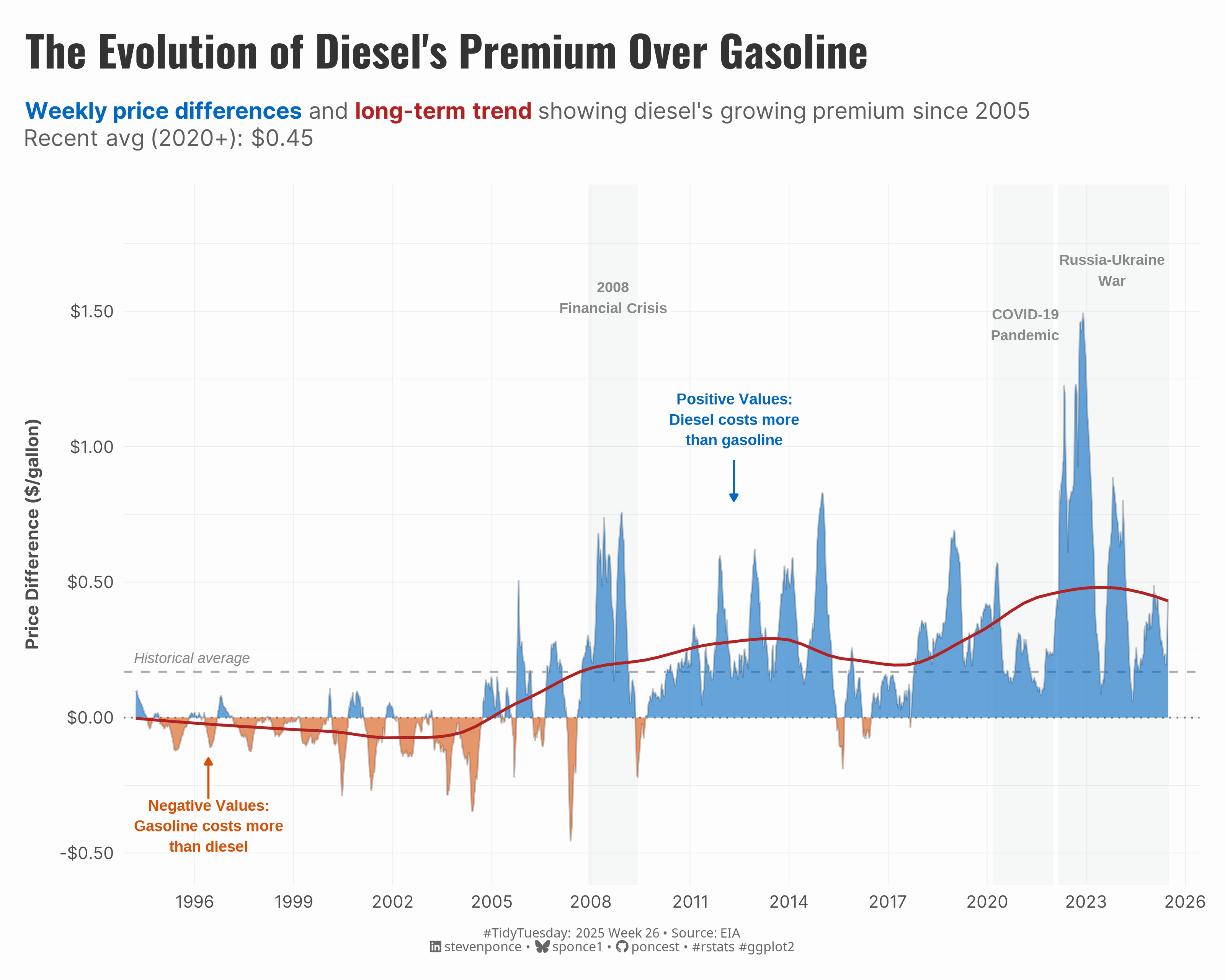{#fig-1}
### <mark> **Steps to Create this Graphic** </mark>
#### 1. Load Packages & Setup
```{r}
#| label: load
#| warning: false
#| message: false
#| results: "hide"

## 1. LOAD PACKAGES & SETUP ----
suppressPackageStartupMessages({
if (!require("pacman")) install.packages("pacman")
pacman::p_load(
  tidyverse,  # Easily Install and Load the 'Tidyverse'
  ggtext,     # Improved Text Rendering Support for 'ggplot2'
  showtext,   # Using Fonts More Easily in R Graphs
  janitor,    # Simple Tools for Examining and Cleaning Dirty Data
  scales,     # Scale Functions for Visualization
  glue        # Interpreted String Literals
  )})

### |- figure size ----
camcorder::gg_record(
  dir    = here::here("temp_plots"),
  device = "png",
   width  =  10,
  height =  8,
  units  = "in",
  dpi    = 320
)

# Source utility functions
suppressMessages(source(here::here("R/utils/fonts.R")))
source(here::here("R/utils/social_icons.R"))
source(here::here("R/utils/image_utils.R"))
source(here::here("R/themes/base_theme.R"))
```
#### 2. Read in the Data
```{r}
#| label: read
#| include: true
#| eval: true
#| warning: false

tt <- tidytuesdayR::tt_load(2025, week = 26)

weekly_gas_prices_raw <- tt$weekly_gas_prices |> clean_names()

tidytuesdayR::readme(tt)
rm(tt)
```
#### 3. Examine the Data
```{r}
#| label: examine
#| include: true
#| eval: true
#| results: 'hide'
#| warning: false

glimpse(weekly_gas_prices_raw)
```
#### 4. Tidy Data
```{r}
#| label: tidy
#| warning: false

# Data preparation
gas_prices <- weekly_gas_prices_raw |>
  mutate(
    date = as.Date(date),
    year = year(date),
    month = month(date),
    quarter = quarter(date)
  )

# Define major events
major_events <- tibble(
  event = c("2008 Financial Crisis", "COVID-19 Pandemic", "Russia-Ukraine War"),
  start_date = as.Date(c("2007-12-01", "2020-03-01", "2022-02-24")),
  end_date = as.Date(c("2009-06-01", "2021-12-31", "2025-06-30"))
)

# Plot data
spread_data <- gas_prices |>
  filter(
    grade == "all",
    (fuel == "gasoline" & formulation == "all") |
      (fuel == "diesel")
  ) |>
  select(date, fuel, price) |>
  pivot_wider(names_from = fuel, values_from = price) |>
  filter(!is.na(gasoline), !is.na(diesel)) |>
  mutate(
    spread = gasoline - diesel,
    diesel_premium = diesel - gasoline,
    positive_premium = ifelse(diesel_premium >= 0, diesel_premium, 0),
    negative_premium = ifelse(diesel_premium < 0, diesel_premium, 0)
  )

# Key statistics for annotations
summary_stats <- spread_data |>
  summarise(
    avg_premium = mean(diesel_premium, na.rm = TRUE),
    max_premium = max(diesel_premium, na.rm = TRUE),
    min_premium = min(diesel_premium, na.rm = TRUE),
    recent_avg = mean(diesel_premium[date >= as.Date("2020-01-01")], na.rm = TRUE)
  )
```
#### 5. Visualization Parameters
```{r}
#| label: params
#| include: true
#| warning: false

### |-  plot aesthetics ----
colors <- get_theme_colors(
  palette = c("#0267C1", "#D65108", "#b22222", "#888888", "gray40")
)

### |- titles and caption ----
title_text <- str_glue("The Evolution of Diesel's Premium Over Gasoline")

subtitle_text <- str_glue(
    "<span style='color:#0267C1'>**Weekly price differences**</span> and ",
    "<span style='color:#b22222'>**long-term trend**</span> showing diesel\\'s growing premium since 2005<br>",
    "Recent avg (2020+): {dollar(summary_stats$recent_avg, accuracy = 0.01)}"
)

caption_text <- create_social_caption(
  tt_year = 2025,
  tt_week = 26,
  source_text =  "EIA"
)

### |-  fonts ----
setup_fonts()
fonts <- get_font_families()

### |-  plot theme ----

# Start with base theme
base_theme <- create_base_theme(colors)

# Add weekly-specific theme elements
weekly_theme <- extend_weekly_theme(
  base_theme,
  theme(
    # Axis elements
    axis.text = element_text(color = colors$text, size = rel(0.7)),
    axis.title.x = element_text(color = colors$text, face = "bold", size = rel(0.8), margin = margin(t = 15)),
    axis.title.y = element_text(color = colors$text, face = "bold", size = rel(0.8), margin = margin(r = 10)),

    # Grid elements
    panel.grid.major.y = element_line(color = "gray50", linewidth = 0.05),
    panel.grid.minor = element_blank(),
    panel.grid.major.x = element_blank(),

    # Legend elements
    legend.position = "plot",
    legend.title = element_text(family = fonts$tsubtitle, color = colors$text, size = rel(0.8), face = "bold"),
    legend.text = element_text(family = fonts$tsubtitle, color = colors$text, size = rel(0.7)),

    # Plot margins
    plot.margin = margin(t = 15, r = 15, b = 15, l = 15),
  )
)

# Set theme
theme_set(weekly_theme)
```
#### 6. Plot
```{r}
#| label: plot
#| warning: false

# Initial Plot ----
p <- spread_data |>
  ggplot(aes(x = date, y = diesel_premium)) +

  # Geoms
  geom_rect(
    data = major_events,
    aes(xmin = start_date, xmax = end_date, ymin = -Inf, ymax = Inf),
    inherit.aes = FALSE,
    alpha = 0.15,
    fill = "#ced4da"
  ) +
  geom_hline(
    yintercept = 0,
    linetype = "dotted",
    color = "#555555",
    linewidth = 0.5,
    alpha = 0.8
  ) +
  geom_hline(
    yintercept = summary_stats$avg_premium,
    linetype = "dashed",
    color = "#888888",
    linewidth = 0.6,
    alpha = 0.7
  ) +
  geom_line(
    color = "gray",
    linewidth = 0.5,
    alpha = 0.9
  ) +
  geom_area(
    aes(y = positive_premium),
    fill = colors$palette[1], # diesel premium
    alpha = 0.6
  ) +
  geom_area(
    aes(y = negative_premium),
    fill = colors$palette[2], # gasoline premium
    alpha = 0.6
  ) +
  geom_smooth(
    se = FALSE,
    color = colors$palette[3],
    alpha = 0.15,
    linewidth = 0.8,
    method = "loess",
    span = 0.4
  ) +

  # Scales
  scale_y_continuous(
    labels = dollar_format(accuracy = 0.01),
    breaks = seq(-0.5, 2, by = 0.5),
    limits = c(-0.5, 1.85)
  ) +
  scale_x_date(
    date_breaks = "3 years",
    date_labels = "%Y",
    expand = expansion(mult = c(0.01, 0.03))
  ) +

  # Labs
  labs(
    title = title_text,
    subtitle = subtitle_text,
    caption = caption_text,
    x = NULL,
    y = "Price Difference ($/gallon)",
  ) +

  # Theme
  theme(
    plot.title = element_text(
      size = rel(1.8),
      family = fonts$title,
      face = "bold",
      color = colors$title,
      lineheight = 1.1,
      margin = margin(t = 5, b = 10)
    ),
    plot.subtitle = element_markdown(
      size = rel(0.95),
      family = fonts$subtitle,
      color = alpha(colors$subtitle, 0.9),
      lineheight = 1.2,
      margin = margin(t = 5, b = 20)
    ),
    plot.caption = element_markdown(
      size = rel(0.55),
      family = fonts$caption,
      color = colors$caption,
      hjust = 0.5,
      margin = margin(t = 10)
    ),

    # Grid and panel styling
    panel.grid.major.x = element_line(
      color = "#e9ecef",
      linewidth = 0.2
    ),
    panel.grid.minor.x = element_blank(),
    panel.grid.major.y = element_line(
      color = "#e9ecef",
      linewidth = 0.2
    ),
    panel.grid.minor.y = element_line(
      color = "#dde2e6",
      linewidth = 0.1
    )
  )

# Annotated plot
p <- p +
  annotate(
    "text",
    x = as.Date("2008-09-01"),
    y = 1.55,
    label = "2008\nFinancial Crisis",
    size = 3,
    color = colors$palette[4],
    fontface = "bold",
    hjust = 0.5
  ) +
  annotate(
    "text",
    x = as.Date("2021-03-01"),
    y = 1.45,
    label = "COVID-19\nPandemic",
    size = 3,
    color = colors$palette[4],
    fontface = "bold",
    hjust = 0.5
  ) +
  annotate(
    "text",
    x = as.Date("2023-10-15"),
    y = 1.65,
    label = "Russia-Ukraine\nWar",
    size = 3,
    color = colors$palette[4],
    fontface = "bold",
    hjust = 0.5
  ) +
  annotate(
    "segment",
    x = as.Date("2012-05-01"), xend = as.Date("2012-05-01"),
    y = 0.95, yend = 0.80,
    arrow = arrow(length = unit(0.15, "cm"), type = "closed"),
    color = colors$palette[1],
    linewidth = 0.6
  ) +
  annotate(
    "text",
    x = as.Date("2012-05-01"),
    y = 1.1,
    label = "Positive Values:\nDiesel costs more\nthan gasoline",
    size = 3.2,
    color = colors$palette[1],
    hjust = 0.5,
    fontface = "bold",
    lineheight = 1.1
  ) +
  annotate(
    "segment",
    x = as.Date("1996-06-01"), xend = as.Date("1996-06-01"),
    y = -0.30, yend = -0.15,
    arrow = arrow(length = unit(0.15, "cm"), type = "closed"),
    color = colors$palette[2],
    linewidth = 0.6
  ) +
  annotate(
    "text",
    x = as.Date("1996-06-01"),
    y = -0.4,
    label = "Negative Values:\nGasoline costs more\nthan diesel",
    size = 3.2,
    color = colors$palette[2],
    hjust = 0.5,
    fontface = "bold",
    lineheight = 1.1
  ) +
  annotate(
    "text",
    x = as.Date("1994-03-01"),
    y = summary_stats$avg_premium + 0.05,
    label = "Historical average",
    size = 3,
    color = colors$palette[4],
    hjust = 0,
    fontface = "italic"
  )
```
#### 7. Save
```{r}
#| label: save
#| warning: false

### |-  plot image ----
save_plot(
  plot = p,
  type = "tidytuesday",
  year = 2025,
  week = 26,
  width  = 10,
  height = 8
)
```
#### 8. Session Info
::: {.callout-tip collapse="true"}
##### Expand for Session Info
```{r, echo = FALSE}
#| eval: true
#| warning: false
sessionInfo()
```
:::
#### 9. GitHub Repository
::: {.callout-tip collapse="true"}
##### Expand for GitHub Repo
The complete code for this analysis is available in [`tt_2025_26.qmd`](https://github.com/poncest/personal-website/blob/master/data_visualizations/TidyTuesday/2025/tt_2025_26.qmd).
For the full repository, [click here](https://github.com/poncest/personal-website/).
:::
#### 10. References
::: {.callout-tip collapse="true"}
##### Expand for References
1. Data Sources:
- TidyTuesday 2025 Week 26: \[Weekly US Gas Prices\](https://github.com/rfordatascience/tidytuesday/blob/main/data/2025/2025-07-01)
:::
