---
title: "The Geography of Inequality and the Redistribution Gap"
subtitle: "The distribution of post-tax inequality is sharply divided by geography, with the highest levels concentrated in Latin America"
description: "An analysis of income inequality before and after taxes across countries and regions using TidyTuesday data. This visualization reveals how geographic location and policy choices determine inequality"
author: "Steven Ponce"
date: "2025-08-04"
categories: ["TidyTuesday", "2025"]
tags: [
"income-inequality",
"redistribution",
"ridge-plots",
"latin-america",
"policy-analysis",
"ggridges",
"patchwork"
]
image: "thumbnails/tt_2025_31.png"
format:
html:
toc: true
toc-depth: 5
code-link: true
code-fold: true
code-tools: true
code-summary: "Show code"
editor_options:
chunk_output_type: inline
execute:
freeze: true
cache: true
error: false
message: false
warning: false
eval: true
---
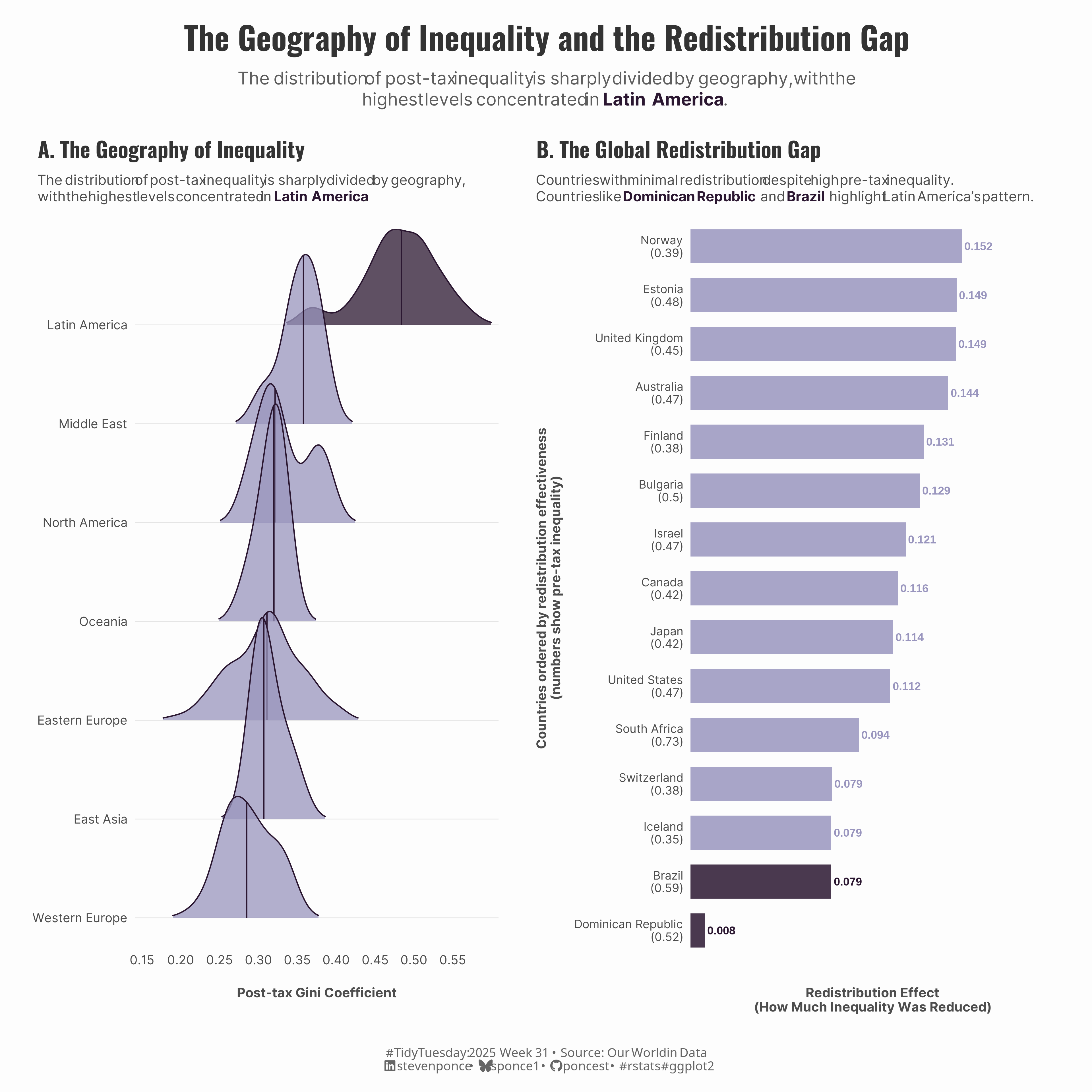{#fig-1}
### <mark> **Steps to Create this Graphic** </mark>
#### 1. Load Packages & Setup
```{r}
#| label: load
#| warning: false
#| message: false
#| results: "hide"

## 1. LOAD PACKAGES & SETUP ----
suppressPackageStartupMessages({
if (!require("pacman")) install.packages("pacman")
pacman::p_load(
        tidyverse,  # Easily Install and Load the 'Tidyverse'
    ggtext,     # Improved Text Rendering Support for 'ggplot2'
    showtext,   # Using Fonts More Easily in R Graphs
    janitor,    # Simple Tools for Examining and Cleaning Dirty Data
    scales,     # Scale Functions for Visualization
    glue,       # Interpreted String Literals
    ggridges,   # Ridgeline Plots in 'ggplot2'
    patchwork   # The Composer of Plots
  )})

### |- figure size ----
camcorder::gg_record(
  dir    = here::here("temp_plots"),
  device = "png",
  width  = 12,
  height = 12,
  units  = "in",
  dpi    = 320
)

# Source utility functions
suppressMessages(source(here::here("R/utils/fonts.R")))
source(here::here("R/utils/social_icons.R"))
source(here::here("R/utils/image_utils.R"))
source(here::here("R/themes/base_theme.R"))
```
#### 2. Read in the Data
```{r}
#| label: read
#| include: true
#| eval: true
#| warning: false

tt <- tidytuesdayR::tt_load(2025, week = 31)

income_inequality_processed <- tt$income_inequality_processed |> clean_names()
income_inequality_raw <- tt$income_inequality_raw |> clean_names()

tidytuesdayR::readme(tt)
rm(tt)
```
#### 3. Examine the Data
```{r}
#| label: examine
#| include: true
#| eval: true
#| results: 'hide'
#| warning: false

glimpse(income_inequality_processed)
glimpse(income_inequality_raw)
```
#### 4. Tidy Data
```{r}
#| label: tidy
#| warning: false

# Helper Function
classify_region <- function(entity) {
    case_when(
        entity %in% c(
            "Brazil", "Chile", "Colombia", "Dominican Republic",
            "Guatemala", "Mexico", "Panama", "Paraguay", "Peru", "Uruguay"
        ) ~ "Latin America",
        entity %in% c("United States", "Canada") ~ "North America",
        entity %in% c(
            "Germany", "France", "United Kingdom", "Sweden", "Denmark",
            "Norway", "Finland", "Netherlands", "Belgium", "Austria",
            "Switzerland", "Italy", "Spain", "Portugal", "Ireland",
            "Luxembourg", "Greece", "Cyprus", "Malta"
        ) ~ "Western Europe",
        entity %in% c(
            "Poland", "Czechia", "Slovakia", "Hungary", "Slovenia",
            "Estonia", "Lithuania", "Croatia", "Bulgaria",
            "Romania", "Serbia"
        ) ~ "Eastern Europe",
        entity %in% c("Japan", "South Korea", "Singapore", "Taiwan", "Hong Kong") ~ "East Asia",
        entity %in% c("Australia", "New Zealand") ~ "Oceania",
        entity %in% c("Israel", "Turkey") ~ "Middle East",
        entity %in% c("South Africa") ~ "Africa",
        TRUE ~ "Other"
    )
}

# Base data with regional classification
base_data <- income_inequality_processed |>
    mutate(
        region = classify_region(entity),
        redistribution_effect = gini_mi_eq - gini_dhi_eq
    )

# PANEL 1: Ridge plot data
ridge_data <- base_data |>
    filter(!is.na(gini_dhi_eq), region != "Other") |>
    group_by(region) |>
    filter(n() >= 10) |>
    ungroup() |>
    mutate(region = fct_reorder(region, gini_dhi_eq, .fun = median, .desc = FALSE))

# PANEL 2: Redistribution data
redistribution_data <- base_data |>
    filter(!is.na(redistribution_effect), !is.na(gini_mi_eq), !is.na(gini_dhi_eq)) |>
    group_by(entity, region) |>
    summarise(
        avg_redistribution = mean(redistribution_effect, na.rm = TRUE),
        avg_pretax_gini = mean(gini_mi_eq, na.rm = TRUE),
        avg_posttax_gini = mean(gini_dhi_eq, na.rm = TRUE),
        observations = n(),
        .groups = "drop"
    ) |>
    # Get the 15 countries with minimal redistribution
    slice_min(avg_redistribution, n = 15) |>
    mutate(
        is_latin = region == "Latin America",
        bar_color = ifelse(is_latin, "highlight", "main"),
        text_color = ifelse(is_latin, "highlight", "main"),
        country_label = paste0(entity, "\n(", round(avg_pretax_gini, 2), ")"),
        entity = fct_reorder(entity, avg_redistribution, .desc = FALSE)
    )
```
#### 5. Visualization Parameters
```{r}
#| label: params
#| include: true
#| warning: false

### |-  plot aesthetics ----
colors <- get_theme_colors(
    palette = c(
        "highlight" = "#2b1731",
        "main" = "#9995be",
        "dark_line" = "#2b1731",
        "text_dark" = "#4D4D4D",
        "text_medium" = "#7F7F7F",
        "text_light" = "#B2B2B2",
        "grid_line" = "#EAEAEA"
    )
)

### |- titles and caption ----
title_text <- str_glue("The Geography of Inequality and the Redistribution Gap")

subtitle_text <- str_glue(
    "The distribution of post-tax inequality is sharply divided by geography, with the<br>",
    "highest levels concentrated in <span style='color:", colors$palette["highlight"], ";'>**Latin America**</span>."
)

caption_text <- create_social_caption(
    tt_year = 2025,
    tt_week = 31,
    source_text =  "Our World in Data"
)

### |-  fonts ----
setup_fonts()
fonts <- get_font_families()

### |-  plot theme ----
# Start with base theme
base_theme <- create_base_theme(colors)

# Add weekly-specific theme elements
weekly_theme <- extend_weekly_theme(
    base_theme,
    theme(
        # Text styling
        plot.title = element_text(face = "bold", family = fonts$title, size = rel(1.2), color  = colors$title, margin = margin(b = 10)),
        plot.subtitle = element_markdown(family = fonts$subtitle, lineheight = 1.2, color = colors$subtitle, size = rel(0.78), margin = margin(b = 20)),

        # Axis elements
        axis.line = element_blank(),
        axis.ticks = element_blank(),

        # Grid elements
        panel.grid.major.y = element_line(color = "gray90",linetype = "solid", linewidth = 0.3),
        panel.grid.minor.y = element_blank(),
        panel.grid.major.x = element_blank(),
        panel.grid.minor.x = element_blank(),

        # Axis elements
        axis.text = element_text(color = colors$text, size = rel(0.7)),
        axis.title.x = element_text(color = colors$text, face = "bold", size = rel(0.8), margin = margin(t = 15)),
        axis.title.y = element_text(color = colors$text, face = "bold", size = rel(0.8), margin = margin(r = 10)),

        # Legend elements
        legend.position = "plot",
        legend.title = element_text(family = fonts$tsubtitle, color = colors$text, size = rel(0.8), face = "bold"),
        legend.text = element_text(family = fonts$tsubtitle, color = colors$text, size = rel(0.7)),

        # Plot margin
        plot.margin = margin(t = 15, r = 15, b = 15, l = 15),
    )
)

# Set theme
theme_set(weekly_theme)
```
#### 6. Plot
```{r}
#| label: plot
#| warning: false

# PANEL 1: Ridge plot
ridge_plot <- ridge_data |>
    ggplot(aes(x = gini_dhi_eq, y = region)) +
    # Geoms
    geom_density_ridges(
        aes(fill = ifelse(region == "Latin America", "highlight", "main")),
        scale = 2.2,
        alpha = 0.75,
        bandwidth = 0.015,
        rel_min_height = 0.01,
        quantile_lines = TRUE,
        quantiles = 2,
        color = colors$palette["dark_line"]
    ) +
    # Scales
    scale_fill_manual(
        values = colors$palette,
        guide = "none"
    ) +
    scale_x_continuous(
        name = "Post-tax Gini Coefficient",
        breaks = seq(0.15, 0.55, 0.05),
        labels = number_format(accuracy = 0.01),
        limits = c(0.15, 0.6),
        expand = expansion(mult = c(0.02, 0.02))
    ) +
    scale_y_discrete(name = NULL, expand = expansion(mult = c(0.05, 0.15))) +
    # Labs
    labs(
        title = "A. The Geography of Inequality",
        subtitle = paste0(
            "The distribution of post-tax inequality is sharply divided by geography,<br>",
            "with the highest levels concentrated in <span style='color:", colors$palette["highlight"], ";'>**Latin America**</span>."
        )
    )

# PANEL 2: Minimal Redistributors
redistributors_plot <- redistribution_data |>
    ggplot(aes(x = entity, y = avg_redistribution)) +
    # Geoms
    geom_col(aes(fill = bar_color), width = 0.7, alpha = 0.85) +
    geom_text(
        aes(label = round(avg_redistribution, 3), color = bar_color),
        hjust = -0.1,
        vjust = 0.5,
        size = 3.2,
        fontface = "bold"
    ) +
    # Scales
    scale_y_continuous(
        name = "Redistribution Effect\n(How Much Inequality Was Reduced)",
        breaks = seq(0, 0.16, 0.04),
        labels = number_format(accuracy = 0.01),
        limits = c(0, 0.2),
        expand = expansion(mult = c(0, 0.02))
    ) +
    scale_x_discrete(
        name = "Countries ordered by redistribution effectiveness\n(numbers show pre-tax inequality)",
        labels = redistribution_data$country_label,
        expand = expansion(mult = c(0.02, 0.02))
    ) +
    scale_fill_manual(
        values = colors$palette,
        guide = "none"
    ) +
    scale_color_manual(
        values = colors$palette,
        guide = "none"
    ) +
    coord_flip() +
    # Labs
    labs(
        title = "B. The Global Redistribution Gap",
        subtitle = paste0(
            "Countries with minimal redistribution despite high pre-tax inequality.<br>",
            "Countries like <span style='color:", colors$palette["highlight"], ";'>**Dominican Republic**</span> and ",
            "<span style='color:", colors$palette["highlight"], ";'>**Brazil**</span> highlight Latin America's pattern."
        )
    ) +
    # Theme
    theme(
        # Remove all gridlines
        panel.grid.major.y = element_blank(),

        # Remove x-axis text and ticks
        axis.text.x = element_blank(),
        axis.ticks.x = element_blank(),

        # Adjust y-axis text size for readability with pre-tax labels
        axis.text.y = element_text(size = rel(0.95), lineheight = 0.9)
    )

### |-  combined plot ----
combined_plots <- ridge_plot | redistributors_plot

combined_plots <- combined_plots +
    plot_annotation(
        title = title_text,
        subtitle = subtitle_text,
        caption = caption_text,
        theme = theme(
            plot.title = element_text(
                size = rel(1.8),
                family = fonts$title,
                face = "bold",
                color = colors$title,
                lineheight = 1.1,
                hjust = 0.5,
                margin = margin(t = 5, b = 5)
            ),
            plot.subtitle = element_markdown(
                size = rel(1),
                family = fonts$subtitle,
                color = alpha(colors$subtitle, 0.9),
                lineheight = 1.2,
                hjust = 0.5,
                margin = margin(t = 5, b = 10)
            ),
            plot.caption = element_markdown(
                size = rel(0.7),
                family = fonts$caption,
                color = colors$caption,
                hjust = 0.5,
                margin = margin(t = 10)
            )
        )
    )
```
#### 7. Save
```{r}
#| label: save
#| warning: false

### |-  plot image ----
save_plot_patchwork(
  plot = combined_plots,
  type = "tidytuesday",
  year = 2025,
  week = 31,
  width  = 12,
  height = 12
  )
```
#### 8. Session Info
::: {.callout-tip collapse="true"}
##### Expand for Session Info
```{r, echo = FALSE}
#| eval: true
#| warning: false
sessionInfo()
```
:::
#### 9. GitHub Repository
::: {.callout-tip collapse="true"}
##### Expand for GitHub Repo
The complete code for this analysis is available in [`tt_2025_31.qmd`](https://github.com/poncest/personal-website/blob/master/data_visualizations/TidyTuesday/2025/tt_2025_31.qmd).
For the full repository, [click here](https://github.com/poncest/personal-website/).
:::
#### 10. References
::: {.callout-tip collapse="true"}
##### Expand for References
1. Data Sources:
- TidyTuesday 2025 Week 31: \[Income Inequality Before and After Taxes\](https://github.com/rfordatascience/tidytuesday/blob/main/data/2025/2025-08-05)
:::
