---
title: "The Secret Sauce: Bob's Burgers Rating Trends?"
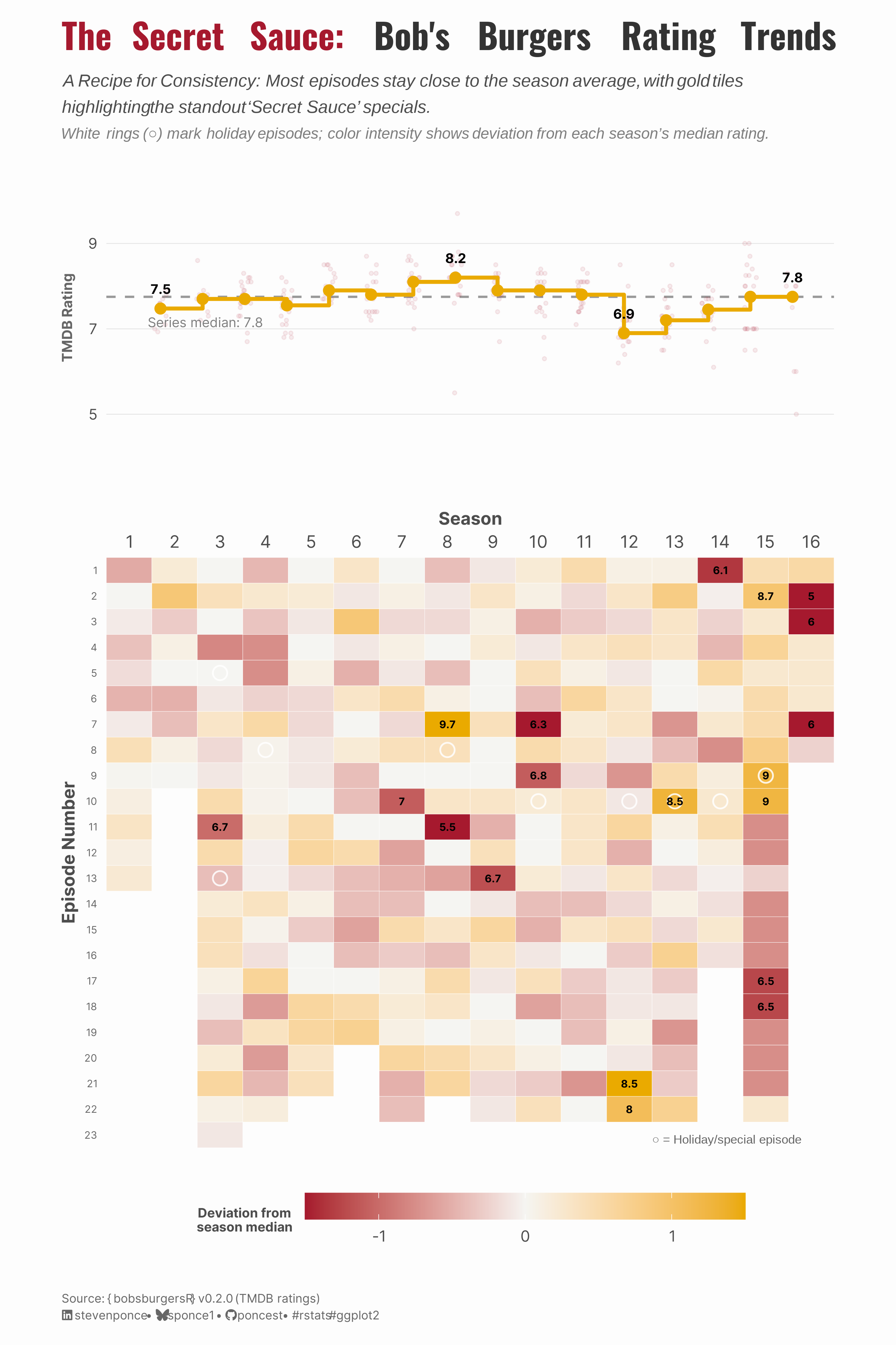
subtitle: "Season medians stay stable (6.9–8.2) while individual episodes vary widely."
description: "A two-panel visualization exploring TMDB ratings for Bob's Burgers across all 16 seasons (309 episodes). Features a step chart of season medians and a diverging heatmap showing episode deviations from season averages. Built with bobsburgersR v0.2.0."
date: "2026-01-21"
author:
- name: "Steven Ponce"
url: "https://stevenponce.netlify.app"
citation:
url: "https://stevenponce.netlify.app/projects/standalone_visualizations/sa_2026-01-21.html"
categories: ["Standalone Visualization", "Bob's Burgers", "2026"]
tags: [
"bobsburgersR",
"TMDB",
"heatmap",
"patchwork",
"ggplot2",
"TV ratings",
"diverging color scale"
]
image: "thumbnails/sa_2026-01-21.png"
format:
html:
toc: true
toc-depth: 5
code-link: true
code-fold: true
code-tools: true
code-summary: "Show code"
editor_options:
chunk_output_type: inline
execute:
freeze: true
cache: true
error: false
message: false
warning: false
eval: true
---
{#fig-1}
### [**Steps to Create this Graphic**]{.mark}
#### [1. Load Packages & Setup]{.smallcaps}
```{r}
#| label: load
#| warning: false
#| message: false
#| results: "hide"

## 1. LOAD PACKAGES & SETUP ----
suppressPackageStartupMessages({
if (!require("pacman")) install.packages("pacman")
pacman::p_load(
  tidyverse,         # Easily Install and Load the 'Tidyverse'
  ggtext,            # Improved Text Rendering Support for 'ggplot2'
  showtext,          # Using Fonts More Easily in R Graphs
  janitor,           # Simple Tools for Examining and Cleaning Dirty Data
  skimr,             # Compact and Flexible Summaries of Data
  scales,            # Scale Functions for Visualization
  glue,              # Interpreted String Literals
  patchwork,         # The Composer of Plots
  bobsburgersR       # Bob's Burgers Datasets for Data Visualization
)
})

### |- figure size ----
camcorder::gg_record(
  dir    = here::here("temp_plots"),
  device = "png",
  width  = 8,
  height = 12,
  units  = "in",
  dpi    = 320
)

# Source utility functions
suppressMessages(source(here::here("R/utils/fonts.R")))
source(here::here("R/utils/social_icons.R"))
source(here::here("R/utils/image_utils.R"))
source(here::here("R/themes/base_theme.R"))
```
#### [2. Read in the Data]{.smallcaps}
```{r}
#| label: read
#| include: true
#| eval: true
#| warning: false

episode_data <- bobsburgersR::episode_data
```
#### [3. Examine the Data]{.smallcaps}
```{r}
#| label: examine
#| include: true
#| eval: true
#| results: 'hide'
#| warning: false

glimpse(episode_data)
skim_without_charts(episode_data)
```
#### [4. Tidy Data]{.smallcaps}
```{r}
#| label: tidy-fixed
#| warning: false

# Holiday detection
holiday_pattern <- "(?i)Thanksgiving|Christmas|Halloween|Valentine"

episodes <- episode_data |>
  filter(!is.na(rating)) |>
  mutate(
    season_num  = as.numeric(as.character(season)),
    season = factor(season, levels = sort(unique(season_num))),
    episode_num = as.numeric(as.character(episode)),
    episode = factor(episode, levels = rev(sort(unique(episode_num)))),
    is_holiday = str_detect(title, holiday_pattern)
  )

# Series median (all episodes)
series_median <- median(episodes$rating, na.rm = TRUE)

# Season medians (top panel)
season_medians <- episodes |>
  group_by(season_num) |>
  summarise(median_rating = median(rating, na.rm = TRUE), .groups = "drop")

# Clear label toggles ---
label_mode <- "extremes"
dev_label_cutoff <- 0.9

# Season-relative deviations (bottom panel)
heatmap_df <- episodes |>
  group_by(season) |>
  mutate(
    season_median = median(rating, na.rm = TRUE),
    dev = rating - season_median
  ) |>
  ungroup()

# Data-driven dev limits  ---
dev_limit <- quantile(abs(heatmap_df$dev), 0.95, na.rm = TRUE)
dev_limit <- max(1.5, as.numeric(dev_limit))

# Label only meaningful deviations
heatmap_df <- heatmap_df |>
  mutate(
    tile_label = case_when(
      label_mode == "all" ~ as.character(round(rating, 1)),
      label_mode == "extremes" & abs(dev) >= dev_label_cutoff ~ as.character(round(rating, 1)),
      TRUE ~ ""
    )
  )

# Selective season labels: first, best, worst, last
highlight_seasons <- c(
  min(season_medians$season_num),
  season_medians$season_num[which.max(season_medians$median_rating)],
  season_medians$season_num[which.min(season_medians$median_rating)],
  max(season_medians$season_num)
  ) |>
  unique()
```
#### [5. Visualization Parameters]{.smallcaps}
```{r}
#| label: params
#| include: true
#| warning: false

### |-  plot aesthetics ----
colors <- get_theme_colors(
  palette = list(
    col_red     = "#A6192E",
    col_gold    = "#EAAA00",
    col_neutral = "#F5F5F2"
  )
)

### |- titles and caption ----
title_text <- "<span style='color:#A6192E;'>The Secret Sauce:</span> Bob\\'s Burgers Rating Trends"

subtitle_text <- str_glue(
  "A Recipe for Consistency: Most episodes stay close to the season average, with gold tiles<br>",
  "highlighting the standout 'Secret Sauce' specials.<br>
  <span style='font-size:10pt; color:gray50; font-family:sans;'>White rings (○) mark holiday episodes;
  color intensity shows deviation from each season's median rating.</span>"
)

caption_text <- create_standalone_caption(
  source_text = "{ bobsburgersR } v0.2.0 (TMDB ratings)"
)

### |-  fonts ----
setup_fonts()
fonts <- get_font_families()

### |-  plot theme ----
# Start with base theme
base_theme <- create_base_theme(colors)

# Add weekly-specific theme elements
weekly_theme <- extend_weekly_theme(
  base_theme,
  theme(
    # Text styling
    plot.title = element_text(
      face = "bold", family = fonts$title, size = rel(1.4),
      color = colors$title, margin = margin(b = 10), hjust = 0
    ),
    plot.subtitle = element_markdown(
      face = "italic", family = fonts$subtitle, lineheight = 1.2,
      color = colors$subtitle, size = rel(0.9), margin = margin(b = 20), hjust = 0
    ),

    # Grid
    panel.grid.minor = element_blank(),
    panel.grid.major.x = element_blank(),
    panel.grid.major = element_line(color = "gray90", linewidth = 0.25),

    # Axes
    axis.title = element_text(size = rel(0.8), color = "gray30"),
    axis.text = element_text(color = "gray30"),
    axis.text.y = element_text(size = rel(0.85)),
    axis.ticks = element_blank(),

    # Facets
    strip.background = element_rect(fill = "gray95", color = NA),
    strip.text = element_text(
      face = "bold",
      color = "gray20",
      size = rel(0.9),
      margin = margin(t = 6, b = 4)
    ),
    panel.spacing = unit(1.5, "lines"),

    # Legend elements
    legend.position = "plot",
    legend.title = element_text(
      family = fonts$subtitle,
      color = colors$text, size = rel(0.6), face = "bold"
    ),
    legend.text = element_text(
      family = fonts$tsubtitle,
      color = colors$text, size = rel(0.7)
    ),
    legend.margin = margin(t = 15),

    # Plot margin
    plot.margin = margin(10, 20, 10, 20),

  )
)

# Set theme
theme_set(weekly_theme)
```
#### [6. Plot]{.smallcaps}
```{r}
#| label: plot
#| warning: false

### |-  line chart ----
line_chart <-
ggplot(season_medians, aes(x = season_num, y = median_rating)) +
  # Geoms
  geom_hline(
    yintercept = series_median,
    linetype = "dashed",
    color = "gray60",
    linewidth = 0.7
  ) +
  geom_point(
    data = episodes,
    aes(x = season_num, y = rating),
    position = position_jitter(width = 0.15, height = 0, seed = 123),
    alpha = 0.08, size = 0.9,
    color = colors$palette$col_red
  ) +
  geom_step(color = colors$palette$col_gold, linewidth = 1.2) +
  geom_point(color = colors$palette$col_gold, size = 3) +
  geom_text(
    data = season_medians |> filter(season_num %in% highlight_seasons),
    aes(label = round(median_rating, 1)),
    vjust = -1.5,
    family = fonts$text,
    fontface = "bold",
    size = 3
  ) +
  # Annotate
  annotate(
    "text",
    x = 0.7,
    y = series_median - 0.6,
    label = glue("Series median: {round(series_median, 1)}"),
    hjust = 0,
    family = fonts$text,
    size = 3,
    color = "gray50",
    fontface = "italic"
  ) +
  # Scales
  scale_y_continuous(
    limits = c(4, 10.5),
    breaks = c(5, 7, 9)
  ) +
  scale_x_continuous(
    breaks = 1:16,
    limits = c(0.5, 16.2)
  ) +
  # Labs
  labs(y = "TMDB Rating", x = NULL) +
  # Theme
  theme(
    panel.grid.minor = element_blank(),
    panel.grid.major.x = element_blank(),
    axis.text.x = element_blank(),
    axis.title.y = element_text(size = 9, color = "gray40")
  )

# ### |-  heatmap plot ----
heatmap_plot <-
  ggplot(heatmap_df, aes(x = season, y = episode)) +
    # Geoms
    geom_tile(aes(fill = dev), color = "white", linewidth = 0.1) +
    geom_point(
      data = heatmap_df |> filter(is_holiday),
      shape = 1,
      size = 3.8,
      color = "white",
      stroke = 0.8,
      alpha = 0.85
    ) +
    geom_text(
      aes(label = tile_label),
      size = 2.4,
      fontface = "bold",
      family = fonts$text,
      color = "black"
    ) +
    # Annotate
    annotate(
      "text",
      x = 12.5,
      y = levels(heatmap_df$episode)[1],
      label = "○ = Holiday/special episode",
      hjust = 0,
      vjust = 1,
      size = 2.8,
      family = "sans",
      color = "gray40"
    ) +
    # Scales
    scale_fill_gradient2(
      low = colors$palette$col_red,
      mid = colors$palette$col_neutral,
      high = colors$palette$col_gold,
      midpoint = 0,
      limits = c(-dev_limit, dev_limit),
      oob = squish,
      breaks = c(-2, -1, 0, 1, 2),
      name = "Deviation from\nseason median"
    ) +
    scale_x_discrete(position = "top") +
    coord_cartesian(expand = FALSE) +
    # Labs
    labs(x = "Season", y = "Episode Number") +
    # Theme
    theme(
      axis.text.y = element_text(size = 6.5, color = "gray40"),
      legend.position = "bottom",
      legend.key.width = unit(2, "cm"),
      panel.grid.major.y = element_blank(),
      panel.grid.minor.y = element_blank(),
      panel.grid = element_blank(),

    )

### |-  combined plots ----
combined_plot <-
    (line_chart / heatmap_plot) +
      plot_layout(heights = c(0.75, 1.45)) +

      # Labs
        plot_annotation(
          title = title_text,
          subtitle = subtitle_text,
          caption = caption_text
        ) &

        # Theme
        theme(
          plot.title = element_markdown(
            size = rel(1.6),
            family = fonts$title,
            face = "bold",
            color = colors$title,
            lineheight = 1.15,
            margin = margin(t = 5, b = 5)
          ),
          plot.subtitle = element_markdown(
            size = rel(0.8),
            family = 'sans',
            color = colors$subtitle,
            lineheight = 1.5,
            margin = margin(t = 5, b = 5)
          ),
          plot.caption = element_markdown(
            size = rel(0.55),
            family = fonts$subtitle,
            color = colors$caption,
            hjust = 0,
            lineheight = 1.4,
            margin = margin(t = 20, b = 5)
          ),
          legend.title = element_text(hjust = 0.5)
        )
```
#### [7. Save]{.smallcaps}
```{r}
#| label: save
#| warning: false

### |-  plot image ----
save_plot_patchwork(
  plot = combined_plot,
  type = "standalone",
  year = 2026,
  width  = 8,
  height = 12,
  )
```
#### [8. Session Info]{.smallcaps}
::: {.callout-tip collapse="true"}
##### Expand for Session Info
```{r, echo = FALSE}
#| eval: true
#| warning: false
sessionInfo()
```
:::
#### [9. GitHub Repository]{.smallcaps}
::: {.callout-tip collapse="true"}
##### Expand for GitHub Repo
The complete code for this analysis is available in [`sa_2026-01-21.qmd`](https://github.com/poncest/personal-website/blob/master/projects/standalone_visualizations/sa_2026-01-21.qmd).
For the full repository, [click here](https://github.com/poncest/personal-website/).
:::
#### [10. References]{.smallcaps}
::: {.callout-tip collapse="true"}
##### Expand for References
1. **Data Source:**
- bobsburgersR R Package v0.2.0: [GitHub Repository](https://github.com/poncest/bobsburgersR)
- Episode Ratings: [TMDB (The Movie Database)](https://www.themoviedb.org/tv/32726-bob-s-burgers)
2. **Bob's Burgers:**
- Official Show Page: [FOX - Bob's Burgers](https://www.fox.com/bobs-burgers/)
- Wikipedia: [Bob's Burgers Episode List](https://en.wikipedia.org/wiki/List_of_Bob%27s_Burgers_episodes)
:::
#### [11. Custom Functions Documentation]{.smallcaps}
::: {.callout-note collapse="true"}
##### 📦 Custom Helper Functions
This analysis uses custom functions from my personal module library for efficiency and consistency across projects.
**Functions Used:**
- **`fonts.R`**: `setup_fonts()`, `get_font_families()` - Font management with showtext
- **`social_icons.R`**: `create_social_caption()` - Generates formatted social media captions
- **`image_utils.R`**: `save_plot()` - Consistent plot saving with naming conventions
- **`base_theme.R`**: `create_base_theme()`, `extend_weekly_theme()`, `get_theme_colors()` - Custom ggplot2 themes
**Why custom functions?**\
These utilities standardize theming, fonts, and output across all my data visualizations. The core analysis (data tidying and visualization logic) uses only standard tidyverse packages.
**Source Code:**\
View all custom functions → [GitHub: R/utils](https://github.com/poncest/personal-website/tree/master/R)
:::