---
title: "The Global Housing Bubble is Losing Air"
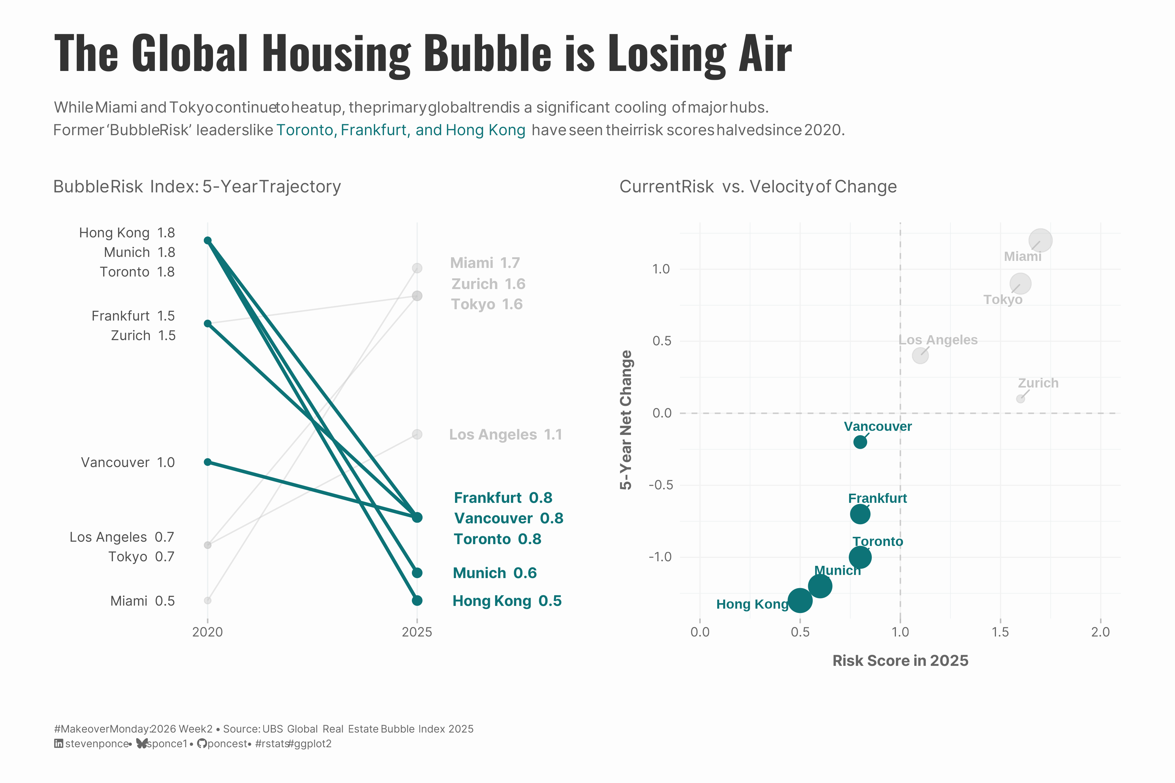
subtitle: "While Miami and Tokyo continue to heat up, the primary global trend is a significant cooling of major hubs. Former 'Bubble Risk' leaders like Toronto, Frankfurt, and Hong Kong have seen their risk scores halved since 2020."
description: "A #MakeoverMonday redesign analyzing UBS Global Real Estate Bubble Index data (2020-2025). This dual-panel visualization reveals a surprising story: while Miami dominates headlines, the broader trend shows major financial hubs like Toronto, Frankfurt, and Hong Kong experiencing dramatic bubble deflation."
date: "2026-01-12"
author:
- name: "Steven Ponce"
url: "https://stevenponce.netlify.app"
citation:
url: "https://stevenponce.netlify.app/data_visualizations/MakeoverMonday/2026/mm_2026_02.html"
categories: ["MakeoverMonday", "2026"]
tags: [
"ggplot2",
"housing-market",
"real-estate",
"bubble-risk",
"slope-chart",
"scatter-plot",
"patchwork",
"UBS",
"global-markets",
"time-series",
]
image: "thumbnails/mm_2026_02.png"
format:
html:
toc: true
toc-depth: 5
code-link: true
code-fold: true
code-tools: true
code-summary: "Show code"
theme:
light: [flatly, assets/styling/custom_styles.scss]
dark: [darkly, assets/styling/custom_styles_dark.scss]
editor_options:
chunk_output_type: inline
execute:
freeze: true
cache: true
error: false
message: false
warning: false
eval: true
---
```{r}
#| label: setup-links
#| include: false
# CENTRALIZED LINK MANAGEMENT
## Project-specific info
current_year <- 2026
current_week <- 02
project_file <- "mm_2026_02.qmd"
project_image <- "mm_2026_02.png"
## Data Sources
data_main <- "https://data.world/makeovermonday/2026wk2-the-biggest-housing-bubble-risks-globally"
data_secondary <- "https://data.world/makeovermonday/2026wk2-the-biggest-housing-bubble-risks-globally"
## Repository Links
repo_main <- "https://github.com/poncest/personal-website/"
repo_file <- paste0("https://github.com/poncest/personal-website/blob/master/data_visualizations/MakeoverMonday/", current_year, "/", project_file)
## External Resources/Images
chart_original <- "https://raw.githubusercontent.com/poncest/MakeoverMonday/refs/heads/master/2028/Week_02/original_chart.png"
## Organization/Platform Links
org_primary <- "https://www.visualcapitalist.com/sp/ter01-the-biggest-housing-bubble-risks-globally/"
org_secondary <- "https://www.visualcapitalist.com/sp/ter01-the-biggest-housing-bubble-risks-globally/"
# Helper function to create markdown links
create_link <- function(text, url) {
paste0("[", text, "](", url, ")")
}
# Helper function for citation-style links
create_citation_link <- function(text, url, title = NULL) {
if (is.null(title)) {
paste0("[", text, "](", url, ")")
} else {
paste0("[", text, "](", url, ' "', title, '")')
}
}
```
### Original
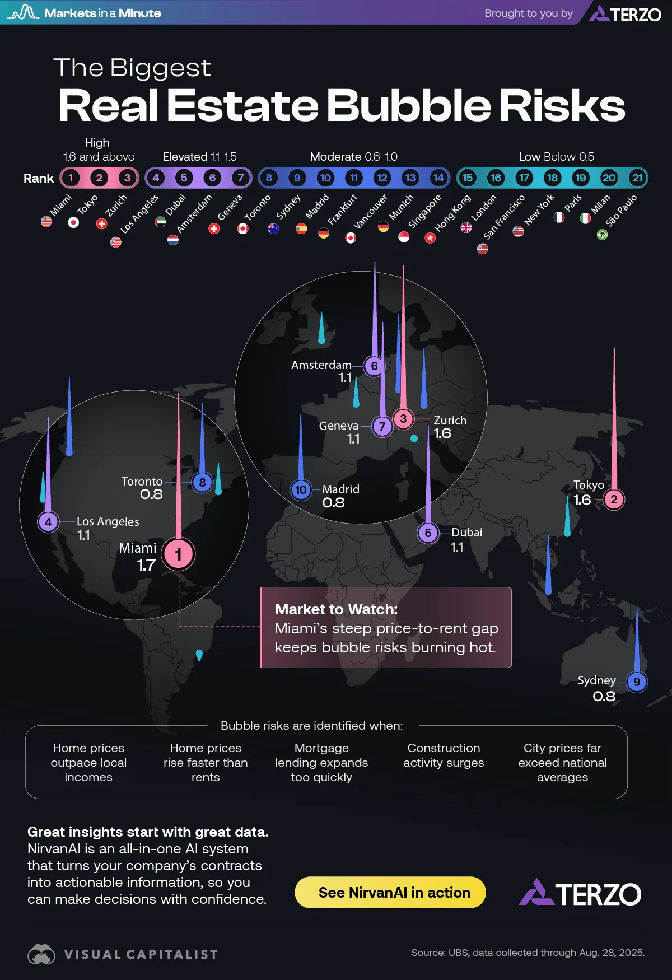
The original visualization comes from `r create_link("The Biggest Housing Bubble Risks Globally", data_secondary)`
### Makeover
{#fig-1}
### [**Steps to Create this Graphic**]{.mark}
#### [1. Load Packages & Setup]{.smallcaps}
```{r}
#| label: load
#| warning: false
#| message: false
#| results: "hide"

## 1. LOAD PACKAGES & SETUP ----
suppressPackageStartupMessages({
  if (!require("pacman")) install.packages("pacman")
  pacman::p_load(
    tidyverse, janitor, skimr, scales, ggtext, showtext, glue,
    patchwork, ggrepel          # Interpreted String Literals
)
})

### |- figure size ----
camcorder::gg_record(
    dir    = here::here("temp_plots"),
    device = "png",
    width  = 12,
    height = 8,
    units  = "in",
    dpi    = 320
)

# Source utility functions
suppressMessages(source(here::here("R/utils/fonts.R")))
source(here::here("R/utils/social_icons.R"))
source(here::here("R/utils/image_utils.R"))
source(here::here("R/themes/base_theme.R"))
```
#### [2. Read in the Data]{.smallcaps}
```{r}
#| label: read
#| include: true
#| eval: true
#| warning: false
#|

### |- Current data (2025) ----
housing_bubble_raw <- readxl::read_excel(
   here::here("data/MakeoverMonday/2026/Housing bubbles.xlsx")) |>
  clean_names()

### |- Historical data (2020-2025) from UBS reports ----

# Source: UBS Global Real Estate Bubble Index reports 2020-2025
# https://www.ubs.com/global/en/wealth-management/insights/2024/global-real-estate-bubble-index.html
# Note: Historical data compiled from annual UBS reports

historical_raw <- tribble(
  ~city, ~year_2020, ~year_2021, ~year_2022, ~year_2023, ~year_2024, ~year_2025,
  "Miami", 0.5, 0.8, 1.4, 1.8, 1.8, 1.7,
  "Tokyo", 0.7, 0.7, 0.6, 0.9, 1.2, 1.6,
  "Zurich", 1.5, 1.8, 1.7, 1.7, 1.5, 1.6,
  "Los Angeles", 0.7, 1.0, 1.2, 1.2, 1.2, 1.1,
  "Toronto", 1.8, 2.0, 2.2, 1.2, 0.9, 0.8,
  "Frankfurt", 1.5, 2.2, 2.2, 1.1, 0.8, 0.8,
  "Munich", 1.8, 2.3, 2.0, 1.1, 0.9, 0.6,
  "Hong Kong", 1.8, 1.7, 1.7, 1.2, 0.7, 0.5,
  "Vancouver", 1.0, 1.6, 1.7, 1.1, 0.9, 0.8
)
```
#### [3. Examine the Data]{.smallcaps}
```{r}
#| label: examine
#| include: true
#| eval: true
#| results: 'hide'
#| warning: false

glimpse(housing_bubble_raw)
glimpse(historical_raw)
```
#### [4. Tidy Data]{.smallcaps}
```{r}
#| label: tidy
#| warning: false

slope_data <- historical_raw |>
  mutate(
    change     = year_2025 - year_2020,
    direction  = if_else(change < 0, "Cooling", "Rising"),
    label_2020 = sprintf("%s  %.1f", city, year_2020),
    label_2025 = sprintf("%s  %.1f", city, year_2025)
  ) |>
  arrange(desc(year_2025)) |>
  mutate(city = factor(city, levels = unique(city)))
```
#### [5. Visualization Parameters]{.smallcaps}
```{r}
#| label: params
#| include: true
#| warning: false

### |-  plot aesthetics ----
# Get base colors with custom palette
colors <- get_theme_colors(
  palette = list(
    cooling    = "#0D7377",
    rising     = "#C4C4C4"
  )
)

### |-  Main titles ----
title_text <- "The Global Housing Bubble is Losing Air"

subtitle_text <- str_glue(
  "While Miami and Tokyo continue to heat up, the primary global trend is a **significant cooling** of major hubs.<br>",
  "Former 'Bubble Risk' leaders like ",
  "<span style='color:{colors$palette$cooling};'>**Toronto, Frankfurt, and Hong Kong**</span>",
  " have seen their risk scores halved since 2020."
)

caption_text <- create_mm_caption(
  mm_year = 2026, mm_week = 02,
  source_text = str_glue(
    "UBS Global Real Estate Bubble Index 2025"
  )
)

### |-  fonts ----
setup_fonts()
fonts <- get_font_families()

### |-  plot theme ----

# Start with base theme
base_theme <- create_base_theme(colors)

# Add weekly-specific theme elements
weekly_theme <- extend_weekly_theme(
  base_theme,
  theme(
    # # Text styling
    plot.title = element_text(
      size = rel(1.5), family = fonts$title, face = "bold",
      color = colors$title, lineheight = 1.1, hjust = 0,
      margin = margin(t = 5, b = 10)
    ),
    plot.subtitle = element_markdown(
      size = rel(0.9), family = fonts$subtitle, face = "italic",
      color = alpha(colors$subtitle, 0.9), lineheight = 1.1,
      margin = margin(t = 0, b = 20)
    ),

    # Legend formatting
    legend.position = "plot",
    legend.justification = "right",
    legend.margin = margin(l = 12, b = 5),
    legend.key.size = unit(0.8, "cm"),
    legend.box.margin = margin(b = 10),

    # Axis formatting
    axis.ticks.y = element_blank(),
    axis.ticks.x = element_line(color = "gray", linewidth = 0.5),
    axis.title.x = element_text(
      face = "bold", size = rel(0.85),
      margin = margin(t = 10), family = fonts$subtitle,
      color = "gray40"
    ),
    axis.title.y = element_text(
      face = "bold", size = rel(0.85),
      margin = margin(r = 10), family = fonts$subtitle,
      color = "gray40"
    ),
    axis.text.x = element_text(
      size = rel(0.85), family = fonts$subtitle,
      color = "gray40"
    ),
    axis.text.y = element_markdown(
      size = rel(0.85), family = fonts$subtitle,
      color = "gray40"
    ),

    # Grid lines
    panel.grid.minor = element_line(color = "#ecf0f1", linewidth = 0.2),
    panel.grid.major = element_line(color = "#ecf0f1", linewidth = 0.4),

    # Margin
    plot.margin = margin(20, 20, 20, 20)
  )
)

# Set theme
theme_set(weekly_theme)
```
#### [6. Plot]{.smallcaps}
```{r}
#| label: plot
#| warning: false

### |-  p1: slope chart ----
p1 <-
ggplot(slope_data) +
  # Geoms
  geom_segment(
    aes(
      x = 1, xend = 2,
      y = year_2020, yend = year_2025,
      color = direction, alpha = direction, linewidth = direction
    )
  ) +
  geom_point(aes(x = 1, y = year_2020, color = direction, alpha = direction), size = 2) +
  geom_point(aes(x = 2, y = year_2025, color = direction, alpha = direction), size = 3) +
  geom_text_repel(
    aes(x = 1, y = year_2020, label = label_2020),
    direction = "y",
    hjust = 1,
    nudge_x = -0.15,
    size = 3.5,
    segment.color = NA,
    family = fonts$text,
    color = colors$text
  ) +
  geom_text_repel(
    aes(x = 2, y = year_2025, label = label_2025, color = direction),
    direction = "y",
    hjust = 0,
    nudge_x = 0.15,
    size = 3.8,
    fontface = "bold",
    segment.color = NA,
    family = fonts$text,
    seed = 123
  ) +
  # Scales
  scale_color_manual(values = c("Cooling" = colors$palette$cooling, "Rising" = colors$palette$rising)) +
  scale_alpha_manual(values = c("Cooling" = 1, "Rising" = 0.4)) +
  scale_linewidth_manual(values = c("Cooling" = 1.2, "Rising" = 0.5)) +
  scale_x_continuous(
    limits = c(0.4, 2.6),
    breaks = c(1, 2),
    labels = c("2020", "2025")
  ) +
  # Labs
  labs(subtitle = "Bubble Risk Index: 5-Year Trajectory", x = NULL, y = NULL) +
  # Theme
  theme(
    panel.grid.minor = element_blank(),
    panel.grid.major.y = element_blank(),
    axis.text.y = element_blank(),
    legend.position = "none"
    )

### |-  p2: quadrant chart ----
p2 <-
ggplot(slope_data, aes(x = year_2025, y = change)) +
  # Geoms
  geom_hline(yintercept = 0, color = "grey80", linetype = "dashed") +
  geom_vline(xintercept = 1, color = "grey80", linetype = "dashed") +
  geom_point(aes(color = direction, alpha = direction, size = abs(change))) +
  geom_text_repel(
    aes(label = city, color = direction),
    size = 3.5,
    fontface = "bold",
    box.padding = 0.5,
    seed = 123
  ) +
  # Scales
  scale_color_manual(values = c("Cooling" = colors$palette$cooling, "Rising" = colors$palette$rising)) +
  scale_alpha_manual(values = c("Cooling" = 1, "Rising" = 0.4)) +
  scale_size(range = c(2.5, 8)) +
  coord_cartesian(xlim = c(0, 2)) +
  # Labs
  labs(
    subtitle = "Current Risk vs. Velocity of Change",
    x = "Risk Score in 2025",
    y = "5-Year Net Change"
  ) +
  # Theme
  theme(
    legend.position = "none",
    panel.grid.major = element_line(color = "grey95")
  )

### |-  combined plot ----
combined_plot <- p1 + p2 +
  plot_layout(widths = c(1.15, 1)) +
  plot_annotation(
    title = title_text,
    subtitle = subtitle_text,
    caption = caption_text,
    theme = theme(
      plot.title = element_text(
        size = rel(2.4),
        family = fonts$title,
        face = "bold",
        color = colors$title,
        lineheight = 1.15,
        margin = margin(t = 5, b = 10)
      ),
      plot.subtitle = element_markdown(
        size = rel(0.8),
        family = fonts$subtitle,
        color = alpha(colors$subtitle, 0.88),
        lineheight = 1.5,
        margin = margin(t = 5, b = 10)
      ),
      plot.caption = element_markdown(
        size = rel(0.55),
        family = fonts$subtitle,
        color = colors$caption,
        hjust = 0,
        lineheight = 1.4,
        margin = margin(t = 20, b = 5)
      ),
    )
  )
```
#### [7. Save]{.smallcaps}
```{r}
#| label: save
#| warning: false

### |-  plot image ----
save_plot_patchwork(
  plot = combined_plot,
  type = "makeovermonday",
  year = current_year,
  week = current_week,
  width = 12,
  height = 8
  )
```
#### [8. Session Info]{.smallcaps}
::: {.callout-tip collapse="true"}
##### Expand for Session Info
```{r, echo = FALSE}
#| eval: true
#| warning: false
sessionInfo()
```
:::
#### [9. GitHub Repository]{.smallcaps}
::: {.callout-tip collapse="true"}
##### Expand for GitHub Repo
The complete code for this analysis is available in `r create_link(project_file, repo_file)`.
For the full repository, `r create_link("click here", repo_main)`.
:::
#### [10. References]{.smallcaps}
::: {.callout-tip collapse="true"}
##### Expand for References
1. Data:
- Makeover Monday `r current_year` Week `r current_week`: `r create_link("The Biggest Housing Bubble Risks Globally", data_main)`
2. Article
- `r create_link("The Biggest Housing Bubble Risks Globally", data_secondary)`
:::
#### [11. Custom Functions Documentation]{.smallcaps}
::: {.callout-note collapse="true"}
##### 📦 Custom Helper Functions
This analysis uses custom functions from my personal module library for efficiency and consistency across projects.
**Functions Used:**
- **`fonts.R`**: `setup_fonts()`, `get_font_families()` - Font management with showtext
- **`social_icons.R`**: `create_social_caption()` - Generates formatted social media captions
- **`image_utils.R`**: `save_plot()` - Consistent plot saving with naming conventions
- **`base_theme.R`**: `create_base_theme()`, `extend_weekly_theme()`, `get_theme_colors()` - Custom ggplot2 themes
**Why custom functions?**\
These utilities standardize theming, fonts, and output across all my data visualizations. The core analysis (data tidying and visualization logic) uses only standard tidyverse packages.
**Source Code:**\
View all custom functions → [GitHub: R/utils](https://github.com/poncest/personal-website/tree/master/R)
:::

