• Steven Ponce
  • About
  • Data Visualizations
  • Projects
  • Resume
  • Email

On this page

  • Original
  • Makeover
  • Steps to Create this Graphic
    • 1. Load Packages & Setup
    • 2. Read in the Data
    • 3. Examine the Data
    • 4. Tidy Data
    • 5. Visualization Parameters
    • 6. Plot
    • 7. Save
    • 8. Session Info
    • 9. GitHub Repository
    • 10. References
    • 11. Custom Functions Documentation

The biggest data centers are mostly still in the pipeline

  • Show All Code
  • Hide All Code

  • View Source

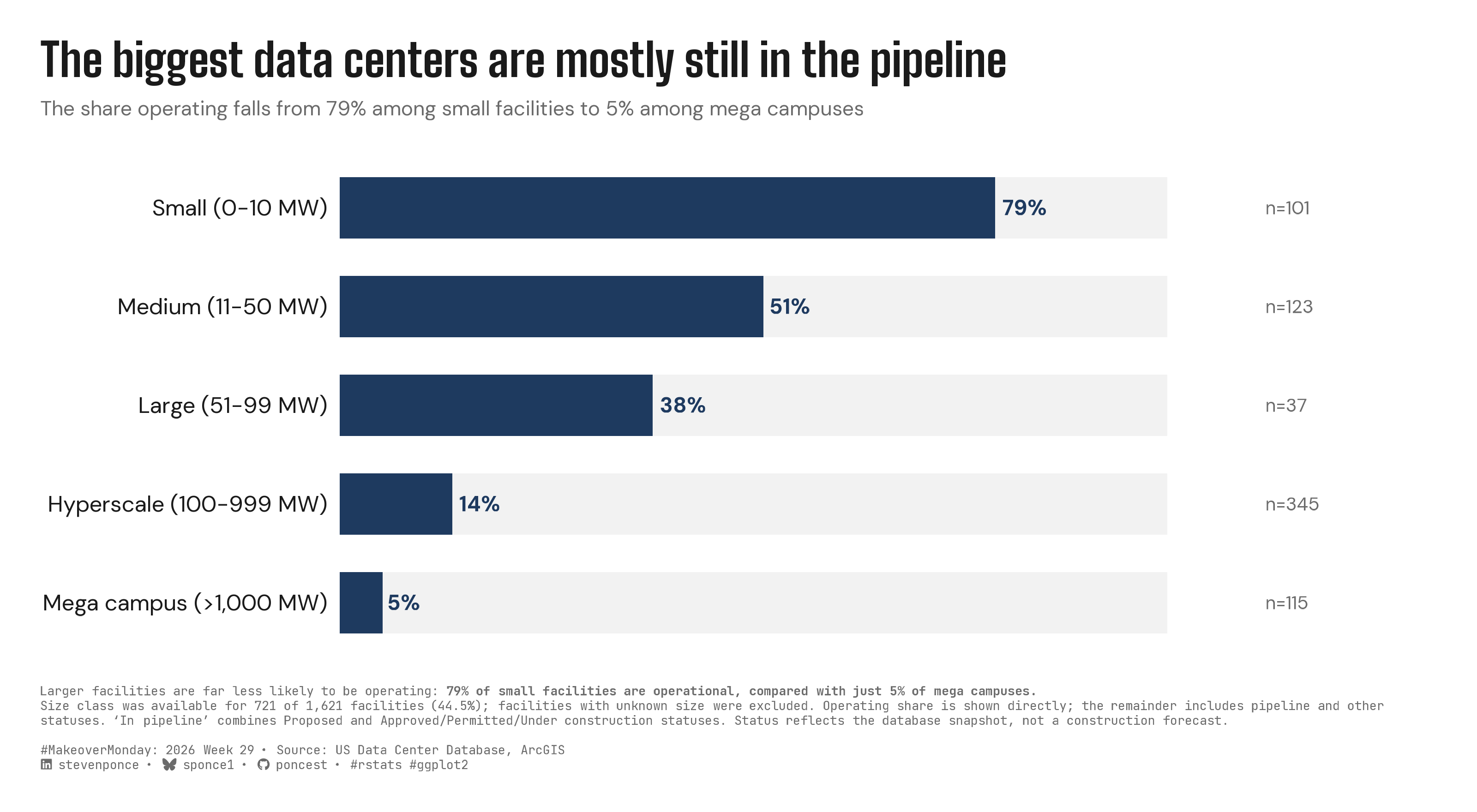
The share operating falls from 79% among small facilities to 5% among mega campuses

MakeoverMonday
Data Visualization
R Programming
2026
Data center facility status by size class, from small (0-10 MW) to mega campus (>1,000 MW), shows the share currently operating collapsing from 79% to 5% as project scale increases. Percentages are normalized within each known size class (721 of 1,621 facilities), not compared as raw counts. Built in R with ggplot2, ggtext, and glue.
Author

Steven Ponce

Published

July 22, 2026

Original

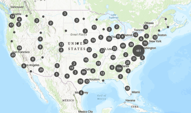
The original visualization comes from US Data Center Locations

Original visualization

Makeover

Figure 1: Progress-bar chart showing the share of US data centers currently operating by size class: 79% of small facilities (0–10 MW) are operating, falling to 51% for medium, 38% for large, 14% for hyperscale, and just 5% for mega campuses (>1,000 MW).

Steps to Create this Graphic

1. Load Packages & Setup

Show code
```{r}
#| label: load
#| warning: false
#| message: false      
#| results: "hide"     

## 1. LOAD PACKAGES & SETUP ----
suppressPackageStartupMessages({
  if (!require("pacman")) install.packages("pacman")
  pacman::p_load(
    tidyverse, ggtext, showtext, scales, glue, janitor
)
})

### |- figure size ----
camcorder::gg_record(
  dir    = here::here("temp_plots"),
  device = "png",
  width  = 10,
  height = 5.5,
  units  = "in",
  dpi    = 320
)

# Source utility functions
suppressMessages(source(here::here("R/utils/fonts.R")))
source(here::here("R/utils/social_icons.R"))
source(here::here("R/utils/image_utils.R"))
source(here::here("R/themes/base_theme.R"))
```

2. Read in the Data

Show code
```{r}
#| label: read
#| include: true
#| eval: true
#| warning: false
#| 

df_raw <- readxl::read_excel(
  here::here("data/MakeoverMonday/2026/Data_Centers_Database.xlsx")) |>
  clean_names()
```

3. Examine the Data

Show code
```{r}
#| label: examine
#| include: true
#| eval: true
#| results: 'hide'
#| warning: false

glimpse(df_raw)
skimr::skim_without_charts(df_raw)
```

4. Tidy Data

Show code
```{r}
#| label: tidy
#| warning: false

### |- clean status / sizerank, collapse pipeline categories ----
df_tidy <- df_raw |>
  mutate(
    status = str_squish(status),
    sizerank = str_squish(sizerank),
    sizerank = if_else(
      sizerank == "Hyperscale (101-999 MW)",
      "Hyperscale (100-999 MW)",
      sizerank
    )
  ) |>
  filter(sizerank != "Unknown") |>
  mutate(
    status_bucket = case_when(
      status == "Operating" ~ "Operating",
      status %in% c("Proposed", "Approved/Permitted/Under construction") ~ "In pipeline",
      TRUE ~ "Stalled/Other"
    ),
    sizerank = factor(
      sizerank,
      levels = c(
        "Small (0-10 MW)",
        "Medium (11-50 MW)",
        "Large (51-99 MW)",
        "Hyperscale (100-999 MW)",
        "Mega campus (>1,000 MW)"
      )
    )
  )

### |- summarize: % operating by size class ----
plot_data <- df_tidy |>
  summarise(
    n           = n(),
    n_operating = sum(status_bucket == "Operating"),
    .by = sizerank
  ) |>
  mutate(
    pct_operating = n_operating / n * 100,
    label_pct     = paste0(round(pct_operating), "%"),
    label_n       = paste0("n=", n)
  ) |>
  arrange(sizerank) |>
  ungroup()  
```

5. Visualization Parameters

Show code
```{r}
#| label: params
#| include: true
#| warning: false

### |- plot aesthetics ----
clrs <- get_theme_colors(
  palette = list(
    accent     = "#1E3A5F",
    track      = "#F2F2F2",
    text       = "#1A1A1A",
    muted      = "#6B6B6B",
    background = "#FFFFFF"
  )
)$palette

### |- annotation / layout scalars ----
n_known      <- nrow(df_tidy)
n_total      <- nrow(df_raw)
pct_known    <- round(n_known / n_total * 100, 1)

track_max    <- 100
n_label_x    <- 112
x_axis_max   <- 130
bar_width    <- 0.62

### |- titles and caption ----
title_text <- "The biggest data centers are mostly still in the pipeline"

subtitle_text <- glue(
  "The share operating falls from {round(plot_data$pct_operating[plot_data$sizerank == 'Small (0-10 MW)'])}% ",
  "among small facilities to {round(plot_data$pct_operating[plot_data$sizerank == 'Mega campus (>1,000 MW)'])}% ",
  "among mega campuses"
)

caption_lead <- glue(
  "Larger facilities are far less likely to be operating: **",
  "{round(plot_data$pct_operating[plot_data$sizerank == 'Small (0-10 MW)'])}% of small ",
  "facilities are operational, compared with just ",
  "{round(plot_data$pct_operating[plot_data$sizerank == 'Mega campus (>1,000 MW)'])}% ",
  "of mega campuses.**"
)

caption_note <- glue(
  "Size class was available for {n_known} of {scales::comma(n_total)} facilities ",
  "({pct_known}%); facilities with unknown size were excluded. Operating share is shown ",
  "directly; the remainder includes pipeline and other statuses. \u2018In pipeline\u2019 combines ",
  "Proposed and Approved/Permitted/Under\u00A0construction statuses. Status reflects the database ",
  "snapshot, not a construction forecast.<br>"
)

caption_text <- glue(
  "{caption_lead}<br>",
  "{caption_note}<br>",
  create_mm_caption(
    mm_year = 2026,
    mm_week = 29,
    source_text = "US Data Center Database, ArcGIS"
  )
)

### |- fonts ----
setup_fonts()
fonts <- get_font_families()

### |- plot theme ----
base_theme <- create_base_theme(clrs)

weekly_theme <- extend_weekly_theme(
  base_theme,
  theme(
    plot.background = element_rect(fill = clrs$background, color = NA),
    panel.background = element_rect(fill = clrs$background, color = NA),
    panel.grid = element_blank(),
    axis.title = element_blank(),
    axis.text.x = element_blank(),
    axis.ticks = element_blank(),
    axis.text.y = element_text(
      family = fonts$text, color = clrs$text, size = 11, hjust = 1
    ),
    plot.title = element_text(
      family = fonts$title_1, color = clrs$text, size = 22, face = "bold"
    ),
    plot.subtitle = element_text(
      family = fonts$subtitle, color = clrs$muted, size = 10,
      margin = margin(b = 14)
    ),
    plot.caption = element_textbox_simple(
      family = fonts$caption, color = clrs$muted, size = 6,
      margin = margin(t = 12)
    ),
    plot.margin = margin(20, 30, 20, 20)
  )
)

theme_set(weekly_theme)
```

6. Plot

Show code
```{r}
#| label: plot
#| warning: false

### |- plot ----
p <- ggplot(plot_data, aes(y = sizerank)) +
  geom_col(
    aes(x = track_max),
    fill  = clrs$track,
    width = bar_width
  ) +
  geom_col(
    aes(x = pct_operating),
    fill  = clrs$accent,
    width = bar_width
  ) +
  geom_text(
    aes(x = pct_operating, label = label_pct),
    hjust = -0.18,
    size = 3.6,
    fontface = "bold",
    color = clrs$accent,
    family = fonts$text
  ) +
  geom_text(
    aes(x = n_label_x, label = label_n),
    hjust = 0,
    size = 3.2,
    color = clrs$muted,
    family = fonts$text
  ) +
  scale_y_discrete(limits = rev) +
  scale_x_continuous(
    limits = c(0, x_axis_max),
    expand = c(0, 0)
  ) +
  labs(
    title = title_text,
    subtitle = subtitle_text,
    caption = caption_text
  )
```

7. Save

Show code
```{r}
#| label: save
#| warning: false

### |-  plot image ----  
save_plot(
  plot = p, 
  type = "makeovermonday", 
  year = current_year,
  week = current_week,
  width = 10, 
  height = 5.5
  )
```

8. Session Info

TipExpand for Session Info
R version 4.6.1 (2026-06-24)
Platform: aarch64-apple-darwin23
Running under: macOS Tahoe 26.5.2

Matrix products: default
BLAS:   /Library/Frameworks/R.framework/Versions/4.6/Resources/lib/libRblas.0.dylib 
LAPACK: /Library/Frameworks/R.framework/Versions/4.6/Resources/lib/libRlapack.dylib;  LAPACK version 3.12.1

locale:
[1] en_US.UTF-8/en_US.UTF-8/en_US.UTF-8/C/en_US.UTF-8/en_US.UTF-8

time zone: America/New_York
tzcode source: internal

attached base packages:
[1] stats     graphics  grDevices utils     datasets  methods   base     

other attached packages:
 [1] here_1.0.2      janitor_2.2.1   glue_1.8.1      scales_1.4.0   
 [5] showtext_0.9-8  showtextdb_3.0  sysfonts_0.8.9  ggtext_0.1.2   
 [9] lubridate_1.9.5 forcats_1.0.1   stringr_1.6.0   dplyr_1.2.1    
[13] purrr_1.2.2     readr_2.2.0     tidyr_1.3.2     tibble_3.3.1   
[17] ggplot2_4.0.3   tidyverse_2.0.0 pacman_0.5.1   

loaded via a namespace (and not attached):
 [1] gtable_0.3.6       xfun_0.60          htmlwidgets_1.6.4  tzdb_0.5.0        
 [5] vctrs_0.7.3        tools_4.6.1        generics_0.1.4     curl_7.1.0        
 [9] gifski_1.32.0-2    pkgconfig_2.0.3    RColorBrewer_1.1-3 skimr_2.2.2       
[13] S7_0.2.2           readxl_1.5.0       lifecycle_1.0.5    compiler_4.6.1    
[17] farver_2.1.2       textshaping_1.0.5  repr_1.1.7         codetools_0.2-20  
[21] snakecase_0.11.1   litedown_0.10      htmltools_0.5.9    yaml_2.3.12       
[25] pillar_1.11.1      camcorder_0.1.0    magick_2.9.1       commonmark_2.0.0  
[29] tidyselect_1.2.1   digest_0.6.39      stringi_1.8.7      labeling_0.4.3    
[33] rsvg_2.7.0         rprojroot_2.1.1    fastmap_1.2.0      grid_4.6.1        
[37] cli_3.6.6          magrittr_2.0.5     base64enc_0.1-6    withr_3.0.3       
[41] timechange_0.4.0   rmarkdown_2.31     otel_0.2.0         cellranger_1.1.0  
[45] ragg_1.5.2         hms_1.1.4          evaluate_1.0.5     knitr_1.51        
[49] markdown_2.0       rlang_1.3.0        gridtext_0.1.6     Rcpp_1.1.2        
[53] xml2_1.6.0         svglite_2.2.2      rstudioapi_0.19.0  jsonlite_2.0.0    
[57] R6_2.6.1           systemfonts_1.3.2 

9. GitHub Repository

TipExpand for GitHub Repo

The complete code for this analysis is available in mm_2026_29.qmd.

For the full repository, click here.

10. References

TipExpand for References

Primary Data (Makeover Monday): 1. Makeover Monday 2026 Week 29: US Data Center Locations - Excel: 1,621 rows × 44 columns. Each record represents a single U.S. data center facility, with fields covering location, development status, size classification, reported power capacity (MW), operator, cooling infrastructure, and documented community pushback. - The original Esri/ArcGIS dashboard presents facilities as clustered map markers labeled only by raw facility count. This makeover instead asks a maturity question: how does the share of facilities actually operating change as project size increases? - Analysis was restricted to the 721 of 1,621 facilities (44.5%) with a known sizerank classification; facilities coded "Unknown" size were excluded rather than imputed. A near-duplicate size-label entry ("Hyperscale (101-999 MW)", n=1) was merged into "Hyperscale (100-999 MW)" prior to analysis. 2. Original Chart: US Data Center Locations dashboard — Esri / ArcGIS - An interactive clustered map showing facility count totals as circle labels at varying zoom levels, with no encoding for development status, size, or ownership. - This makeover asks a different question: rather than showing where facilities are located, it examines how mature facility development is (operating vs. still in the pipeline) as project size class increases.

Source Data: 3. US Data Center Database - The database tracks individual U.S. data center facilities — proposed, under construction, operating, suspended, and cancelled — compiled from media monitoring and public records. - This visualization uses only the status and sizerank fields. Facility-level fields such as operator name, power source, and community pushback were reviewed during exploratory analysis but are not shown in the published chart.

Methodological Notes: 4. Development status was grouped from the source’s seven status categories for the caption text (not shown as a separate visual encoding in the final chart): - Operating: Operating - In pipeline: Proposed + Approved/Permitted/Under construction - Stalled/Other: Cancelled + Suspended + Expanding + Pre-proposal - The chart encodes Operating share directly; the gray remainder includes both pipeline and stalled/other statuses and should not be read as “100% − Operating = Pipeline.” 5. Size class (sizerank) is a source-published categorical field, not independently recomputed from reported megawatt (mw) capacity. Reported mw was missing for 62% of facilities overall, while sizerank was populated independently for a minority of those cases — sizerank was therefore used as the sole size-grouping variable rather than deriving classes from mw directly.

11. Custom Functions Documentation

Note📦 Custom Helper Functions

This analysis uses custom functions from my personal module library for efficiency and consistency across projects.

Functions Used:

  • fonts.R: setup_fonts(), get_font_families() - Font management with showtext
  • social_icons.R: create_social_caption() - Generates formatted social media captions
  • image_utils.R: save_plot() - Consistent plot saving with naming conventions
  • base_theme.R: create_base_theme(), extend_weekly_theme(), get_theme_colors() - Custom ggplot2 themes

Why custom functions?
These utilities standardize theming, fonts, and output across all my data visualizations. The core analysis (data tidying and visualization logic) uses only standard tidyverse packages.

Source Code:
View all custom functions → GitHub: R/utils

Back to top

Citation

BibTeX citation:
@online{ponce2026,
  author = {Ponce, Steven},
  title = {The Biggest Data Centers Are Mostly Still in the Pipeline},
  date = {2026-07-22},
  url = {https://stevenponce.netlify.app/data_visualizations/MakeoverMonday/2026/mm_2026_29.html},
  langid = {en}
}
For attribution, please cite this work as:
Ponce, Steven. 2026. “The Biggest Data Centers Are Mostly Still in the Pipeline.” July 22. https://stevenponce.netlify.app/data_visualizations/MakeoverMonday/2026/mm_2026_29.html.
Source Code
---
title: "The biggest data centers are mostly still in the pipeline"
subtitle: "The share operating falls from 79% among small facilities to 5% among mega campuses"
description: "Data center facility status by size class, from small (0-10 MW) to mega campus (>1,000 MW), shows the share currently operating collapsing from 79% to 5% as project scale increases. Percentages are normalized within each known size class (721 of 1,621 facilities), not compared as raw counts. Built in R with ggplot2, ggtext, and glue."
date: "2026-07-22"
author:
  - name: "Steven Ponce"
    url: "https://stevenponce.netlify.app"
citation:
  url: "https://stevenponce.netlify.app/data_visualizations/MakeoverMonday/2026/mm_2026_29.html"
categories: ["MakeoverMonday", "Data Visualization", "R Programming", "2026"]
tags: [
  "makeover-monday",
  "data-visualization",
  "ggplot2",
  "ggtext",
  "data-centers",
  "artificial-intelligence",
  "infrastructure",
  "bar-chart",
  "progress-bar",
  "r-programming",
  "project-maturity",
  "2026"
]
image: "thumbnails/mm_2026_29.png"
format:
  html:
    toc: true
    toc-depth: 5
    code-link: true
    code-fold: true
    code-tools: true
    code-summary: "Show code"
    self-contained: true
    theme: 
      light: [flatly, assets/styling/custom_styles.scss]
      dark: [darkly, assets/styling/custom_styles_dark.scss]
editor_options: 
  chunk_output_type: inline
execute: 
  freeze: true
  cache: true
  error: false
  message: false
  warning: false
  eval: true
---

```{r}
#| label: setup-links
#| include: false

# CENTRALIZED LINK MANAGEMENT

## Project-specific info 
current_year <- 2026
current_week <- 29
project_file <- "mm_2026_29.qmd"
project_image <- "mm_2026_29.png"

## Data Sources
data_main <- "https://pub-cee805df54de4b6c8f93bee984e3c725.r2.dev/datasets/us-data-center-locations/Data_Centers_Database.xlsx"
data_secondary <- "https://pub-cee805df54de4b6c8f93bee984e3c725.r2.dev/datasets/us-data-center-locations/Data_Centers_Database.xlsx"

## Repository Links  
repo_main <- "https://github.com/poncest/personal-website/"
repo_file <- paste0("https://github.com/poncest/personal-website/blob/master/data_visualizations/MakeoverMonday/", current_year, "/", project_file)

## External Resources/Images
chart_original <- "https://raw.githubusercontent.com/poncest/MakeoverMonday/refs/heads/master/2026/Week_29_original_chart.png"

## Organization/Platform Links
org_primary <- "https://experience.arcgis.com/experience/5a4d072ad01449bba5698a80103fb909"
org_secondary <- "https://experience.arcgis.com/experience/5a4d072ad01449bba5698a80103fb909"

# Helper function to create markdown links
create_link <- function(text, url) {
  paste0("[", text, "](", url, ")")
}

# Helper function for citation-style links
create_citation_link <- function(text, url, title = NULL) {
  if (is.null(title)) {
    paste0("[", text, "](", url, ")")
  } else {
    paste0("[", text, "](", url, ' "', title, '")')
  }
}
```

### Original

The original visualization comes from `r create_link("US Data Center Locations", org_primary)`
![Original visualization](https://raw.githubusercontent.com/poncest/MakeoverMonday/refs/heads/master/2026/Week_29/original_chart.png)

### Makeover

![Progress-bar chart showing the share of US data centers currently operating by size class: 79% of small facilities (0–10 MW) are operating, falling to 51% for medium, 38% for large, 14% for hyperscale, and just 5% for mega campuses (>1,000 MW).](mm_2026_29.png){#fig-1}

### [**Steps to Create this Graphic**]{.mark}

#### [1. Load Packages & Setup]{.smallcaps}

```{r}
#| label: load
#| warning: false
#| message: false      
#| results: "hide"     

## 1. LOAD PACKAGES & SETUP ----
suppressPackageStartupMessages({
  if (!require("pacman")) install.packages("pacman")
  pacman::p_load(
    tidyverse, ggtext, showtext, scales, glue, janitor
)
})

### |- figure size ----
camcorder::gg_record(
  dir    = here::here("temp_plots"),
  device = "png",
  width  = 10,
  height = 5.5,
  units  = "in",
  dpi    = 320
)

# Source utility functions
suppressMessages(source(here::here("R/utils/fonts.R")))
source(here::here("R/utils/social_icons.R"))
source(here::here("R/utils/image_utils.R"))
source(here::here("R/themes/base_theme.R"))
```

#### [2. Read in the Data]{.smallcaps}

```{r}
#| label: read
#| include: true
#| eval: true
#| warning: false
#| 

df_raw <- readxl::read_excel(
  here::here("data/MakeoverMonday/2026/Data_Centers_Database.xlsx")) |>
  clean_names()
```

#### [3. Examine the Data]{.smallcaps}

```{r}
#| label: examine
#| include: true
#| eval: true
#| results: 'hide'
#| warning: false

glimpse(df_raw)
skimr::skim_without_charts(df_raw)
```

#### [4. Tidy Data]{.smallcaps}

```{r}
#| label: tidy
#| warning: false

### |- clean status / sizerank, collapse pipeline categories ----
df_tidy <- df_raw |>
  mutate(
    status = str_squish(status),
    sizerank = str_squish(sizerank),
    sizerank = if_else(
      sizerank == "Hyperscale (101-999 MW)",
      "Hyperscale (100-999 MW)",
      sizerank
    )
  ) |>
  filter(sizerank != "Unknown") |>
  mutate(
    status_bucket = case_when(
      status == "Operating" ~ "Operating",
      status %in% c("Proposed", "Approved/Permitted/Under construction") ~ "In pipeline",
      TRUE ~ "Stalled/Other"
    ),
    sizerank = factor(
      sizerank,
      levels = c(
        "Small (0-10 MW)",
        "Medium (11-50 MW)",
        "Large (51-99 MW)",
        "Hyperscale (100-999 MW)",
        "Mega campus (>1,000 MW)"
      )
    )
  )

### |- summarize: % operating by size class ----
plot_data <- df_tidy |>
  summarise(
    n           = n(),
    n_operating = sum(status_bucket == "Operating"),
    .by = sizerank
  ) |>
  mutate(
    pct_operating = n_operating / n * 100,
    label_pct     = paste0(round(pct_operating), "%"),
    label_n       = paste0("n=", n)
  ) |>
  arrange(sizerank) |>
  ungroup()  
```

#### [5. Visualization Parameters]{.smallcaps}

```{r}
#| label: params
#| include: true
#| warning: false

### |- plot aesthetics ----
clrs <- get_theme_colors(
  palette = list(
    accent     = "#1E3A5F",
    track      = "#F2F2F2",
    text       = "#1A1A1A",
    muted      = "#6B6B6B",
    background = "#FFFFFF"
  )
)$palette

### |- annotation / layout scalars ----
n_known      <- nrow(df_tidy)
n_total      <- nrow(df_raw)
pct_known    <- round(n_known / n_total * 100, 1)

track_max    <- 100
n_label_x    <- 112
x_axis_max   <- 130
bar_width    <- 0.62

### |- titles and caption ----
title_text <- "The biggest data centers are mostly still in the pipeline"

subtitle_text <- glue(
  "The share operating falls from {round(plot_data$pct_operating[plot_data$sizerank == 'Small (0-10 MW)'])}% ",
  "among small facilities to {round(plot_data$pct_operating[plot_data$sizerank == 'Mega campus (>1,000 MW)'])}% ",
  "among mega campuses"
)

caption_lead <- glue(
  "Larger facilities are far less likely to be operating: **",
  "{round(plot_data$pct_operating[plot_data$sizerank == 'Small (0-10 MW)'])}% of small ",
  "facilities are operational, compared with just ",
  "{round(plot_data$pct_operating[plot_data$sizerank == 'Mega campus (>1,000 MW)'])}% ",
  "of mega campuses.**"
)

caption_note <- glue(
  "Size class was available for {n_known} of {scales::comma(n_total)} facilities ",
  "({pct_known}%); facilities with unknown size were excluded. Operating share is shown ",
  "directly; the remainder includes pipeline and other statuses. \u2018In pipeline\u2019 combines ",
  "Proposed and Approved/Permitted/Under\u00A0construction statuses. Status reflects the database ",
  "snapshot, not a construction forecast.<br>"
)

caption_text <- glue(
  "{caption_lead}<br>",
  "{caption_note}<br>",
  create_mm_caption(
    mm_year = 2026,
    mm_week = 29,
    source_text = "US Data Center Database, ArcGIS"
  )
)

### |- fonts ----
setup_fonts()
fonts <- get_font_families()

### |- plot theme ----
base_theme <- create_base_theme(clrs)

weekly_theme <- extend_weekly_theme(
  base_theme,
  theme(
    plot.background = element_rect(fill = clrs$background, color = NA),
    panel.background = element_rect(fill = clrs$background, color = NA),
    panel.grid = element_blank(),
    axis.title = element_blank(),
    axis.text.x = element_blank(),
    axis.ticks = element_blank(),
    axis.text.y = element_text(
      family = fonts$text, color = clrs$text, size = 11, hjust = 1
    ),
    plot.title = element_text(
      family = fonts$title_1, color = clrs$text, size = 22, face = "bold"
    ),
    plot.subtitle = element_text(
      family = fonts$subtitle, color = clrs$muted, size = 10,
      margin = margin(b = 14)
    ),
    plot.caption = element_textbox_simple(
      family = fonts$caption, color = clrs$muted, size = 6,
      margin = margin(t = 12)
    ),
    plot.margin = margin(20, 30, 20, 20)
  )
)

theme_set(weekly_theme)

```

#### [6. Plot]{.smallcaps}

```{r}
#| label: plot
#| warning: false

### |- plot ----
p <- ggplot(plot_data, aes(y = sizerank)) +
  geom_col(
    aes(x = track_max),
    fill  = clrs$track,
    width = bar_width
  ) +
  geom_col(
    aes(x = pct_operating),
    fill  = clrs$accent,
    width = bar_width
  ) +
  geom_text(
    aes(x = pct_operating, label = label_pct),
    hjust = -0.18,
    size = 3.6,
    fontface = "bold",
    color = clrs$accent,
    family = fonts$text
  ) +
  geom_text(
    aes(x = n_label_x, label = label_n),
    hjust = 0,
    size = 3.2,
    color = clrs$muted,
    family = fonts$text
  ) +
  scale_y_discrete(limits = rev) +
  scale_x_continuous(
    limits = c(0, x_axis_max),
    expand = c(0, 0)
  ) +
  labs(
    title = title_text,
    subtitle = subtitle_text,
    caption = caption_text
  )
```

#### [7. Save]{.smallcaps}

```{r}
#| label: save
#| warning: false

### |-  plot image ----  
save_plot(
  plot = p, 
  type = "makeovermonday", 
  year = current_year,
  week = current_week,
  width = 10, 
  height = 5.5
  )
```

#### [8. Session Info]{.smallcaps}

::: {.callout-tip collapse="true"}
##### Expand for Session Info

```{r, echo = FALSE}
#| eval: true
#| warning: false

sessionInfo()
```
:::

#### [9. GitHub Repository]{.smallcaps}

::: {.callout-tip collapse="true"}
##### Expand for GitHub Repo

The complete code for this analysis is available in `r create_link(project_file, repo_file)`.

For the full repository, `r create_link("click here", repo_main)`.
:::

#### [10. References]{.smallcaps}
::: {.callout-tip collapse="true"}
##### Expand for References
**Primary Data (Makeover Monday):**
1. Makeover Monday `r current_year` Week `r current_week`: `r create_link("US Data Center Locations", "https://experience.arcgis.com/experience/5a4d072ad01449bba5698a80103fb909")`
   - Excel: 1,621 rows × 44 columns. Each record represents a single U.S. data center facility, with fields covering location, development status, size classification, reported power capacity (MW), operator, cooling infrastructure, and documented community pushback.
   - The original Esri/ArcGIS dashboard presents facilities as clustered map markers labeled only by raw facility count. This makeover instead asks a maturity question: how does the share of facilities actually operating change as project size increases?
   - Analysis was restricted to the 721 of 1,621 facilities (44.5%) with a known `sizerank` classification; facilities coded `"Unknown"` size were excluded rather than imputed. A near-duplicate size-label entry (`"Hyperscale (101-999 MW)"`, n=1) was merged into `"Hyperscale (100-999 MW)"` prior to analysis.
2. Original Chart: `r create_link("US Data Center Locations dashboard", "https://experience.arcgis.com/experience/5a4d072ad01449bba5698a80103fb909")` — Esri / ArcGIS
   - An interactive clustered map showing facility count totals as circle labels at varying zoom levels, with no encoding for development status, size, or ownership.
   - This makeover asks a different question: rather than showing *where* facilities are located, it examines *how mature* facility development is (operating vs. still in the pipeline) as project size class increases.

**Source Data:**
3. `r create_link("US Data Center Database", "https://pub-cee805df54de4b6c8f93bee984e3c725.r2.dev/datasets/us-data-center-locations/Data_Centers_Database.xlsx")`
   - The database tracks individual U.S. data center facilities — proposed, under construction, operating, suspended, and cancelled — compiled from media monitoring and public records.
   - This visualization uses only the `status` and `sizerank` fields. Facility-level fields such as operator name, power source, and community pushback were reviewed during exploratory analysis but are not shown in the published chart.

**Methodological Notes:**
4. Development status was grouped from the source's seven `status` categories for the caption text (not shown as a separate visual encoding in the final chart):
   - **Operating:** Operating
   - **In pipeline:** Proposed + Approved/Permitted/Under construction
   - **Stalled/Other:** Cancelled + Suspended + Expanding + Pre-proposal
   - The chart encodes Operating share directly; the gray remainder includes both pipeline and stalled/other statuses and should not be read as "100% − Operating = Pipeline."
5. Size class (`sizerank`) is a source-published categorical field, not independently recomputed from reported megawatt (`mw`) capacity. Reported `mw` was missing for 62% of facilities overall, while `sizerank` was populated independently for a minority of those cases — `sizerank` was therefore used as the sole size-grouping variable rather than deriving classes from `mw` directly.
:::

#### [11. Custom Functions Documentation]{.smallcaps}

::: {.callout-note collapse="true"}
##### 📦 Custom Helper Functions

This analysis uses custom functions from my personal module library for efficiency and consistency across projects.

**Functions Used:**

-   **`fonts.R`**: `setup_fonts()`, `get_font_families()` - Font management with showtext
-   **`social_icons.R`**: `create_social_caption()` - Generates formatted social media captions
-   **`image_utils.R`**: `save_plot()` - Consistent plot saving with naming conventions
-   **`base_theme.R`**: `create_base_theme()`, `extend_weekly_theme()`, `get_theme_colors()` - Custom ggplot2 themes

**Why custom functions?**\
These utilities standardize theming, fonts, and output across all my data visualizations. The core analysis (data tidying and visualization logic) uses only standard tidyverse packages.

**Source Code:**\
View all custom functions → [GitHub: R/utils](https://github.com/poncest/personal-website/tree/master/R)
:::

© 2024 Steven Ponce

Source Issues
