• Steven Ponce
  • About
  • Data Visualizations
  • Projects
  • Resume
  • Email

On this page

  • Original
  • Makeover
  • Steps to Create this Graphic
    • 1. Load Packages & Setup
    • 2. Read in the Data
    • 3. Examine the Data
    • 4. Tidy Data
    • 5. Visualization Parameters
    • 6. Plot
    • 7. Save
    • 8. Session Info
    • 9. GitHub Repository
    • 10. References
    • 11. Custom Functions Documentation

Large U.S. Services Surpluses Mask Overall Trade Deficits

  • Show All Code
  • Hide All Code

  • View Source

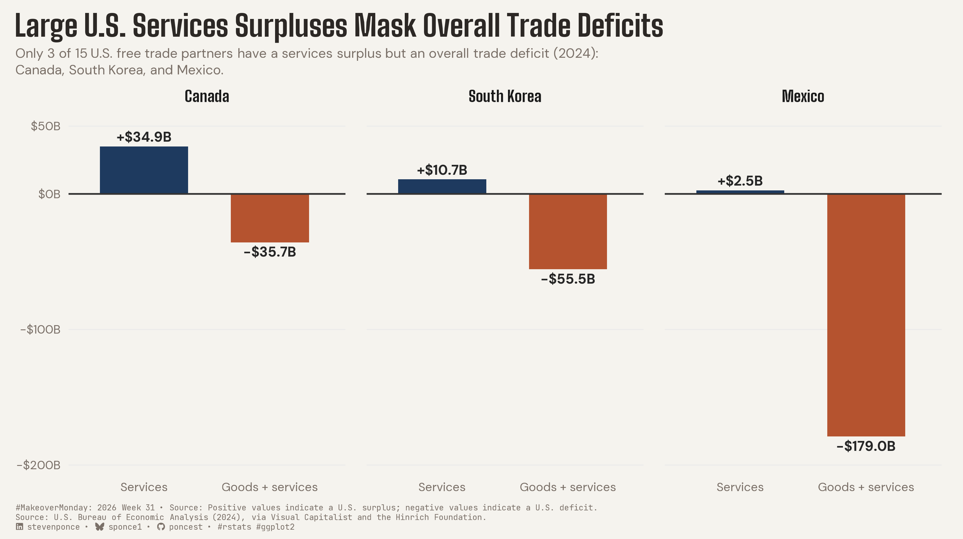
Only 3 of 15 U.S. free trade partners have a services surplus but an overall trade deficit (2024): Canada, South Korea, and Mexico.

MakeoverMonday
Data Visualization
R Programming
2026
Compares U.S. services-only and overall (goods + services) trade balances for the three free-trade partners where the two diverge in sign in 2024. Canada, South Korea, and Mexico each show a services surplus that becomes an overall deficit once goods are included — a gap the original services-only ranking obscured. Built in R with ggplot2, ggtext, and scales.
Author

Steven Ponce

Published

August 3, 2026

Original

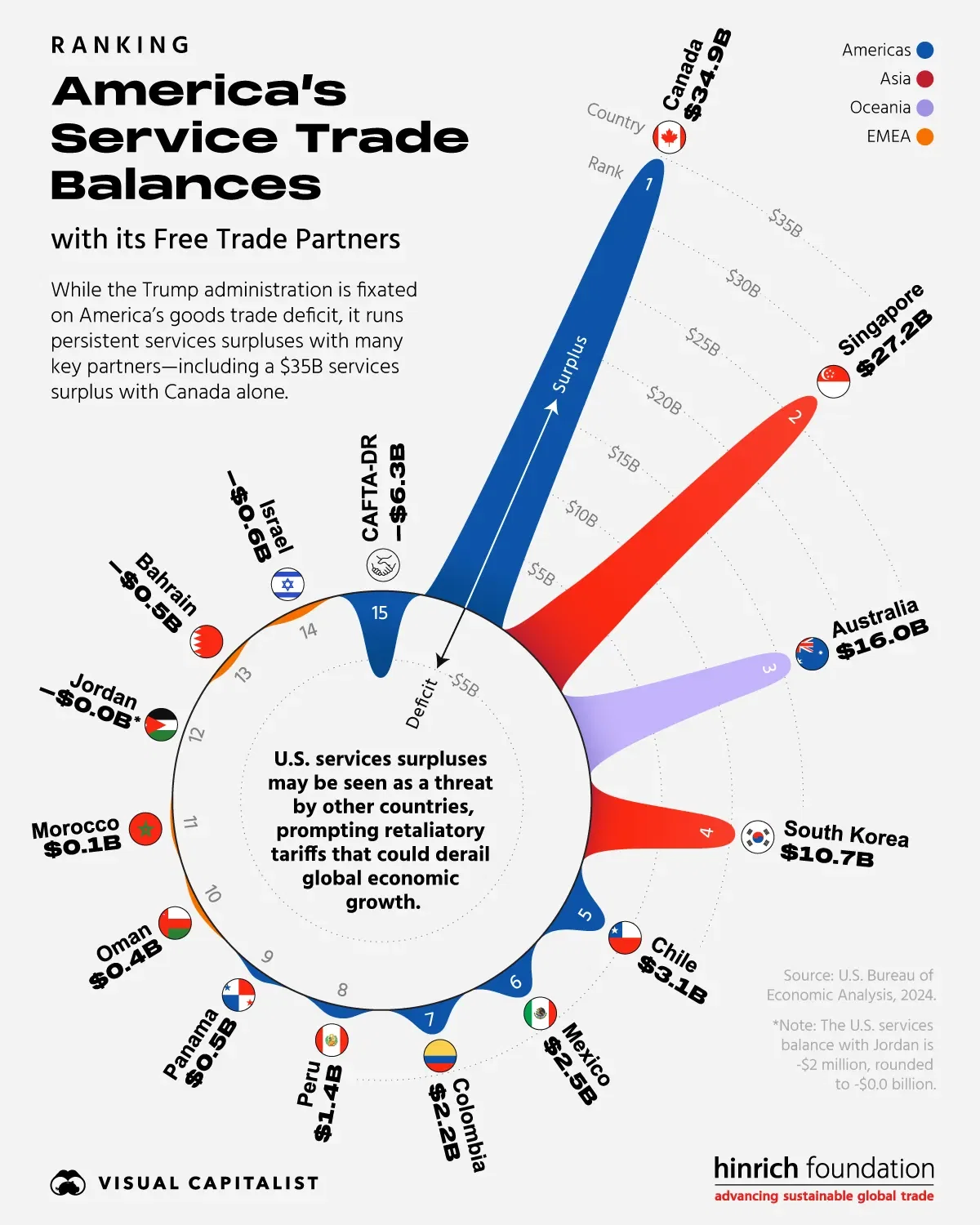
The original visualization comes from America’s Services Trade Balances with Its Free Trade Partners

Original visualization

Makeover

Figure 1: Diverging column chart comparing the U.S. services trade balance to the overall (goods + services) trade balance for three countries in 2024. Canada: services +$34.9B, overall −$35.7B. South Korea: services +$10.7B, overall −$55.5B. Mexico: services +$2.5B, overall −$179.0B. All three show a positive services balance but a negative overall balance — the only 3 of 15 U.S. free-trade partners where this pattern holds in 2024.

Steps to Create this Graphic

1. Load Packages & Setup

Show code
```{r}
#| label: load
#| warning: false
#| message: false      
#| results: "hide"     

## 1. LOAD PACKAGES & SETUP ----
suppressPackageStartupMessages({
  if (!require("pacman")) install.packages("pacman")
  pacman::p_load(
    tidyverse, ggtext, showtext, scales, glue, 
  janitor, ggview, patchwork
)
})

# Source utility functions
suppressMessages(
  source(here::here("R/utils/fonts.R")))
  source(here::here("R/utils/social_icons.R"))
  source(here::here("R/themes/base_theme.R"))
```

2. Read in the Data

Show code
```{r}
#| label: read
#| include: true
#| eval: true
#| warning: false
#| 

df_raw <- readxl::read_excel(
  here::here("data/MakeoverMonday/2026/Americas_Services_Trade_Balances.xlsx"))  |>
  clean_names()
```

3. Examine the Data

Show code
```{r}
#| label: examine
#| include: true
#| eval: true
#| results: 'hide'
#| warning: false

glimpse(df_raw)
skimr::skim_without_charts(df_raw)
```

4. Tidy Data

Show code
```{r}
#| label: tidy
#| warning: false

### |- verify the central claim ----
# "Canada, South Korea, and Mexico are the only 3 of 15 partners with a
# services surplus AND an overall deficit"
n_total <- nrow(df_raw)

df_selected <- df_raw |>
  filter(services_b > 0, goods_and_services_b < 0)

n_selected <- nrow(df_selected)

### |- scope to the three hero countries ----
hero_countries <- c("Canada", "South Korea", "Mexico")

df3 <- df_raw |>
  filter(country %in% hero_countries) |>
  mutate(country = factor(country, levels = hero_countries))

### |- long format, sign-coded ----
# "Overall" -> "Goods + services"
df_sign <- df3 |>
  select(country, Services = services_b, `Goods + services` = goods_and_services_b) |>
  pivot_longer(cols = -country, names_to = "metric", values_to = "value") |>
  mutate(
    metric = factor(metric, levels = c("Services", "Goods + services")),
    sign = if_else(value >= 0, "Positive", "Negative"),
    label = label_dollar(accuracy = 0.1, style_positive = "plus")(value) |>
      str_replace("^-", "\u2212") |>
      paste0("B")
  )
```

5. Visualization Parameters

Show code
```{r}
#| label: params
#| include: true
#| warning: false

### |- plot aesthetics ----
colors <- get_theme_colors(
  palette = list(
    positive  = "#1E3A5F",
    negative  = "#B5532F",
    zero_line = "gray20",
    grid      = "gray92"
  )
)
clrs <- colors$palette
col_positive <- clrs[["positive"]]
col_negative <- clrs[["negative"]]
col_zero     <- clrs[["zero_line"]]
col_grid     <- clrs[["grid"]]

### |- titles and caption ----
title_text <- "Large U.S. Services Surpluses Mask Overall Trade Deficits"

subtitle_text <- str_glue(
  "Only {n_selected} of {n_total} U.S. free trade partners have a services ",
  "surplus but an overall trade deficit (2024):<br>",
  "{glue_collapse(hero_countries, sep = ', ', last = ', and ')}."
)

caption_text <- create_mm_caption(
  mm_year = 2026,
  mm_week = 31,
  source_text = paste0(
    "Positive values indicate a U.S. surplus; negative values indicate a ",
    "U.S. deficit.<br>",
    "Source: U.S. Bureau of Economic Analysis (2024), via Visual Capitalist ",
    "and the Hinrich Foundation."
  )
)

### |- fonts ----
setup_fonts()
fonts <- get_font_families()

### |- plot theme ----
base_theme <- create_base_theme(colors)

### |- fonts ----
setup_fonts()
fonts <- get_font_families()

### |- plot theme ----
base_theme <- create_base_theme(colors)

weekly_theme <- extend_weekly_theme(
  base_theme,
  theme(
    legend.position = "none",
    axis.text = element_text(size = 9, family = fonts$text),
    panel.grid.minor = element_blank(),
    panel.grid.major.y = element_line(color = col_grid, linewidth = 0.35),
    panel.grid.major.x = element_blank(),
    strip.text = element_text(face = "bold", size = 11.5, margin = margin(b = 4), family = fonts$title_2),
    plot.title.position = "plot",
    plot.title = element_text(
      face = "bold", size = 22, family = fonts$title_1, color = colors$title,
      margin = margin(b = 4), lineheight = 1.15
    ),
    plot.subtitle = element_textbox_simple(
      color = colors$subtitle, size = 10, family = fonts$subtitle,
      lineheight = 1.25, margin = margin(b = 8)
    ),
    plot.caption = element_textbox_simple(
      hjust = 0, size = 6, color = colors$caption,
      family = fonts$caption, margin = margin(t = 8)
    ),
    panel.spacing.x = unit(1.1, "lines"),
    plot.margin = margin(t = 10, r = 16, b = 6, l = 12)
  )
)

theme_set(weekly_theme)
```

6. Plot

Show code
```{r}
#| label: plot
#| warning: false

### |- plot ----
p <- ggplot(df_sign, aes(x = metric, y = value, fill = sign)) +
  geom_col(
    data = df_sign |> filter(sign == "Positive"),
    aes(fill = sign), width = 0.70
  ) +
  geom_col(
    data = df_sign |> filter(sign == "Negative"),
    aes(fill = sign), width = 0.62
  ) +
  geom_hline(yintercept = 0, color = col_zero, linewidth = 0.6) +
  geom_text(
    data = df_sign |> filter(sign == "Positive"),
    aes(label = label), vjust = -0.5, size = 3.6, fontface = "bold", color = "gray15"
  ) +
  geom_text(
    data = df_sign |> filter(sign == "Negative"),
    aes(label = label), vjust = 1.5, size = 3.6, fontface = "bold", color = "gray15"
  ) +
  facet_wrap(~country, nrow = 1) +
  scale_fill_manual(values = c(Positive = col_positive, Negative = col_negative)) +
  scale_y_continuous(
    labels = label_dollar(suffix = "B"),
    breaks = c(-200, -100, 0, 50),
    expand = expansion(mult = 0.13)
  ) +
  labs(
    title = title_text,
    subtitle = subtitle_text,
    caption = caption_text,
    x = NULL, y = NULL
  ) +
  canvas(width = 10, height = 5.6, units = "in")
```

7. Save

Show code
```{r}
#| label: save
#| warning: false

### |- save ----
main_path  <- here::here("data_visualizations", "MakeoverMonday", "2026", "mm_2026_31.png")
thumb_path <- here::here("data_visualizations", "MakeoverMonday", "2026", "thumbnails", "mm_2026_31.png")

# Full-size version, for the QMD figure
save_ggplot(
  plot = p,
  file = main_path,
  width = 10,
  height = 5.6,
  units = "in",
  dpi = 320,
  create.dir = TRUE
)

# Reduced-size thumbnail, for the YAML `image:` field
fs::dir_create(dirname(thumb_path))
magick::image_read(main_path) |>
  magick::image_resize("400") |>
  magick::image_write(thumb_path)
```

8. Session Info

TipExpand for Session Info
R version 4.6.1 (2026-06-24)
Platform: aarch64-apple-darwin23
Running under: macOS Tahoe 26.5.2

Matrix products: default
BLAS:   /Library/Frameworks/R.framework/Versions/4.6/Resources/lib/libRblas.0.dylib 
LAPACK: /Library/Frameworks/R.framework/Versions/4.6/Resources/lib/libRlapack.dylib;  LAPACK version 3.12.1

locale:
[1] en_US.UTF-8/en_US.UTF-8/en_US.UTF-8/C/en_US.UTF-8/en_US.UTF-8

time zone: America/New_York
tzcode source: internal

attached base packages:
[1] stats     graphics  grDevices utils     datasets  methods   base     

other attached packages:
 [1] here_1.0.2      patchwork_1.3.2 ggview_0.2.2    janitor_2.2.1  
 [5] glue_1.8.1      scales_1.4.0    showtext_0.9-8  showtextdb_3.0 
 [9] sysfonts_0.8.9  ggtext_0.1.2    lubridate_1.9.5 forcats_1.0.1  
[13] stringr_1.6.0   dplyr_1.2.1     purrr_1.2.2     readr_2.2.0    
[17] tidyr_1.3.2     tibble_3.3.1    ggplot2_4.0.3   tidyverse_2.0.0
[21] pacman_0.5.1   

loaded via a namespace (and not attached):
 [1] gtable_0.3.6       xfun_0.60          htmlwidgets_1.6.4  tzdb_0.5.0        
 [5] vctrs_0.7.3        tools_4.6.1        generics_0.1.4     curl_7.1.0        
 [9] pkgconfig_2.0.3    RColorBrewer_1.1-3 skimr_2.2.2        S7_0.2.2          
[13] readxl_1.5.0       lifecycle_1.0.5    compiler_4.6.1     farver_2.1.2      
[17] textshaping_1.0.5  repr_1.1.7         codetools_0.2-20   snakecase_0.11.1  
[21] litedown_0.10      htmltools_0.5.9    yaml_2.3.12        pillar_1.11.1     
[25] magick_2.9.1       commonmark_2.0.0   tidyselect_1.2.1   digest_0.6.39     
[29] stringi_1.8.7      rprojroot_2.1.1    fastmap_1.2.0      grid_4.6.1        
[33] cli_3.6.6          magrittr_2.0.5     base64enc_0.1-6    withr_3.0.3       
[37] timechange_0.4.0   rmarkdown_2.31     otel_0.2.0         cellranger_1.1.0  
[41] ragg_1.5.2         hms_1.1.4          evaluate_1.0.5     knitr_1.51        
[45] markdown_2.0       rlang_1.3.0        gridtext_0.1.6     Rcpp_1.1.2        
[49] xml2_1.6.0         rstudioapi_0.19.0  jsonlite_2.0.0     R6_2.6.1          
[53] fs_2.1.0           systemfonts_1.3.2 

9. GitHub Repository

TipExpand for GitHub Repo

The complete code for this analysis is available in mm_2026_31.qmd.

For the full repository, click here.

10. References

TipExpand for References

Primary Data (Makeover Monday): 1. Makeover Monday 2026 Week 31: America’s Services Trade Balances with Its Free Trade Partners - XLSX: 15 rows × 4 columns (country, goods_and_services_b, goods_b, services_b). Each row is one U.S. free-trade partner, with 2024 trade balance figures in USD billions. - The original visualization shows only the services balance, ranked across all 15 partners in a radial layout. This makeover restores the omitted goods balance and total (goods + services) balance the original left out.

Source Data: 2. U.S. Bureau of Economic Analysis, 2024, via Visual Capitalist and the Hinrich Foundation

Methodological Notes: 3. The three highlighted partners (Canada, South Korea, Mexico) were selected with an objective rule computed directly from the data — positive services balance and negative overall balance — not chosen by hand. This is enforced in code with stopifnot(n_selected == 3), so the chart’s central claim (“only 3 of 15”) fails loudly rather than silently going stale if the underlying data is ever refreshed. 4. CAFTA-DR, one of the 15 partners in the denominator, is a six-country regional trade bloc, not a single nation. It is retained in the count consistent with how the source treats it; all copy in this piece says “partners,” never “countries,” so the claim stays accurate without needing a separate exclusion or footnote. 5. The shared y-axis scale across all three country panels is intentional. Mexico’s overall balance (−$179.0B) dominating the shared scale is part of the finding, not a distortion to correct with independent per-panel scales.

11. Custom Functions Documentation

Note📦 Custom Helper Functions

This analysis uses custom functions from my personal module library for efficiency and consistency across projects.

Functions Used:

  • fonts.R: setup_fonts(), get_font_families() - Font management with showtext
  • social_icons.R: create_social_caption() - Generates formatted social media captions
  • image_utils.R: save_plot() - Consistent plot saving with naming conventions
  • base_theme.R: create_base_theme(), extend_weekly_theme(), get_theme_colors() - Custom ggplot2 themes

Why custom functions?
These utilities standardize theming, fonts, and output across all my data visualizations. The core analysis (data tidying and visualization logic) uses only standard tidyverse packages.

Source Code:
View all custom functions → GitHub: R/utils

Back to top

Citation

BibTeX citation:
@online{ponce2026,
  author = {Ponce, Steven},
  title = {Large {U.S.} {Services} {Surpluses} {Mask} {Overall} {Trade}
    {Deficits}},
  date = {2026-08-03},
  url = {https://stevenponce.netlify.app/data_visualizations/MakeoverMonday/2026/mm_2026_31.html},
  langid = {en}
}
For attribution, please cite this work as:
Ponce, Steven. 2026. “Large U.S. Services Surpluses Mask Overall Trade Deficits.” August 3. https://stevenponce.netlify.app/data_visualizations/MakeoverMonday/2026/mm_2026_31.html.
Source Code
---
title: "Large U.S. Services Surpluses Mask Overall Trade Deficits"
subtitle: "Only 3 of 15 U.S. free trade partners have a services surplus but an overall trade deficit (2024): Canada, South Korea, and Mexico."
description: "Compares U.S. services-only and overall (goods + services) trade balances for the three free-trade partners where the two diverge in sign in 2024. Canada, South Korea, and Mexico each show a services surplus that becomes an overall deficit once goods are included — a gap the original services-only ranking obscured. Built in R with ggplot2, ggtext, and scales."
date: "2026-08-03"
author:
  - name: "Steven Ponce"
    url: "https://stevenponce.netlify.app"
citation:
  url: "https://stevenponce.netlify.app/data_visualizations/MakeoverMonday/2026/mm_2026_31.html"
categories: ["MakeoverMonday", "Data Visualization", "R Programming", "2026"]
tags: [
  "makeover-monday",
  "data-visualization",
  "ggplot2",
  "r-programming",
  "trade-balance",
  "international-trade",
  "united-states",
  "bar-chart",
  "diverging-bar-chart",
  "economics",
  "canada",
  "south-korea",
  "mexico",
  "2026"
]
image: "thumbnails/mm_2026_31.png"
format:
  html:
    toc: true
    toc-depth: 5
    code-link: true
    code-fold: true
    code-tools: true
    code-summary: "Show code"
    self-contained: true
    theme: 
      light: [flatly, assets/styling/custom_styles.scss]
      dark: [darkly, assets/styling/custom_styles_dark.scss]
editor_options: 
  chunk_output_type: inline
execute: 
  freeze: true
  cache: true
  error: false
  message: false
  warning: false
  eval: true
---

```{r}
#| label: setup-links
#| include: false

# CENTRALIZED LINK MANAGEMENT

## Project-specific info 
current_year <- 2026
current_week <- 31
project_file <- "mm_2026_31.qmd"
project_image <- "mm_2026_31.png"

## Data Sources
data_main <- "https://pub-cee805df54de4b6c8f93bee984e3c725.r2.dev/datasets/america-s-services-trade-balances-with-its-free-trade-partners/Americas%20Services%20Trade%20Balances.xlsx"
data_secondary <- "https://pub-cee805df54de4b6c8f93bee984e3c725.r2.dev/datasets/america-s-services-trade-balances-with-its-free-trade-partners/Americas%20Services%20Trade%20Balances.xlsx"

## Repository Links  
repo_main <- "https://github.com/poncest/personal-website/"
repo_file <- paste0("https://github.com/poncest/personal-website/blob/master/data_visualizations/MakeoverMonday/", current_year, "/", project_file)

## External Resources/Images
chart_original <- "https://raw.githubusercontent.com/poncest/MakeoverMonday/refs/heads/master/2026/Week_31_original_chart.png"

## Organization/Platform Links
org_primary <- "https://www.voronoiapp.com/geopolitics/Ranked-Americas-Services-Trade-Balances-with-Its-Free-Trade-Partners-4860"
org_secondary <- "https://www.voronoiapp.com/geopolitics/Ranked-Americas-Services-Trade-Balances-with-Its-Free-Trade-Partners-4860"

# Helper function to create markdown links
create_link <- function(text, url) {
  paste0("[", text, "](", url, ")")
}

# Helper function for citation-style links
create_citation_link <- function(text, url, title = NULL) {
  if (is.null(title)) {
    paste0("[", text, "](", url, ")")
  } else {
    paste0("[", text, "](", url, ' "', title, '")')
  }
}
```

### Original

The original visualization comes from `r create_link("America's Services Trade Balances with Its Free Trade Partners", org_primary)`
![Original visualization](https://raw.githubusercontent.com/poncest/MakeoverMonday/refs/heads/master/2026/Week_31/original_chart.png)

### Makeover

![Diverging column chart comparing the U.S. services trade balance to the overall (goods + services) trade balance for three countries in 2024. Canada: services +$34.9B, overall −$35.7B. South Korea: services +$10.7B, overall −$55.5B. Mexico: services +$2.5B, overall −$179.0B. All three show a positive services balance but a negative overall balance — the only 3 of 15 U.S. free-trade partners where this pattern holds in 2024.](mm_2026_31.png){#fig-1}

### [**Steps to Create this Graphic**]{.mark}

#### [1. Load Packages & Setup]{.smallcaps}

```{r}
#| label: load
#| warning: false
#| message: false      
#| results: "hide"     

## 1. LOAD PACKAGES & SETUP ----
suppressPackageStartupMessages({
  if (!require("pacman")) install.packages("pacman")
  pacman::p_load(
    tidyverse, ggtext, showtext, scales, glue, 
  janitor, ggview, patchwork
)
})

# Source utility functions
suppressMessages(
  source(here::here("R/utils/fonts.R")))
  source(here::here("R/utils/social_icons.R"))
  source(here::here("R/themes/base_theme.R"))
```

#### [2. Read in the Data]{.smallcaps}

```{r}
#| label: read
#| include: true
#| eval: true
#| warning: false
#| 

df_raw <- readxl::read_excel(
  here::here("data/MakeoverMonday/2026/Americas_Services_Trade_Balances.xlsx"))  |>
  clean_names()
```

#### [3. Examine the Data]{.smallcaps}

```{r}
#| label: examine
#| include: true
#| eval: true
#| results: 'hide'
#| warning: false

glimpse(df_raw)
skimr::skim_without_charts(df_raw)
```

#### [4. Tidy Data]{.smallcaps}

```{r}
#| label: tidy
#| warning: false

### |- verify the central claim ----
# "Canada, South Korea, and Mexico are the only 3 of 15 partners with a
# services surplus AND an overall deficit"
n_total <- nrow(df_raw)

df_selected <- df_raw |>
  filter(services_b > 0, goods_and_services_b < 0)

n_selected <- nrow(df_selected)

### |- scope to the three hero countries ----
hero_countries <- c("Canada", "South Korea", "Mexico")

df3 <- df_raw |>
  filter(country %in% hero_countries) |>
  mutate(country = factor(country, levels = hero_countries))

### |- long format, sign-coded ----
# "Overall" -> "Goods + services"
df_sign <- df3 |>
  select(country, Services = services_b, `Goods + services` = goods_and_services_b) |>
  pivot_longer(cols = -country, names_to = "metric", values_to = "value") |>
  mutate(
    metric = factor(metric, levels = c("Services", "Goods + services")),
    sign = if_else(value >= 0, "Positive", "Negative"),
    label = label_dollar(accuracy = 0.1, style_positive = "plus")(value) |>
      str_replace("^-", "\u2212") |>
      paste0("B")
  )

```

#### [5. Visualization Parameters]{.smallcaps}

```{r}
#| label: params
#| include: true
#| warning: false

### |- plot aesthetics ----
colors <- get_theme_colors(
  palette = list(
    positive  = "#1E3A5F",
    negative  = "#B5532F",
    zero_line = "gray20",
    grid      = "gray92"
  )
)
clrs <- colors$palette
col_positive <- clrs[["positive"]]
col_negative <- clrs[["negative"]]
col_zero     <- clrs[["zero_line"]]
col_grid     <- clrs[["grid"]]

### |- titles and caption ----
title_text <- "Large U.S. Services Surpluses Mask Overall Trade Deficits"

subtitle_text <- str_glue(
  "Only {n_selected} of {n_total} U.S. free trade partners have a services ",
  "surplus but an overall trade deficit (2024):<br>",
  "{glue_collapse(hero_countries, sep = ', ', last = ', and ')}."
)

caption_text <- create_mm_caption(
  mm_year = 2026,
  mm_week = 31,
  source_text = paste0(
    "Positive values indicate a U.S. surplus; negative values indicate a ",
    "U.S. deficit.<br>",
    "Source: U.S. Bureau of Economic Analysis (2024), via Visual Capitalist ",
    "and the Hinrich Foundation."
  )
)

### |- fonts ----
setup_fonts()
fonts <- get_font_families()

### |- plot theme ----
base_theme <- create_base_theme(colors)

### |- fonts ----
setup_fonts()
fonts <- get_font_families()

### |- plot theme ----
base_theme <- create_base_theme(colors)

weekly_theme <- extend_weekly_theme(
  base_theme,
  theme(
    legend.position = "none",
    axis.text = element_text(size = 9, family = fonts$text),
    panel.grid.minor = element_blank(),
    panel.grid.major.y = element_line(color = col_grid, linewidth = 0.35),
    panel.grid.major.x = element_blank(),
    strip.text = element_text(face = "bold", size = 11.5, margin = margin(b = 4), family = fonts$title_2),
    plot.title.position = "plot",
    plot.title = element_text(
      face = "bold", size = 22, family = fonts$title_1, color = colors$title,
      margin = margin(b = 4), lineheight = 1.15
    ),
    plot.subtitle = element_textbox_simple(
      color = colors$subtitle, size = 10, family = fonts$subtitle,
      lineheight = 1.25, margin = margin(b = 8)
    ),
    plot.caption = element_textbox_simple(
      hjust = 0, size = 6, color = colors$caption,
      family = fonts$caption, margin = margin(t = 8)
    ),
    panel.spacing.x = unit(1.1, "lines"),
    plot.margin = margin(t = 10, r = 16, b = 6, l = 12)
  )
)

theme_set(weekly_theme)
```

#### [6. Plot]{.smallcaps}

```{r}
#| label: plot
#| warning: false

### |- plot ----
p <- ggplot(df_sign, aes(x = metric, y = value, fill = sign)) +
  geom_col(
    data = df_sign |> filter(sign == "Positive"),
    aes(fill = sign), width = 0.70
  ) +
  geom_col(
    data = df_sign |> filter(sign == "Negative"),
    aes(fill = sign), width = 0.62
  ) +
  geom_hline(yintercept = 0, color = col_zero, linewidth = 0.6) +
  geom_text(
    data = df_sign |> filter(sign == "Positive"),
    aes(label = label), vjust = -0.5, size = 3.6, fontface = "bold", color = "gray15"
  ) +
  geom_text(
    data = df_sign |> filter(sign == "Negative"),
    aes(label = label), vjust = 1.5, size = 3.6, fontface = "bold", color = "gray15"
  ) +
  facet_wrap(~country, nrow = 1) +
  scale_fill_manual(values = c(Positive = col_positive, Negative = col_negative)) +
  scale_y_continuous(
    labels = label_dollar(suffix = "B"),
    breaks = c(-200, -100, 0, 50),
    expand = expansion(mult = 0.13)
  ) +
  labs(
    title = title_text,
    subtitle = subtitle_text,
    caption = caption_text,
    x = NULL, y = NULL
  ) +
  canvas(width = 10, height = 5.6, units = "in")
```

#### [7. Save]{.smallcaps}

```{r}
#| label: save
#| warning: false

### |- save ----
main_path  <- here::here("data_visualizations", "MakeoverMonday", "2026", "mm_2026_31.png")
thumb_path <- here::here("data_visualizations", "MakeoverMonday", "2026", "thumbnails", "mm_2026_31.png")

# Full-size version, for the QMD figure
save_ggplot(
  plot = p,
  file = main_path,
  width = 10,
  height = 5.6,
  units = "in",
  dpi = 320,
  create.dir = TRUE
)

# Reduced-size thumbnail, for the YAML `image:` field
fs::dir_create(dirname(thumb_path))
magick::image_read(main_path) |>
  magick::image_resize("400") |>
  magick::image_write(thumb_path)
```

#### [8. Session Info]{.smallcaps}

::: {.callout-tip collapse="true"}
##### Expand for Session Info

```{r, echo = FALSE}
#| eval: true
#| warning: false

sessionInfo()
```
:::

#### [9. GitHub Repository]{.smallcaps}

::: {.callout-tip collapse="true"}
##### Expand for GitHub Repo

The complete code for this analysis is available in `r create_link(project_file, repo_file)`.

For the full repository, `r create_link("click here", repo_main)`.
:::

#### [10. References]{.smallcaps}
::: {.callout-tip collapse="true"}
##### Expand for References
**Primary Data (Makeover Monday):**
1. Makeover Monday 2026 Week 31: `r create_link("America's Services Trade Balances with Its Free Trade Partners", "https://www.voronoiapp.com/geopolitics/Ranked-Americas-Services-Trade-Balances-with-Its-Free-Trade-Partners-4860")`
   - XLSX: 15 rows × 4 columns (`country`, `goods_and_services_b`, `goods_b`, `services_b`). Each row is one U.S. free-trade partner, with 2024 trade balance figures in USD billions.
   - The original visualization shows only the services balance, ranked across all 15 partners in a radial layout. This makeover restores the omitted goods balance and total (goods + services) balance the original left out.

**Source Data:**
2. U.S. Bureau of Economic Analysis, 2024, via `r create_link("Visual Capitalist and the Hinrich Foundation", "https://pub-cee805df54de4b6c8f93bee984e3c725.r2.dev/datasets/america-s-services-trade-balances-with-its-free-trade-partners/Americas%20Services%20Trade%20Balances.xlsx")`

**Methodological Notes:**
3. The three highlighted partners (Canada, South Korea, Mexico) were selected with an objective rule computed directly from the data — positive services balance and negative overall balance — not chosen by hand. This is enforced in code with `stopifnot(n_selected == 3)`, so the chart's central claim ("only 3 of 15") fails loudly rather than silently going stale if the underlying data is ever refreshed.
4. CAFTA-DR, one of the 15 partners in the denominator, is a six-country regional trade bloc, not a single nation. It is retained in the count consistent with how the source treats it; all copy in this piece says "partners," never "countries," so the claim stays accurate without needing a separate exclusion or footnote.
5. The shared y-axis scale across all three country panels is intentional. Mexico's overall balance (−$179.0B) dominating the shared scale is part of the finding, not a distortion to correct with independent per-panel scales.
:::

#### [11. Custom Functions Documentation]{.smallcaps}

::: {.callout-note collapse="true"}
##### 📦 Custom Helper Functions

This analysis uses custom functions from my personal module library for efficiency and consistency across projects.

**Functions Used:**

-   **`fonts.R`**: `setup_fonts()`, `get_font_families()` - Font management with showtext
-   **`social_icons.R`**: `create_social_caption()` - Generates formatted social media captions
-   **`image_utils.R`**: `save_plot()` - Consistent plot saving with naming conventions
-   **`base_theme.R`**: `create_base_theme()`, `extend_weekly_theme()`, `get_theme_colors()` - Custom ggplot2 themes

**Why custom functions?**\
These utilities standardize theming, fonts, and output across all my data visualizations. The core analysis (data tidying and visualization logic) uses only standard tidyverse packages.

**Source Code:**\
View all custom functions → [GitHub: R/utils](https://github.com/poncest/personal-website/tree/master/R)
:::

© 2024 Steven Ponce

Source Issues
