• Steven Ponce
  • About
  • Data Visualizations
  • Projects
  • Resume
  • Email

On this page

  • Original
  • Makeover
  • Steps to Create this Graphic
    • 1. Load Packages & Setup
    • 2. Read in the Data
    • 3. Examine the Data
    • 4. Tidy Data
    • 5. Visualization Parameters
    • 6. Plot
    • 7. Save
    • 8. Session Info
    • 9. GitHub Repository
    • 10. References
    • 11. Custom Functions Documentation

2025’s record heat wasn’t a one-month spike

  • Show All Code
  • Hide All Code

  • View Source

Monthly temperature difference from the 1991–2020 average · UK, 2025 — 10 of 12 months were warmer than normal

MakeoverMonday
Data Visualization
R Programming
2026
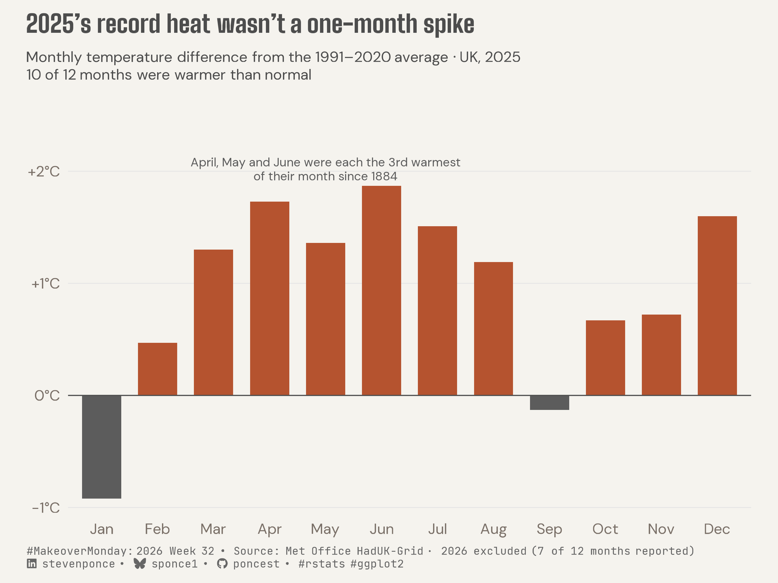
The UK’s hottest year on record wasn’t driven by a single anomalous month — 10 of 12 months ran warmer than the 1991–2020 average, with April, May, and June each ranking as the third warmest occurrence of their calendar month since 1884. Built from Met Office monthly climate normals using an anomaly framing rather than raw temperatures. Created in R with ggplot2, ggtext, and showtext.
Author

Steven Ponce

Published

August 10, 2026

Original

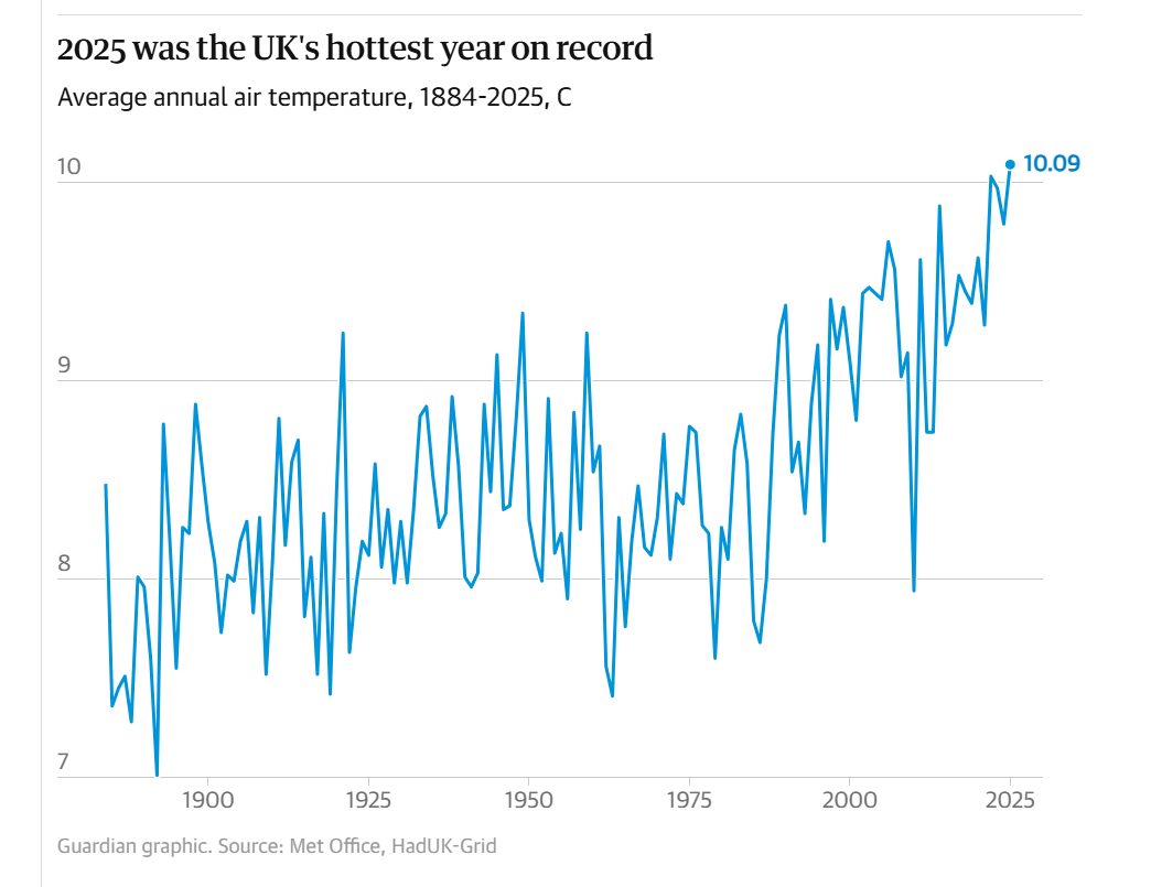
The original visualization comes from Met Office Average Air Temperatures

Original visualization

Makeover

Figure 1: Diverging bar chart of the UK’s 2025 monthly temperature difference from the 1991–2020 average. Ten of twelve months ran warmer than normal, with April, May, and June each the third warmest on record for their calendar month since 1884. January was the year’s largest negative deviation, roughly 0.9°C below normal; September sat just under normal. Source: Met Office HadUK-Grid.

Steps to Create this Graphic

1. Load Packages & Setup

Show code
```{r}
#| label: load
#| warning: false
#| message: false      
#| results: "hide"     

## 1. LOAD PACKAGES & SETUP ----
suppressPackageStartupMessages({
  if (!require("pacman")) install.packages("pacman")
  pacman::p_load(
    tidyverse, ggtext, showtext, scales, glue, janitor, ggview
)
})

# Source utility functions
suppressMessages(
  source(here::here("R/utils/fonts.R")))
  source(here::here("R/utils/social_icons.R"))
  source(here::here("R/themes/base_theme.R"))
```

2. Read in the Data

Show code
```{r}
#| label: read
#| include: true
#| eval: true
#| warning: false
#| 

df_raw <- read_csv(
  here::here("data/MakeoverMonday/2026/met_office_uk_mean_temps.csv"))  |>
  clean_names()
```

3. Examine the Data

Show code
```{r}
#| label: examine
#| include: true
#| eval: true
#| results: 'hide'
#| warning: false

glimpse(df_raw)
skimr::skim_without_charts(df_raw)
```

4. Tidy Data

Show code
```{r}
#| label: tidy
#| warning: false

month_order <- c(
  "January", "February", "March", "April", "May", "June",
  "July", "August", "September", "October", "November", "December"
)

monthly_2025 <- df_raw |>
  filter(value_type == "Monthly", year == 2025) |>
  mutate(
    anomaly_9120 = mean_temp_c - baseline_1991_2020,
    period = factor(period, levels = month_order)
  ) |>
  arrange(period)

# all-time rank of each 2025 month against every other year's same calendar
# month 
monthly_all_time_rank <- df_raw |>
  filter(value_type == "Monthly", !is.na(mean_temp_c)) |>
  mutate(anomaly_9120 = mean_temp_c - baseline_1991_2020) |>
  mutate(
    rank_all_time = min_rank(desc(anomaly_9120)),
    n_years_available = n(),
    .by = period
  ) |>
  filter(year == 2025) |>
  select(period, rank_all_time, n_years_available)

monthly_2025 <- monthly_2025 |>
  left_join(monthly_all_time_rank, by = "period") |>
  mutate(period = factor(period, levels = month_order))

annual_2025 <- df_raw |>
  filter(period == "Annual", year == 2025) |>
  mutate(anomaly_9120 = mean_temp_c - baseline_1991_2020)

### |- pre-extracted named scalars for annotation coordinates ----
n_months_positive <- sum(monthly_2025$anomaly_9120 > 0)

n_years_record <- monthly_2025 |>
  filter(period == "April") |>
  pull(n_years_available)

annual_anomaly_2025 <- annual_2025 |> pull(anomaly_9120)
earliest_year <- min(df_raw$year, na.rm = TRUE)
cluster_months <- c("April", "May", "June")

cluster_y_top <- monthly_2025 |>
  filter(period %in% cluster_months) |>
  summarise(y = max(anomaly_9120)) |>
  pull(y) + 0.15

cluster_x_start <- match("April", month_order)
cluster_x_end <- match("June", month_order)
cluster_x_mid <- mean(c(cluster_x_start, cluster_x_end))

cluster_label <- glue(
  "April, May and June were each the 3rd warmest\n",
  "of their month since {earliest_year}"
)
```

5. Visualization Parameters

Show code
```{r}
#| label: params
#| include: true
#| warning: false

## |- plot aesthetics ----
colors <- get_theme_colors(
  palette = list(
    warm    = "#B5532F",
    neutral = "#5C5C5C"
  )
)
clrs <- colors$palette

### |- titles and caption ----
title_text <- str_glue("2025's record heat wasn't a one-month spike")

subtitle_text <- glue(
  "Monthly temperature difference from the 1991–2020 average · UK, 2025<br>",
  "<span style='font-weight:700;'>{n_months_positive} of 12 months were warmer than normal</span>"
)

caption_text <- create_mm_caption(
  mm_year = 2026,
  mm_week = 32,
  source_text = "Met Office HadUK-Grid · 2026 excluded (7 of 12 months reported)"
)

### |- fonts ----
setup_fonts()
fonts <- get_font_families()

### |- plot theme ----
base_theme <- create_base_theme(colors)

weekly_theme <- extend_weekly_theme(
  base_theme,
  theme(
    panel.grid.major.x = element_blank(),
    panel.grid.major.y = element_line(color = "gray90", linewidth = 0.3),
    panel.grid.minor = element_blank(),
    axis.ticks = element_blank(),
    plot.caption = element_textbox_simple(
      size = 8, color = "gray40", margin = margin(t = 7),
      family = fonts$caption
    ),
    plot.subtitle = element_textbox_simple(
      size = 11, color = "gray30", margin = margin(b = 10), lineheight = 1.2,
      family = fonts$subtitle
    ),
    plot.title = element_textbox_simple(
      size = 18, color = "gray30", margin = margin(b = 10), lineheight = 1.2,
      family = fonts$title_1
    ),
    axis.title.y = element_blank()
  )
)

theme_set(weekly_theme)
```

6. Plot

Show code
```{r}
#| label: plot
#| warning: false

### |- plot ----
p <- monthly_2025 |>
  ggplot(aes(x = period, y = anomaly_9120, fill = anomaly_9120 > 0)) +
  geom_col(width = 0.7) +
  geom_hline(yintercept = 0, color = "gray30", linewidth = 0.4) +
  annotate(
    "text",
    x = cluster_x_mid, y = cluster_y_top,
    label = cluster_label,
    family = fonts$text, size = 3.2, color = clrs$neutral, lineheight = 0.95
  ) +
  scale_x_discrete(labels = \(x) str_sub(x, 1, 3)) +
  scale_y_continuous(
    labels = label_number(suffix = "°C", style_positive = "plus"),
    expand = expansion(mult = c(0.05, 0.22))
  ) +
  scale_fill_manual(
    values = c(`TRUE` = clrs$warm, `FALSE` = clrs$neutral),
    guide = "none"
  ) +
  labs(
    title = title_text,
    subtitle = subtitle_text,
    caption = caption_text,
    x = NULL,
    y = NULL
  )
```

7. Save

Show code
```{r}
#| label: save
#| warning: false

### |- save ----
main_path  <- here::here("data_visualizations", "MakeoverMonday", "2026", "mm_2026_32.png")
thumb_path <- here::here("data_visualizations", "MakeoverMonday", "2026", "thumbnails", "mm_2026_32.png")

# Full-size version, for the QMD figure
save_ggplot(
  plot = p,
  file = main_path,
  width = 8,
  height = 6,
  units = "in",
  dpi = 320,
  create.dir = TRUE
)

# Reduced-size thumbnail, for the YAML `image:` field
fs::dir_create(dirname(thumb_path))
magick::image_read(main_path) |>
  magick::image_resize("400") |>
  magick::image_write(thumb_path)
```

8. Session Info

TipExpand for Session Info
R version 4.6.1 (2026-06-24)
Platform: aarch64-apple-darwin23
Running under: macOS Tahoe 26.5.2

Matrix products: default
BLAS:   /Library/Frameworks/R.framework/Versions/4.6/Resources/lib/libRblas.0.dylib 
LAPACK: /Library/Frameworks/R.framework/Versions/4.6/Resources/lib/libRlapack.dylib;  LAPACK version 3.12.1

locale:
[1] en_US.UTF-8/en_US.UTF-8/en_US.UTF-8/C/en_US.UTF-8/en_US.UTF-8

time zone: America/New_York
tzcode source: internal

attached base packages:
[1] stats     graphics  grDevices utils     datasets  methods   base     

other attached packages:
 [1] here_1.0.2      ggview_0.2.2    janitor_2.2.1   glue_1.8.1     
 [5] scales_1.4.0    showtext_0.9-8  showtextdb_3.0  sysfonts_0.8.9 
 [9] ggtext_0.1.2    lubridate_1.9.5 forcats_1.0.1   stringr_1.6.0  
[13] dplyr_1.2.1     purrr_1.2.2     readr_2.2.0     tidyr_1.3.2    
[17] tibble_3.3.1    ggplot2_4.0.3   tidyverse_2.0.0 pacman_0.5.1   

loaded via a namespace (and not attached):
 [1] gtable_0.3.6       xfun_0.60          htmlwidgets_1.6.4  tzdb_0.5.0        
 [5] vctrs_0.7.3        tools_4.6.1        generics_0.1.4     curl_7.1.0        
 [9] parallel_4.6.1     pkgconfig_2.0.3    RColorBrewer_1.1-3 skimr_2.2.2       
[13] S7_0.2.2           lifecycle_1.0.5    compiler_4.6.1     farver_2.1.2      
[17] textshaping_1.0.5  repr_1.1.7         codetools_0.2-20   snakecase_0.11.1  
[21] litedown_0.10      htmltools_0.5.9    yaml_2.3.12        pillar_1.11.1     
[25] crayon_1.5.3       magick_2.9.1       commonmark_2.0.0   tidyselect_1.2.1  
[29] digest_0.6.39      stringi_1.8.7      labeling_0.4.3     rprojroot_2.1.1   
[33] fastmap_1.2.0      grid_4.6.1         cli_3.6.6          magrittr_2.0.5    
[37] base64enc_0.1-6    withr_3.0.3        bit64_4.8.2        timechange_0.4.0  
[41] rmarkdown_2.31     bit_4.6.0          otel_0.2.0         ragg_1.5.2        
[45] hms_1.1.4          evaluate_1.0.5     knitr_1.51         markdown_2.0      
[49] rlang_1.3.0        gridtext_0.1.6     Rcpp_1.1.2         xml2_1.6.0        
[53] rstudioapi_0.19.0  vroom_1.7.1        jsonlite_2.0.0     R6_2.6.1          
[57] fs_2.1.0           systemfonts_1.3.2 

9. GitHub Repository

TipExpand for GitHub Repo

The complete code for this analysis is available in mm_2026_32.qmd.

For the full repository, click here.

10. References

TipExpand for References

Primary Data (Makeover Monday):

  1. Makeover Monday 2026 Week 32: 2025: UK’s Warmest and Sunniest Year on Record
    • CSV: 2,422 rows × 6 columns (year, period, value_type, mean_temp_c, baseline_1961_1990, baseline_1991_2020). Covers 1884–2026, with monthly, seasonal, and annual observations for the UK, each carrying two climate-normal baselines.
    • The original visualization shows only the annual mean as a single line, 1884–2025. This makeover decomposes the record year itself: the 12 monthly anomalies that made up 2025, rather than restating the long-run trend the original already told.

Source Data:

  1. Met Office, 2026, HadUK-Grid UK Mean Temperature Dataset

11. Custom Functions Documentation

Note📦 Custom Helper Functions

This analysis uses custom functions from my personal module library for efficiency and consistency across projects.

Functions Used:

  • fonts.R: setup_fonts(), get_font_families() - Font management with showtext
  • social_icons.R: create_social_caption() - Generates formatted social media captions
  • image_utils.R: save_plot() - Consistent plot saving with naming conventions
  • base_theme.R: create_base_theme(), extend_weekly_theme(), get_theme_colors() - Custom ggplot2 themes

Why custom functions?
These utilities standardize theming, fonts, and output across all my data visualizations. The core analysis (data tidying and visualization logic) uses only standard tidyverse packages.

Source Code:
View all custom functions → GitHub: R/utils

Back to top

Citation

BibTeX citation:
@online{ponce2026,
  author = {Ponce, Steven},
  title = {2025’s Record Heat Wasn’t a One-Month Spike},
  date = {2026-08-10},
  url = {https://stevenponce.netlify.app/data_visualizations/MakeoverMonday/2026/mm_2026_32.html},
  langid = {en}
}
For attribution, please cite this work as:
Ponce, Steven. 2026. “2025’s Record Heat Wasn’t a One-Month Spike.” August 10. https://stevenponce.netlify.app/data_visualizations/MakeoverMonday/2026/mm_2026_32.html.
Source Code
---
title: "2025's record heat wasn't a one-month spike"
subtitle: "Monthly temperature difference from the 1991–2020 average · UK, 2025 — 10 of 12 months were warmer than normal"
description: "The UK's hottest year on record wasn't driven by a single anomalous month — 10 of 12 months ran warmer than the 1991–2020 average, with April, May, and June each ranking as the third warmest occurrence of their calendar month since 1884. Built from Met Office monthly climate normals using an anomaly framing rather than raw temperatures. Created in R with ggplot2, ggtext, and showtext."
date: "2026-08-10"
author:
  - name: "Steven Ponce"
    url: "https://stevenponce.netlify.app"
citation:
  url: "https://stevenponce.netlify.app/data_visualizations/MakeoverMonday/2026/mm_2026_32.html"
categories: ["MakeoverMonday", "Data Visualization", "R Programming", "2026"]
tags: [
  "makeover-monday",
  "diverging-bar-chart",
  "climate",
  "temperature",
  "UK",
  "weather",
  "anomaly",
  "annotation",
  "ggtext",
  "showtext",
  "data-storytelling",
  "2026"
]
image: "thumbnails/mm_2026_32.png"
format:
  html:
    toc: true
    toc-depth: 5
    code-link: true
    code-fold: true
    code-tools: true
    code-summary: "Show code"
    self-contained: true
    theme: 
      light: [flatly, assets/styling/custom_styles.scss]
      dark: [darkly, assets/styling/custom_styles_dark.scss]
editor_options: 
  chunk_output_type: inline
execute: 
  freeze: true
  cache: true
  error: false
  message: false
  warning: false
  eval: true
---

```{r}
#| label: setup-links
#| include: false

# CENTRALIZED LINK MANAGEMENT

## Project-specific info 
current_year <- 2026
current_week <- 32
project_file <- "mm_2026_32.qmd"
project_image <- "mm_2026_32.png"

## Data Sources
data_main <- "https://www.metoffice.gov.uk/pub/data/weather/uk/climate/datasets/Tmean/date/UK.txt"
data_secondary <- "https://www.metoffice.gov.uk/pub/data/weather/uk/climate/datasets/Tmean/date/UK.txt"

## Repository Links  
repo_main <- "https://github.com/poncest/personal-website/"
repo_file <- paste0("https://github.com/poncest/personal-website/blob/master/data_visualizations/MakeoverMonday/", current_year, "/", project_file)

## External Resources/Images
chart_original <- "https://raw.githubusercontent.com/poncest/MakeoverMonday/refs/heads/master/2026/Week_32_original_chart.png"

## Organization/Platform Links
org_primary <- "https://www.theguardian.com/uk-news/2026/jan/02/2025-uk-warmest-and-sunniest-year-on-record-met-office"
org_secondary <- "https://www.theguardian.com/uk-news/2026/jan/02/2025-uk-warmest-and-sunniest-year-on-record-met-office"

# Helper function to create markdown links
create_link <- function(text, url) {
  paste0("[", text, "](", url, ")")
}

# Helper function for citation-style links
create_citation_link <- function(text, url, title = NULL) {
  if (is.null(title)) {
    paste0("[", text, "](", url, ")")
  } else {
    paste0("[", text, "](", url, ' "', title, '")')
  }
}
```

### Original

The original visualization comes from `r create_link("Met Office Average Air Temperatures", org_primary)`
![Original visualization](https://raw.githubusercontent.com/poncest/MakeoverMonday/refs/heads/master/2026/Week_32/original_chart.png)

### Makeover

![Diverging bar chart of the UK's 2025 monthly temperature difference from the 1991–2020 average. Ten of twelve months ran warmer than normal, with April, May, and June each the third warmest on record for their calendar month since 1884. January was the year's largest negative deviation, roughly 0.9°C below normal; September sat just under normal. Source: Met Office HadUK-Grid.](mm_2026_32.png){#fig-1}

### [**Steps to Create this Graphic**]{.mark}

#### [1. Load Packages & Setup]{.smallcaps}

```{r}
#| label: load
#| warning: false
#| message: false      
#| results: "hide"     

## 1. LOAD PACKAGES & SETUP ----
suppressPackageStartupMessages({
  if (!require("pacman")) install.packages("pacman")
  pacman::p_load(
    tidyverse, ggtext, showtext, scales, glue, janitor, ggview
)
})

# Source utility functions
suppressMessages(
  source(here::here("R/utils/fonts.R")))
  source(here::here("R/utils/social_icons.R"))
  source(here::here("R/themes/base_theme.R"))
```

#### [2. Read in the Data]{.smallcaps}

```{r}
#| label: read
#| include: true
#| eval: true
#| warning: false
#| 

df_raw <- read_csv(
  here::here("data/MakeoverMonday/2026/met_office_uk_mean_temps.csv"))  |>
  clean_names()
```

#### [3. Examine the Data]{.smallcaps}

```{r}
#| label: examine
#| include: true
#| eval: true
#| results: 'hide'
#| warning: false

glimpse(df_raw)
skimr::skim_without_charts(df_raw)
```

#### [4. Tidy Data]{.smallcaps}

```{r}
#| label: tidy
#| warning: false

month_order <- c(
  "January", "February", "March", "April", "May", "June",
  "July", "August", "September", "October", "November", "December"
)

monthly_2025 <- df_raw |>
  filter(value_type == "Monthly", year == 2025) |>
  mutate(
    anomaly_9120 = mean_temp_c - baseline_1991_2020,
    period = factor(period, levels = month_order)
  ) |>
  arrange(period)

# all-time rank of each 2025 month against every other year's same calendar
# month 
monthly_all_time_rank <- df_raw |>
  filter(value_type == "Monthly", !is.na(mean_temp_c)) |>
  mutate(anomaly_9120 = mean_temp_c - baseline_1991_2020) |>
  mutate(
    rank_all_time = min_rank(desc(anomaly_9120)),
    n_years_available = n(),
    .by = period
  ) |>
  filter(year == 2025) |>
  select(period, rank_all_time, n_years_available)

monthly_2025 <- monthly_2025 |>
  left_join(monthly_all_time_rank, by = "period") |>
  mutate(period = factor(period, levels = month_order))

annual_2025 <- df_raw |>
  filter(period == "Annual", year == 2025) |>
  mutate(anomaly_9120 = mean_temp_c - baseline_1991_2020)

### |- pre-extracted named scalars for annotation coordinates ----
n_months_positive <- sum(monthly_2025$anomaly_9120 > 0)

n_years_record <- monthly_2025 |>
  filter(period == "April") |>
  pull(n_years_available)

annual_anomaly_2025 <- annual_2025 |> pull(anomaly_9120)
earliest_year <- min(df_raw$year, na.rm = TRUE)
cluster_months <- c("April", "May", "June")

cluster_y_top <- monthly_2025 |>
  filter(period %in% cluster_months) |>
  summarise(y = max(anomaly_9120)) |>
  pull(y) + 0.15

cluster_x_start <- match("April", month_order)
cluster_x_end <- match("June", month_order)
cluster_x_mid <- mean(c(cluster_x_start, cluster_x_end))

cluster_label <- glue(
  "April, May and June were each the 3rd warmest\n",
  "of their month since {earliest_year}"
)
```

#### [5. Visualization Parameters]{.smallcaps}

```{r}
#| label: params
#| include: true
#| warning: false

## |- plot aesthetics ----
colors <- get_theme_colors(
  palette = list(
    warm    = "#B5532F",
    neutral = "#5C5C5C"
  )
)
clrs <- colors$palette

### |- titles and caption ----
title_text <- str_glue("2025's record heat wasn't a one-month spike")

subtitle_text <- glue(
  "Monthly temperature difference from the 1991–2020 average · UK, 2025<br>",
  "<span style='font-weight:700;'>{n_months_positive} of 12 months were warmer than normal</span>"
)

caption_text <- create_mm_caption(
  mm_year = 2026,
  mm_week = 32,
  source_text = "Met Office HadUK-Grid · 2026 excluded (7 of 12 months reported)"
)

### |- fonts ----
setup_fonts()
fonts <- get_font_families()

### |- plot theme ----
base_theme <- create_base_theme(colors)

weekly_theme <- extend_weekly_theme(
  base_theme,
  theme(
    panel.grid.major.x = element_blank(),
    panel.grid.major.y = element_line(color = "gray90", linewidth = 0.3),
    panel.grid.minor = element_blank(),
    axis.ticks = element_blank(),
    plot.caption = element_textbox_simple(
      size = 8, color = "gray40", margin = margin(t = 7),
      family = fonts$caption
    ),
    plot.subtitle = element_textbox_simple(
      size = 11, color = "gray30", margin = margin(b = 10), lineheight = 1.2,
      family = fonts$subtitle
    ),
    plot.title = element_textbox_simple(
      size = 18, color = "gray30", margin = margin(b = 10), lineheight = 1.2,
      family = fonts$title_1
    ),
    axis.title.y = element_blank()
  )
)

theme_set(weekly_theme)
```

#### [6. Plot]{.smallcaps}

```{r}
#| label: plot
#| warning: false

### |- plot ----
p <- monthly_2025 |>
  ggplot(aes(x = period, y = anomaly_9120, fill = anomaly_9120 > 0)) +
  geom_col(width = 0.7) +
  geom_hline(yintercept = 0, color = "gray30", linewidth = 0.4) +
  annotate(
    "text",
    x = cluster_x_mid, y = cluster_y_top,
    label = cluster_label,
    family = fonts$text, size = 3.2, color = clrs$neutral, lineheight = 0.95
  ) +
  scale_x_discrete(labels = \(x) str_sub(x, 1, 3)) +
  scale_y_continuous(
    labels = label_number(suffix = "°C", style_positive = "plus"),
    expand = expansion(mult = c(0.05, 0.22))
  ) +
  scale_fill_manual(
    values = c(`TRUE` = clrs$warm, `FALSE` = clrs$neutral),
    guide = "none"
  ) +
  labs(
    title = title_text,
    subtitle = subtitle_text,
    caption = caption_text,
    x = NULL,
    y = NULL
  )
```

#### [7. Save]{.smallcaps}

```{r}
#| label: save
#| warning: false

### |- save ----
main_path  <- here::here("data_visualizations", "MakeoverMonday", "2026", "mm_2026_32.png")
thumb_path <- here::here("data_visualizations", "MakeoverMonday", "2026", "thumbnails", "mm_2026_32.png")

# Full-size version, for the QMD figure
save_ggplot(
  plot = p,
  file = main_path,
  width = 8,
  height = 6,
  units = "in",
  dpi = 320,
  create.dir = TRUE
)

# Reduced-size thumbnail, for the YAML `image:` field
fs::dir_create(dirname(thumb_path))
magick::image_read(main_path) |>
  magick::image_resize("400") |>
  magick::image_write(thumb_path)
```

#### [8. Session Info]{.smallcaps}

::: {.callout-tip collapse="true"}
##### Expand for Session Info

```{r, echo = FALSE}
#| eval: true
#| warning: false

sessionInfo()
```
:::

#### [9. GitHub Repository]{.smallcaps}

::: {.callout-tip collapse="true"}
##### Expand for GitHub Repo

The complete code for this analysis is available in `r create_link(project_file, repo_file)`.

For the full repository, `r create_link("click here", repo_main)`.
:::

#### [10. References]{.smallcaps}
::: {.callout-tip collapse="true"}
##### Expand for References

**Primary Data (Makeover Monday):**

1. Makeover Monday 2026 Week 32: `r create_link("2025: UK's Warmest and Sunniest Year on Record", "https://www.theguardian.com/uk-news/2026/jan/02/2025-uk-warmest-and-sunniest-year-on-record-met-office")`
   - CSV: 2,422 rows × 6 columns (`year`, `period`, `value_type`, `mean_temp_c`, `baseline_1961_1990`, `baseline_1991_2020`). Covers 1884–2026, with monthly, seasonal, and annual observations for the UK, each carrying two climate-normal baselines.
   - The original visualization shows only the annual mean as a single line, 1884–2025. This makeover decomposes the record year itself: the 12 monthly anomalies that made up 2025, rather than restating the long-run trend the original already told.

**Source Data:**

2. Met Office, 2026, `r create_link("HadUK-Grid UK Mean Temperature Dataset", "https://www.metoffice.gov.uk/pub/data/weather/uk/climate/datasets/Tmean/date/UK.txt")`

:::

#### [11. Custom Functions Documentation]{.smallcaps}

::: {.callout-note collapse="true"}
##### 📦 Custom Helper Functions

This analysis uses custom functions from my personal module library for efficiency and consistency across projects.

**Functions Used:**

-   **`fonts.R`**: `setup_fonts()`, `get_font_families()` - Font management with showtext
-   **`social_icons.R`**: `create_social_caption()` - Generates formatted social media captions
-   **`image_utils.R`**: `save_plot()` - Consistent plot saving with naming conventions
-   **`base_theme.R`**: `create_base_theme()`, `extend_weekly_theme()`, `get_theme_colors()` - Custom ggplot2 themes

**Why custom functions?**\
These utilities standardize theming, fonts, and output across all my data visualizations. The core analysis (data tidying and visualization logic) uses only standard tidyverse packages.

**Source Code:**\
View all custom functions → [GitHub: R/utils](https://github.com/poncest/personal-website/tree/master/R)
:::

© 2024 Steven Ponce

Source Issues
