• Steven Ponce
  • About
  • Data Visualizations
  • Behind the Viz
  • Projects
  • Resume
  • Email

On this page

  • Original
  • Makeover
  • Steps to Create this Graphic
    • 1. Load Packages & Setup
    • 2. Read in the Data
    • 3. Examine the Data
    • 4. Tidy Data
    • 5. Visualization Parameters
    • 6. Plot
    • 7. Save
    • 8. Session Info
    • 9. GitHub Repository
    • 10. References
    • 11. Custom Functions Documentation

Growth Slowed. The Yearly Additions Didn’t. Where They Happen Did.

  • Show All Code
  • Hide All Code

  • View Source

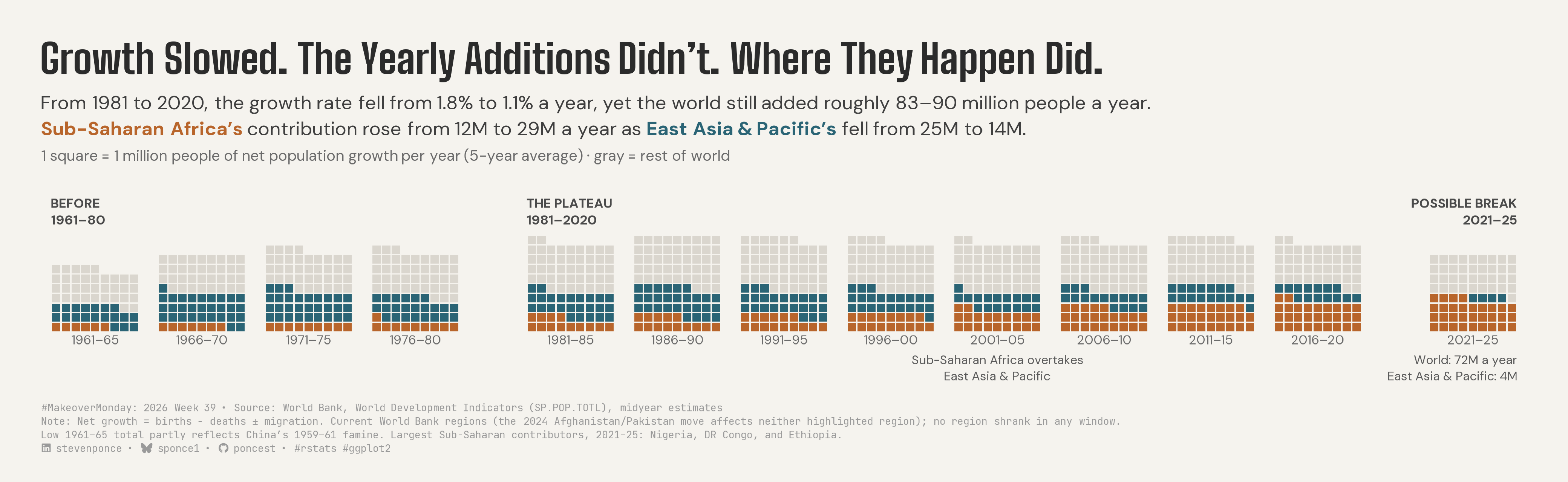
From 1981 to 2020, the growth rate fell from 1.8% to 1.1% a year, yet the world still added roughly 83–90 million people a year. Sub-Saharan Africa’s contribution rose from 12M to 29M a year as East Asia & Pacific’s fell from 25M to 14M.

MakeoverMonday
Data Visualization
R Programming
2026
A waffle-chart makeover of the World Bank population map showing that yearly world additions held near 83–90 million from 1981 to 2020 while their source shifted from East Asia & Pacific to Sub-Saharan Africa. Five-year windows of net growth are split by region, with one square per million people a year. Built in R with ggplot2 and ggtext.
Author

Steven Ponce

Published

September 29, 2026

Original

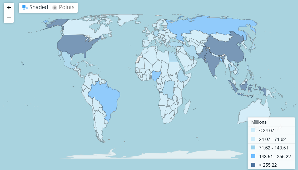
The original visualization comes from World Population

Original visualization

Makeover

Figure 1: Waffle chart titled “Growth Slowed. The Yearly Additions Didn’t. Where They Happen Did.” From 1981 to 2020, the world added roughly 83–90 million people a year even as the growth rate fell from 1.8% to 1.1%, while Sub-Saharan Africa’s contribution rose from 12 million to 29 million a year and East Asia & Pacific’s fell from 25 million to 14 million. Thirteen grids show five-year windows from 1961–65 to 2021–25; each square is 1 million people of net population growth per year, ochre for Sub-Saharan Africa, teal for East Asia & Pacific, gray for the rest of the world. Gaps separate Before (1961–80), The Plateau (1981–2020), and Possible Break (2021–25). Sub-Saharan Africa overtook East Asia & Pacific in 2001–05. The final grid was smaller: 72 million a year, with East Asia & Pacific contributing 4 million. Source: World Bank, World Development Indicators.

Steps to Create this Graphic

1. Load Packages & Setup

Show code
```{r}
#| label: load
#| warning: false
#| message: false      
#| results: "hide"     

## 1. LOAD PACKAGES & SETUP ----
suppressPackageStartupMessages({
  if (!require("pacman")) install.packages("pacman")
  pacman::p_load(
    tidyverse, ggtext, showtext, scales, glue, 
  janitor, ggview
)
})

# Source utility functions
suppressMessages(
  source(here::here("R/utils/fonts.R")))
  source(here::here("R/utils/social_icons.R"))
  source(here::here("R/themes/base_theme.R"))

### |- figure size ----
fig_w <- 13
fig_h <- 4.0 
```

2. Read in the Data

Show code
```{r}
#| label: read
#| include: true
#| eval: true
#| warning: false
#| 

df_raw <- readxl::read_excel(
  here::here("data/MakeoverMonday/2026/World-Population.xls"))  |>
  clean_names()
```

3. Examine the Data

Show code
```{r}
#| label: examine
#| include: true
#| eval: true
#| results: 'hide'
#| warning: false

glimpse(df_raw)
skimr::skim_without_charts(df_raw)
```

4. Tidy Data

Show code
```{r}
#| label: tidy
#| warning: false

### |- long format ----
df_long <- df_raw |>
  pivot_longer(
    starts_with("x"),
    names_to = "year", names_prefix = "x",
    names_transform = as.integer, values_to = "pop"
  )

### |- 5-year windows: 13 complete windows tile 1961-2025 exactly ----
win_starts <- seq(1961, 2021, by = 5)
win_label <- function(start) as.character(glue("{start}–{str_sub(start + 4, 3, 4)}"))

annual <- df_long |>
  filter(country_code %in% c("WLD", "SSF", "EAS")) |>
  select(code = country_code, year, pop) |>
  arrange(code, year) |>
  mutate(add = pop - lag(pop), .by = code) |>
  filter(year >= 1961) |>
  mutate(win_start = 1961 + (year - 1961) %/% 5 * 5)

### |- window means: SSF / EAS / Rest (= WLD - SSF - EAS, exact) ----
three <- annual |>
  summarise(add_m = mean(add) / 1e6, .by = c(code, win_start)) |>
  pivot_wider(names_from = code, values_from = add_m) |>
  mutate(Rest = WLD - SSF - EAS) |>
  arrange(win_start)

### |- copy guards: every number quoted in title/subtitle/annotations ----
plateau <- three |> filter(between(win_start, 1981, 2016))
w <- \(start, col) three[[col]][three$win_start == start]

crossover_start <- three |>
  filter(SSF > EAS) |>
  slice_min(win_start, n = 1) |>
  pull(win_start)

### |- growth rate by window ----
wld_rate <- df_long |>
  filter(country_code == "WLD") |>
  arrange(year) |>
  mutate(rate = pop / lag(pop) - 1) |>
  filter(year >= 1961) |>
  mutate(win_start = 1961 + (year - 1961) %/% 5 * 5) |>
  summarise(rate = mean(rate), .by = win_start)

rate_81 <- wld_rate$rate[wld_rate$win_start == 1981]
rate_16 <- wld_rate$rate[wld_rate$win_start == 2016]

### |- squares: 1 square = 1M net growth / yr, largest-remainder rounding ----
alloc_units <- function(x) {
  base <- floor(x)
  rem <- round(sum(x)) - sum(base)
  base + (rank(-(x - base), ties.method = "first") <= rem)
}

n_cols <- 9 # grid width in squares
gap_in <- 2 # gap between windows within an era
gap_era <- 7 # gap between eras (Ma: the void marks the boundary)

win_meta <- tibble(win_start = win_starts) |>
  mutate(
    k = row_number(),
    era = case_when(
      win_start < 1981 ~ "before",
      win_start < 2021 ~ "plateau",
      .default = "break"
    ),
    era_idx = match(era, c("before", "plateau", "break")),
    x0 = (k - 1) * (n_cols + gap_in) + (era_idx - 1) * (gap_era - gap_in),
    window = win_label(win_start)
  )

squares <- three |>
  pivot_longer(c(SSF, EAS, Rest), names_to = "group", values_to = "add_m") |>
  mutate(group = factor(group, levels = c("SSF", "EAS", "Rest"))) |> # fixed fill order
  arrange(win_start, group) |>
  mutate(n_sq = alloc_units(add_m), .by = win_start)

# Row-wise from bottom-left (column-wise fill would rebuild stacked columns)
tiles <- squares |>
  uncount(n_sq) |>
  mutate(
    i = row_number() - 1,
    col = i %% n_cols,
    row = i %/% n_cols,
    .by = win_start
  ) |>
  left_join(win_meta |> select(win_start, x0), by = "win_start") |>
  mutate(x = x0 + col, y = row)

max_row <- max(tiles$row)

### |- labels ----
window_labels <- win_meta |>
  mutate(x = x0 + (n_cols - 1) / 2, y = -1.3)

era_labels <- win_meta |>
  slice_min(k, n = 1, by = era) |>
  mutate(
    x = x0 - 0.5,
    y = max_row + 1.6,
    label = case_match(
      era,
      "before" ~ "BEFORE\n1961–80",
      "plateau" ~ "THE PLATEAU\n1981–2020",
      "break" ~ "POSSIBLE BREAK\n2021–25"
    ),
    hjust = if_else(era == "break", 1, 0),
    x = if_else(era == "break", x0 + n_cols - 0.5, x)
  )

x0_cross <- win_meta$x0[win_meta$win_start == crossover_start]
x0_break <- win_meta$x0[win_meta$win_start == 2021]

annotations <- tibble(
  x = c(x0_cross + (n_cols - 1) / 2, x0_break + n_cols - 0.5),
  y = c(-2.9, -2.9),
  hjust = c(0.5, 1),
  label = c(
    "Sub-Saharan Africa overtakes\nEast Asia & Pacific",
    glue(
      "World: {round(w(2021, 'WLD'))}M a year\n",
      "East Asia & Pacific: {round(w(2021, 'EAS'))}M"
    )
  )
)

### |- layer for the caption: largest SSF contributors, 2021-25 ----
ssf_codes <- countrycode::codelist |>
  filter(region == "Sub-Saharan Africa") |>
  pull(iso3c)

top_ssf <- df_long |>
  filter(country_code %in% ssf_codes, year %in% 2020:2025) |>
  arrange(country_code, year) |>
  mutate(add = pop - lag(pop), .by = country_code) |>
  filter(year >= 2021) |>
  summarise(add_m = mean(add) / 1e6, .by = country_name) |>
  slice_max(add_m, n = 3, with_ties = FALSE) |>
  mutate(country_name = str_replace(country_name, "Congo, Dem\\. Rep\\.", "DR Congo"))
```

5. Visualization Parameters

Show code
```{r}
#| label: params
#| include: true
#| warning: false

#### |- plot aesthetics ----
clrs <- get_theme_colors(
  palette = list(
    text = "#2B2B2B",
    subtext = "#5A5A5A"
  )
)

# Encoding colors hardcoded at the geoms 
col_ssf <- "#B8652B"
col_eas <- "#2A6475"
col_rest <- "#DAD6CE"
col_label <- "#6B6B6B"

### |- titles and caption ----
title_text <- "Growth Slowed. The Yearly Additions Didn't. Where They Happen Did."

subtitle_text <- str_glue(
  "From 1981 to 2020, the growth rate fell from {percent(rate_81, 0.1)} to ",
  "{percent(rate_16, 0.1)} a year, yet the world still added roughly 83–90 million people a year.<br>",
  "<span style='color:{col_ssf}'>**Sub-Saharan Africa's**</span> contribution rose from ",
  "12M to 29M a year as <span style='color:{col_eas}'>**East Asia & Pacific's**</span> ",
  "fell from 25M to 14M.<br>",
  "<span style='font-size:9pt; color:{col_label}'>",
  "1 square = 1 million people of net population growth per year (5-year average) · ",
  "gray = rest of world</span>"
)

caption_text <- create_mm_caption(
  mm_year = 2026,
  mm_week = 39,
  source_text = str_glue(
    "World Bank, World Development Indicators (SP.POP.TOTL), midyear estimates<br>",
    "Note: Net growth = births − deaths ± migration. Current World Bank regions (the 2024 ",
    "Afghanistan/Pakistan move affects neither highlighted region); no region shrank in any window.<br>",
    "Low 1961–65 total partly reflects China's 1959–61 famine. ",
    "Largest Sub-Saharan contributors, 2021–25: {str_flatten_comma(top_ssf$country_name, ', and ')}."
  )
)

### |- fonts ----
setup_fonts()
fonts <- get_font_families()

### |- plot theme ----
base_theme <- create_base_theme(clrs)

weekly_theme <- extend_weekly_theme(
  base_theme,
  theme(
    plot.title = element_textbox_simple(
      family = fonts$title_1, size = 24, face = "bold", 
      color = "#2B2B2B", lineheight = 1.05,
      margin = margin(b = 8)
    ),
    plot.subtitle = element_textbox_simple(
      family = fonts$subtitle, size = 11.5,
      color = "#3F3F3F", lineheight = 1.35,
      margin = margin(b = 18)
    ),
    plot.caption = element_textbox_simple(
      family = fonts$caption, size = 6,
      color = "#9A9A9A", lineheight = 1.35,
      margin = margin(t = 14)
    ),
    axis.text = element_blank(),
    axis.title = element_blank(),
    axis.ticks = element_blank(),
    panel.grid = element_blank(),
    legend.position = "none",
    plot.margin = margin(20, 25, 12, 25)
  )
)

theme_set(weekly_theme)
```

6. Plot

Show code
```{r}
#| label: plot
#| warning: false

### |- plot ----
p <- ggplot() +
  # Geoms
  geom_tile(
    data = tiles,
    aes(x = x, y = y, fill = group),
    width = 0.86, height = 0.86
  ) +
  geom_text(
    data = window_labels,
    aes(x = x, y = y, label = window),
    family = fonts$text, size = 2.7, color = col_label
  ) +
  geom_text(
    data = era_labels,
    aes(x = x, y = y, label = label, hjust = hjust),
    family = fonts$text, size = 2.8, fontface = "bold",
    color = "#4A4A4A", vjust = 0, lineheight = 1.05
  ) +
  geom_text(
    data = annotations,
    aes(x = x, y = y, label = label, hjust = hjust),
    family = fonts$text, size = 2.6, color = "#5A5A5A",
    vjust = 1, lineheight = 1.1
  ) +
  # Scales
  scale_fill_manual(values = c(SSF = col_ssf, EAS = col_eas, Rest = col_rest)) +
  scale_x_continuous(expand = expansion(add = 1)) +
  scale_y_continuous(
    limits = c(-5.5, max_row + 4.6),
    expand = expansion(add = 0)
  ) +
  coord_equal(clip = "off") +
  # Labs
  labs(
    title = title_text,
    subtitle = subtitle_text,
    caption = caption_text
  )
```

7. Save

Show code
```{r}
#| label: save
#| warning: false

### |- save ----
main_path  <- here::here("data_visualizations", "MakeoverMonday", "2026", "mm_2026_39.png")
thumb_path <- here::here("data_visualizations", "MakeoverMonday", "2026", "thumbnails", "mm_2026_39.png")

# Full-size version, for the QMD figure
save_ggplot(
  plot = p,
  file = main_path,
  width = fig_w, height = fig_h,
  units = "in", dpi = 320,
  create.dir = TRUE
)

# Reduced-size thumbnail, for the YAML `image:` field
fs::dir_create(dirname(thumb_path))
magick::image_read(main_path) |>
  magick::image_resize("400") |>
  magick::image_write(thumb_path)
```

8. Session Info

TipExpand for Session Info
R version 4.6.1 (2026-06-24)
Platform: aarch64-apple-darwin23
Running under: macOS Tahoe 26.6.2

Matrix products: default
BLAS:   /Library/Frameworks/R.framework/Versions/4.6/Resources/lib/libRblas.0.dylib 
LAPACK: /Library/Frameworks/R.framework/Versions/4.6/Resources/lib/libRlapack.dylib;  LAPACK version 3.12.1

locale:
[1] en_US.UTF-8/en_US.UTF-8/en_US.UTF-8/C/en_US.UTF-8/en_US.UTF-8

time zone: America/New_York
tzcode source: internal

attached base packages:
[1] stats     graphics  grDevices utils     datasets  methods   base     

other attached packages:
 [1] here_1.0.2      ggview_0.2.2    janitor_2.2.1   glue_1.8.1     
 [5] scales_1.4.0    showtext_0.9-8  showtextdb_3.0  sysfonts_0.8.9 
 [9] ggtext_0.2.0    lubridate_1.9.5 forcats_1.0.1   stringr_1.6.0  
[13] dplyr_1.2.1     purrr_1.2.2     readr_2.2.0     tidyr_1.3.2    
[17] tibble_3.3.1    ggplot2_4.0.3   tidyverse_2.0.0 pacman_0.5.1   

loaded via a namespace (and not attached):
 [1] gtable_0.3.6       xfun_0.60          htmlwidgets_1.6.4  tzdb_0.5.0        
 [5] vctrs_0.7.3        tools_4.6.1        generics_0.1.4     curl_7.1.0        
 [9] pkgconfig_2.0.3    RColorBrewer_1.1-3 skimr_2.2.2        S7_0.2.2          
[13] readxl_1.5.0       lifecycle_1.0.5    compiler_4.6.1     farver_2.1.2      
[17] textshaping_1.0.5  repr_1.1.7         codetools_0.2-20   snakecase_0.11.1  
[21] litedown_0.10      htmltools_0.5.9    yaml_2.3.12        pillar_1.11.1     
[25] magick_2.9.1       countrycode_1.9.0  commonmark_2.0.0   tidyselect_1.2.1  
[29] digest_0.6.39      stringi_1.8.7      labeling_0.4.3     rprojroot_2.1.1   
[33] fastmap_1.2.0      grid_4.6.1         cli_3.6.6          magrittr_2.0.5    
[37] base64enc_0.1-6    withr_3.0.3        timechange_0.4.0   rmarkdown_2.31    
[41] otel_0.2.0         cellranger_1.1.0   ragg_1.5.2         hms_1.1.4         
[45] evaluate_1.0.5     knitr_1.51         markdown_2.0       rlang_1.3.0       
[49] gridtext_0.1.6     Rcpp_1.1.2         xml2_1.6.0         rstudioapi_0.19.0 
[53] jsonlite_2.0.0     R6_2.6.1           fs_2.1.0           systemfonts_1.3.2 

9. GitHub Repository

TipExpand for GitHub Repo

The complete code for this analysis is available in mm_2026_39.qmd.

For the full repository, click here.

10. References

TipExpand for References

Primary Data (Makeover Monday): 1. Makeover Monday 2026 Week 39: Population, total (SP.POP.TOTL) - XLS: 265 rows × 68 columns (country_name, country_code, x1960–x2025). World Bank World Development Indicators midyear population estimates, 1960–2025; the UN World Population Prospects is a major underlying source. The 265 rows are 217 economies plus 48 World Bank aggregates (regions, income groups, lending groups, and World), so the file cannot be read as 265 countries. West Bank and Gaza has no values before 1990, and the “Not classified” aggregate is empty in every year. The seven World Bank regional aggregates sum exactly to the World series in every year. The 217 economy rows sum to 0.28–0.40% less than World (10.7M in 1960, 23.3M in 2025), a gap consistent with Taiwan, which World Bank aggregates include but which has no economy row. All world totals here therefore use the World series directly. Albania’s 1990–2000 values fall by an identical ~19,751 people a year, a linear interpolation between two anchors; it is the only such run in the file and does not affect any regional total used here. - The original is the World Bank’s interactive choropleth of total population in five classes. Its class breaks are the rounded 2025 populations of Burkina Faso (24.07M), Thailand (71.62M), Russia (143.51M), and Pakistan (255.22M), which identifies the map year as 2025. Each break is the smallest country in the class above it, so Pakistan is shaded in the top class even though the legend reads “> 255.22.” The binning compresses both tails: 158 of 217 economies share the lightest class (from under 10,000 people to 22M), and the darkest class holds five economies spanning 255M to 1,464M (5.7×), about 46% of all people. Shading by country area gives Russia, Canada, and Australia far more visual weight than their populations, and a single year leaves out the 66-year series entirely. The map’s own “Points” mode already offers proportional symbols, so this makeover does not use them. - This makeover changes the question from how many people live where (stock) to where each year’s population growth happens (flow). Net growth is the year-over-year change in population (births − deaths ± net migration). Thirteen five-year windows (1961–65 through 2021–25) tile the 65 annual changes exactly, so no partial bins are used. Sub-Saharan Africa and East Asia & Pacific come from the World Bank regional aggregates, and “rest of world” is World minus those two. Each square is 1M people of net growth per year (window average), rounded with largest-remainder rounding so every grid sums to the rounded world total. No regional aggregate shrank in any window. East Asia & Pacific stayed positive in every year of 2021–25 (lowest +2.55M in 2025), so no negative encoding was needed despite China’s decline from 2022. - Key figures: - Plateau: across the eight plateau windows (1981–85 to 2016–20), world net growth ranged from 82.6M to 89.7M a year. The average annual growth rate fell from 1.8% (1981–85) to 1.1% (2016–20). - The shift: Sub-Saharan Africa’s contribution rose from 12.4M to 28.7M a year while East Asia & Pacific’s fell from 25.1M to 13.7M. Sub-Saharan Africa first exceeded East Asia & Pacific in 2001–05 (19.7M vs. 16.9M). - Possible break: in 2021–25, world net growth fell to 72.3M a year. Of the 10.3M drop from 2016–20, East Asia & Pacific accounts for −9.4M and the rest of the world for −2.8M, while Sub-Saharan Africa still rose by +2.0M. The window includes COVID-era mortality and China’s population decline, so it is labeled a possible break rather than a new regime. - Early windows: the low 1961–65 total (59.5M) partly reflects the aftermath of China’s 1959–61 famine. - Regional definitions follow current World Bank groupings applied to all years. Since 2024, Afghanistan and Pakistan belong to “Middle East, North Africa, Afghanistan & Pakistan” rather than South Asia, which raises that region’s world share from 5.2% to 10.1% over 1960–2025, versus 3.4% to 6.4% without them. Neither highlighted region is affected, which is why the comparison rests on Sub-Saharan Africa and East Asia & Pacific. Current income groups were not used, because applying today’s classification to 1960 would be anachronistic. - Largest Sub-Saharan contributors to net growth, 2021–25 (average per year): Nigeria (4.71M), DR Congo (3.37M), and Ethiopia (3.31M), with Tanzania next at 1.91M. Sub-Saharan membership for this country-level check uses World Bank regions via the countrycode package.

Source Data: 2. World Bank, 2026, World Development Indicators: Population, total (SP.POP.TOTL) 3. United Nations, Department of Economic and Social Affairs, Population Division, 2024, World Population Prospects 2024 4. Arel-Bundock, V., Enevoldsen, N., & Yetman, C., 2018, countrycode: An R package to convert country names and country codes, Journal of Open Source Software, 3(28), 848

11. Custom Functions Documentation

Note📦 Custom Helper Functions

This analysis uses custom functions from my personal module library for efficiency and consistency across projects.

Functions Used:

  • fonts.R: setup_fonts(), get_font_families() - Font management with showtext
  • social_icons.R: create_social_caption() - Generates formatted social media captions
  • image_utils.R: save_plot() - Consistent plot saving with naming conventions
  • base_theme.R: create_base_theme(), extend_weekly_theme(), get_theme_colors() - Custom ggplot2 themes

Why custom functions?
These utilities standardize theming, fonts, and output across all my data visualizations. The core analysis (data tidying and visualization logic) uses only standard tidyverse packages.

Source Code:
View all custom functions → GitHub: R/utils

Back to top

Citation

BibTeX citation:
@online{ponce2026,
  author = {Ponce, Steven},
  title = {Growth {Slowed.} {The} {Yearly} {Additions} {Didn’t.} {Where}
    {They} {Happen} {Did.}},
  date = {2026-09-29},
  url = {https://stevenponce.netlify.app/data_visualizations/MakeoverMonday/2026/mm_2026_39.html},
  langid = {en}
}
For attribution, please cite this work as:
Ponce, Steven. 2026. “Growth Slowed. The Yearly Additions Didn’t. Where They Happen Did.” September 29. https://stevenponce.netlify.app/data_visualizations/MakeoverMonday/2026/mm_2026_39.html.
Source Code
---
title: "Growth Slowed. The Yearly Additions Didn't. Where They Happen Did."
subtitle: "From 1981 to 2020, the growth rate fell from 1.8% to 1.1% a year, yet the world still added roughly 83–90 million people a year. Sub-Saharan Africa's contribution rose from 12M to 29M a year as East Asia & Pacific's fell from 25M to 14M."
description: "A waffle-chart makeover of the World Bank population map showing that yearly world additions held near 83–90 million from 1981 to 2020 while their source shifted from East Asia & Pacific to Sub-Saharan Africa. Five-year windows of net growth are split by region, with one square per million people a year. Built in R with ggplot2 and ggtext."
date: "2026-09-29"
author:
  - name: "Steven Ponce"
    url: "https://stevenponce.netlify.app"
citation:
  url: "https://stevenponce.netlify.app/data_visualizations/MakeoverMonday/2026/mm_2026_39.html"
categories: ["MakeoverMonday", "Data Visualization", "R Programming", "2026"]
tags: [
  "makeover-monday",
  "data-visualization",
  "ggplot2",
  "ggtext",
  "waffle-chart",
  "unit-chart",
  "world-population",
  "population-growth",
  "demographics",
  "sub-saharan-africa",
  "east-asia-pacific",
  "world-bank",
  "2026"
]
image: "thumbnails/mm_2026_39.png"
format:
  html:
    toc: true
    toc-depth: 5
    code-link: true
    code-fold: true
    code-tools: true
    code-summary: "Show code"
    self-contained: true
    theme: 
      light: [flatly, assets/styling/custom_styles.scss]
      dark: [darkly, assets/styling/custom_styles_dark.scss]
editor_options: 
  chunk_output_type: inline
execute: 
  freeze: true
  cache: true
  error: false
  message: false
  warning: false
  eval: true
---

```{r}
#| label: setup-links
#| include: false

# CENTRALIZED LINK MANAGEMENT

## Project-specific info 
current_year <- 2026
current_week <- 39
project_file <- "mm_2026_39.qmd"
project_image <- "mm_2026_39.png"

## Data Sources
data_main <- "https://data.worldbank.org/indicator/SP.POP.TOTL"
data_secondary <- "https://data.worldbank.org/indicator/SP.POP.TOTL"

## Repository Links  
repo_main <- "https://github.com/poncest/personal-website/"
repo_file <- paste0("https://github.com/poncest/personal-website/blob/master/data_visualizations/MakeoverMonday/", current_year, "/", project_file)

## External Resources/Images
chart_original <- "https://raw.githubusercontent.com/poncest/MakeoverMonday/refs/heads/master/2026/Week_39_original_chart.png"

## Organization/Platform Links
org_primary <- "https://data.worldbank.org/indicator/SP.POP.TOTL"
org_secondary <- "https://data.worldbank.org/indicator/SP.POP.TOTL"

# Helper function to create markdown links
create_link <- function(text, url) {
  paste0("[", text, "](", url, ")")
}

# Helper function for citation-style links
create_citation_link <- function(text, url, title = NULL) {
  if (is.null(title)) {
    paste0("[", text, "](", url, ")")
  } else {
    paste0("[", text, "](", url, ' "', title, '")')
  }
}
```

### Original

The original visualization comes from `r create_link("World Population", org_primary)`
![Original visualization](https://raw.githubusercontent.com/poncest/MakeoverMonday/refs/heads/master/2026/Week_39/original_chart.png)

### Makeover

![Waffle chart titled "Growth Slowed. The Yearly Additions Didn't. Where They Happen Did." From 1981 to 2020, the world added roughly 83–90 million people a year even as the growth rate fell from 1.8% to 1.1%, while Sub-Saharan Africa's contribution rose from 12 million to 29 million a year and East Asia & Pacific's fell from 25 million to 14 million. Thirteen grids show five-year windows from 1961–65 to 2021–25; each square is 1 million people of net population growth per year, ochre for Sub-Saharan Africa, teal for East Asia & Pacific, gray for the rest of the world. Gaps separate Before (1961–80), The Plateau (1981–2020), and Possible Break (2021–25). Sub-Saharan Africa overtook East Asia & Pacific in 2001–05. The final grid was smaller: 72 million a year, with East Asia & Pacific contributing 4 million. Source: World Bank, World Development Indicators.](mm_2026_39.png){#fig-1}

### [**Steps to Create this Graphic**]{.mark}

#### [1. Load Packages & Setup]{.smallcaps}

```{r}
#| label: load
#| warning: false
#| message: false      
#| results: "hide"     

## 1. LOAD PACKAGES & SETUP ----
suppressPackageStartupMessages({
  if (!require("pacman")) install.packages("pacman")
  pacman::p_load(
    tidyverse, ggtext, showtext, scales, glue, 
  janitor, ggview
)
})

# Source utility functions
suppressMessages(
  source(here::here("R/utils/fonts.R")))
  source(here::here("R/utils/social_icons.R"))
  source(here::here("R/themes/base_theme.R"))

### |- figure size ----
fig_w <- 13
fig_h <- 4.0 
```

#### [2. Read in the Data]{.smallcaps}

```{r}
#| label: read
#| include: true
#| eval: true
#| warning: false
#| 

df_raw <- readxl::read_excel(
  here::here("data/MakeoverMonday/2026/World-Population.xls"))  |>
  clean_names()
```

#### [3. Examine the Data]{.smallcaps}

```{r}
#| label: examine
#| include: true
#| eval: true
#| results: 'hide'
#| warning: false

glimpse(df_raw)
skimr::skim_without_charts(df_raw)
```

#### [4. Tidy Data]{.smallcaps}

```{r}
#| label: tidy
#| warning: false


### |- long format ----
df_long <- df_raw |>
  pivot_longer(
    starts_with("x"),
    names_to = "year", names_prefix = "x",
    names_transform = as.integer, values_to = "pop"
  )

### |- 5-year windows: 13 complete windows tile 1961-2025 exactly ----
win_starts <- seq(1961, 2021, by = 5)
win_label <- function(start) as.character(glue("{start}–{str_sub(start + 4, 3, 4)}"))

annual <- df_long |>
  filter(country_code %in% c("WLD", "SSF", "EAS")) |>
  select(code = country_code, year, pop) |>
  arrange(code, year) |>
  mutate(add = pop - lag(pop), .by = code) |>
  filter(year >= 1961) |>
  mutate(win_start = 1961 + (year - 1961) %/% 5 * 5)

### |- window means: SSF / EAS / Rest (= WLD - SSF - EAS, exact) ----
three <- annual |>
  summarise(add_m = mean(add) / 1e6, .by = c(code, win_start)) |>
  pivot_wider(names_from = code, values_from = add_m) |>
  mutate(Rest = WLD - SSF - EAS) |>
  arrange(win_start)

### |- copy guards: every number quoted in title/subtitle/annotations ----
plateau <- three |> filter(between(win_start, 1981, 2016))
w <- \(start, col) three[[col]][three$win_start == start]

crossover_start <- three |>
  filter(SSF > EAS) |>
  slice_min(win_start, n = 1) |>
  pull(win_start)

### |- growth rate by window ----
wld_rate <- df_long |>
  filter(country_code == "WLD") |>
  arrange(year) |>
  mutate(rate = pop / lag(pop) - 1) |>
  filter(year >= 1961) |>
  mutate(win_start = 1961 + (year - 1961) %/% 5 * 5) |>
  summarise(rate = mean(rate), .by = win_start)

rate_81 <- wld_rate$rate[wld_rate$win_start == 1981]
rate_16 <- wld_rate$rate[wld_rate$win_start == 2016]

### |- squares: 1 square = 1M net growth / yr, largest-remainder rounding ----
alloc_units <- function(x) {
  base <- floor(x)
  rem <- round(sum(x)) - sum(base)
  base + (rank(-(x - base), ties.method = "first") <= rem)
}

n_cols <- 9 # grid width in squares
gap_in <- 2 # gap between windows within an era
gap_era <- 7 # gap between eras (Ma: the void marks the boundary)

win_meta <- tibble(win_start = win_starts) |>
  mutate(
    k = row_number(),
    era = case_when(
      win_start < 1981 ~ "before",
      win_start < 2021 ~ "plateau",
      .default = "break"
    ),
    era_idx = match(era, c("before", "plateau", "break")),
    x0 = (k - 1) * (n_cols + gap_in) + (era_idx - 1) * (gap_era - gap_in),
    window = win_label(win_start)
  )

squares <- three |>
  pivot_longer(c(SSF, EAS, Rest), names_to = "group", values_to = "add_m") |>
  mutate(group = factor(group, levels = c("SSF", "EAS", "Rest"))) |> # fixed fill order
  arrange(win_start, group) |>
  mutate(n_sq = alloc_units(add_m), .by = win_start)

# Row-wise from bottom-left (column-wise fill would rebuild stacked columns)
tiles <- squares |>
  uncount(n_sq) |>
  mutate(
    i = row_number() - 1,
    col = i %% n_cols,
    row = i %/% n_cols,
    .by = win_start
  ) |>
  left_join(win_meta |> select(win_start, x0), by = "win_start") |>
  mutate(x = x0 + col, y = row)

max_row <- max(tiles$row)

### |- labels ----
window_labels <- win_meta |>
  mutate(x = x0 + (n_cols - 1) / 2, y = -1.3)

era_labels <- win_meta |>
  slice_min(k, n = 1, by = era) |>
  mutate(
    x = x0 - 0.5,
    y = max_row + 1.6,
    label = case_match(
      era,
      "before" ~ "BEFORE\n1961–80",
      "plateau" ~ "THE PLATEAU\n1981–2020",
      "break" ~ "POSSIBLE BREAK\n2021–25"
    ),
    hjust = if_else(era == "break", 1, 0),
    x = if_else(era == "break", x0 + n_cols - 0.5, x)
  )

x0_cross <- win_meta$x0[win_meta$win_start == crossover_start]
x0_break <- win_meta$x0[win_meta$win_start == 2021]

annotations <- tibble(
  x = c(x0_cross + (n_cols - 1) / 2, x0_break + n_cols - 0.5),
  y = c(-2.9, -2.9),
  hjust = c(0.5, 1),
  label = c(
    "Sub-Saharan Africa overtakes\nEast Asia & Pacific",
    glue(
      "World: {round(w(2021, 'WLD'))}M a year\n",
      "East Asia & Pacific: {round(w(2021, 'EAS'))}M"
    )
  )
)

### |- layer for the caption: largest SSF contributors, 2021-25 ----
ssf_codes <- countrycode::codelist |>
  filter(region == "Sub-Saharan Africa") |>
  pull(iso3c)

top_ssf <- df_long |>
  filter(country_code %in% ssf_codes, year %in% 2020:2025) |>
  arrange(country_code, year) |>
  mutate(add = pop - lag(pop), .by = country_code) |>
  filter(year >= 2021) |>
  summarise(add_m = mean(add) / 1e6, .by = country_name) |>
  slice_max(add_m, n = 3, with_ties = FALSE) |>
  mutate(country_name = str_replace(country_name, "Congo, Dem\\. Rep\\.", "DR Congo"))

```

#### [5. Visualization Parameters]{.smallcaps}

```{r}
#| label: params
#| include: true
#| warning: false

#### |- plot aesthetics ----
clrs <- get_theme_colors(
  palette = list(
    text = "#2B2B2B",
    subtext = "#5A5A5A"
  )
)

# Encoding colors hardcoded at the geoms 
col_ssf <- "#B8652B"
col_eas <- "#2A6475"
col_rest <- "#DAD6CE"
col_label <- "#6B6B6B"

### |- titles and caption ----
title_text <- "Growth Slowed. The Yearly Additions Didn't. Where They Happen Did."

subtitle_text <- str_glue(
  "From 1981 to 2020, the growth rate fell from {percent(rate_81, 0.1)} to ",
  "{percent(rate_16, 0.1)} a year, yet the world still added roughly 83–90 million people a year.<br>",
  "<span style='color:{col_ssf}'>**Sub-Saharan Africa's**</span> contribution rose from ",
  "12M to 29M a year as <span style='color:{col_eas}'>**East Asia & Pacific's**</span> ",
  "fell from 25M to 14M.<br>",
  "<span style='font-size:9pt; color:{col_label}'>",
  "1 square = 1 million people of net population growth per year (5-year average) · ",
  "gray = rest of world</span>"
)

caption_text <- create_mm_caption(
  mm_year = 2026,
  mm_week = 39,
  source_text = str_glue(
    "World Bank, World Development Indicators (SP.POP.TOTL), midyear estimates<br>",
    "Note: Net growth = births − deaths ± migration. Current World Bank regions (the 2024 ",
    "Afghanistan/Pakistan move affects neither highlighted region); no region shrank in any window.<br>",
    "Low 1961–65 total partly reflects China's 1959–61 famine. ",
    "Largest Sub-Saharan contributors, 2021–25: {str_flatten_comma(top_ssf$country_name, ', and ')}."
  )
)

### |- fonts ----
setup_fonts()
fonts <- get_font_families()

### |- plot theme ----
base_theme <- create_base_theme(clrs)

weekly_theme <- extend_weekly_theme(
  base_theme,
  theme(
    plot.title = element_textbox_simple(
      family = fonts$title_1, size = 24, face = "bold", 
      color = "#2B2B2B", lineheight = 1.05,
      margin = margin(b = 8)
    ),
    plot.subtitle = element_textbox_simple(
      family = fonts$subtitle, size = 11.5,
      color = "#3F3F3F", lineheight = 1.35,
      margin = margin(b = 18)
    ),
    plot.caption = element_textbox_simple(
      family = fonts$caption, size = 6,
      color = "#9A9A9A", lineheight = 1.35,
      margin = margin(t = 14)
    ),
    axis.text = element_blank(),
    axis.title = element_blank(),
    axis.ticks = element_blank(),
    panel.grid = element_blank(),
    legend.position = "none",
    plot.margin = margin(20, 25, 12, 25)
  )
)

theme_set(weekly_theme)
```

#### [6. Plot]{.smallcaps}

```{r}
#| label: plot
#| warning: false

### |- plot ----
p <- ggplot() +
  # Geoms
  geom_tile(
    data = tiles,
    aes(x = x, y = y, fill = group),
    width = 0.86, height = 0.86
  ) +
  geom_text(
    data = window_labels,
    aes(x = x, y = y, label = window),
    family = fonts$text, size = 2.7, color = col_label
  ) +
  geom_text(
    data = era_labels,
    aes(x = x, y = y, label = label, hjust = hjust),
    family = fonts$text, size = 2.8, fontface = "bold",
    color = "#4A4A4A", vjust = 0, lineheight = 1.05
  ) +
  geom_text(
    data = annotations,
    aes(x = x, y = y, label = label, hjust = hjust),
    family = fonts$text, size = 2.6, color = "#5A5A5A",
    vjust = 1, lineheight = 1.1
  ) +
  # Scales
  scale_fill_manual(values = c(SSF = col_ssf, EAS = col_eas, Rest = col_rest)) +
  scale_x_continuous(expand = expansion(add = 1)) +
  scale_y_continuous(
    limits = c(-5.5, max_row + 4.6),
    expand = expansion(add = 0)
  ) +
  coord_equal(clip = "off") +
  # Labs
  labs(
    title = title_text,
    subtitle = subtitle_text,
    caption = caption_text
  )
```

#### [7. Save]{.smallcaps}

```{r}
#| label: save
#| warning: false

### |- save ----
main_path  <- here::here("data_visualizations", "MakeoverMonday", "2026", "mm_2026_39.png")
thumb_path <- here::here("data_visualizations", "MakeoverMonday", "2026", "thumbnails", "mm_2026_39.png")

# Full-size version, for the QMD figure
save_ggplot(
  plot = p,
  file = main_path,
  width = fig_w, height = fig_h,
  units = "in", dpi = 320,
  create.dir = TRUE
)

# Reduced-size thumbnail, for the YAML `image:` field
fs::dir_create(dirname(thumb_path))
magick::image_read(main_path) |>
  magick::image_resize("400") |>
  magick::image_write(thumb_path)
```

#### [8. Session Info]{.smallcaps}

::: {.callout-tip collapse="true"}
##### Expand for Session Info

```{r, echo = FALSE}
#| eval: true
#| warning: false

sessionInfo()
```
:::

#### [9. GitHub Repository]{.smallcaps}

::: {.callout-tip collapse="true"}
##### Expand for GitHub Repo

The complete code for this analysis is available in `r create_link(project_file, repo_file)`.

For the full repository, `r create_link("click here", repo_main)`.
:::

#### [10. References]{.smallcaps}
::: {.callout-tip collapse="true"}
##### Expand for References

**Primary Data (Makeover Monday):**
1. Makeover Monday 2026 Week 39: `r create_link("Population, total (SP.POP.TOTL)", "https://data.worldbank.org/indicator/SP.POP.TOTL")`
   - XLS: 265 rows × 68 columns (`country_name`, `country_code`, `x1960`–`x2025`). World Bank World Development Indicators midyear population estimates, 1960–2025; the UN World Population Prospects is a major underlying source. The 265 rows are 217 economies plus 48 World Bank aggregates (regions, income groups, lending groups, and World), so the file cannot be read as 265 countries. West Bank and Gaza has no values before 1990, and the "Not classified" aggregate is empty in every year. The seven World Bank regional aggregates sum exactly to the World series in every year. The 217 economy rows sum to 0.28–0.40% less than World (10.7M in 1960, 23.3M in 2025), a gap consistent with Taiwan, which World Bank aggregates include but which has no economy row. All world totals here therefore use the World series directly. Albania's 1990–2000 values fall by an identical ~19,751 people a year, a linear interpolation between two anchors; it is the only such run in the file and does not affect any regional total used here.
   - The original is the World Bank's interactive choropleth of total population in five classes. Its class breaks are the rounded 2025 populations of Burkina Faso (24.07M), Thailand (71.62M), Russia (143.51M), and Pakistan (255.22M), which identifies the map year as 2025. Each break is the smallest country in the class above it, so Pakistan is shaded in the top class even though the legend reads "> 255.22." The binning compresses both tails: 158 of 217 economies share the lightest class (from under 10,000 people to 22M), and the darkest class holds five economies spanning 255M to 1,464M (5.7×), about 46% of all people. Shading by country area gives Russia, Canada, and Australia far more visual weight than their populations, and a single year leaves out the 66-year series entirely. The map's own "Points" mode already offers proportional symbols, so this makeover does not use them.
   - This makeover changes the question from how many people live where (stock) to where each year's population growth happens (flow). Net growth is the year-over-year change in population (births − deaths ± net migration). Thirteen five-year windows (1961–65 through 2021–25) tile the 65 annual changes exactly, so no partial bins are used. Sub-Saharan Africa and East Asia & Pacific come from the World Bank regional aggregates, and "rest of world" is World minus those two. Each square is 1M people of net growth per year (window average), rounded with largest-remainder rounding so every grid sums to the rounded world total. No regional aggregate shrank in any window. East Asia & Pacific stayed positive in every year of 2021–25 (lowest +2.55M in 2025), so no negative encoding was needed despite China's decline from 2022.
   - Key figures:
     - **Plateau:** across the eight plateau windows (1981–85 to 2016–20), world net growth ranged from 82.6M to 89.7M a year. The average annual growth rate fell from 1.8% (1981–85) to 1.1% (2016–20).
     - **The shift:** Sub-Saharan Africa's contribution rose from 12.4M to 28.7M a year while East Asia & Pacific's fell from 25.1M to 13.7M. Sub-Saharan Africa first exceeded East Asia & Pacific in 2001–05 (19.7M vs. 16.9M).
     - **Possible break:** in 2021–25, world net growth fell to 72.3M a year. Of the 10.3M drop from 2016–20, East Asia & Pacific accounts for −9.4M and the rest of the world for −2.8M, while Sub-Saharan Africa still rose by +2.0M. The window includes COVID-era mortality and China's population decline, so it is labeled a possible break rather than a new regime.
     - **Early windows:** the low 1961–65 total (59.5M) partly reflects the aftermath of China's 1959–61 famine.
   - Regional definitions follow current World Bank groupings applied to all years. Since 2024, Afghanistan and Pakistan belong to "Middle East, North Africa, Afghanistan & Pakistan" rather than South Asia, which raises that region's world share from 5.2% to 10.1% over 1960–2025, versus 3.4% to 6.4% without them. Neither highlighted region is affected, which is why the comparison rests on Sub-Saharan Africa and East Asia & Pacific. Current income groups were not used, because applying today's classification to 1960 would be anachronistic.
   - Largest Sub-Saharan contributors to net growth, 2021–25 (average per year): Nigeria (4.71M), DR Congo (3.37M), and Ethiopia (3.31M), with Tanzania next at 1.91M. Sub-Saharan membership for this country-level check uses World Bank regions via the `countrycode` package.

**Source Data:**
2. World Bank, 2026, `r create_link("World Development Indicators: Population, total (SP.POP.TOTL)", "https://data.worldbank.org/indicator/SP.POP.TOTL")`
3. United Nations, Department of Economic and Social Affairs, Population Division, 2024, `r create_link("World Population Prospects 2024", "https://population.un.org/wpp/")`
4. Arel-Bundock, V., Enevoldsen, N., & Yetman, C., 2018, `r create_link("countrycode: An R package to convert country names and country codes", "https://joss.theoj.org/papers/10.21105/joss.00848")`, *Journal of Open Source Software*, 3(28), 848
:::


#### [11. Custom Functions Documentation]{.smallcaps}

::: {.callout-note collapse="true"}
##### 📦 Custom Helper Functions

This analysis uses custom functions from my personal module library for efficiency and consistency across projects.

**Functions Used:**

-   **`fonts.R`**: `setup_fonts()`, `get_font_families()` - Font management with showtext
-   **`social_icons.R`**: `create_social_caption()` - Generates formatted social media captions
-   **`image_utils.R`**: `save_plot()` - Consistent plot saving with naming conventions
-   **`base_theme.R`**: `create_base_theme()`, `extend_weekly_theme()`, `get_theme_colors()` - Custom ggplot2 themes

**Why custom functions?**\
These utilities standardize theming, fonts, and output across all my data visualizations. The core analysis (data tidying and visualization logic) uses only standard tidyverse packages.

**Source Code:**\
View all custom functions → [GitHub: R/utils](https://github.com/poncest/personal-website/tree/master/R)
:::

© 2024 Steven Ponce

Source Issues
