---
title: "Chronic burdens climbed as infectious diseases fell"
subtitle: "Among 25 causes that ranked among WHO's leading causes of global disease burden in 2000 or 2021, diabetes rose from 18th to 7th, while HIV/AIDS fell from 7th to 21st and measles from 11th to 25th. COVID-19 disrupted the order in 2020-21."
description: "A bump chart ranks the leading global causes of disease burden from 2000 to 2021, showing chronic conditions like diabetes climbing as infectious diseases like HIV/AIDS and measles declined. COVID-19 abruptly disrupted the two-decade reordering, jumping to the top rank by 2021. Built in R with ggplot2 and ggbump using WHO Global Health Estimates data."
date: "2026-09-01"
author:
- name: "Steven Ponce"
url: "https://stevenponce.netlify.app"
citation:
url: "https://stevenponce.netlify.app/data_visualizations/SWD%20Challenge/2026/swd_2026_09.html"
categories: ["SWDchallenge", "2026"]
tags: [
"SWDchallenge",
"bump-chart",
"ranking",
"global-health",
"who-data",
"daly",
"disease-burden",
"covid-19",
"public-health",
"ggplot2",
"ggbump",
"r-stats",
"data-visualization"
]
image: "thumbnails/swd_2026_09.png"
format:
html:
toc: true
toc-depth: 5
code-link: true
code-fold: true
code-tools: true
code-summary: "Show code"
theme:
light: [flatly, assets/styling/custom_styles.scss]
dark: [darkly, assets/styling/custom_styles_dark.scss]
editor_options:
chunk_output_type: inline
execute:
freeze: true
cache: true
error: false
message: false
warning: false
eval: true
---
### Challenge
Categories can be tricky to visualize over time when the underlying numbers don't align: different scales, different totals, different counts year over year. This month's challenge is to share a bump chart that sets that noise aside and shows what actually moved.
Additional information can be found [HERE](https://community.storytellingwithdata.com/challenges/sep-2026-bump-it)
### Visualization
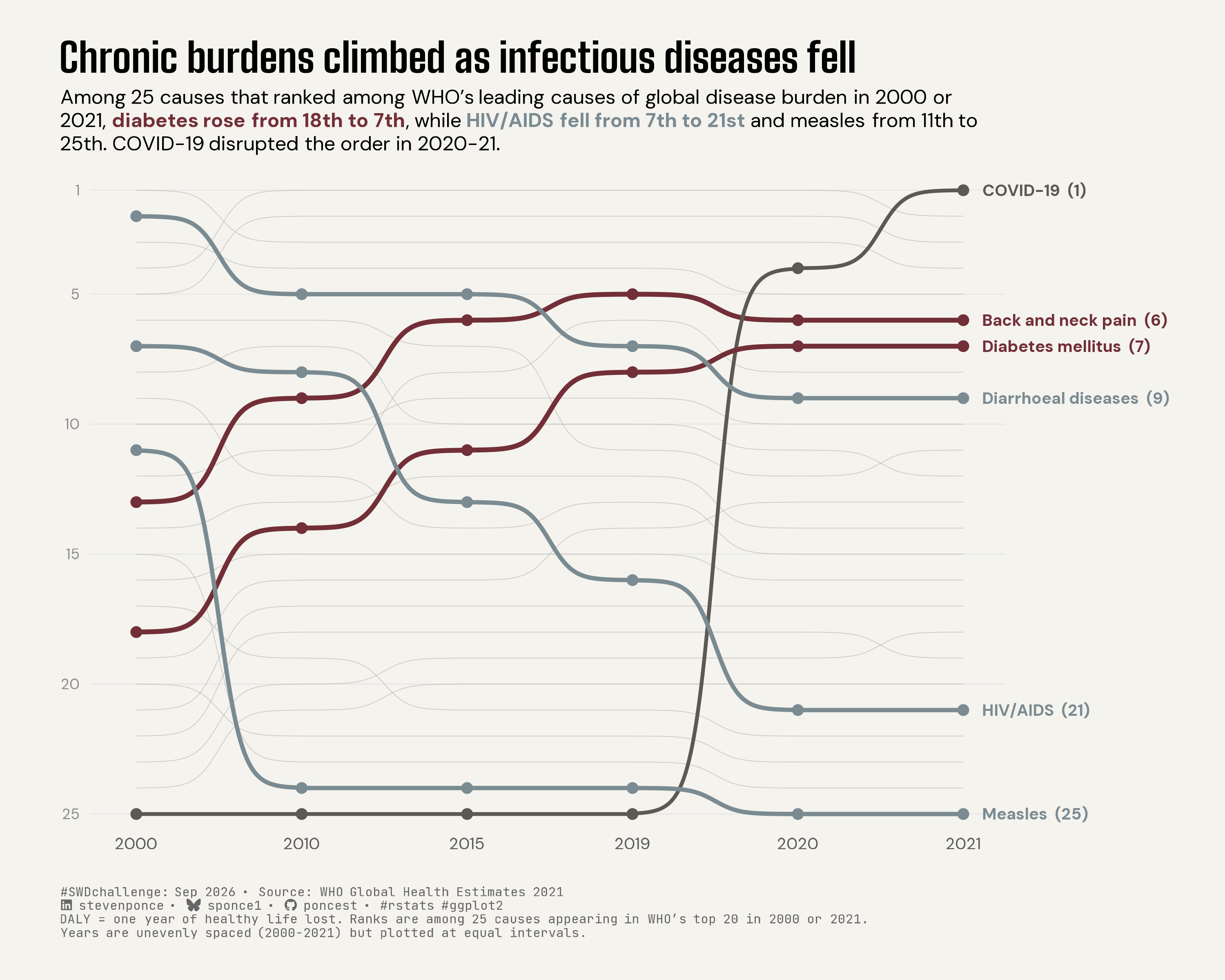{#fig-1}
### [**Steps to Create this Graphic**]{.mark}
#### [1. Load Packages & Setup]{.smallcaps}
```{r}
#| label: load

if (!require("pacman")) install.packages("pacman")
pacman::p_load(
  tidyverse, ggtext, showtext, janitor, scales, glue, ggview, ggbump
  )

# Source utility functions
suppressMessages(source(here::here("R/utils/fonts.R")))
source(here::here("R/utils/social_icons.R"))
source(here::here("R/utils/image_utils.R"))
source(here::here("R/themes/base_theme.R"))
```
#### [2. Read in the Data]{.smallcaps}
```{r}
#| label: read

# The workbook was tidied separately in `WHO_GHE_DALY_tidy.R`.
# https://github.com/poncest/SWDchallenge/blob/main/2026/09_Sep/WHO_GHE_DALY_tidy.R

df_tidy <- read_csv(
  here::here("data/SWDchallenge/2026/who_ghe_daly_global_tidy.csv"),
  show_col_types = FALSE
) |>
  clean_names()
```
#### [3. Examine the Data]{.smallcaps}
```{r}
#| label: examine
#| include: true
#| eval: true
#| results: 'hide'
#| warning: false

glimpse(df_tidy)
skimr::skim_without_charts(df_tidy)
```
#### [4. Tidy Data]{.smallcaps}
```{r}
#| label: tidy
#| output: false

endpoint_causes <- c(
  "Lower respiratory infections", "Diarrhoeal diseases",
  "Preterm birth complications", "Ischaemic heart disease", "Stroke",
  "Tuberculosis", "HIV/AIDS", "Birth asphyxia and birth trauma", "Malaria",
  "Road injury", "Measles", "Chronic obstructive pulmonary disease",
  "Back and neck pain", "Congenital anomalies", "Other neonatal conditions",
  "Cirrhosis of the liver", "Self-harm", "Diabetes mellitus",
  "Depressive disorders", "Interpersonal violence", "COVID-19",
  "Trachea, bronchus, lung cancers", "Other hearing loss", "Falls",
  "Kidney diseases"
)

year_lookup <- tibble(year = c(2000, 2010, 2015, 2019, 2020, 2021), year_index = 1:6)
# x-axis uses year_index (equal categorical spacing), not true year value.
# True temporal spacing was tested and reverted: it made
# COVID's rise correctly abrupt but crowded the 2019-2021 endpoint label
# Caption disclose the six periods are unevenly spaced in reality.

highlight_causes <- tribble(
  ~cause,                 ~story_group,
  "Diabetes mellitus",   "Rising chronic burden",
  "Back and neck pain",  "Rising chronic burden",
  "HIV/AIDS",            "Declining infectious burden",
  "Measles",             "Declining infectious burden",
  "Diarrhoeal diseases", "Declining infectious burden",
  "COVID-19",            "Pandemic disruption"
)

df_bump <- df_tidy |>
  filter(cause %in% endpoint_causes) |>
  group_by(year) |>
  mutate(rank = min_rank(desc(dalys))) |>
  ungroup() |>
  left_join(year_lookup, by = "year") |>
  left_join(highlight_causes, by = "cause") |>
  mutate(
    story_group = factor(
      story_group,
      levels = c("Rising chronic burden", "Declining infectious burden", "Pandemic disruption")
    )
  ) |>
  arrange(cause, year)

df_background <- df_bump |> filter(is.na(story_group))
df_highlight  <- df_bump |> filter(!is.na(story_group))
df_labels <- df_highlight |> filter(year == 2021) |> mutate(label = glue("{cause}  ({rank})"))
```
#### [5. Visualization Parameters]{.smallcaps}
```{r}
#| label: params

### |-  plot aesthetics ----
clrs <- get_theme_colors(
  palette = list(
    rising     = "#722F37",
    declining  = "#7A8B92",
    disruption = "#5C5954",
    background = "#C7C2B8",
    accent     = "#722F37",
    neutral    = "#9B968C"
  )
)

story_colors <- c(
  "Rising chronic burden" = clrs$palette[["rising"]],
  "Declining infectious burden" = clrs$palette[["declining"]],
  "Pandemic disruption" = clrs$palette[["disruption"]]
)

### |- titles and caption ----
title_text <- "Chronic burdens climbed as infectious diseases fell"

subtitle_text <- glue(
  "Among 25 causes that ranked among WHO's leading causes of global disease burden ",
  "in 2000 or 2021, <span style='color:{story_colors[[\"Rising chronic burden\"]]}'><b>diabetes rose from 18th to 7th</b></span>, ",
  "while <span style='color:{story_colors[[\"Declining infectious burden\"]]}'><b>HIV/AIDS fell from 7th to 21st</b></span> ",
  "and measles from 11th to 25th. COVID-19 disrupted the order in 2020-21."
)

caption_text <- paste0(
  create_swd_caption(
    year = 2026,
    month = "Sep",
    source_text = "WHO Global Health Estimates 2021"
  ),
  "<br>DALY = one year of healthy life lost. Ranks are among 25 causes appearing in WHO's top 20 in 2000 or 2021.",
  "<br>Years are unevenly spaced (2000-2021) but plotted at equal intervals."
)

### |- fonts ----
setup_fonts()
fonts <- get_font_families()

### |- plot theme ----
base_theme <- create_base_theme(clrs)

weekly_theme <- extend_weekly_theme(
  base_theme,
  theme(
    axis.title = element_blank(),
    axis.text.x = element_text(family = fonts$text, size = 9, color = "grey35"),
    axis.text.y = element_text(family = fonts$text, size = 8, color = "grey55"),
    axis.ticks = element_blank(),
    panel.grid.major.x = element_blank(),
    panel.grid.major.y = element_line(color = "grey91", linewidth = 0.35),
    panel.grid.minor = element_blank(),
    legend.position = "none",
    plot.title = element_text(
      family = fonts$title_1, face = "bold", size = 22, margin = margin(b = 8)
      ),
    plot.subtitle = element_textbox_simple(
      family = fonts$subtitle, size = 11, margin = margin(t = 4, b = 20),
      lineheight = 1.25
    ),
    plot.caption = element_markdown(
      family = fonts$caption, size = 7, color = "grey40", hjust = 0,
      margin = margin(t = 20, b = 0),  lineheight = 1.15
      ),
    plot.margin = margin(t = 24, r = 130, b = 24, l = 36)
  )
)

theme_set(weekly_theme)
```
#### [6. Plot]{.smallcaps}
```{r}
#| label: plot
#| output: false

### |-  plot ----
p <- ggplot(df_bump, aes(x = year_index, y = rank, group = cause)) +
  geom_bump(
    data = df_background,
    color = clrs$palette[["neutral"]],
    alpha = 0.45,
    linewidth = 0.2,
    smooth = 7
  ) +
  geom_bump(
    data = df_highlight,
    aes(color = story_group, linewidth = story_group),
    smooth = 7
  ) +
  geom_point(
    data = df_highlight,
    aes(color = story_group),
    size = 2.4
  ) +
  geom_text(
    data = df_labels,
    aes(x = 6.12, label = label, color = story_group),
    hjust = 0,
    size = 3.15,
    family = fonts$text,
    fontface = "bold"
  ) +
  scale_color_manual(values = story_colors, guide = "none") +
  scale_linewidth_manual(
    values = c(
      "Rising chronic burden" = 1.35,
      "Declining infectious burden" = 1.2,
      "Pandemic disruption" = 1.05
    ),
    guide = "none"
  ) +
  scale_x_continuous(
    breaks = year_lookup$year_index,
    labels = year_lookup$year,
    limits = c(0.72, 6.25),
    expand = expansion(mult = 0)
  ) +
  scale_y_reverse(
    breaks = c(1, 5, 10, 15, 20, 25),
    limits = c(25.5, 0.5),
    expand = expansion(mult = 0)
  ) +
  coord_cartesian(clip = "off") +
  labs(title = title_text, subtitle = subtitle_text, caption = caption_text)
```
#### [7. Save]{.smallcaps}
```{r}
#| label: save
#| warning: false

### |- save ----
main_path  <- here::here("data_visualizations", "SWD Challenge", "2026", "swd_2026_09.png")
thumb_path <- here::here("data_visualizations", "SWD Challenge", "2026", "thumbnails", "swd_2026_09.png")

# Full-size version, for the QMD figure
save_ggplot(
  plot = p,
  file = main_path,
  width = 10,
  height = 8,
  units = "in",
  dpi = 300,
  create.dir = TRUE
)

# Reduced-size thumbnail, for the YAML `image:` field
fs::dir_create(dirname(thumb_path))
magick::image_read(main_path) |>
  magick::image_resize("400") |>
  magick::image_write(thumb_path)
```
#### [8. Session Info]{.smallcaps}
::: {.callout-tip collapse="true"}
##### Expand for Session Info
```{r, echo = FALSE}
#| eval: true
#| warning: false
sessionInfo()
```
:::
#### [9. GitHub Repository]{.smallcaps}
::: {.callout-tip collapse="true"}
##### Expand for GitHub Repo
The complete code for this analysis is available in [`swd_2026_09.qmd`](https://github.com/poncest/personal-website/tree/master/data_visualizations/SWD%20Challenge/2026/swd_2026_09.qmd). For the full repository, [click here](https://github.com/poncest/personal-website/).
:::
#### [10. References]{.smallcaps}
::: {.callout-tip collapse="true"}
##### Expand for References
**SWD Challenge:**
- Storytelling with Data: [September 2026 — bump it!](https://community.storytellingwithdata.com/challenges/sep-2026-bump-it)
**Data Sources:**
- World Health Organization. *Global Health Estimates 2021: Disease burden by cause, age, sex, by country and by region, 2000–2021.* December 2020. <https://www.who.int/data/gho/data/themes/mortality-and-global-health-estimates/global-health-estimates-leading-causes-of-dalys> — global DALYs by cause, 2000, 2010, 2015, 2019, 2020, 2021. WHO's `Top20` worksheet reports the 20 leading causes in 2000 and 2021; their union forms the 25-cause comparison set ranked in this chart.
**Data Preparation:**
- Tidying script: [`WHO_GHE_DALY_tidy.R`](https://github.com/poncest/SWDchallenge/blob/main/2026/09_Sep/WHO_GHE_DALY_tidy.R) — converts the WHO workbook into long/tidy format prior to the ranking and visualization steps in the main script.
:::
#### [11. Custom Functions Documentation]{.smallcaps}
::: {.callout-note collapse="true"}
##### 📦 Custom Helper Functions
This analysis uses custom functions from my personal module library for efficiency and consistency across projects.
**Functions Used:**
- **`fonts.R`**: `setup_fonts()`, `get_font_families()` - Font management with showtext
- **`social_icons.R`**: `create_social_caption()` - Generates formatted social media captions
- **`image_utils.R`**: `save_plot()` - Consistent plot saving with naming conventions
- **`base_theme.R`**: `create_base_theme()`, `extend_weekly_theme()`, `get_theme_colors()` - Custom ggplot2 themes
**Why custom functions?**\
These utilities standardize theming, fonts, and output across all my data visualizations. The core analysis (data tidying and visualization logic) uses only standard tidyverse packages.
**Source Code:**\
View all custom functions → [GitHub: R/utils](https://github.com/poncest/personal-website/tree/master/R)
:::
