Exploring Individual Word Trends Across 27 Seasons of Power Rangers
Tracking the top 10 words and how they evolve independently over time in episode descriptions
TidyTuesday
Data Visualization
R Programming
2024
Author
Steven Ponce
Published
August 27, 2024
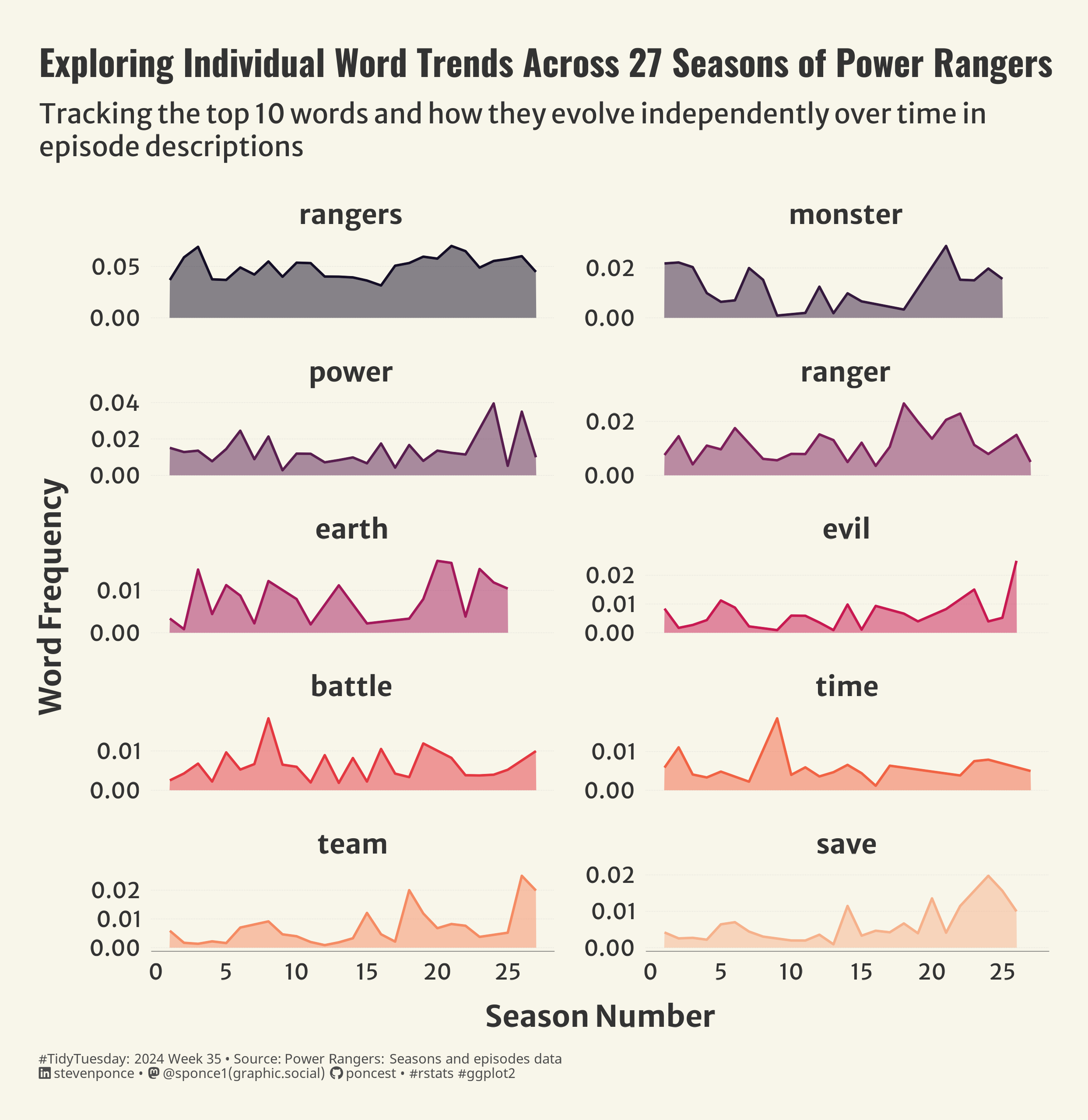
Figure 1: The faceted area chart displays the frequency of the top 10 words used in Power Rangers episode descriptions over 27 seasons. Each word is plotted separately, with its frequency on the y-axis and the season number on the x-axis. This highlights individual word trends over time.
Steps to Create this Graphic
1. Load Packages & Setup
Code
```{r}#| label: loadpacman::p_load( tidyverse, # Easily Install and Load the 'Tidyverse' ggtext, # Improved Text Rendering Support for 'ggplot2' showtext, # Using Fonts More Easily in R Graphs janitor, # Simple Tools for Examining and Cleaning Dirty Data skimr, # Compact and Flexible Summaries of Data scales, # Scale Functions for Visualization lubridate, # Make Dealing with Dates a Little Easier MetBrewer, # Color Palettes Inspired by Works at the Metropolitan Museum of Art tidytext # Text Mining using 'dplyr', 'ggplot2', and Other Tidy Tools ) ### |- figure size ----camcorder::gg_record(dir = here::here("temp_plots"),device ="png",width =7.77,height =8,units ="in",dpi =320)### |- resolution ----showtext_opts(dpi =320, regular.wt =300, bold.wt =800)```
```{r}#| label: tidy# Tidyjoined_data <- episodes |>left_join(y = seasons, by ="season_title") |>rename(imdb_rating_episode = imdb_rating.x,imdb_rating_season = imdb_rating.y, ) |>mutate(air_date_last_ep =ymd(air_date_last_ep)) # Unnest tokens from the 'desc' column, remove stop words, and calculate word frequencyword_frequency_over_time <- joined_data |>unnest_tokens(word, desc) |>anti_join(stop_words, by ="word") |>count(season_num, word, sort =TRUE) |>group_by(season_num) |>mutate(frequency = n /sum(n)) |>ungroup()# Select the top 10 words by total frequency across all seasonstop_words <- word_frequency_over_time |>group_by(word) |>summarise(total_frequency =sum(frequency)) |>top_n(10, total_frequency) |>pull(word)# Filter for top words data_plot <- word_frequency_over_time |>filter(word %in% top_words) |>mutate(word =fct_reorder(word, -frequency))```
5. Visualization Parameters
Code
```{r}#| label: params### |- plot aesthetics ----bkg_col <- colorspace::lighten('#f7f5e9', 0.05) title_col <-"gray20"subtitle_col <-"gray20"caption_col <-"gray30"text_col <-"gray20"### |- titles and caption ----# iconstt <-str_glue("#TidyTuesday: { 2024 } Week { 35 } • Source: Power Rangers: Seasons and episodes data<br>")li <-str_glue("<span style='font-family:fa6-brands'></span>")gh <-str_glue("<span style='font-family:fa6-brands'></span>")mn <-str_glue("<span style='font-family:fa6-brands'></span>")# texttitle_text <-str_glue("Exploring Individual Word Trends Across 27 Seasons of Power Rangers")subtitle_text <-str_glue("Tracking the top 10 words and how they evolve independently over time in\nepisode descriptions")caption_text <-str_glue("{tt} {li} stevenponce • {mn} @sponce1(graphic.social) {gh} poncest • #rstats #ggplot2")### |- fonts ----font_add("fa6-brands", "fonts/6.4.2/Font Awesome 6 Brands-Regular-400.otf")font_add_google("Oswald", regular.wt =400, family ="title")font_add_google("Merriweather Sans", regular.wt =400, family ="subtitle")font_add_google("Merriweather Sans", regular.wt =400, family ="text")font_add_google("Noto Sans", regular.wt =400, family ="caption")showtext_auto(enable =TRUE)### |- plot theme ----theme_set(theme_minimal(base_size =14, base_family ="text")) theme_update(plot.title.position ="plot",plot.caption.position ="plot",legend.position ='plot',plot.background =element_rect(fill = bkg_col, color = bkg_col),panel.background =element_rect(fill = bkg_col, color = bkg_col),plot.margin =margin(t =20, r =20, b =20, l =20),axis.title.x =element_text(margin =margin(10, 0, 0, 0), size =rel(1.1), color = text_col, family ="text", face ="bold", hjust =0.5),axis.title.y =element_text(margin =margin(0, 10, 0, 0), size =rel(1.1), color = text_col, family ="text", face ="bold", hjust =0.5),axis.text =element_text(size =rel(0.8), color = text_col, family ="text"),axis.line.x =element_line(color ="gray40", linewidth = .15),panel.grid.minor.y =element_blank(),panel.grid.major.y =element_line(linetype ="dotted", linewidth =0.1, color ='gray'),panel.grid.minor.x =element_blank(),panel.grid.major.x =element_blank(),strip.text =element_textbox(size =rel(1),face ='bold',color = text_col,hjust =0.5,halign =0.5,r =unit(5, "pt"),width =unit(5.5, "npc"),padding =margin(3, 0, 3, 0),margin =margin(3, 3, 3, 3),fill ="transparent"),panel.spacing =unit(1, 'lines')) ```
6. Plot
Code
```{r}#| label: plot### |- final plot ---- p <- data_plot |>ggplot(aes(x = season_num, y = frequency, color = word, fill = word)) +# Geomsgeom_line(linewidth =0.6) +geom_area(alpha =0.5) +# Scalesscale_x_continuous(breaks =pretty_breaks()) +scale_y_continuous(breaks =pretty_breaks(n =2)) +scale_color_viridis_d(option ="F", begin =0.05, end = .85) +scale_fill_viridis_d(option ="F", begin =0.05, end = .85) +coord_cartesian(clip ='off') +# Labslabs(x ="Season Number",y ="Word Frequency",title = title_text,subtitle = subtitle_text,caption = caption_text ) +# Facetsfacet_wrap(~ word, scales ="free_y", ncol =2) +# Themetheme(plot.title =element_text(size =rel(1.3),family ="title",color = title_col,face ="bold",lineheight =0.85,margin =margin(t =5, b =5) ),plot.subtitle =element_text(size =rel(1),family ="subtitle",color = title_col,lineheight =1,margin =margin(t =5, b =15) ),plot.caption =element_markdown(size =rel(.5),family ="caption",color = caption_col,lineheight =0.6,hjust =0,halign =0,margin =margin(t =10, b =0) ) )```