Distribution of College Attendance Rates by Selectivity Tier
A Comparison of Attendance Rates for U.S. Colleges Across Selectivity Levels
TidyTuesday
Data Visualization
R Programming
2024
Author
Steven Ponce
Published
September 10, 2024
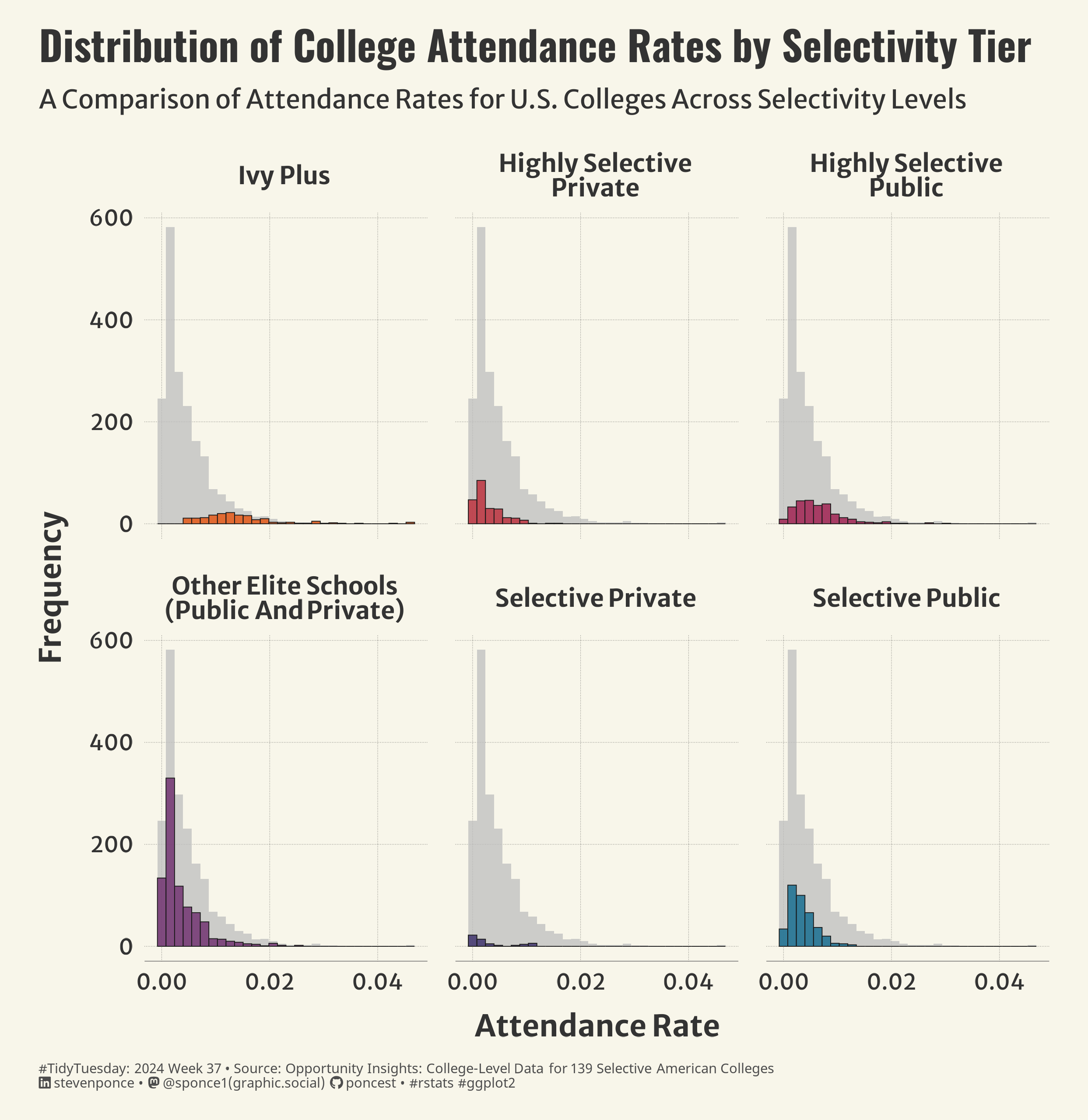
Figure 1: A faceted bar plot displaying the distribution of college attendance rates based on selectivity tier. The x-axis is labeled “Attendance Rate,” and the y-axis is labeled “Frequency.” Six panels represent different college tiers: Ivy Plus, Highly Selective Private, Highly Selective Public, Other Elite Schools (Public and Private), Selective Private, and Selective Public. Each panel has a histogram in gray with colored bars highlighting specific sections, using different colors for each tier.
Steps to Create this Graphic
1. Load Packages & Setup
Code
```{r}#| label: loadpacman::p_load( tidyverse, # Easily Install and Load the 'Tidyverse' ggtext, # Improved Text Rendering Support for 'ggplot2' showtext, # Using Fonts More Easily in R Graphs janitor, # Simple Tools for Examining and Cleaning Dirty Data skimr, # Compact and Flexible Summaries of Data scales, # Scale Functions for Visualization lubridate, # Make Dealing with Dates a Little Easier MetBrewer, # Color Palettes Inspired by Works at the Metropolitan Museum of Art MoMAColors, # Color Palettes Inspired by Artwork at the Museum of Modern Art in New York City glue, # Interpreted String Literals gghighlight # Highlight Lines and Points in 'ggplot2' ) ### |- figure size ----camcorder::gg_record(dir = here::here("temp_plots"),device ="png",width =7.77,height =8,units ="in",dpi =320)### |- resolution ----showtext_opts(dpi =320, regular.wt =300, bold.wt =800)```