Gender Representation in the International Mathematical Olympiad
Left: Total number of male and female contestants by country
Proportion of total contestants who were male and female each year
TidyTuesday
Data Visualization
R Programming
2024
Author
Steven Ponce
Published
September 21, 2024
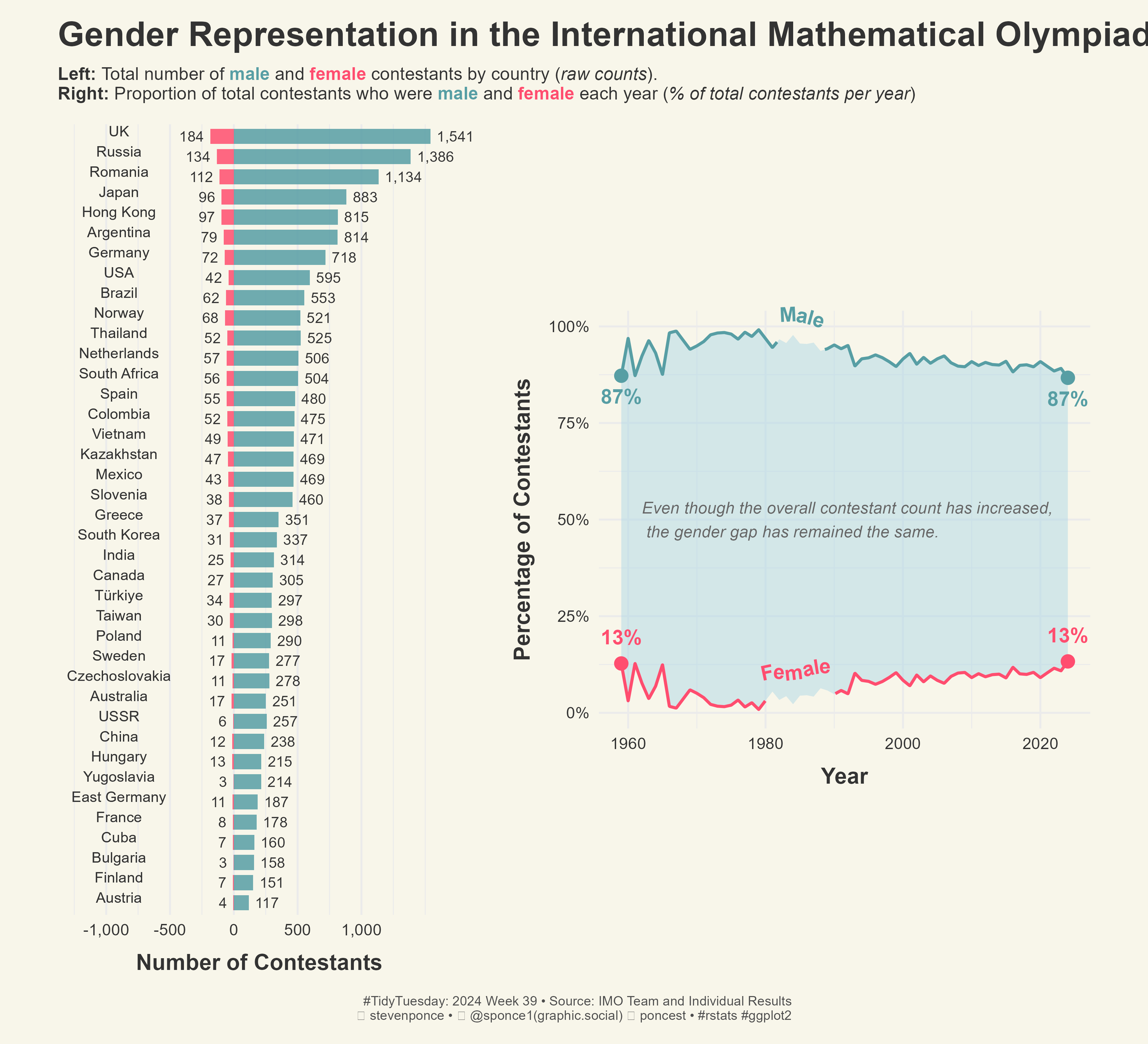
Figure 1: Gender Representation in the International Mathematical Olympiad. On the left, a bar chart shows the total number of male and female contestants by country (raw counts), with the UK, Russia, and Romania having the highest totals. Male contestants dominate in nearly every country. On the right, a line chart shows the proportion of male and female contestants each year from 1959 to 2024, with males consistently comprising around 87% of contestants and females around 13%. Annotations highlight that despite an increase in overall contestants, the gender gap has remained the same.
Steps to Create this Graphic
1. Load Packages & Setup
Code
```{r}#| label: loadpacman::p_load( tidyverse, # Easily Install and Load the 'Tidyverse' ggtext, # Improved Text Rendering Support for 'ggplot2' showtext, # Using Fonts More Easily in R Graphs janitor, # Simple Tools for Examining and Cleaning Dirty Data skimr, # Compact and Flexible Summaries of Data scales, # Scale Functions for Visualization lubridate, # Make Dealing with Dates a Little Easier MetBrewer, # Color Palettes Inspired by Works at the Metropolitan Museum of Art MoMAColors, # Color Palettes Inspired by Artwork at the Museum of Modern Art in New York City glue, # Interpreted String Literals patchwork, # The Composer of Plots geomtextpath # Curved Text in 'ggplot2' ) # ### |- figure size ----camcorder::gg_record(dir = here::here("temp_plots"),device ="png",width =11,height =10,units ="in",dpi =320)### |- resolution ----showtext_opts(dpi =320, regular.wt =300, bold.wt =800)```
```{r}#| label: tidy# first plot data (pyramid style chart) ----# Calculate the total number of male and female contestants per countrygender_by_country_summary <- timeline |>group_by(country) |>summarize(male =sum(male_contestant, na.rm =TRUE),female =sum(female_contestant, na.rm =TRUE),total_contestants = male + female ) |>ungroup() |>arrange(desc(total_contestants))# Prepare the data for a pyramid chartgender_by_country <- gender_by_country_summary |>pivot_longer(cols =c(male, female),names_to ="gender",values_to ="count" ) |>mutate(count =ifelse(gender =="female", -count, count)) # Negative for female# Modify the country labels to shorten or reformat namesgender_by_country <- gender_by_country |>mutate(country =case_when( country =="United States of America"~"USA", country =="United Kingdom"~"UK", country =="People's Republic of China"~"China", country =="Union of Soviet Socialist Republics"~"USSR", country =="Republic of Korea"~"South Korea", country =="Russian Federation"~"Russia", country =="German Democratic Republic"~"East Germany",TRUE~ country # Keep all other country names as they are ) )# second plot (line chart) ----# Data prep: Normalize by total contestants and calculate the gapgender_representation_normalized <- timeline |>filter(!is.na(female_contestant) &!is.na(male_contestant)) |>mutate(total_contestants = female_contestant + male_contestant,female_percentage = (female_contestant / total_contestants) *100,male_percentage = (male_contestant / total_contestants) *100 ) |>select(year, female_percentage, male_percentage)# Pivot longergender_representation_normalized_long <- gender_representation_normalized |>pivot_longer(cols =c(female_percentage, male_percentage), names_to ="gender", values_to ="percentage" ) |>mutate(gender =ifelse(gender =="female_percentage", "Female", "Male"))# Split the data into two separate datasets for ribbon usemale_data <- gender_representation_normalized_long |>filter(gender =="Male")female_data <- gender_representation_normalized_long |>filter(gender =="Female")```
5. Visualization Parameters
Code
```{r}#| label: params### |- plot aesthetics ----bkg_col <- colorspace::lighten('#f7f5e9', 0.05) title_col <-"gray20"subtitle_col <-"gray20"caption_col <-"gray30"text_col <-"gray20"col_palette <- MoMAColors::moma.colors(palette_name ='Klein', type ="discrete")[c(1,2)]### |- titles and caption ----# iconstt <-str_glue("#TidyTuesday: { 2024 } Week { 39 } • Source: IMO Team and Individual Results<br>")li <-str_glue("<span style='font-family:fa6-brands'></span>")gh <-str_glue("<span style='font-family:fa6-brands'></span>")mn <-str_glue("<span style='font-family:fa6-brands'></span>")# textmale <-str_glue("<span style='color:{ col_palette[2] }'>**male**</span>")female <-str_glue("<span style='color:{ col_palette[1] }'>**female**</span>")title_text <-str_glue("Gender Representation in the International Mathematical Olympiad")subtitle_text <-str_glue("__Left:__ Total number of { male } and { female } contestants by country (_raw counts_).<br> __Right:__ Proportion of total contestants who were { male } and { female } each year (_% of total contestants per year_)")caption_text <-str_glue("{tt} {li} stevenponce • {mn} @sponce1(graphic.social) {gh} poncest • #rstats #ggplot2")### |- fonts ----font_add("fa6-brands", "fonts/6.4.2/Font Awesome 6 Brands-Regular-400.otf")font_add_google("Oswald", regular.wt =400, family ="title")font_add_google("Merriweather Sans", regular.wt =400, family ="subtitle")font_add_google("Merriweather Sans", regular.wt =400, family ="text")font_add_google("Noto Sans", regular.wt =400, family ="caption")showtext_auto(enable =TRUE)### |- plot theme ----theme_set(theme_minimal(base_size =14, base_family ="text")) theme_update(plot.title.position ="plot",plot.caption.position ="plot",legend.position ='plot',plot.background =element_rect(fill = bkg_col, color = bkg_col),panel.background =element_rect(fill = bkg_col, color = bkg_col),plot.margin =margin(t =10, r =20, b =10, l =20),axis.title.x =element_text(margin =margin(10, 0, 0, 0), size =rel(1.1), color = text_col, family ="text", face ="bold", hjust =0.5),axis.title.y =element_text(margin =margin(0, 10, 0, 0), size =rel(1.1), color = text_col, family ="text", face ="bold", hjust =0.5),axis.text =element_text(size =rel(0.8), color = text_col, family ="text"),) ```
6. Plot
Code
```{r}#| label: plot### |- first plot ---- # Pyramid style chartp1 <-ggplot(gender_by_country, aes(x =reorder(country, total_contestants), y = count, fill = gender)) +geom_bar(stat ="identity", width =0.75, alpha =0.85) +# Geoms# Adding labels outside the barsgeom_text(aes(label =comma(abs(count))),position =position_nudge(y =ifelse(gender_by_country$gender =="female", -50, 50)),size =3.6, hjust =ifelse(gender_by_country$gender =="female", 1, 0), color = text_col ) +# Adding a single country label next to the barsgeom_text(aes(y =-900, label = country), # Position countries next to the barssize =3.6, hjust =0.5, vjust =0, color = text_col ) +# Scalesscale_y_continuous(breaks =seq(-1000, 1000, by =500),labels = scales::comma_format(),limits =c(-1200, 1600) ) +scale_fill_manual(values = col_palette) +coord_flip(clip ="off") +# labslabs(x =NULL,y ="Number of Contestants",fill ="Gender" ) +# Themetheme(axis.text.y =element_blank(),axis.title.y =element_blank(),axis.ticks.y =element_blank(),panel.grid.major.y =element_blank(), )### |- second plot ---- # Create the plot, including the ribbon and the textlinesp2 <-ggplot() +# Geoms# Add ribbon to fill the area between male and female percentagesgeom_ribbon(aes(x = male_data$year, ymin = female_data$percentage, ymax = male_data$percentage),fill ="lightblue", alpha =0.5 ) +# Add the geom_textline for male and female percentagesgeom_textline(aes(x = year, y = percentage, color = gender, label = gender),data = gender_representation_normalized_long,linewidth =1,family ="text",size =5,fontface ="bold",hjust =0.5, # move labels to the rightoffset =unit(0.3, "cm"), # move labels uptext_smoothing =30# smooth text (more legible) ) +# Adding geom_point and geom_text for the start and end percentages for male and femalegeom_point(data =filter(gender_representation_normalized_long, year ==min(year) | year ==max(year)),aes(x = year, y = percentage, color = gender), size =4 ) +# Femalegeom_text(data =filter( gender_representation_normalized_long, (year ==min(year) | year ==max(year)) & gender =="Female" ),aes(x = year, y = percentage, label = scales::percent(percentage /100, accuracy =1),color = gender ), size =5, nudge_x =-0.005, vjust =-1.3, fontface ="bold", family ="text" ) +# Malegeom_text(data =filter( gender_representation_normalized_long, (year ==min(year) | year ==max(year)) & gender =="Male" ),aes(x = year, y = percentage, label = scales::percent(percentage /100, accuracy =1),color = gender ), size =5, nudge_x =0.005, vjust =1.9, fontface ="bold", family ="text" ) +# Labslabs(x ="Year",y ="Percentage of Contestants",color ="Gender" ) +# Scalesscale_x_continuous() +scale_y_continuous(labels = scales::label_percent(scale =1)) +scale_color_manual(values = col_palette) +coord_cartesian(clip ="off")#### |- combined plot ---- # Annotation and aspect ratio of p2p2 <- p2 +annotate("text", x =1962, y =50, label ="Even though the overall contestant count has increased,\n the gender gap has remained the same.", size =4, fontface ="italic", family ="text", color ='gray40',hjust =0 ) +theme(aspect.ratio =0.85) # Combine plotscombined_plot <- (p1 | p2) + patchwork::plot_layout(ncol =2, widths =c(1, 1.25), # Adjusting relative widthsguides ='collect'# Collect legends ) +# Labsplot_annotation(title = title_text,subtitle = subtitle_text,caption = caption_text ) &# Theme theme(plot.margin =margin(10, 20, 10, 20), plot.title =element_markdown(size =rel(1.7), family ="title",face ="bold",color = title_col,lineheight =1.1,margin =margin(t =5, b =5) ),plot.subtitle =element_markdown(size =rel(0.88), family ='subtitle',color = subtitle_col,lineheight =1.1, margin =margin(t =5, b =5) ),plot.caption =element_markdown(size =rel(0.65),family ="caption",color = caption_col,lineheight =1.1,hjust =0.5,halign =1,margin =margin(t =5, b =5) ) )# Show the combined plotcombined_plot ```
7. Save
Code
```{r}#| label: save### |- plot image ---- library(ggplotify)# Convert patchwork plot to grob # There was some issues between patchwork and ggsaveplot_grob <-as.grob(combined_plot)# Save the plot againggsave(filename = here::here("data_visualizations/TidyTuesday/2024/tt_2024_39.png"),plot = plot_grob,width =11,height =10,units ="in",dpi =320)### |- plot thumbnail---- magick::image_read(here::here("data_visualizations/TidyTuesday/2024/tt_2024_39.png")) |> magick::image_resize(geometry ="400") |> magick::image_write(here::here("data_visualizations/TidyTuesday/2024/thumbnails/tt_2024_39.png"))```
8. Session Info
Code
```{r, eval=TRUE}info <-capture.output(sessioninfo::session_info())# Remove lines that contain "[1]" and "[2]" (the file paths)filtered_info <-grep("\\[1\\]|\\[2\\]", info, value =TRUE, invert =TRUE)cat(filtered_info, sep ="\n")```
─ Session info ───────────────────────────────────────────────────────────────
 setting  value
 version  R version 4.4.1 (2024-06-14 ucrt)
 os       Windows 11 x64 (build 22631)
 system   x86_64, mingw32
 ui       RTerm
 language (EN)
 collate  English_United States.utf8
 ctype    English_United States.utf8
 tz       America/New_York
 date     2025-05-22
 pandoc   3.4 @ C:/Program Files/RStudio/resources/app/bin/quarto/bin/tools/ (via rmarkdown)

─ Packages ───────────────────────────────────────────────────────────────────
 ! package     * version date (UTC) lib source
 P digest        0.6.37  2024-08-19 [?] RSPM (R 4.4.0)
 P evaluate      1.0.1   2024-10-10 [?] RSPM (R 4.4.0)
 P fastmap       1.2.0   2024-05-15 [?] RSPM (R 4.4.0)
 P htmltools     0.5.8.1 2024-04-04 [?] RSPM (R 4.4.0)
 P htmlwidgets   1.6.4   2023-12-06 [?] CRAN (R 4.4.0)
 P jsonlite      1.8.9   2024-09-20 [?] RSPM (R 4.4.0)
 P knitr         1.49    2024-11-08 [?] RSPM (R 4.4.0)
 P rmarkdown     2.29    2024-11-04 [?] RSPM (R 4.4.0)
 P rstudioapi    0.17.1  2024-10-22 [?] RSPM (R 4.4.0)
 P sessioninfo   1.2.2   2021-12-06 [?] RSPM (R 4.4.0)
 P xfun          0.49    2024-10-31 [?] RSPM (R 4.4.0)
 P yaml          2.3.10  2024-07-26 [?] RSPM (R 4.4.0)


 P ── Loaded and on-disk path mismatch.

──────────────────────────────────────────────────────────────────────────────