---
title: "Africa's Indigenous Language Families Span the Continentr"
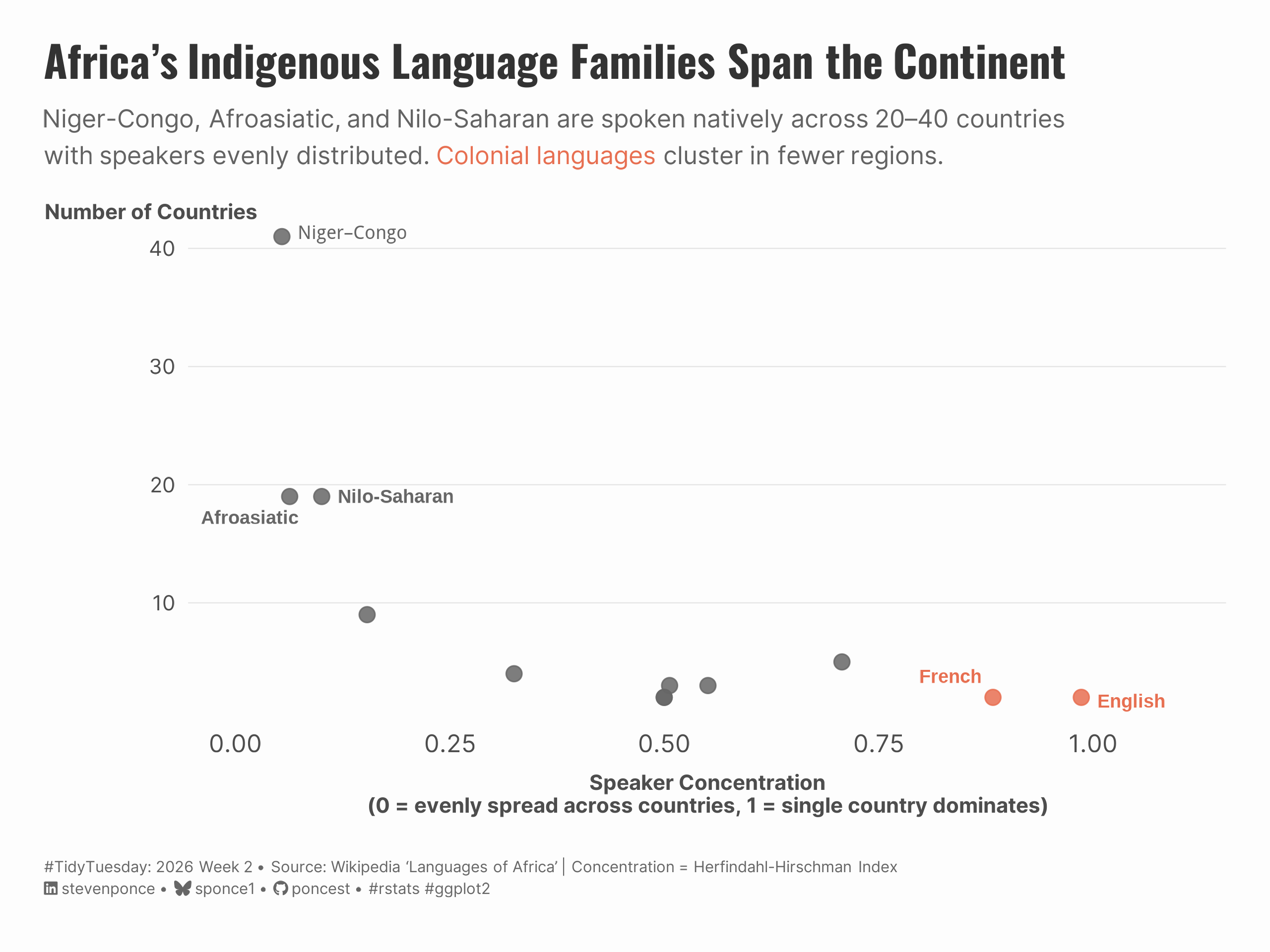
subtitle: "Niger-Congo, Afroasiatic, and Nilo-Saharan are spoken natively across 20–40 countries with speakers evenly distributed. Colonial languages cluster in fewer regions."
description: "A scatter plot exploring the geographic spread of African language families. Using the Herfindahl-Hirschman Index to measure speaker concentration, this visualization reveals that indigenous families like Niger-Congo span 40+ countries with evenly distributed speakers, while colonial languages (English, French) cluster in specific regions."
date: "2026-01-11"
author:
- name: "Steven Ponce"
url: "https://stevenponce.netlify.app"
citation:
url: "https://stevenponce.netlify.app/data_visualizations/TidyTuesday/2026/tt_2026_02.html"
categories: ["TidyTuesday", "2026"]
tags: [
"African Languages",
"Language Families",
"Linguistics",
"Geographic Concentration",
"Herfindahl-Hirschman Index",
"Scatter Plot",
"ggplot2",
"ggrepel",
"Wikipedia Data",
"Indigenous Languages",
"Colonial Languages"
]
image: "thumbnails/tt_2026_02.png"
format:
html:
toc: true
toc-depth: 5
code-link: true
code-fold: true
code-tools: true
code-summary: "Show code"
editor_options:
chunk_output_type: inline
execute:
freeze: true
cache: true
error: false
message: false
warning: false
eval: true
---
{#fig-1}
### <mark> **Steps to Create this Graphic** </mark>
#### 1. Load Packages & Setup
```{r}
#| label: load
#| warning: false
#| message: false
#| results: "hide"

## 1. LOAD PACKAGES & SETUP ----
suppressPackageStartupMessages({
if (!require("pacman")) install.packages("pacman")
pacman::p_load(
    tidyverse,     # Easily Install and Load the 'Tidyverse'
    ggtext,        # Improved Text Rendering Support for 'ggplot2'
    showtext,      # Using Fonts More Easily in R Graphs
    ggrepel,       # Non-overlapping Text Labels
    janitor,       # Simple Tools for Examining and Cleaning Dirty Data
    scales,        # Scale Functions for Visualization
    glue           # Interpreted String Literals
)
})

### |- figure size ----
camcorder::gg_record(
  dir    = here::here("temp_plots"),
  device = "png",
  width  = 8,
  height = 6,
  units  = "in",
  dpi    = 320
)

# Source utility functions
suppressMessages(source(here::here("R/utils/fonts.R")))
source(here::here("R/utils/social_icons.R"))
source(here::here("R/utils/image_utils.R"))
source(here::here("R/themes/base_theme.R"))
```
#### 2. Read in the Data
```{r}
#| label: read
#| include: true
#| eval: true
#| warning: false

tt <- tidytuesdayR::tt_load(2026, week = 02)

africa_raw <- tt$africa |> clean_names()

tidytuesdayR::readme(tt)
rm(tt)
```
#### 3. Examine the Data
```{r}
#| label: examine
#| include: true
#| eval: true
#| results: 'hide'
#| warning: false

glimpse(africa_raw)
```
#### 4. Tidy Data
```{r}
#| label: tidy-fixed
#| warning: false

#' Note:
#' HHI (Herfindahl-Hirschman Index) measures market concentration - originally used
#' in economics to see if one company dominates a market. We're adapting it to see
#' if one country dominates a language family's speaker base.
#'

### |-  calculate HHI concentration + country coverage ----
family_summary <- africa_raw |>
    filter(!is.na(native_speakers), native_speakers > 0) |>
    group_by(family, country) |>
    summarise(
        speakers = sum(native_speakers),
        .groups = "drop"
        ) |>
    group_by(family) |>
    mutate(
        total = sum(speakers),
        share = speakers / total
    ) |>
    summarise(
        hhi_concentration = sum(share^2),
        n_countries = n_distinct(country),
        .groups = "drop"
    ) |>
    filter(n_countries > 1) |>
    group_by(family) |>
    slice_max(n_countries, n = 1) |>
    ungroup() |>
    mutate(
        family_group = if_else(family %in% c("English", "French"),
                               "Colonial",
                               "Indigenous")
    )

### |-  labels for key points ----
label_df <- family_summary |>
    filter(
        str_detect(family, regex("^English$|^French$|Niger|Afroasiatic|Nilo", ignore_case = TRUE))
    )
```
#### 5. Visualization Parameters
```{r}
#| label: params
#| include: true
#| warning: false

### |-  plot aesthetics ----
colors <- get_theme_colors(
  palette = c(
      "Colonial"   = "#E76F51",
      "Indigenous" = "gray40"
  )
)

### |- titles and caption ----
title_text <- str_glue("Africa's Indigenous Language Families Span the Continent")

subtitle_text <- str_glue(
    "Niger-Congo, Afroasiatic, and Nilo-Saharan are spoken natively across 20–40 countries<br>with speakers evenly distributed. ",
    "<b style='color:#E76F51'>Colonial languages</b> cluster in fewer regions.",
)

caption_text <- create_social_caption(
    tt_year = 2026,
    tt_week = 02,
    source_text = "Wikipedia 'Languages of Africa' | Concentration = Herfindahl-Hirschman Index"
)

### |-  fonts ----
setup_fonts()
fonts <- get_font_families()

### |-  plot theme ----
# Start with base theme
base_theme <- create_base_theme(colors)

# Add weekly-specific theme elements
weekly_theme <- extend_weekly_theme(
  base_theme,
  theme(
    # Text styling
    plot.title = element_text(
      face = "bold", family = fonts$title, size = rel(1.4),
      color = colors$title, margin = margin(b = 10), hjust = 0
    ),
    plot.subtitle = element_markdown(
      face = "italic", family = fonts$subtitle, lineheight = 1.2,
      color = colors$subtitle, size = rel(0.9), margin = margin(b = 20), hjust = 0
    ),

    # Grid
    panel.grid.minor = element_blank(),
    panel.grid.major.x = element_blank(),
    panel.grid.major = element_line(color = "gray90", linewidth = 0.25),

    # Axes
    axis.title.x = element_text(size = 9.5, color = "gray30", margin = margin(t = 8)),
    axis.title.y = element_text(size = 9.5, color = "gray30", margin = margin(r = 8)),
    # axis.title = element_text(size = rel(0.8), color = "gray30"),
    axis.text = element_text(color = "gray30"),
    axis.text.y = element_text(size = rel(0.85)),
    axis.ticks = element_blank(),

    # Facets
    strip.background = element_rect(fill = "gray95", color = NA),
    strip.text = element_text(
      face = "bold",
      color = "gray20",
      size = rel(0.9),
      margin = margin(t = 6, b = 4)
    ),
    panel.spacing = unit(1.5, "lines"),

    # Legend elements
    legend.position = "plot",
    legend.title = element_text(
      family = fonts$subtitle,
      color = colors$text, size = rel(0.8), face = "bold"
    ),
    legend.text = element_text(
      family = fonts$tsubtitle,
      color = colors$text, size = rel(0.7)
    ),
    legend.margin = margin(t = 15),

    # Plot margin
    plot.margin = margin(20, 20, 20, 20),

  )
)

# Set theme
theme_set(weekly_theme)
```
#### 6. Plot
```{r}
#| label: plot
#| warning: false

### |- Plot ----
p <- ggplot(family_summary, aes(x = hhi_concentration, y = n_countries)) +
    # Geoms
    geom_point(
        aes(color = family_group),
        size = 3,
        alpha = 0.85
    ) +
    geom_text_repel(
        data = label_df,
        aes(label = family, color = family_group),
        size = 3.0,
        fontface = "bold",
        box.padding = 0.4,
        point.padding = 0.3,
        segment.color = "gray70",
        segment.size = 0.3,
        max.overlaps = Inf,
        seed = 123
    ) +
    # Scales
    scale_color_manual(
        values = colors$palette,
        guide = "none"
    ) +
    scale_x_continuous(
        limits = c(0, 1.1),
        breaks = c(0, 0.25, 0.5, 0.75, 1)
    ) +
    scale_y_continuous(
        breaks = seq(0, 45, by = 10)
    ) +
    # Labs
    labs(
        title = title_text,
        subtitle = subtitle_text,
        caption = caption_text,
        x = "Speaker Concentration\n(0 = evenly spread across countries, 1 = single country dominates)",
        y = "Number of Countries"
    ) +
    # Theme
    theme(
        axis.title.y = element_text(
            angle = 0,           # Makes it horizontal
            vjust = 1.02,        # Pushes it to the top of the axis
            hjust = 0.5,
            margin = margin(r = -50) # Adjusts distance from the axis
        ),
    plot.title = element_markdown(
        size = rel(1.4),
        family = fonts$title,
        face = "bold",
        color = colors$title,
        lineheight = 1.15,
        margin = margin(t = 0, b = 5)
    ),
    plot.subtitle = element_markdown(
        size = rel(0.8),
        family = fonts$subtitle,
        color = alpha(colors$subtitle, 0.88),
        lineheight = 1.5,
        margin = margin(t = 5, b = 20)
    ),
    plot.caption = element_markdown(
        size = rel(0.5),
        family = fonts$subtitle,
        color = colors$caption,
        hjust = 0,
        lineheight = 1.4,
        margin = margin(t = 20, b = 5)
    )
)
```
#### 7. Save
```{r}
#| label: save
#| warning: false

### |-  plot image ----
save_plot(
  plot = p,
  type = "tidytuesday",
  year = 2026,
  week = 02,
  width  = 8,
  height = 6,
  )
```
#### 8. Session Info
::: {.callout-tip collapse="true"}
##### Expand for Session Info
```{r, echo = FALSE}
#| eval: true
#| warning: false
sessionInfo()
```
:::
#### 9. GitHub Repository
::: {.callout-tip collapse="true"}
##### Expand for GitHub Repo
The complete code for this analysis is available in [`tt_2026_02.qmd`](https://github.com/poncest/personal-website/blob/master/data_visualizations/TidyTuesday/2025/tt_2026_02.qmd).
For the full repository, [click here](https://github.com/poncest/personal-website/).
:::
#### 10. References
::: {.callout-tip collapse="true"}
##### Expand for References
1. **Data Source:**
- TidyTuesday 2026 Week 02: [The Languages of Africa](https://github.com/rfordatascience/tidytuesday/blob/main/data/2026/2026-01-13/readme.md)
:::
#### 11. Custom Functions Documentation
::: {.callout-note collapse="true"}
##### 📦 Custom Helper Functions
This analysis uses custom functions from my personal module library for efficiency and consistency across projects.
**Functions Used:**
- **`fonts.R`**: `setup_fonts()`, `get_font_families()` - Font management with showtext
- **`social_icons.R`**: `create_social_caption()` - Generates formatted social media captions
- **`image_utils.R`**: `save_plot()` - Consistent plot saving with naming conventions
- **`base_theme.R`**: `create_base_theme()`, `extend_weekly_theme()`, `get_theme_colors()` - Custom ggplot2 themes
**Why custom functions?**\
These utilities standardize theming, fonts, and output across all my data visualizations. The core analysis (data tidying and visualization logic) uses only standard tidyverse packages.
**Source Code:**\
View all custom functions → [GitHub: R/utils](https://github.com/poncest/personal-website/tree/master/R)
:::
