• Steven Ponce
  • About
  • Data Visualizations
  • Behind the Viz
  • Projects
  • Resume
  • Email

On this page

  • Steps to Create this Graphic
    • 1. Load Packages & Setup
    • 2. Read in the Data
    • 3. Examine the Data
    • 4. Tidy Data
    • 5. Visualization Parameters
    • 6. Plot
  • 7. Save
    • 8. Session Info
    • 9. GitHub Repository
    • 10. References
    • 11. Custom Functions Documentation

The High End of Estimated Urban Green Area Came Down

  • Show All Code
  • Hide All Code

  • View Source

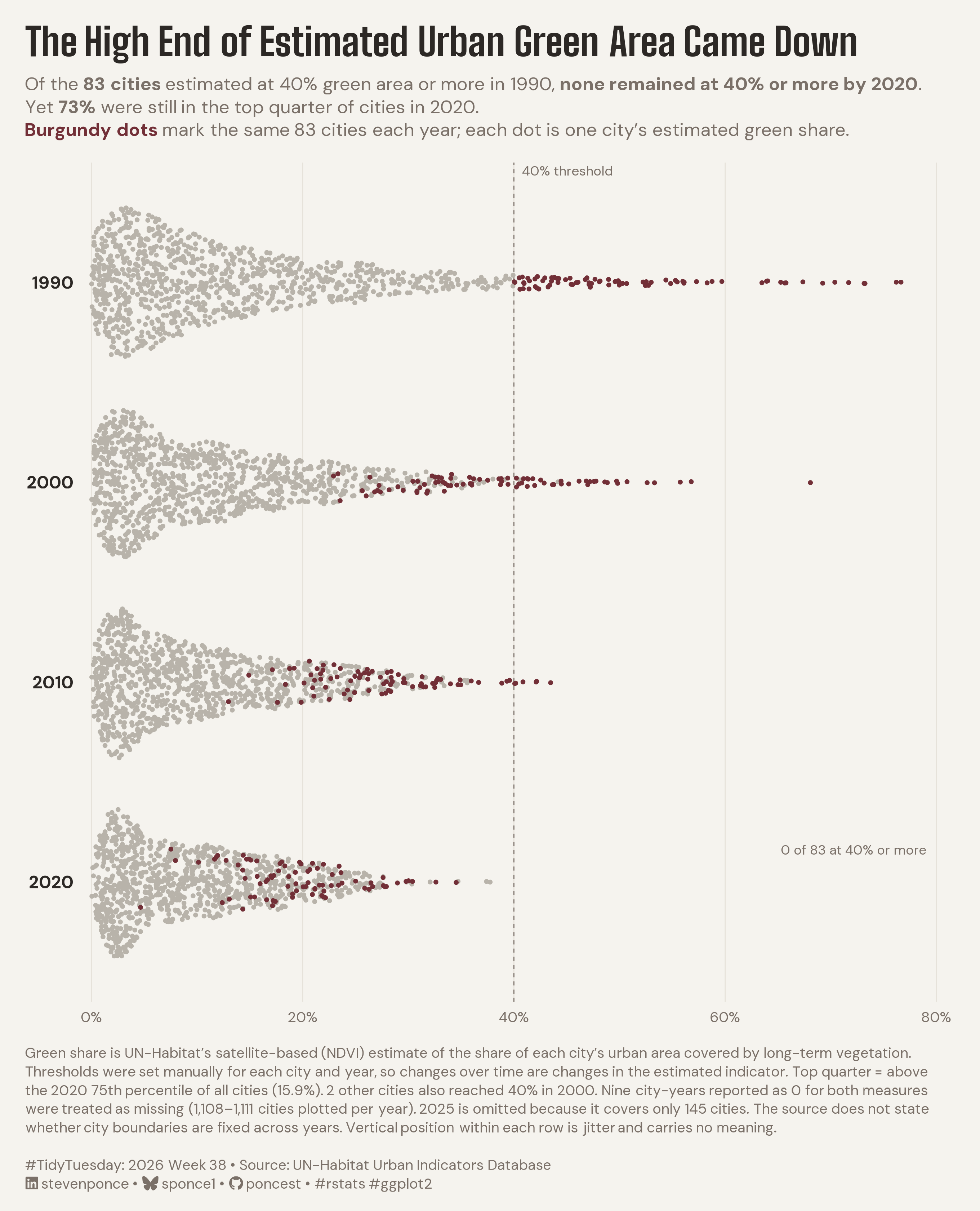
Of the 83 cities estimated at 40% green area or more in 1990, none remained at 40% or more by 2020. Yet 73% were still in the top quarter of cities in 2020.

TidyTuesday
Data Visualization
R Programming
2026
A beeswarm of UN-Habitat green-area estimates shows that none of the 83 cities at 40% or more in 1990 remained at that level in 2020, yet 73% stayed in the top quarter. The same cities are tracked through 2020; top quarter means above the 2020 75th percentile. Built in R with ggplot2 and ggbeeswarm.
Author

Steven Ponce

Published

September 21, 2026

Figure 1: Beeswarm chart titled The High End of Estimated Urban Green Area Came Down. Four stacked strips for 1990, 2000, 2010, and 2020 place about 1,110 cities by estimated green area share on a 0 to 80% axis, with a dashed line at 40%. None of the 83 cities estimated at 40% or more in 1990, drawn in burgundy in every strip, were still at 40% or more in 2020, yet 73% stayed in the top quarter of cities. The 83 ran from 40% to 77% in 1990, 23% to 68% in 2000, 13% to 44% in 2010, and about 5% to 35% in 2020. Most cities sit below about 20% each year, and the maximum fell from about 77% to 38%. Data: UN-Habitat Urban Indicators Database.

Steps to Create this Graphic

1. Load Packages & Setup

Show code
```{r}
#| label: load
#| warning: false
#| message: false      
#| results: "hide"     

## 1. LOAD PACKAGES & SETUP ----
suppressPackageStartupMessages({
if (!require("pacman")) install.packages("pacman")
pacman::p_load(
    tidyverse, ggtext, showtext, janitor, ggrepel,      
    scales, glue, skimr, ggview, ggbeeswarm
    )
})

# Source utility functions
suppressMessages(source(here::here("R/utils/fonts.R")))
source(here::here("R/utils/social_icons.R"))
source(here::here("R/utils/image_utils.R"))
source(here::here("R/themes/base_theme.R"))
```

2. Read in the Data

Show code
```{r}
#| label: read
#| include: true
#| eval: true
#| warning: false

### |- figure settings ----
plot_years <- c(1990, 2000, 2010, 2020)
fig_w      <- 8.5
fig_h      <- 10.5

## 2. READ IN THE DATA ----
tt <- tidytuesdayR::tt_load(2026, week = 38)
urban <- tt$urban
rm(tt)
```

3. Examine the Data

Show code
```{r}
#| label: examine
#| include: true
#| eval: true
#| results: 'hide'
#| warning: false

## 3. EXAMINING THE DATA ----
glimpse(urban)
skim_without_charts(urban)
```

4. Tidy Data

Show code
```{r}
#| label: tidy
#| warning: false

### |- identified cities, epochs 1990-2020 ----
d <- urban |>
  filter(!is.na(cityCode), year %in% plot_years) |>
  transmute(
    city_code = cityCode,
    year,
    share = averageShareOfGreenAreaInCityUrbanAreaPct,
    pc = greenAreaPerCapitaM2
  ) |>
  mutate(
    zero_flag = share == 0 & pc == 0 & !is.na(share),
    share     = if_else(zero_flag, NA_real_, share)
  )

### |- cohort: cities estimated at 40% or more in 1990, fixed for every epoch ----
cohort_ids <- d |>
  filter(year == 1990, share >= 40) |>
  pull(city_code)

d <- d |> mutate(cohort = city_code %in% cohort_ids)

### |- facts used in the copy: computed first, then guarded ----
n_cohort <- length(cohort_ids)

# "top quarter" = strictly above the 75th percentile of ALL cities' 2020 estimates
p75_2020 <- quantile(d$share[d$year == 2020], 0.75, na.rm = TRUE, names = FALSE)
n_top_quarter <- d |>
  filter(year == 2020, cohort, share > p75_2020) |>
  nrow()
pct_top_quarter <- round(100 * n_top_quarter / n_cohort)

# Two different counts, kept apart on purpose:
#   cohort_ge40 = how many of the SAME 83 cities are at 40%+ in each year (chart label)
#   all_ge40    = how many cities of ANY origin are at 40%+ in each year (caption note)
cohort_ge40 <- d |>
  filter(cohort) |>
  summarise(n = sum(share >= 40, na.rm = TRUE), .by = year) |>
  arrange(year)

all_ge40 <- d |>
  summarise(n = sum(share >= 40, na.rm = TRUE), .by = year) |>
  arrange(year)

n_extra_2000 <- all_ge40$n[all_ge40$year == 2000] - cohort_ge40$n[cohort_ge40$year == 2000]

# Cities plotted per year (after the nine zero city-years become NA)
n_plotted <- d |>
  summarise(n = sum(!is.na(share)), .by = year) |>
  arrange(year)

# Cities with a 2025 share (the partial update that is excluded from the plot)
n_2025 <- urban |>
  filter(year == 2025, !is.na(cityCode), !is.na(averageShareOfGreenAreaInCityUrbanAreaPct)) |>
  nrow()

### |- plotting data ----
strips <- d |>
  filter(!is.na(share)) |>
  mutate(year_f = factor(year, levels = rev(plot_years))) |>
  arrange(cohort)

# The single annotation the cohort count in 2020 only
count_label <- tibble(
  year_f = factor(2020, levels = rev(plot_years)),
  label = str_c(
    cohort_ge40$n[cohort_ge40$year == 2020], " of ", n_cohort,
    " at 40% or more"
  )
)
```

5. Visualization Parameters

Show code
```{r}
#| label: params
#| include: true
#| warning: false

### |- plot aesthetics ----
clrs <- get_theme_colors(
    palette = c("highlight" = "#722F37", "secondary" = "#B8B3AA")
)

### |- titles and caption ----
title_text <- "The High End of Estimated Urban Green Area Came Down"

subtitle_text <- str_glue(
    "Of the **{n_cohort} cities** estimated at 40% green area or more in 1990, ",
    "**none remained at 40% or more by 2020**. ",
    "Yet **{pct_top_quarter}%** were still in the top quarter of cities in 2020.<br>",
    "<span style='color:#722F37'>**Burgundy dots**</span> mark the same {n_cohort} ",
    "cities each year; each dot is one city's estimated green share."
)

method_note <- str_glue(
    "Green share is UN-Habitat's satellite-based (NDVI) estimate of the share of each ",
    "city's urban area covered by long-term vegetation. Thresholds were set manually for ",
    "each city and year, so changes over time are changes in the estimated indicator. ",
    "Top quarter = above the 2020 75th percentile of all cities ",
    "({number(p75_2020, accuracy = 0.1)}%). {n_extra_2000} other cities also reached 40% ",
    "in 2000. Nine city-years reported as 0 for both measures were treated as missing ",
    "({comma(min(n_plotted$n))}\u2013{comma(max(n_plotted$n))} cities plotted per year). ",
    "2025 is omitted because it covers only {n_2025} cities. The source does not state ",
    "whether city boundaries are fixed across years. Vertical position within each row ",
    "is jitter and carries no meaning."
)

social_caption <- create_social_caption(
    tt_year = 2026,
    tt_week = 38,
    source_text = "UN-Habitat Urban Indicators Database"
)

caption_text <- paste0(method_note, "<br><br>", social_caption)

### |- fonts ----
setup_fonts()
fonts <- get_font_families()

### |- plot theme ----
base_theme <- create_base_theme(clrs)

weekly_theme <- extend_weekly_theme(
  base_theme,
  theme(
    plot.background = element_rect(fill = "#F5F3EE", color = NA),
    panel.background = element_rect(fill = "#F5F3EE", color = NA),
    plot.title.position = "plot",
    plot.caption.position = "plot",
    plot.title = element_textbox_simple(
      family = fonts$title_1, face = "bold", size = 24, color = "#2C2825",
      width = unit(1, "npc"), margin = margin(b = 8)
    ),
    plot.subtitle = element_textbox_simple(
      family = fonts$text, size = 11.5, color = "#7A7068", lineheight = 1.25,
      width = unit(1, "npc"), margin = margin(b = 14)
    ),
    # 9 pt, not 8: same string, only size varied, gave visibly cleaner word spacing
    plot.caption = element_textbox_simple(
      family = fonts$text, size = 9, color = "#7A7068", lineheight = 1.3,
      width = unit(1, "npc"), margin = margin(t = 14)
    ),
    panel.grid.major.x = element_line(color = "#E6E2DA", linewidth = 0.3),
    panel.grid.major.y = element_blank(),
    panel.grid.minor = element_blank(),
    axis.ticks = element_blank(),
    axis.text.x = element_text(family = fonts$text, size = 9, color = "#7A7068"),
    axis.text.y = element_text(
      family = fonts$text, size = 11, face = "bold",
      color = "#2C2825"
    ),
    legend.position = "none",
    plot.margin = margin(16, 22, 12, 16)
  )
)

theme_set(weekly_theme)
```

6. Plot

Show code
```{r}
#| label: plot
#| warning: false

### |-  plot ----
p <- ggplot(strips, aes(x = share, y = year_f, color = cohort)) +
    geom_vline(xintercept = 40, linetype = "dashed", linewidth = 0.3, color = "#7A7068") +
    geom_quasirandom(method = "pseudorandom", groupOnX = FALSE, width = 0.38, size = 0.6) +
    geom_text(
        data = count_label,
        aes(x = 79, y = year_f, label = label),
        inherit.aes = FALSE, hjust = 1, nudge_y = 0.16, size = 2.9,
        color = "#7A7068", family = fonts$text
    ) +
    annotate(
        "text", x = 40.8, y = Inf, label = "40% threshold",
        hjust = 0, vjust = 1.4, size = 2.9, color = "#7A7068", family = fonts$text
    ) +
    scale_color_manual(values = c(`FALSE` = "#B8B3AA", `TRUE` = "#722F37"), guide = "none") +
    scale_x_continuous(
        limits = c(0, 80), breaks = seq(0, 80, 20),
        labels = label_number(suffix = "%"),
        expand = expansion(mult = c(0.01, 0.01))
    ) +
    scale_y_discrete(expand = expansion(add = 0.6)) +
    labs(title = title_text, subtitle = subtitle_text, caption = caption_text,
         x = NULL, y = NULL)
```

7. Save

Show code
```{r}
#| label: save
#| warning: false

### |- save ----
main_path  <- here::here("data_visualizations", "TidyTuesday", "2026", "tt_2026_38.png")
thumb_path <- here::here("data_visualizations", "TidyTuesday", "2026", "thumbnails", "tt_2026_38.png")

# Full-size version, for the QMD figure
set.seed(38)
ggview::save_ggplot(
    plot   = p,
    file   = main_path,
    width  = fig_w,
    height = fig_h,
    units  = "in",
    dpi    = 320
)

# Reduced-size thumbnail, for the YAML `image:` field
fs::dir_create(dirname(thumb_path))
magick::image_read(main_path) |>
  magick::image_resize("400") |>
  magick::image_write(thumb_path)
```

8. Session Info

TipExpand for Session Info
R version 4.6.1 (2026-06-24)
Platform: aarch64-apple-darwin23
Running under: macOS Tahoe 26.6.2

Matrix products: default
BLAS:   /Library/Frameworks/R.framework/Versions/4.6/Resources/lib/libRblas.0.dylib 
LAPACK: /Library/Frameworks/R.framework/Versions/4.6/Resources/lib/libRlapack.dylib;  LAPACK version 3.12.1

locale:
[1] en_US.UTF-8/en_US.UTF-8/en_US.UTF-8/C/en_US.UTF-8/en_US.UTF-8

time zone: America/New_York
tzcode source: internal

attached base packages:
[1] stats     graphics  grDevices utils     datasets  methods   base     

other attached packages:
 [1] here_1.0.2       ggbeeswarm_0.7.3 ggview_0.2.2     skimr_2.2.2     
 [5] glue_1.8.1       scales_1.4.0     ggrepel_0.9.8    janitor_2.2.1   
 [9] showtext_0.9-8   showtextdb_3.0   sysfonts_0.8.9   ggtext_0.2.0    
[13] lubridate_1.9.5  forcats_1.0.1    stringr_1.6.0    dplyr_1.2.1     
[17] purrr_1.2.2      readr_2.2.0      tidyr_1.3.2      tibble_3.3.1    
[21] ggplot2_4.0.3    tidyverse_2.0.0  pacman_0.5.1    

loaded via a namespace (and not attached):
 [1] gtable_0.3.6       beeswarm_0.4.0     xfun_0.60          httr2_1.3.0       
 [5] htmlwidgets_1.6.4  gh_1.6.1           tzdb_0.5.0         vctrs_0.7.3       
 [9] tools_4.6.1        generics_0.1.4     parallel_4.6.1     curl_7.1.0        
[13] pkgconfig_2.0.3    RColorBrewer_1.1-3 S7_0.2.2           lifecycle_1.0.5   
[17] compiler_4.6.1     farver_2.1.2       textshaping_1.0.5  repr_1.1.7        
[21] codetools_0.2-20   snakecase_0.11.1   litedown_0.10      vipor_0.4.7       
[25] htmltools_0.5.9    yaml_2.3.12        crayon_1.5.3       pillar_1.11.1     
[29] magick_2.9.1       commonmark_2.0.0   tidyselect_1.2.1   digest_0.6.39     
[33] stringi_1.8.7      rprojroot_2.1.1    fastmap_1.2.0      grid_4.6.1        
[37] cli_3.6.6          magrittr_2.0.5     base64enc_0.1-6    withr_3.0.3       
[41] bit64_4.8.2        timechange_0.4.0   rmarkdown_2.31     tidytuesdayR_1.3.2
[45] gitcreds_0.1.2     bit_4.6.0          otel_0.2.0         ragg_1.5.2        
[49] hms_1.1.4          evaluate_1.0.5     knitr_1.51         markdown_2.0      
[53] rlang_1.3.0        gridtext_0.1.6     Rcpp_1.1.2         xml2_1.6.0        
[57] vroom_1.7.1        rstudioapi_0.19.0  jsonlite_2.0.0     R6_2.6.1          
[61] fs_2.1.0           systemfonts_1.3.2 

9. GitHub Repository

TipExpand for GitHub Repo

The complete code for this analysis is available in tt_2026_38.qmd.

For the full repository, click here.

10. References

TipExpand for References
  1. Data Source:
    • TidyTuesday 2026 Week 38: Average share of green areas across cities (UN-Habitat Urban Indicators)

11. Custom Functions Documentation

Note📦 Custom Helper Functions

This analysis uses custom functions from my personal module library for efficiency and consistency across projects.

Functions Used:

  • fonts.R: setup_fonts(), get_font_families() - Font management with showtext
  • social_icons.R: create_social_caption() - Generates formatted social media captions
  • image_utils.R: save_plot() - Consistent plot saving with naming conventions
  • base_theme.R: create_base_theme(), extend_weekly_theme(), get_theme_colors() - Custom ggplot2 themes

Why custom functions?
These utilities standardize theming, fonts, and output across all my data visualizations. The core analysis (data tidying and visualization logic) uses only standard tidyverse packages.

Source Code:
View all custom functions → GitHub: R/utils

Back to top

Citation

BibTeX citation:
@online{ponce2026,
  author = {Ponce, Steven},
  title = {The {High} {End} of {Estimated} {Urban} {Green} {Area} {Came}
    {Down}},
  date = {2026-09-21},
  url = {https://stevenponce.netlify.app/data_visualizations/TidyTuesday/2026/tt_2026_38.html},
  langid = {en}
}
For attribution, please cite this work as:
Ponce, Steven. 2026. “The High End of Estimated Urban Green Area Came Down.” September 21. https://stevenponce.netlify.app/data_visualizations/TidyTuesday/2026/tt_2026_38.html.
Source Code
---
title: "The High End of Estimated Urban Green Area Came Down"
subtitle: "Of the 83 cities estimated at 40% green area or more in 1990, none remained at 40% or more by 2020. Yet 73% were still in the top quarter of cities in 2020."
description: "A beeswarm of UN-Habitat green-area estimates shows that none of the 83 cities at 40% or more in 1990 remained at that level in 2020, yet 73% stayed in the top quarter. The same cities are tracked through 2020; top quarter means above the 2020 75th percentile. Built in R with ggplot2 and ggbeeswarm."
date: "2026-09-21"
author:
  - name: "Steven Ponce"
    url: "https://stevenponce.netlify.app"
citation:
  url: "https://stevenponce.netlify.app/data_visualizations/TidyTuesday/2026/tt_2026_38.html"
categories: ["TidyTuesday", "Data Visualization", "R Programming", "2026"]
tags: [
  "TidyTuesday",
  "Beeswarm Plot",
  "Distribution",
  "Cohort Analysis",
  "Urban Green Space",
  "Cities",
  "UN-Habitat",
  "Remote Sensing",
  "NDVI",
  "ggplot2",
  "ggbeeswarm",
  "ggtext",
  "2026"
]
image: "thumbnails/tt_2026_38.png"
format:
  html:
    toc: true
    toc-depth: 5
    code-link: true
    code-fold: true
    code-tools: true
    code-summary: "Show code"
    self-contained: true
    theme: 
      light: [flatly, assets/styling/custom_styles.scss]
      dark: [darkly, assets/styling/custom_styles_dark.scss]
editor_options: 
  chunk_output_type: inline
execute: 
  freeze: true
  cache: true
  error: false
  message: false
  warning: false
  eval: true
---
![Beeswarm chart titled The High End of Estimated Urban Green Area Came Down. Four stacked strips for 1990, 2000, 2010, and 2020 place about 1,110 cities by estimated green area share on a 0 to 80% axis, with a dashed line at 40%. None of the 83 cities estimated at 40% or more in 1990, drawn in burgundy in every strip, were still at 40% or more in 2020, yet 73% stayed in the top quarter of cities. The 83 ran from 40% to 77% in 1990, 23% to 68% in 2000, 13% to 44% in 2010, and about 5% to 35% in 2020. Most cities sit below about 20% each year, and the maximum fell from about 77% to 38%. Data: UN-Habitat Urban Indicators Database.](tt_2026_38.png){#fig-1}

### [**Steps to Create this Graphic**]{.mark}

#### [1. Load Packages & Setup]{.smallcaps}

```{r}
#| label: load
#| warning: false
#| message: false      
#| results: "hide"     

## 1. LOAD PACKAGES & SETUP ----
suppressPackageStartupMessages({
if (!require("pacman")) install.packages("pacman")
pacman::p_load(
    tidyverse, ggtext, showtext, janitor, ggrepel,      
    scales, glue, skimr, ggview, ggbeeswarm
    )
})

# Source utility functions
suppressMessages(source(here::here("R/utils/fonts.R")))
source(here::here("R/utils/social_icons.R"))
source(here::here("R/utils/image_utils.R"))
source(here::here("R/themes/base_theme.R"))
```

#### [2. Read in the Data]{.smallcaps}

```{r}
#| label: read
#| include: true
#| eval: true
#| warning: false

### |- figure settings ----
plot_years <- c(1990, 2000, 2010, 2020)
fig_w      <- 8.5
fig_h      <- 10.5

## 2. READ IN THE DATA ----
tt <- tidytuesdayR::tt_load(2026, week = 38)
urban <- tt$urban
rm(tt)
```

#### [3. Examine the Data]{.smallcaps}

```{r}
#| label: examine
#| include: true
#| eval: true
#| results: 'hide'
#| warning: false

## 3. EXAMINING THE DATA ----
glimpse(urban)
skim_without_charts(urban)
```

#### [4. Tidy Data]{.smallcaps}

```{r}
#| label: tidy
#| warning: false

### |- identified cities, epochs 1990-2020 ----
d <- urban |>
  filter(!is.na(cityCode), year %in% plot_years) |>
  transmute(
    city_code = cityCode,
    year,
    share = averageShareOfGreenAreaInCityUrbanAreaPct,
    pc = greenAreaPerCapitaM2
  ) |>
  mutate(
    zero_flag = share == 0 & pc == 0 & !is.na(share),
    share     = if_else(zero_flag, NA_real_, share)
  )

### |- cohort: cities estimated at 40% or more in 1990, fixed for every epoch ----
cohort_ids <- d |>
  filter(year == 1990, share >= 40) |>
  pull(city_code)

d <- d |> mutate(cohort = city_code %in% cohort_ids)

### |- facts used in the copy: computed first, then guarded ----
n_cohort <- length(cohort_ids)

# "top quarter" = strictly above the 75th percentile of ALL cities' 2020 estimates
p75_2020 <- quantile(d$share[d$year == 2020], 0.75, na.rm = TRUE, names = FALSE)
n_top_quarter <- d |>
  filter(year == 2020, cohort, share > p75_2020) |>
  nrow()
pct_top_quarter <- round(100 * n_top_quarter / n_cohort)

# Two different counts, kept apart on purpose:
#   cohort_ge40 = how many of the SAME 83 cities are at 40%+ in each year (chart label)
#   all_ge40    = how many cities of ANY origin are at 40%+ in each year (caption note)
cohort_ge40 <- d |>
  filter(cohort) |>
  summarise(n = sum(share >= 40, na.rm = TRUE), .by = year) |>
  arrange(year)

all_ge40 <- d |>
  summarise(n = sum(share >= 40, na.rm = TRUE), .by = year) |>
  arrange(year)

n_extra_2000 <- all_ge40$n[all_ge40$year == 2000] - cohort_ge40$n[cohort_ge40$year == 2000]

# Cities plotted per year (after the nine zero city-years become NA)
n_plotted <- d |>
  summarise(n = sum(!is.na(share)), .by = year) |>
  arrange(year)

# Cities with a 2025 share (the partial update that is excluded from the plot)
n_2025 <- urban |>
  filter(year == 2025, !is.na(cityCode), !is.na(averageShareOfGreenAreaInCityUrbanAreaPct)) |>
  nrow()

### |- plotting data ----
strips <- d |>
  filter(!is.na(share)) |>
  mutate(year_f = factor(year, levels = rev(plot_years))) |>
  arrange(cohort)

# The single annotation the cohort count in 2020 only
count_label <- tibble(
  year_f = factor(2020, levels = rev(plot_years)),
  label = str_c(
    cohort_ge40$n[cohort_ge40$year == 2020], " of ", n_cohort,
    " at 40% or more"
  )
)
```

#### [5. Visualization Parameters]{.smallcaps}

```{r}
#| label: params
#| include: true
#| warning: false

### |- plot aesthetics ----
clrs <- get_theme_colors(
    palette = c("highlight" = "#722F37", "secondary" = "#B8B3AA")
)

### |- titles and caption ----
title_text <- "The High End of Estimated Urban Green Area Came Down"

subtitle_text <- str_glue(
    "Of the **{n_cohort} cities** estimated at 40% green area or more in 1990, ",
    "**none remained at 40% or more by 2020**. ",
    "Yet **{pct_top_quarter}%** were still in the top quarter of cities in 2020.<br>",
    "<span style='color:#722F37'>**Burgundy dots**</span> mark the same {n_cohort} ",
    "cities each year; each dot is one city's estimated green share."
)

method_note <- str_glue(
    "Green share is UN-Habitat's satellite-based (NDVI) estimate of the share of each ",
    "city's urban area covered by long-term vegetation. Thresholds were set manually for ",
    "each city and year, so changes over time are changes in the estimated indicator. ",
    "Top quarter = above the 2020 75th percentile of all cities ",
    "({number(p75_2020, accuracy = 0.1)}%). {n_extra_2000} other cities also reached 40% ",
    "in 2000. Nine city-years reported as 0 for both measures were treated as missing ",
    "({comma(min(n_plotted$n))}\u2013{comma(max(n_plotted$n))} cities plotted per year). ",
    "2025 is omitted because it covers only {n_2025} cities. The source does not state ",
    "whether city boundaries are fixed across years. Vertical position within each row ",
    "is jitter and carries no meaning."
)

social_caption <- create_social_caption(
    tt_year = 2026,
    tt_week = 38,
    source_text = "UN-Habitat Urban Indicators Database"
)

caption_text <- paste0(method_note, "<br><br>", social_caption)

### |- fonts ----
setup_fonts()
fonts <- get_font_families()

### |- plot theme ----
base_theme <- create_base_theme(clrs)

weekly_theme <- extend_weekly_theme(
  base_theme,
  theme(
    plot.background = element_rect(fill = "#F5F3EE", color = NA),
    panel.background = element_rect(fill = "#F5F3EE", color = NA),
    plot.title.position = "plot",
    plot.caption.position = "plot",
    plot.title = element_textbox_simple(
      family = fonts$title_1, face = "bold", size = 24, color = "#2C2825",
      width = unit(1, "npc"), margin = margin(b = 8)
    ),
    plot.subtitle = element_textbox_simple(
      family = fonts$text, size = 11.5, color = "#7A7068", lineheight = 1.25,
      width = unit(1, "npc"), margin = margin(b = 14)
    ),
    # 9 pt, not 8: same string, only size varied, gave visibly cleaner word spacing
    plot.caption = element_textbox_simple(
      family = fonts$text, size = 9, color = "#7A7068", lineheight = 1.3,
      width = unit(1, "npc"), margin = margin(t = 14)
    ),
    panel.grid.major.x = element_line(color = "#E6E2DA", linewidth = 0.3),
    panel.grid.major.y = element_blank(),
    panel.grid.minor = element_blank(),
    axis.ticks = element_blank(),
    axis.text.x = element_text(family = fonts$text, size = 9, color = "#7A7068"),
    axis.text.y = element_text(
      family = fonts$text, size = 11, face = "bold",
      color = "#2C2825"
    ),
    legend.position = "none",
    plot.margin = margin(16, 22, 12, 16)
  )
)

theme_set(weekly_theme)
```

#### [6. Plot]{.smallcaps}

```{r}
#| label: plot
#| warning: false

### |-  plot ----
p <- ggplot(strips, aes(x = share, y = year_f, color = cohort)) +
    geom_vline(xintercept = 40, linetype = "dashed", linewidth = 0.3, color = "#7A7068") +
    geom_quasirandom(method = "pseudorandom", groupOnX = FALSE, width = 0.38, size = 0.6) +
    geom_text(
        data = count_label,
        aes(x = 79, y = year_f, label = label),
        inherit.aes = FALSE, hjust = 1, nudge_y = 0.16, size = 2.9,
        color = "#7A7068", family = fonts$text
    ) +
    annotate(
        "text", x = 40.8, y = Inf, label = "40% threshold",
        hjust = 0, vjust = 1.4, size = 2.9, color = "#7A7068", family = fonts$text
    ) +
    scale_color_manual(values = c(`FALSE` = "#B8B3AA", `TRUE` = "#722F37"), guide = "none") +
    scale_x_continuous(
        limits = c(0, 80), breaks = seq(0, 80, 20),
        labels = label_number(suffix = "%"),
        expand = expansion(mult = c(0.01, 0.01))
    ) +
    scale_y_discrete(expand = expansion(add = 0.6)) +
    labs(title = title_text, subtitle = subtitle_text, caption = caption_text,
         x = NULL, y = NULL)
```

### [7. Save]{.smallcaps}

```{r}
#| label: save
#| warning: false

### |- save ----
main_path  <- here::here("data_visualizations", "TidyTuesday", "2026", "tt_2026_38.png")
thumb_path <- here::here("data_visualizations", "TidyTuesday", "2026", "thumbnails", "tt_2026_38.png")

# Full-size version, for the QMD figure
set.seed(38)
ggview::save_ggplot(
    plot   = p,
    file   = main_path,
    width  = fig_w,
    height = fig_h,
    units  = "in",
    dpi    = 320
)

# Reduced-size thumbnail, for the YAML `image:` field
fs::dir_create(dirname(thumb_path))
magick::image_read(main_path) |>
  magick::image_resize("400") |>
  magick::image_write(thumb_path)
```


#### [8. Session Info]{.smallcaps}

::: {.callout-tip collapse="true"}
##### Expand for Session Info

```{r, echo = FALSE}
#| eval: true
#| warning: false

sessionInfo()
```
:::

#### [9. GitHub Repository]{.smallcaps}

::: {.callout-tip collapse="true"}
##### Expand for GitHub Repo

The complete code for this analysis is available in [`tt_2026_38.qmd`](https://github.com/poncest/personal-website/blob/master/data_visualizations/TidyTuesday/2026/tt_2026_38.qmd).

For the full repository, [click here](https://github.com/poncest/personal-website/).
:::

#### [10. References]{.smallcaps}

::: {.callout-tip collapse="true"}
##### Expand for References
1.  **Data Source:**
    -   TidyTuesday 2026 Week 38: [Average share of green areas across cities (UN-Habitat Urban Indicators)](https://github.com/rfordatascience/tidytuesday/blob/main/data/2026/2026-09-22/readme.md)

:::


#### [11. Custom Functions Documentation]{.smallcaps}

::: {.callout-note collapse="true"}
##### 📦 Custom Helper Functions

This analysis uses custom functions from my personal module library for efficiency and consistency across projects.

**Functions Used:**

-   **`fonts.R`**: `setup_fonts()`, `get_font_families()` - Font management with showtext
-   **`social_icons.R`**: `create_social_caption()` - Generates formatted social media captions
-   **`image_utils.R`**: `save_plot()` - Consistent plot saving with naming conventions
-   **`base_theme.R`**: `create_base_theme()`, `extend_weekly_theme()`, `get_theme_colors()` - Custom ggplot2 themes

**Why custom functions?**\
These utilities standardize theming, fonts, and output across all my data visualizations. The core analysis (data tidying and visualization logic) uses only standard tidyverse packages.

**Source Code:**\
View all custom functions → [GitHub: R/utils](https://github.com/poncest/personal-website/tree/master/R)
:::

© 2024 Steven Ponce

Source Issues