• Steven Ponce
  • About
  • Data Visualizations
  • Behind the Viz
  • Projects
  • Resume
  • Email

On this page

  • Steps to Create this Graphic
    • 1. Load Packages & Setup
    • 2. Read in the Data
    • 3. Examine the Data
    • 4. Tidy Data
    • 5. Visualization Parameters
    • 6. Plot
  • 7. Save
    • 8. Session Info
    • 9. GitHub Repository
    • 10. References
    • 11. Custom Functions Documentation

Income looks like the divide. City density explains most of the gap.

  • Show All Code
  • Hide All Code

  • View Source

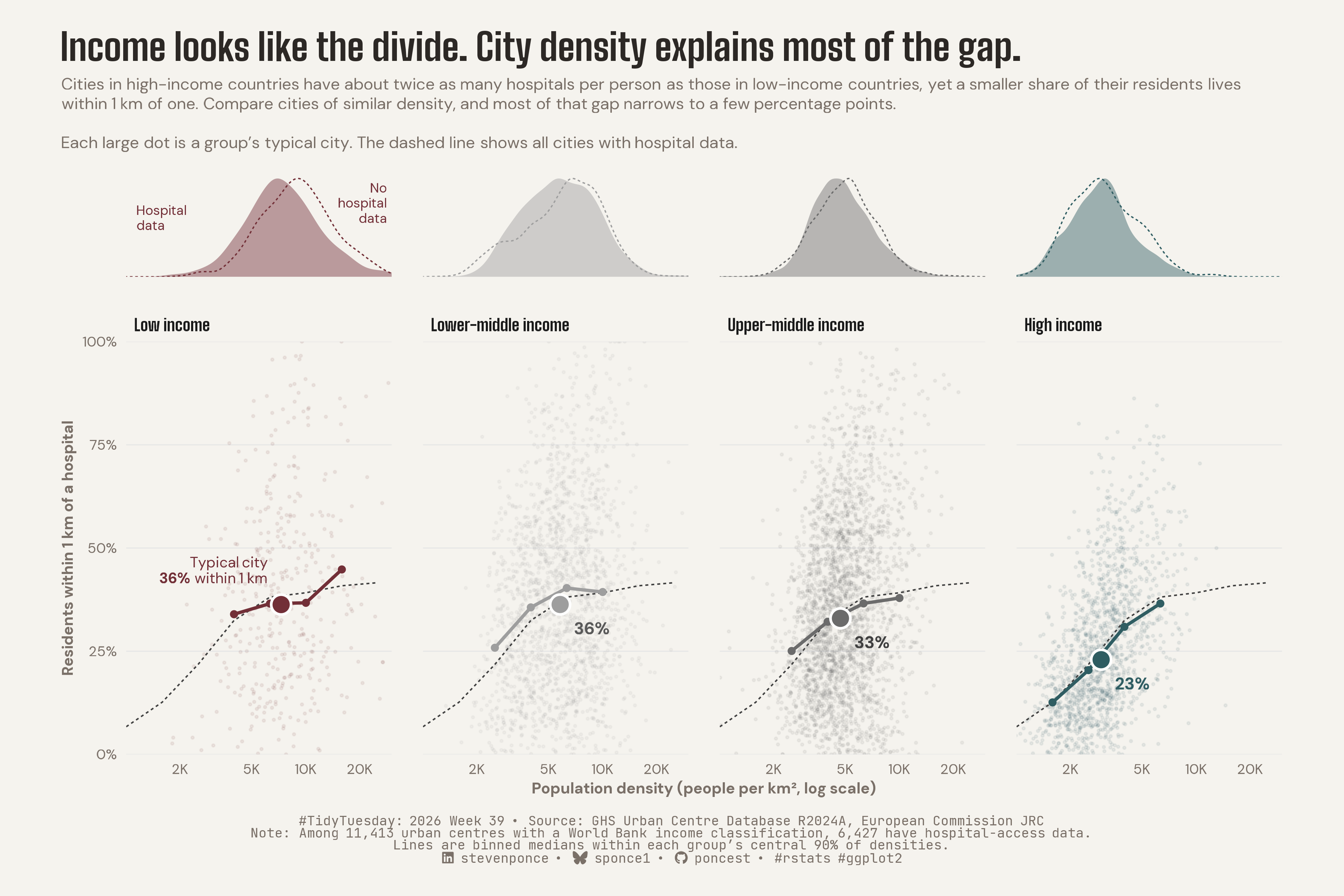
Cities in high-income countries have about twice as many hospitals per person as those in low-income countries, yet a smaller share of their residents lives within 1 km of one. Compare cities of similar density, and most of that gap narrows to a few percentage points.

TidyTuesday
Data Visualization
R Programming
2026
Faceted scatter plot showing that urban centres in higher-income countries have more hospitals per person but lower 1-km hospital access, a gap largely explained by population density. Compares binned median access within each income group’s supported density range against a shared all-city curve. Built in R with ggplot2, ggtext and patchwork.
Author

Steven Ponce

Published

September 28, 2026

Figure 1: Faceted scatter plot titled “Income looks like the divide. City density explains most of the gap.” Four panels, one per World Bank income group, plot the share of residents within 1 km of a hospital against population density (log scale) for 6,427 urban centers. A large dot marks each group’s typical city: 23% within 1 km in high-income countries, 33% in upper-middle, 36% in lower-middle, and 36% in low-income, even though high-income cities have about twice as many hospitals per person as low-income cities. The typical cities sit at rising densities, from about 3,000 people per km² (high income) to about 7,300 (low income), and all four lie close to one dashed curve showing the access–density relationship for all cities. Density strips above each panel show where cities fall on the density axis; cities without hospital data lean denser in low-income countries. Source: GHS Urban Centre Database R2024A, European Commission JRC.

Steps to Create this Graphic

1. Load Packages & Setup

Show code
```{r}
#| label: load
#| warning: false
#| message: false      
#| results: "hide"     

## 1. LOAD PACKAGES & SETUP ----
suppressPackageStartupMessages({
if (!require("pacman")) install.packages("pacman")
pacman::p_load(
    tidyverse, ggtext, showtext, janitor, ggrepel,      
    scales, glue, skimr, ggview, patchwork
    )
})

# Source utility functions
suppressMessages(source(here::here("R/utils/fonts.R")))
source(here::here("R/utils/social_icons.R"))
source(here::here("R/utils/image_utils.R"))
source(here::here("R/themes/base_theme.R"))
```

2. Read in the Data

Show code
```{r}
#| label: read
#| include: true
#| eval: true
#| warning: false

### |- figure settings ----
fig_w      <- 12
fig_h      <- 8

## 2. READ IN THE DATA ----
tt <- tidytuesdayR::tt_load(2026, week = 39)
health_raw <- tt$health |> clean_names()
rm(tt)
```

3. Examine the Data

Show code
```{r}
#| label: examine
#| include: true
#| eval: true
#| results: 'hide'
#| warning: false

## 3. EXAMINING THE DATA ----
glimpse(health_raw)
skim_without_charts(health_raw)
```

4. Tidy Data

Show code
```{r}
#| label: tidy
#| warning: false

### |- constants ----
inc_levels <- c("Low income", "Lower Middle", "Upper Middle", "High income")
inc_labels <- c(
  "Low income", "Lower-middle income", "Upper-middle income", "High income"
)

bin_width <- 0.2
min_n_bin <- 20
support_q <- c(0.05, 0.95)
x_window <- log10(c(1000, 30000))

### |- city table ----
cities <- health_raw |>
  filter(!is.na(gc_dev_wig_2025)) |>
  transmute(
    city         = gc_ucn_mai_2025,
    income       = factor(gc_dev_wig_2025, levels = inc_levels, labels = inc_labels),
    log_density  = log10(gc_pop_tot_2025 / gc_uca_km2_2025),
    access_share = hl_shp_hos_2025,
    reporting    = !is.na(access_share)
  )

reporting_cities <- cities |> filter(reporting)

### |- binned medians ----
bin_breaks <- seq(
  floor(min(cities$log_density) * 10) / 10,
  ceiling(max(cities$log_density) * 10) / 10 + bin_width,
  by = bin_width
)

bin_mid <- head(bin_breaks, -1) + bin_width / 2

bin_medians <- function(data, by = character()) {
  data |>
    mutate(bin = cut(log_density, bin_breaks, include.lowest = TRUE, labels = FALSE)) |>
    summarise(
      median_share = median(access_share),
      n = n(),
      .by = all_of(c(by, "bin"))
    ) |>
    filter(n >= min_n_bin) |>
    mutate(log_density = bin_mid[bin]) |>
    arrange(log_density)
}

support <- reporting_cities |>
  summarise(
    lo = quantile(log_density, support_q[1]),
    hi = quantile(log_density, support_q[2]),
    .by = income
  )

binned <- reporting_cities |>
  inner_join(support, by = "income") |>
  filter(between(log_density, lo, hi)) |>
  bin_medians(by = "income") |>
  arrange(income, log_density)

# All-cities reference
pooled <- bin_medians(reporting_cities)

### |- typical-city markers ----
label_cols <- c(
  "Low income"          = "#722F37",
  "Lower-middle income" = "gray35",
  "Upper-middle income" = "gray25",
  "High income"         = "#2F5D62"
)

centroids <- reporting_cities |>
  summarise(
    med_density = median(log_density),
    med_share = median(access_share),
    n = n(),
    .by = income
  ) |>
  arrange(income) |>
  mutate(
    label = if_else(
      income == "Low income",
      as.character(glue("Typical city<br>**{round(med_share)}%** within 1 km")),
      as.character(glue("**{round(med_share)}%**"))
    ),
    lab_col = unname(label_cols[as.character(income)]),
    is_low = income == "Low income",
    lab_x = med_density + if_else(is_low, -0.04, 0.05),
    lab_y = med_share + if_else(is_low, 3, -3),
    lab_hjust = if_else(is_low, 1, 0),
    lab_vjust = if_else(is_low, 0, 1),
    lab_size = if_else(is_low, 3.3, 3.8)
  )

### |- backdrop: own-group cities only ----
backdrop_own <- reporting_cities

### |- observation-boundary labels ----
strip_labels <- tibble(
  income = factor("Low income", levels = inc_labels),
  x      = log10(c(1150, 28000)),
  y      = c(0.6, 0.75),
  hjust  = c(0, 1),
  label  = c("Hospital\ndata", "No\nhospital\ndata")
)
```

5. Visualization Parameters

Show code
```{r}
#| label: params
#| include: true
#| warning: false

### |- plot aesthetics ----
clrs <- get_theme_colors(
    palette = list(
        col_low    = "#722F37",
        col_lowmid = "gray62",
        col_upmid  = "gray42",
        col_high   = "#2F5D62"
    )
)

# Hardcoded named vector for scales
clr_groups <- c(
    "Low income"          = "#722F37",
    "Lower-middle income" = "gray62",
    "Upper-middle income" = "gray42",
    "High income"         = "#2F5D62"
)

x_break_vals <- c(2000, 5000, 10000, 20000)
x_break_labs <- c("2K", "5K", "10K", "20K")

### |- titles and caption ----
title_text <- str_glue(
    "Income looks like the divide. City density explains most of the gap."
)

subtitle_text <- str_glue(
    "Cities in high-income countries have about twice as many hospitals per ",
    "person as those in low-income countries, yet a smaller share of their ",
    "residents lives within 1 km of one. Compare cities of similar density, and ",
    "most of that gap narrows to a few percentage points.<br><br>",
    "Each large dot is a group's typical city. The dashed line shows all ",
    "cities with hospital data."
)

caption_text <- create_social_caption(
    tt_year = 2026,
    tt_week = 39,
    source_text = paste0(
        "GHS Urban Centre Database R2024A, European Commission JRC<br>",
        "Note: Among 11,413 urban centres with a World Bank income classification, ",
        "6,427 have hospital-access data.<br>",
        "Lines are binned medians within each group's central 90% of densities."
    )
)

### |-  fonts ----
setup_fonts()
fonts <- get_font_families()

### |-  plot theme ----
base_theme <- create_base_theme(clrs)

weekly_theme <- extend_weekly_theme(
    base_theme,
    theme(
        plot.title.position = "plot",
        plot.title = element_text(
            face = "bold", family = fonts$title_1, size = 24,
            margin = margin(b = 6), color = clrs$title
        ),
        plot.subtitle = element_textbox_simple(
            family = fonts$text, size = 10.5, lineheight = 1.2,
            margin = margin(b = 14), color = clrs$subtitle
        ),
        plot.caption = element_markdown(
            family = fonts$caption, size = 8.5, hjust = 0.5,
            margin = margin(t = 12), color = clrs$caption
        ),
        strip.text = element_text(
            face = "bold", family = fonts$title_1, size = 10.5, hjust = 0
        ),
        axis.title = element_text(family = fonts$text, size = 10),
        axis.text = element_text(family = fonts$text, size = 9),
        panel.grid.major.y = element_line(color = "gray90", linewidth = 0.3),
        panel.grid.major.x = element_blank(),
        panel.grid.minor = element_blank(),
        axis.ticks = element_blank(),
        panel.spacing.x = unit(1.4, "lines"),
        legend.position = "none"
    )
)

theme_set(weekly_theme)
```

6. Plot

Show code
```{r}
#| label: plot
#| warning: false

## |- top strips: density by income, reporting vs not ----
p_margin <- ggplot(cities, aes(log_density)) +
    geom_density(
        data = \(d) filter(d, reporting),
        aes(y = after_stat(scaled), fill = income),
        colour = NA, alpha = 0.45
    ) +
    geom_density(
        data = \(d) filter(d, !reporting),
        aes(y = after_stat(scaled), colour = income),
        fill = NA, linetype = "22", linewidth = 0.4
    ) +
    geom_text(
        data = strip_labels,
        aes(x, y, label = label, hjust = hjust),
        inherit.aes = FALSE, colour = "#722F37",
        size = 3, lineheight = 0.95, family = fonts$text
    ) +
    facet_wrap(~income, nrow = 1) +
    scale_fill_manual(values = clr_groups) +
    scale_colour_manual(values = clr_groups) +
    coord_cartesian(xlim = x_window, ylim = c(0, 1.05), expand = FALSE) +
    labs(title = title_text, subtitle = subtitle_text) +
    theme(
        axis.text = element_blank(),
        axis.title = element_blank(),
        panel.grid.major.y = element_blank(),
        strip.text = element_blank()
    )

### |- main panels ----
p_main <- ggplot() +
    geom_point(
        data = backdrop_own, aes(log_density, access_share, colour = income),
        size = 0.45, alpha = 0.08
    ) +
    geom_line(
        data = pooled, aes(log_density, median_share),
        linetype = "22", colour = "gray25", linewidth = 0.45
    ) +
    geom_line(
        data = binned, aes(log_density, median_share, colour = income),
        linewidth = 1
    ) +
    geom_point(
        data = binned, aes(log_density, median_share, colour = income),
        size = 1.6
    ) +
    geom_point(
        data = centroids, aes(med_density, med_share, fill = income),
        shape = 21, size = 5.2, colour = "white", stroke = 1.2
    ) +
    geom_richtext(
        data = centroids,
        aes(lab_x, lab_y, label = label,
            hjust = lab_hjust, vjust = lab_vjust, size = lab_size),
        colour = centroids$lab_col,
        lineheight = 1.1, family = fonts$text,
        fill = NA, label.colour = NA
    ) +
    scale_size_identity() +
    facet_wrap(~income, nrow = 1) +
    scale_colour_manual(values = clr_groups) +
    scale_fill_manual(values = clr_groups) +
    scale_x_continuous(breaks = log10(x_break_vals), labels = x_break_labs) +
    scale_y_continuous(breaks = seq(0, 100, 25), labels = label_percent(scale = 1)) +
    coord_cartesian(xlim = x_window, ylim = c(0, 100), expand = FALSE) +
    labs(
        x = "Population density (people per km², log scale)",
        y = "Residents within 1 km of a hospital",
        caption = caption_text
    )

### |- combine ----
p <- p_margin / p_main +
    plot_layout(heights = c(1, 4))
```

7. Save

Show code
```{r}
#| label: save
#| warning: false

### |- save ----
main_path  <- here::here("data_visualizations", "TidyTuesday", "2026", "tt_2026_39.png")
thumb_path <- here::here("data_visualizations", "TidyTuesday", "2026", "thumbnails", "tt_2026_39.png")

# Full-size version, for the QMD figure
ggview::save_ggplot(
    plot   = p,
    file   = main_path,
    width  = fig_w,
    height = fig_h,
    units  = "in",
    dpi    = 320
)

# Reduced-size thumbnail, for the YAML `image:` field
fs::dir_create(dirname(thumb_path))
magick::image_read(main_path) |>
  magick::image_resize("400") |>
  magick::image_write(thumb_path)
```

8. Session Info

TipExpand for Session Info
R version 4.6.1 (2026-06-24)
Platform: aarch64-apple-darwin23
Running under: macOS Tahoe 26.6.2

Matrix products: default
BLAS:   /Library/Frameworks/R.framework/Versions/4.6/Resources/lib/libRblas.0.dylib 
LAPACK: /Library/Frameworks/R.framework/Versions/4.6/Resources/lib/libRlapack.dylib;  LAPACK version 3.12.1

locale:
[1] en_US.UTF-8/en_US.UTF-8/en_US.UTF-8/C/en_US.UTF-8/en_US.UTF-8

time zone: America/New_York
tzcode source: internal

attached base packages:
[1] stats     graphics  grDevices utils     datasets  methods   base     

other attached packages:
 [1] here_1.0.2      patchwork_1.3.2 ggview_0.2.2    skimr_2.2.2    
 [5] glue_1.8.1      scales_1.4.0    ggrepel_0.9.8   janitor_2.2.1  
 [9] showtext_0.9-8  showtextdb_3.0  sysfonts_0.8.9  ggtext_0.2.0   
[13] lubridate_1.9.5 forcats_1.0.1   stringr_1.6.0   dplyr_1.2.1    
[17] purrr_1.2.2     readr_2.2.0     tidyr_1.3.2     tibble_3.3.1   
[21] ggplot2_4.0.3   tidyverse_2.0.0 pacman_0.5.1   

loaded via a namespace (and not attached):
 [1] gtable_0.3.6       xfun_0.60          httr2_1.3.0        htmlwidgets_1.6.4 
 [5] gh_1.6.1           tzdb_0.5.0         vctrs_0.7.3        tools_4.6.1       
 [9] generics_0.1.4     parallel_4.6.1     curl_7.1.0         pkgconfig_2.0.3   
[13] RColorBrewer_1.1-3 S7_0.2.2           lifecycle_1.0.5    compiler_4.6.1    
[17] farver_2.1.2       textshaping_1.0.5  repr_1.1.7         codetools_0.2-20  
[21] snakecase_0.11.1   litedown_0.10      htmltools_0.5.9    yaml_2.3.12       
[25] crayon_1.5.3       pillar_1.11.1      magick_2.9.1       commonmark_2.0.0  
[29] tidyselect_1.2.1   digest_0.6.39      stringi_1.8.7      labeling_0.4.3    
[33] rprojroot_2.1.1    fastmap_1.2.0      grid_4.6.1         cli_3.6.6         
[37] magrittr_2.0.5     base64enc_0.1-6    withr_3.0.3        bit64_4.8.2       
[41] timechange_0.4.0   rmarkdown_2.31     tidytuesdayR_1.3.2 gitcreds_0.1.2    
[45] bit_4.6.0          otel_0.2.0         ragg_1.5.2         hms_1.1.4         
[49] evaluate_1.0.5     knitr_1.51         markdown_2.0       rlang_1.3.0       
[53] gridtext_0.1.6     Rcpp_1.1.2         xml2_1.6.0         rstudioapi_0.19.0 
[57] vroom_1.7.1        jsonlite_2.0.0     R6_2.6.1           fs_2.1.0          
[61] systemfonts_1.3.2 

9. GitHub Repository

TipExpand for GitHub Repo

The complete code for this analysis is available in tt_2026_39.qmd.

For the full repository, click here.

10. References

TipExpand for References
  1. Data Source:
    • TidyTuesday 2026 Week 39: Health metrics in urban centres worldwide)

11. Custom Functions Documentation

Note📦 Custom Helper Functions

This analysis uses custom functions from my personal module library for efficiency and consistency across projects.

Functions Used:

  • fonts.R: setup_fonts(), get_font_families() - Font management with showtext
  • social_icons.R: create_social_caption() - Generates formatted social media captions
  • image_utils.R: save_plot() - Consistent plot saving with naming conventions
  • base_theme.R: create_base_theme(), extend_weekly_theme(), get_theme_colors() - Custom ggplot2 themes

Why custom functions?
These utilities standardize theming, fonts, and output across all my data visualizations. The core analysis (data tidying and visualization logic) uses only standard tidyverse packages.

Source Code:
View all custom functions → GitHub: R/utils

Back to top

Citation

BibTeX citation:
@online{ponce2026,
  author = {Ponce, Steven},
  title = {Income Looks Like the Divide. {City} Density Explains Most of
    the Gap.},
  date = {2026-09-28},
  url = {https://stevenponce.netlify.app/data_visualizations/TidyTuesday/2026/tt_2026_39.html},
  langid = {en}
}
For attribution, please cite this work as:
Ponce, Steven. 2026. “Income Looks Like the Divide. City Density Explains Most of the Gap.” September 28. https://stevenponce.netlify.app/data_visualizations/TidyTuesday/2026/tt_2026_39.html.
Source Code
---
title: "Income looks like the divide. City density explains most of the gap."
subtitle: "Cities in high-income countries have about twice as many hospitals per person as those in low-income countries, yet a smaller share of their residents lives within 1 km of one. Compare cities of similar density, and most of that gap narrows to a few percentage points."
description: "Faceted scatter plot showing that urban centres in higher-income countries have more hospitals per person but lower 1-km hospital access, a gap largely explained by population density. Compares binned median access within each income group's supported density range against a shared all-city curve. Built in R with ggplot2, ggtext and patchwork."
date: "2026-09-28"
author:
  - name: "Steven Ponce"
    url: "https://stevenponce.netlify.app"
citation:
  url: "https://stevenponce.netlify.app/data_visualizations/TidyTuesday/2026/tt_2026_39.html"
categories: ["TidyTuesday", "Data Visualization", "R Programming", "2026"]
tags: [
  "TidyTuesday",
  "Urban Health",
  "Hospital Access",
  "Healthcare",
  "Population Density",
  "Global Human Settlement Layer",
  "Income Groups",
  "Faceted Scatter Plot",
  "Small Multiples",
  "Density Plot",
  "Confounding",
  "patchwork",
  "ggtext",
  "2026"
]
image: "thumbnails/tt_2026_39.png"
format:
  html:
    toc: true
    toc-depth: 5
    code-link: true
    code-fold: true
    code-tools: true
    code-summary: "Show code"
    self-contained: true
    theme: 
      light: [flatly, assets/styling/custom_styles.scss]
      dark: [darkly, assets/styling/custom_styles_dark.scss]
editor_options: 
  chunk_output_type: inline
execute: 
  freeze: true
  cache: true
  error: false
  message: false
  warning: false
  eval: true
---
![Faceted scatter plot titled "Income looks like the divide. City density explains most of the gap." Four panels, one per World Bank income group, plot the share of residents within 1 km of a hospital against population density (log scale) for 6,427 urban centers. A large dot marks each group's typical city: 23% within 1 km in high-income countries, 33% in upper-middle, 36% in lower-middle, and 36% in low-income, even though high-income cities have about twice as many hospitals per person as low-income cities. The typical cities sit at rising densities, from about 3,000 people per km² (high income) to about 7,300 (low income), and all four lie close to one dashed curve showing the access–density relationship for all cities. Density strips above each panel show where cities fall on the density axis; cities without hospital data lean denser in low-income countries. Source: GHS Urban Centre Database R2024A, European Commission JRC.](tt_2026_39.png){#fig-1}

### [**Steps to Create this Graphic**]{.mark}

#### [1. Load Packages & Setup]{.smallcaps}

```{r}
#| label: load
#| warning: false
#| message: false      
#| results: "hide"     

## 1. LOAD PACKAGES & SETUP ----
suppressPackageStartupMessages({
if (!require("pacman")) install.packages("pacman")
pacman::p_load(
    tidyverse, ggtext, showtext, janitor, ggrepel,      
    scales, glue, skimr, ggview, patchwork
    )
})

# Source utility functions
suppressMessages(source(here::here("R/utils/fonts.R")))
source(here::here("R/utils/social_icons.R"))
source(here::here("R/utils/image_utils.R"))
source(here::here("R/themes/base_theme.R"))
```

#### [2. Read in the Data]{.smallcaps}

```{r}
#| label: read
#| include: true
#| eval: true
#| warning: false

### |- figure settings ----
fig_w      <- 12
fig_h      <- 8

## 2. READ IN THE DATA ----
tt <- tidytuesdayR::tt_load(2026, week = 39)
health_raw <- tt$health |> clean_names()
rm(tt)
```

#### [3. Examine the Data]{.smallcaps}

```{r}
#| label: examine
#| include: true
#| eval: true
#| results: 'hide'
#| warning: false

## 3. EXAMINING THE DATA ----
glimpse(health_raw)
skim_without_charts(health_raw)
```

#### [4. Tidy Data]{.smallcaps}

```{r}
#| label: tidy
#| warning: false

### |- constants ----
inc_levels <- c("Low income", "Lower Middle", "Upper Middle", "High income")
inc_labels <- c(
  "Low income", "Lower-middle income", "Upper-middle income", "High income"
)

bin_width <- 0.2
min_n_bin <- 20
support_q <- c(0.05, 0.95)
x_window <- log10(c(1000, 30000))

### |- city table ----
cities <- health_raw |>
  filter(!is.na(gc_dev_wig_2025)) |>
  transmute(
    city         = gc_ucn_mai_2025,
    income       = factor(gc_dev_wig_2025, levels = inc_levels, labels = inc_labels),
    log_density  = log10(gc_pop_tot_2025 / gc_uca_km2_2025),
    access_share = hl_shp_hos_2025,
    reporting    = !is.na(access_share)
  )

reporting_cities <- cities |> filter(reporting)

### |- binned medians ----
bin_breaks <- seq(
  floor(min(cities$log_density) * 10) / 10,
  ceiling(max(cities$log_density) * 10) / 10 + bin_width,
  by = bin_width
)

bin_mid <- head(bin_breaks, -1) + bin_width / 2

bin_medians <- function(data, by = character()) {
  data |>
    mutate(bin = cut(log_density, bin_breaks, include.lowest = TRUE, labels = FALSE)) |>
    summarise(
      median_share = median(access_share),
      n = n(),
      .by = all_of(c(by, "bin"))
    ) |>
    filter(n >= min_n_bin) |>
    mutate(log_density = bin_mid[bin]) |>
    arrange(log_density)
}

support <- reporting_cities |>
  summarise(
    lo = quantile(log_density, support_q[1]),
    hi = quantile(log_density, support_q[2]),
    .by = income
  )

binned <- reporting_cities |>
  inner_join(support, by = "income") |>
  filter(between(log_density, lo, hi)) |>
  bin_medians(by = "income") |>
  arrange(income, log_density)

# All-cities reference
pooled <- bin_medians(reporting_cities)

### |- typical-city markers ----
label_cols <- c(
  "Low income"          = "#722F37",
  "Lower-middle income" = "gray35",
  "Upper-middle income" = "gray25",
  "High income"         = "#2F5D62"
)

centroids <- reporting_cities |>
  summarise(
    med_density = median(log_density),
    med_share = median(access_share),
    n = n(),
    .by = income
  ) |>
  arrange(income) |>
  mutate(
    label = if_else(
      income == "Low income",
      as.character(glue("Typical city<br>**{round(med_share)}%** within 1 km")),
      as.character(glue("**{round(med_share)}%**"))
    ),
    lab_col = unname(label_cols[as.character(income)]),
    is_low = income == "Low income",
    lab_x = med_density + if_else(is_low, -0.04, 0.05),
    lab_y = med_share + if_else(is_low, 3, -3),
    lab_hjust = if_else(is_low, 1, 0),
    lab_vjust = if_else(is_low, 0, 1),
    lab_size = if_else(is_low, 3.3, 3.8)
  )

### |- backdrop: own-group cities only ----
backdrop_own <- reporting_cities

### |- observation-boundary labels ----
strip_labels <- tibble(
  income = factor("Low income", levels = inc_labels),
  x      = log10(c(1150, 28000)),
  y      = c(0.6, 0.75),
  hjust  = c(0, 1),
  label  = c("Hospital\ndata", "No\nhospital\ndata")
)
```

#### [5. Visualization Parameters]{.smallcaps}

```{r}
#| label: params
#| include: true
#| warning: false

### |- plot aesthetics ----
clrs <- get_theme_colors(
    palette = list(
        col_low    = "#722F37",
        col_lowmid = "gray62",
        col_upmid  = "gray42",
        col_high   = "#2F5D62"
    )
)

# Hardcoded named vector for scales
clr_groups <- c(
    "Low income"          = "#722F37",
    "Lower-middle income" = "gray62",
    "Upper-middle income" = "gray42",
    "High income"         = "#2F5D62"
)

x_break_vals <- c(2000, 5000, 10000, 20000)
x_break_labs <- c("2K", "5K", "10K", "20K")

### |- titles and caption ----
title_text <- str_glue(
    "Income looks like the divide. City density explains most of the gap."
)

subtitle_text <- str_glue(
    "Cities in high-income countries have about twice as many hospitals per ",
    "person as those in low-income countries, yet a smaller share of their ",
    "residents lives within 1 km of one. Compare cities of similar density, and ",
    "most of that gap narrows to a few percentage points.<br><br>",
    "Each large dot is a group's typical city. The dashed line shows all ",
    "cities with hospital data."
)

caption_text <- create_social_caption(
    tt_year = 2026,
    tt_week = 39,
    source_text = paste0(
        "GHS Urban Centre Database R2024A, European Commission JRC<br>",
        "Note: Among 11,413 urban centres with a World Bank income classification, ",
        "6,427 have hospital-access data.<br>",
        "Lines are binned medians within each group's central 90% of densities."
    )
)

### |-  fonts ----
setup_fonts()
fonts <- get_font_families()

### |-  plot theme ----
base_theme <- create_base_theme(clrs)

weekly_theme <- extend_weekly_theme(
    base_theme,
    theme(
        plot.title.position = "plot",
        plot.title = element_text(
            face = "bold", family = fonts$title_1, size = 24,
            margin = margin(b = 6), color = clrs$title
        ),
        plot.subtitle = element_textbox_simple(
            family = fonts$text, size = 10.5, lineheight = 1.2,
            margin = margin(b = 14), color = clrs$subtitle
        ),
        plot.caption = element_markdown(
            family = fonts$caption, size = 8.5, hjust = 0.5,
            margin = margin(t = 12), color = clrs$caption
        ),
        strip.text = element_text(
            face = "bold", family = fonts$title_1, size = 10.5, hjust = 0
        ),
        axis.title = element_text(family = fonts$text, size = 10),
        axis.text = element_text(family = fonts$text, size = 9),
        panel.grid.major.y = element_line(color = "gray90", linewidth = 0.3),
        panel.grid.major.x = element_blank(),
        panel.grid.minor = element_blank(),
        axis.ticks = element_blank(),
        panel.spacing.x = unit(1.4, "lines"),
        legend.position = "none"
    )
)

theme_set(weekly_theme)
```

#### [6. Plot]{.smallcaps}

```{r}
#| label: plot
#| warning: false

## |- top strips: density by income, reporting vs not ----
p_margin <- ggplot(cities, aes(log_density)) +
    geom_density(
        data = \(d) filter(d, reporting),
        aes(y = after_stat(scaled), fill = income),
        colour = NA, alpha = 0.45
    ) +
    geom_density(
        data = \(d) filter(d, !reporting),
        aes(y = after_stat(scaled), colour = income),
        fill = NA, linetype = "22", linewidth = 0.4
    ) +
    geom_text(
        data = strip_labels,
        aes(x, y, label = label, hjust = hjust),
        inherit.aes = FALSE, colour = "#722F37",
        size = 3, lineheight = 0.95, family = fonts$text
    ) +
    facet_wrap(~income, nrow = 1) +
    scale_fill_manual(values = clr_groups) +
    scale_colour_manual(values = clr_groups) +
    coord_cartesian(xlim = x_window, ylim = c(0, 1.05), expand = FALSE) +
    labs(title = title_text, subtitle = subtitle_text) +
    theme(
        axis.text = element_blank(),
        axis.title = element_blank(),
        panel.grid.major.y = element_blank(),
        strip.text = element_blank()
    )

### |- main panels ----
p_main <- ggplot() +
    geom_point(
        data = backdrop_own, aes(log_density, access_share, colour = income),
        size = 0.45, alpha = 0.08
    ) +
    geom_line(
        data = pooled, aes(log_density, median_share),
        linetype = "22", colour = "gray25", linewidth = 0.45
    ) +
    geom_line(
        data = binned, aes(log_density, median_share, colour = income),
        linewidth = 1
    ) +
    geom_point(
        data = binned, aes(log_density, median_share, colour = income),
        size = 1.6
    ) +
    geom_point(
        data = centroids, aes(med_density, med_share, fill = income),
        shape = 21, size = 5.2, colour = "white", stroke = 1.2
    ) +
    geom_richtext(
        data = centroids,
        aes(lab_x, lab_y, label = label,
            hjust = lab_hjust, vjust = lab_vjust, size = lab_size),
        colour = centroids$lab_col,
        lineheight = 1.1, family = fonts$text,
        fill = NA, label.colour = NA
    ) +
    scale_size_identity() +
    facet_wrap(~income, nrow = 1) +
    scale_colour_manual(values = clr_groups) +
    scale_fill_manual(values = clr_groups) +
    scale_x_continuous(breaks = log10(x_break_vals), labels = x_break_labs) +
    scale_y_continuous(breaks = seq(0, 100, 25), labels = label_percent(scale = 1)) +
    coord_cartesian(xlim = x_window, ylim = c(0, 100), expand = FALSE) +
    labs(
        x = "Population density (people per km², log scale)",
        y = "Residents within 1 km of a hospital",
        caption = caption_text
    )

### |- combine ----
p <- p_margin / p_main +
    plot_layout(heights = c(1, 4))
```

### [7. Save]{.smallcaps}

```{r}
#| label: save
#| warning: false

### |- save ----
main_path  <- here::here("data_visualizations", "TidyTuesday", "2026", "tt_2026_39.png")
thumb_path <- here::here("data_visualizations", "TidyTuesday", "2026", "thumbnails", "tt_2026_39.png")

# Full-size version, for the QMD figure
ggview::save_ggplot(
    plot   = p,
    file   = main_path,
    width  = fig_w,
    height = fig_h,
    units  = "in",
    dpi    = 320
)

# Reduced-size thumbnail, for the YAML `image:` field
fs::dir_create(dirname(thumb_path))
magick::image_read(main_path) |>
  magick::image_resize("400") |>
  magick::image_write(thumb_path)
```


#### [8. Session Info]{.smallcaps}

::: {.callout-tip collapse="true"}
##### Expand for Session Info

```{r, echo = FALSE}
#| eval: true
#| warning: false

sessionInfo()
```
:::

#### [9. GitHub Repository]{.smallcaps}

::: {.callout-tip collapse="true"}
##### Expand for GitHub Repo

The complete code for this analysis is available in [`tt_2026_39.qmd`](https://github.com/poncest/personal-website/blob/master/data_visualizations/TidyTuesday/2026/tt_2026_39.qmd).

For the full repository, [click here](https://github.com/poncest/personal-website/).
:::

#### [10. References]{.smallcaps}

::: {.callout-tip collapse="true"}
##### Expand for References
1.  **Data Source:**
    -   TidyTuesday 2026 Week 39: [Health metrics in urban centres worldwide)](https://github.com/rfordatascience/tidytuesday/blob/main/data/2026/2026-09-29/readme.md)

:::


#### [11. Custom Functions Documentation]{.smallcaps}

::: {.callout-note collapse="true"}
##### 📦 Custom Helper Functions

This analysis uses custom functions from my personal module library for efficiency and consistency across projects.

**Functions Used:**

-   **`fonts.R`**: `setup_fonts()`, `get_font_families()` - Font management with showtext
-   **`social_icons.R`**: `create_social_caption()` - Generates formatted social media captions
-   **`image_utils.R`**: `save_plot()` - Consistent plot saving with naming conventions
-   **`base_theme.R`**: `create_base_theme()`, `extend_weekly_theme()`, `get_theme_colors()` - Custom ggplot2 themes

**Why custom functions?**\
These utilities standardize theming, fonts, and output across all my data visualizations. The core analysis (data tidying and visualization logic) uses only standard tidyverse packages.

**Source Code:**\
View all custom functions → [GitHub: R/utils](https://github.com/poncest/personal-website/tree/master/R)
:::

© 2024 Steven Ponce

Source Issues