Analyzing Apple’s ESG Strategy Through a Risk-Based Lens
Transforming 8 years of emissions data into strategic insights on controllability, tradeoffs, and the path to carbon neutrality

🚀 Live app: [Apple ESG Strategy Dashboard]https://0l6jpd-steven-ponce.shinyapps.io/Apple_ESG/
💻 Source code: https://github.com/poncest/Apple_ESG
Scope and limitations.
This analysis is based on publicly reported disclosures and focuses on reported trends, composition, and directional patterns. It does not independently verify underlying data, assess audit quality, or forecast future performance. Scenario views are illustrative stress tests rather than predictions.
Why this project
ESG dashboards often show what happened without explaining what it means strategically. This project explores how to transform publicly available emissions data into a strategic decision-support tool using consulting frameworks—risk matrices, controllability analysis, and scenario planning.
The goal wasn’t to visualize every data point, but to answer the questions executives and analysts actually ask: Where has real progress occurred? What constraints do we face? What tradeoffs must leadership consider?
Note: This is an independent portfolio project using publicly available Apple Environmental Progress Reports. It demonstrates analytical frameworks and strategic thinking—not internal Apple strategy or confidential information.
Apple’s 2030 carbon neutrality pledge is one of the technology sector’s most ambitious climate commitments. However, understanding progress requires more than tracking gross emissions:
- 99.7% of emissions are Scope 3 (supply chain and product use), outside direct operational control
- Reported metrics often conflate real reductions with carbon use of carbon removals
- Strategic dependencies on supplier cooperation and customer behavior create controllability constraints
- Leadership faces tradeoffs between breakthrough investment, timeline adjustment, and stakeholder expectations
The challenge wasn’t building a dashboard that shows all the data. It was building a framework that helps decision-makers understand where they have leverage, what they can control, and what strategic choices they face.
Rather than organize by data tables, the dashboard is structured around five strategic questions.
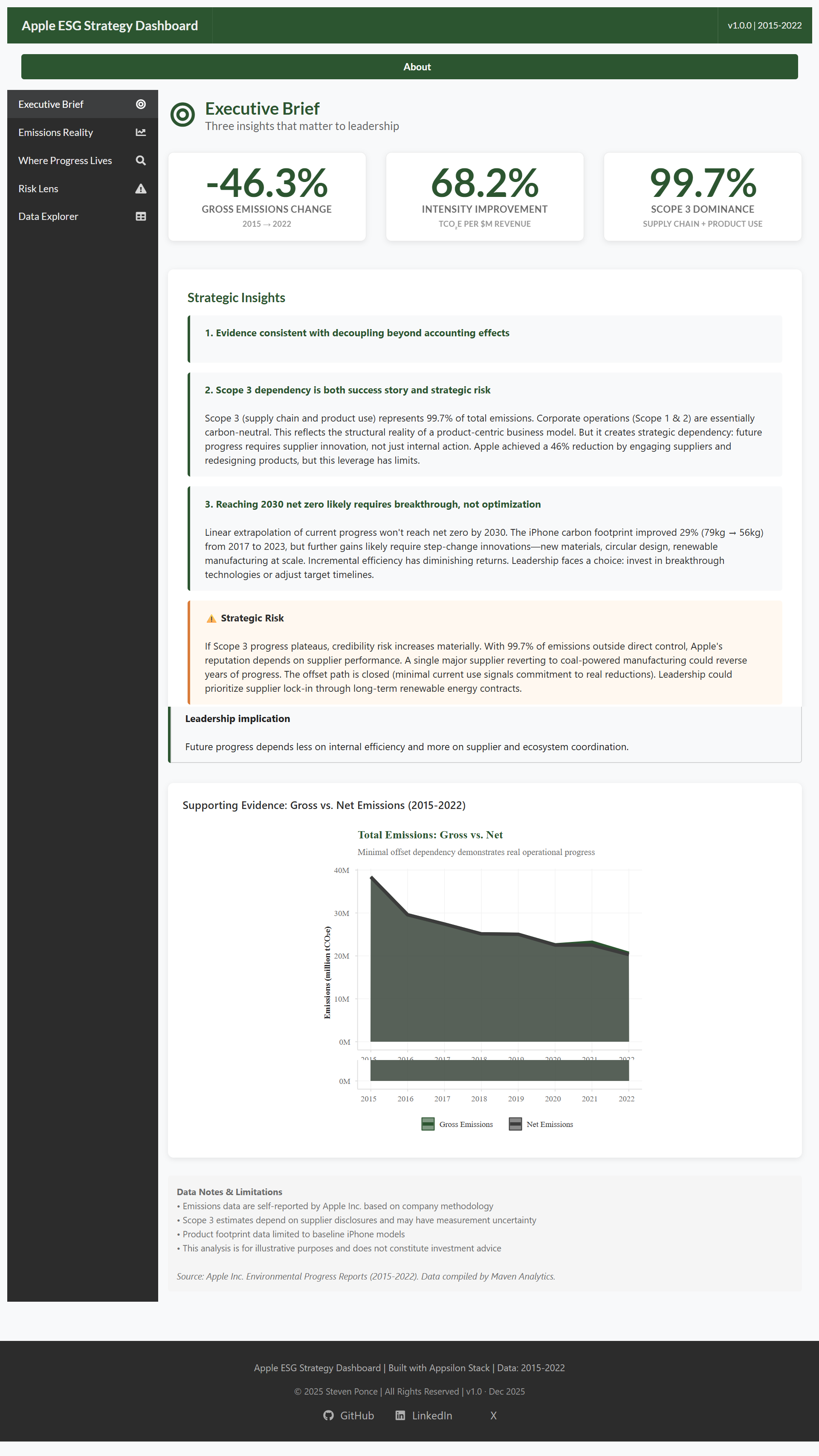
Executive brief: What’s the big picture?
Purpose: Assess progress quickly, understand strategic dependencies, identify key risks
Key elements:
- Three strategic insights synthesized from the data
- High-level KPIs with appropriate context
- Risk callout highlighting Scope 3 dependency
- Gross vs. Net emissions trend showing minimal offset usage
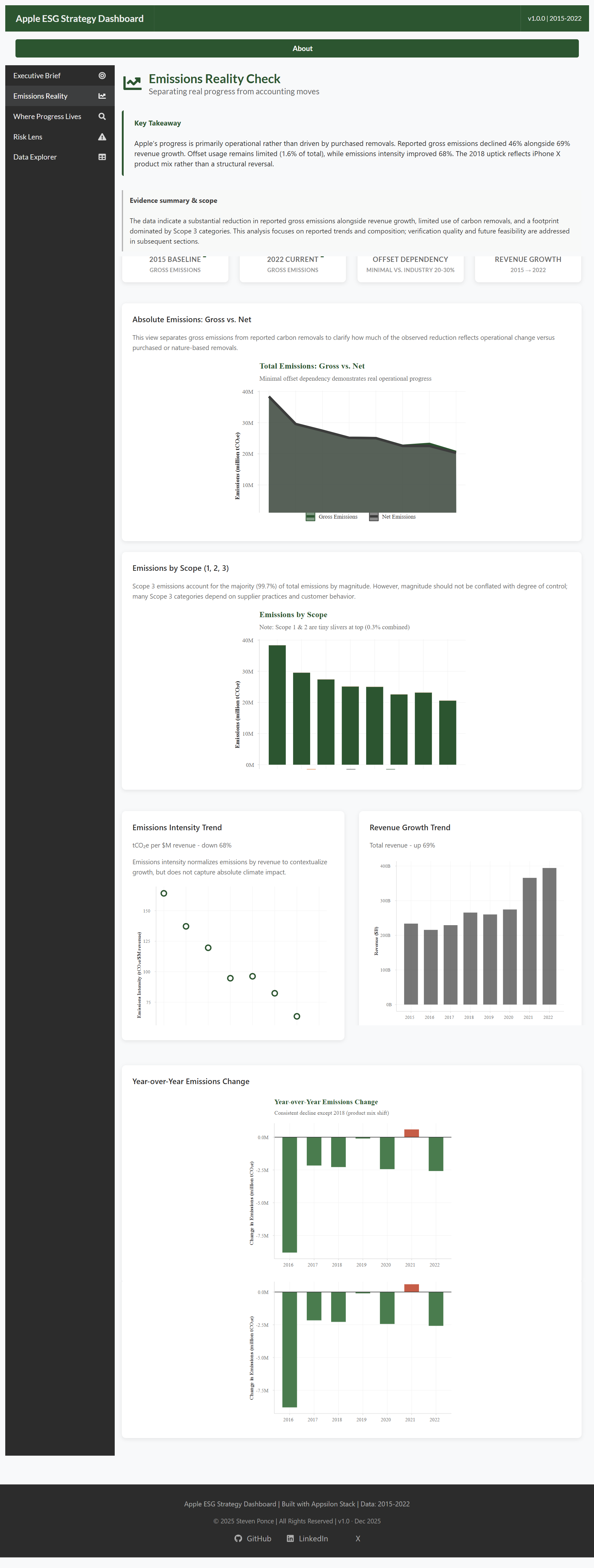
Emissions reality: How real is the progress?
Purpose: Distinguish genuine reductions from accounting adjustments or use of carbon removals
Key elements:
- Consulting-style takeaway box summarizing key findings
- Baseline vs. current emissions with offset dependency metric
- Emissions by scope visualization (showing Scope 3 dominance)
- Emissions intensity improvement alongside revenue growth
- Year-over-year change analysis
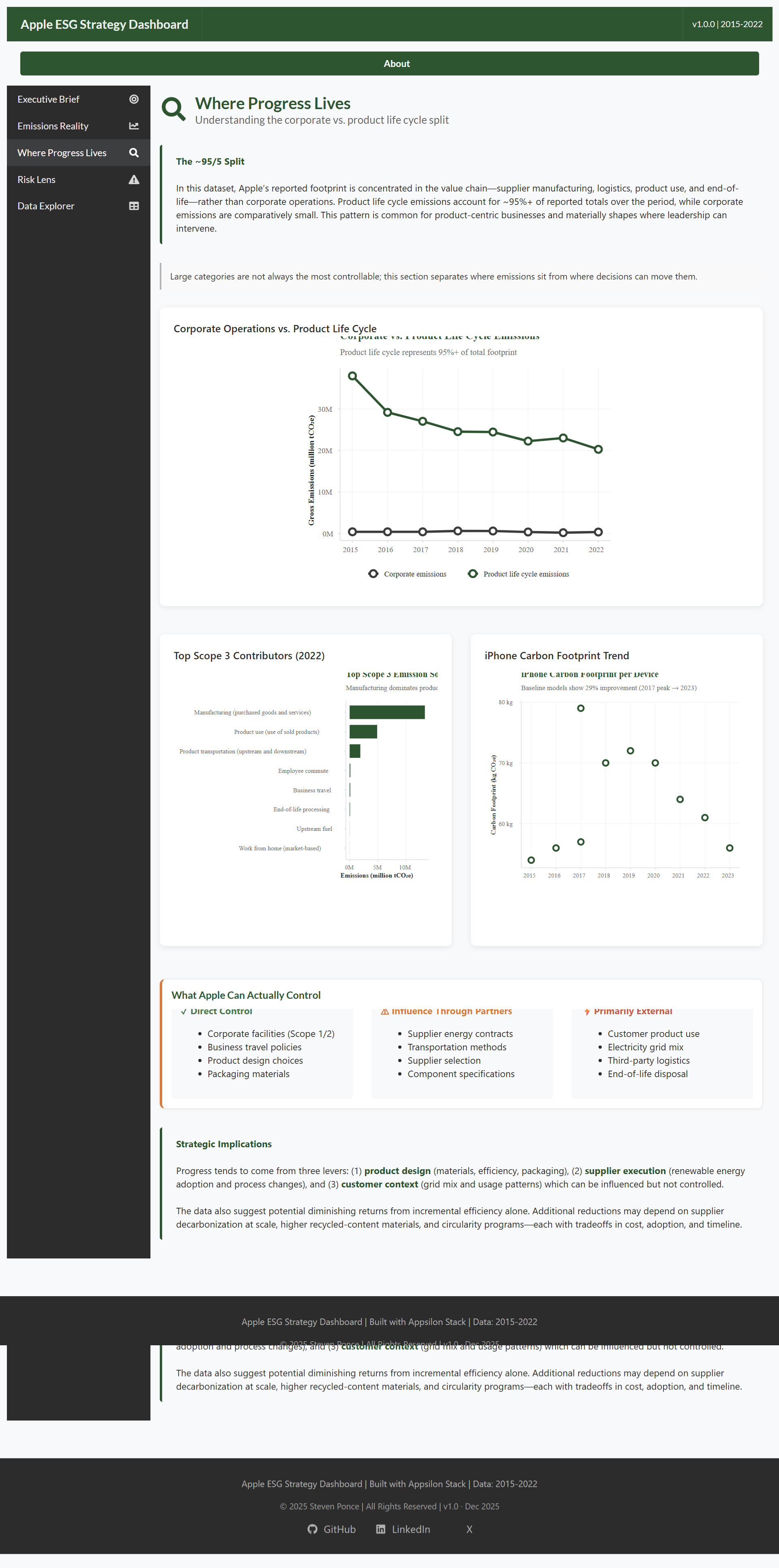
Where progress lives: What can Apple actually control?
Purpose: Understand which emission sources Apple can influence vs. those requiring external cooperation
Key elements:
- Corporate vs. Product Life Cycle emissions split
- Top Scope 3 contributors (manufacturing, product use, transportation)
- iPhone carbon footprint improvement trend (29% reduction)
- Controllability framework classifying sources as High/Medium/Low control
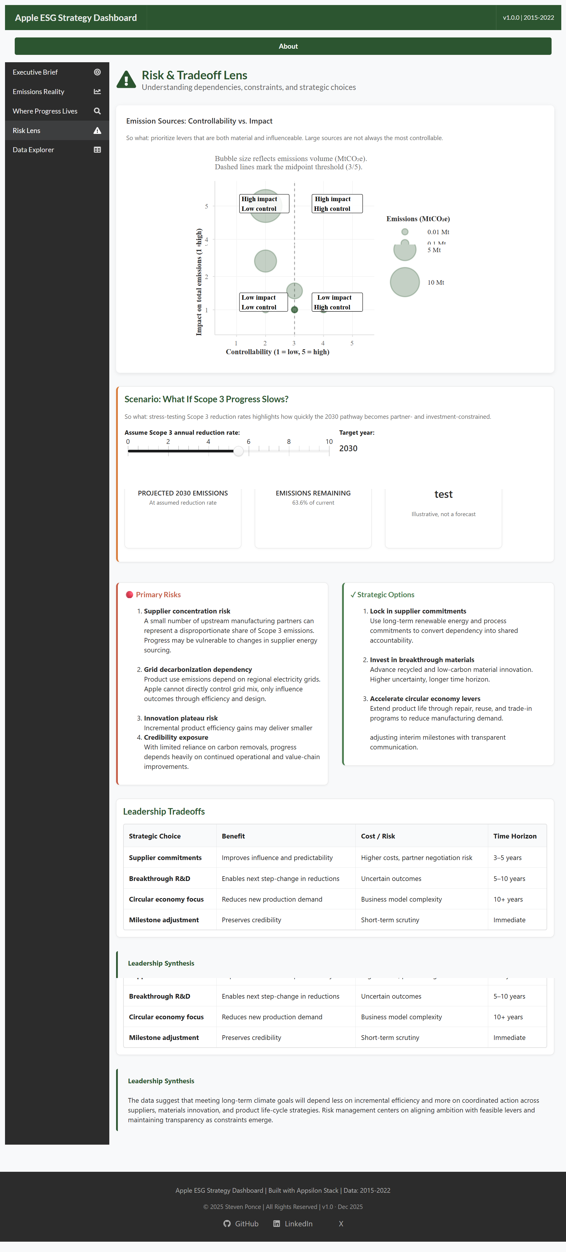
Risk lens: What strategic choices does leadership face?
Purpose: Analyze dependencies, constraints, and strategic tradeoffs using risk-based frameworks
Key elements:
- Risk matrix plotting Controllability × Impact
- Interactive scenario analysis (“What if Scope 3 stalls?”)
- Primary risks vs. Strategic options comparison
- Leadership tradeoffs table with benefit/cost/time horizon
- Recommended portfolio approach
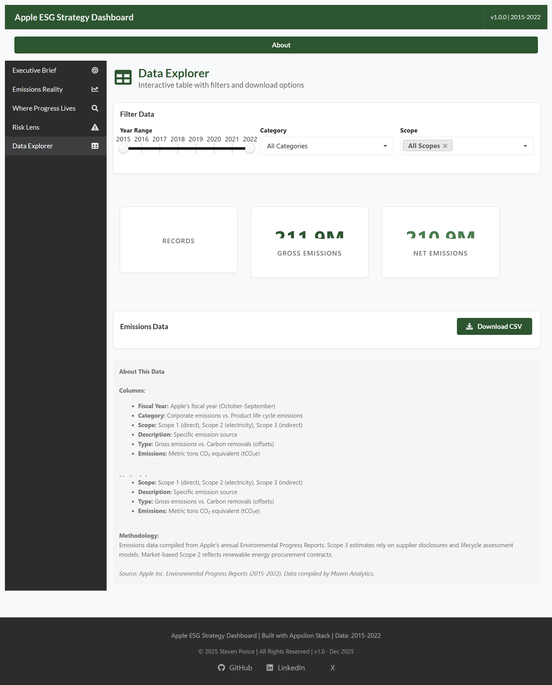
Data explorer: What’s in the underlying data?
Purpose: Provide full transparency and enable analyst deep-dives
Key elements:
- Interactive filters (year range, category, scope)
- Summary statistics with professional card layout
- Searchable, sortable data table
- CSV download for external analysis
Key insights from the analysis
Real progress, real constraints (2015–2022)
Takeaway: Apple’s 40% emissions reduction is operational, not cosmetic.
- Gross emissions reduced 40% despite 69% revenue growth
- Emissions intensity improved 68% (177 → 56 tCO₂e/$M revenue)
- Offset usage minimal (1.6%), signaling commitment to real reductions vs. purchased credits
- However, 99.7% Scope 3 dependency means future progress increasingly relies on suppliers
The controllability paradox
Takeaway: Apple has largely addressed what it can directly control.
- Corporate facilities (Scope 1/2) essentially carbon-neutral through renewable energy
- High-control sources (packaging, business travel, product design) substantially improved
- Remaining emissions concentrated in low-control categories:
- Customer electricity use (product operation)
- Supplier manufacturing energy
- Upstream raw material extraction
Diminishing returns on incremental efficiency
Takeaway: The next 29% reduction will be harder than the last.
- iPhone carbon footprint: 79kg (2017) → 56kg (2023) = 29% improvement
- Required years of R&D in materials science and chip efficiency
- Further gains likely require breakthrough innovations:
- Recycled aluminum and carbon fiber alternatives
- Circular design (modular components, repair programs)
- Renewable manufacturing at scale
Scenario analysis: What if Scope 3 stalls?
Key finding: 2030 net zero would require mathematically impossible reduction rates.
- At 0% Scope 3 reduction: 2030 emissions = 20.6M tCO₂e (current level)
- Gap to net zero: 20.6M tCO₂e (100% of current emissions)
- Required annual reduction: Mathematically impossible (would need to eliminate 100% of remaining emissions each year)
- Implication: Breakthrough innovation or timeline adjustment required
Design decisions that elevated the analysis
Five specific choices that transformed this from a data visualization into a strategic tool:
1. Controllability framework over scope categories
Instead of just showing Scope 1/2/3 (the standard ESG view), the dashboard classifies sources by Apple’s actual influence:
- High Control: Corporate facilities, product design, packaging
- Medium Control: Supplier contracts, component specs, transportation
- Low Control: Customer behavior, grid electricity mix, end-of-life
This reframes the conversation from “what are the emissions?” to “what can we actually do about them?”
2. Risk matrix for strategic prioritization
The scatter plot of Controllability × Impact immediately reveals:
- Top-right quadrant (High Impact, High Control): Strategic opportunities—go here first
- Top-left quadrant (High Impact, Low Control): Strategic risks—requires partnerships, policy, or innovation
- Bottom quadrants: Lower priority
This gives executives a clear framework for resource allocation.
3. Scenario planning over historical reporting
The “What if Scope 3 stalls?” slider lets users see the implications of different reduction trajectories:
- At 5% annual reduction → Still 65% of current emissions in 2030
- At 10% annual reduction → Net zero achievable but requires sustained execution
- At 0% reduction → 2030 target becomes unrealistic
This shifts the conversation from “are we on track?” to “what would it take to get there?”
4. Strategic options table instead of recommendations
Rather than prescribe a single path, the dashboard presents four strategic options with explicit tradeoffs:
- Aggressive supplier contracts (near-term, addressable now, relationship risk)
- Breakthrough R&D investment (long-term, high potential, uncertain timeline)
- Circular economy pivot (transformative, revenue model risk, 10+ year horizon)
- Transparent timeline revision (credible, PR risk, avoids missed target)
This acknowledges complexity and respects that leadership must balance competing priorities.
5. Consulting language throughout
Examples of language refinements:
- “Likely requires” instead of “demands” (acknowledges uncertainty)
- “Should prioritize” instead of “must prioritize” (advisory not prescriptive)
- “Mathematically impossible” instead of “impossible” (clarifies it’s calculation, not hyperbole)
- “Based on current trends” instead of absolute claims (appropriate hedging)
This tone signals professional judgment and strategic thinking.
Technical architecture
The application uses a modular Shiny architecture with consulting-grade visual design.
Core structure
-
app.R— Main application with shinydashboard framework -
global.R— Data loading and configuration -
data_preparation.R— Complete data pipeline with validation -
modules/mod_executive_brief.R— Strategic insights and KPIs -
modules/mod_emissions_reality.R— Detailed emissions analysis -
modules/mod_progress_sources.R— Controllability framework -
modules/mod_risk_lens.R— Risk matrix and scenario planning -
modules/mod_data_explorer.R— Interactive data table
Technology stack
- shiny.semantic + shinydashboard — Modern UI with enterprise patterns
- ggiraph — Interactive charts with consistent hover tooltips
- reactable — Professional data tables with search and download
- ggplot2 + scales — Custom visualizations and formatting
- dplyr + tidyr — Data transformation and aggregation
- bindCache() — Performance optimization through reactive caching
Design system
- Color palette: Forest green (#2C5530), Charcoal (#2C2C2C), Warm amber (#D97C3A)
- Typography: System fonts, 600 weight headers, appropriate hierarchy
- Layout: Card-based, generous white space, progressive disclosure
- Interactivity: Hover tooltips, interactive filters, scenario sliders
Performance optimizations
- Pre-aggregated summary statistics
- Cached reactive computations with
bindCache() - Modular architecture for maintainability
- Lightweight data files (all <50KB)
Making it consulting-grade
Language refinements
Four key changes that elevated the professional tone:
- “demand” → “likely require” — Acknowledges uncertainty appropriately
- “must” → “should” — Advisory stance, not prescriptive
- “impossible” → “mathematically impossible” — Clarifies it’s calculation
- “is not achievable” → “would require” — More measured phrasing
Framework thinking
Applied standard consulting methodologies:
- 2×2 Risk Matrix — Controllability × Impact
- Scenario Planning — Multiple futures with slider input
- Options Analysis — Pros/cons/tradeoffs for each path
- Portfolio Strategy — Balanced approach across time horizons
Visual professionalism
- No rainbow gradients or default color schemes
- No dual-axis charts (replaced with side-by-side)
- Consistent card layout across all tabs
- Professional typography and spacing
Strategic implications (illustrative)
The following represent the type of strategic thinking this framework enables—not actual recommendations for Apple.
Portfolio approach: Hedge across time horizons
Near-term (3-5 years): - Lock in top 5 suppliers with renewable energy contracts - Accelerate iPhone recycling programs - Expected impact: 15-20% Scope 3 reduction (illustrative)
Medium-term (5-10 years): - Invest $500M annually in breakthrough materials R&D - Partner with research institutions on carbon fiber alternatives - Expected impact: Enable next 30% product footprint reduction
Long-term (10+ years): - Circular economy transformation (modular design, repair-first) - Grid decarbonization advocacy and investment - Expected impact: Systemic emissions reduction
Risk mitigation priorities
- Supplier concentration risk — No single supplier >10% of manufacturing emissions
- Innovation timeline risk — Parallel R&D bets, quarterly go/no-go reviews
- Credibility risk — Transparent progress reporting, acknowledge constraints openly
- Competitive risk — Patent protection on breakthrough materials
Five lessons from building strategic ESG analytics
- Frameworks elevate data — Risk matrices and scenario planning transform charts into strategy tools
- Controllability matters more than scope categories — What you can influence > accounting classifications
- Hedging demonstrates judgment — “Likely requires” sounds more professional than “demands”
- Tradeoffs beat prescriptions — Present options with costs/benefits, respect that leaders balance priorities
- Documentation is strategic communication — README and blog post showcase thinking as much as code
Potential extensions
If this were a production deployment supporting actual strategy teams:
- Real-time supplier emissions tracking via API integration
- Monte Carlo simulation for scenario probability distributions
- Competitive benchmarking vs. Microsoft, Google, Amazon climate commitments
Closing takeaway
This project illustrates how sustainability data can be analyzed with the same rigor applied to financial or operational metrics: separating signal from presentation, assessing controllability rather than magnitude alone, and framing uncertainty explicitly.
The objective is not to judge performance, but to demonstrate a structured, defensible way to translate ESG disclosures into executive-relevant insights under real-world constraints.
Appendix
Session info
- Built with R, Shiny, ggplot2, reactable, and ggiraph
- Modular architecture for clarity and extensibility
- Data sourced from publicly available Apple Environmental Progress Reports (FY2015–FY2022)
GitHub repository
https://github.com/poncest/Apple_ESG
References
- Apple Inc. Environmental Progress Reports (2015–2022)
- Greenhouse Gas Protocol (Scope 1, 2, 3 guidance)
- Maven Analytics — Apple Emissions Dataset
Citation
@online{ponce2025,
  author = {Ponce, Steven},
  title = {Analyzing {Apple’s} {ESG} {Strategy} {Through} a {Risk-Based}
    {Lens}},
  date = {2025-12-21},
  url = {https://stevenponce.netlify.app/projects/standalone_visualizations/sa_2025-12-21.html},
  langid = {en}
}