---
title: "The Flu Season Clock"
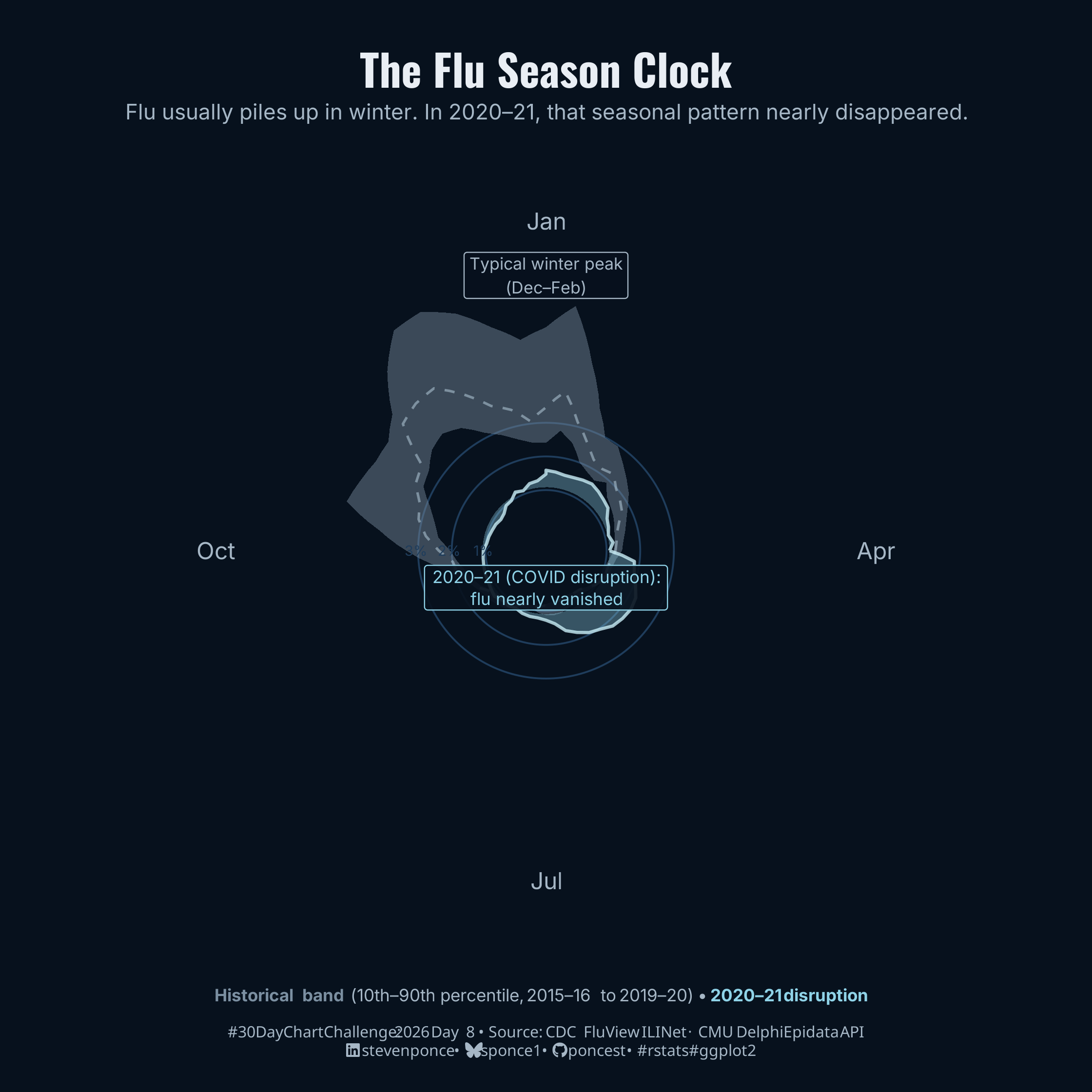
subtitle: "Flu usually piles up in winter. In 2020–21, that seasonal pattern nearly disappeared."
description: "A circular distribution of weekly U.S. flu activity across the 52-week year, using CDC FluView ILINet data. The gray band shows the typical seasonal range from 2015–16 to 2019–20, with a sharp peak in winter months. The cyan shape shows the 2020–21 season, when COVID-19 pandemic measures nearly eliminated flu activity. Built with ggplot2 and coord_polar in R."
date: "2026-04-08"
author:
- name: "Steven Ponce"
url: "https://stevenponce.netlify.app"
citation:
url: "https://stevenponce.netlify.app/data_visualizations/30DayChartChallenge/2026/30dcc_2026_08.html"
categories: ["30DayChartChallenge", "2026"]
tags: [
"30DayChartChallenge",
"Distributions",
"Circular",
"Polar Chart",
"Flu",
"CDC FluView",
"ILINet",
"COVID-19",
"Seasonal Pattern",
"Public Health",
"ggplot2",
"coord_polar",
"Anomaly Detection",
"Time Distribution",
]
image: "thumbnails/30dcc_2026_08.png"
format:
html:
toc: true
toc-depth: 5
code-link: true
code-fold: true
code-tools: true
code-summary: "Show code"
theme:
light: [flatly, assets/styling/custom_styles.scss]
dark: [darkly, assets/styling/custom_styles_dark.scss]
editor_options:
chunk_output_type: inline
execute:
freeze: true
cache: true
error: false
message: false
warning: false
eval: true
---
{#fig-1}
### [**Steps to Create this Graphic**]{.mark}
#### [1. Load Packages & Setup]{.smallcaps}
```{r}
#| label: load
#| warning: false
#| message: false
#| results: "hide"

## 1. LOAD PACKAGES & SETUP ----
suppressPackageStartupMessages({
pacman::p_load(
  tidyverse, ggtext, showtext, patchwork,
  janitor, scales, glue, httr2, jsonlite
  )
})

### |- figure size ----
camcorder::gg_record(
  dir    = here::here("temp_plots"),
  device = "png",
  width  = 7,
  height = 7,
  units  = "in",
  dpi    = 320
)

# Source utility functions
suppressMessages(source(here::here("R/utils/fonts.R")))
source(here::here("R/utils/social_icons.R"))
source(here::here("R/utils/image_utils.R"))
source(here::here("R/themes/base_theme.R"))

### |- helper: fetch one epiweek range from Delphi Epidata ----
# fetch_fluview <- function(epiweek_start, epiweek_end) {
#   resp <- request("https://api.delphi.cmu.edu/epidata/fluview/") |>
#     req_url_query(
#       regions  = "nat",
#       epiweeks = glue("{epiweek_start}-{epiweek_end}")
#     ) |>
#     req_perform()
#
#   content <- resp |>
#     resp_body_string() |>
#     fromJSON(simplifyDataFrame = TRUE)
#
#   if (content$result != 1) {
#     stop(glue("Epidata API error: {content$message}"))
#   }
#
#   content$epidata |>
#     as_tibble() |>
#     clean_names()
# }

### |- cache path ----
# cache_path <- here::here("2026/data/fluview_national_ilinet.csv")

### |- read from cache or fetch from API ----
# if (file.exists(cache_path)) {
#   message("Cache found — reading from local CSV.")
#   flu_raw <- read_csv(cache_path, show_col_types = FALSE)
# } else {
#   message("No cache — fetching from CMU Delphi Epidata API...")
#   flu_raw <- tryCatch(
#     {
#       bind_rows(
#         fetch_fluview(201540, 202039),
#         fetch_fluview(202040, 202439)
#       )
#     },
#     error = function(e) {
#       stop("API fetch failed: ", e$message)
#     }
#   )
#   dir.create(here::here("2026/data"), showWarnings = FALSE, recursive = TRUE)
#   write_csv(flu_raw, cache_path)
#   message("Data cached to: ", cache_path)
# }
```
#### [2. Read in the Data]{.smallcaps}
```{r}
#| label: read
#| include: true
#| eval: true
#| warning: false

### |- RSF 2025 ----
flu_raw <- read_csv(
  here::here("data/30DayChartChallenge/2026/fluview_national_ilinet.csv"),
  show_col_types = FALSE
) |>
  clean_names()
```
#### [3. Examine the Data]{.smallcaps}
```{r}
#| label: examine
#| include: true
#| eval: true
#| results: 'hide'
#| warning: false

glimpse(flu_raw)
```
#### [4. Tidy Data]{.smallcaps}
```{r}
#| label: tidy
#| warning: false

### |-column parsing ----
if ("epiweek" %in% names(flu_raw)) {
  epi_year <- as.integer(flu_raw$epiweek) %/% 100L
  epi_week <- as.integer(flu_raw$epiweek) %% 100L
} else {
  epi_year <- rep(NA_integer_, nrow(flu_raw))
  epi_week <- rep(NA_integer_, nrow(flu_raw))
}

flu_parsed <- flu_raw |>
  mutate(
    year = if ("year" %in% names(flu_raw)) coalesce(as.integer(.data$year), epi_year) else epi_year,
    week = if ("week" %in% names(flu_raw)) coalesce(as.integer(.data$week), epi_week) else epi_week
  ) |>
  filter(!is.na(wili), !is.na(year), !is.na(week))

flu_tidy <- flu_parsed |>
  mutate(
    season_start = if_else(week >= 40L, year, year - 1L),
    season_label = glue("{season_start}-{str_sub(season_start + 1L, 3, 4)}"),
    week_shifted = ((week - 1L + 13L) %% 52L) + 1L
  ) |>
  filter(season_start >= 2015L, season_start <= 2023L)

### |- classify into layers ----
flu_classified <- flu_tidy |>
  mutate(
    layer = case_when(
      season_start %in% 2015:2019 ~ "historical",
      season_start == 2020L ~ "covid",
      TRUE ~ NA_character_
    )
  ) |>
  filter(!is.na(layer))

### |- historical band (10th-90th percentile) ----
historical_band <- flu_classified |>
  filter(layer == "historical") |>
  group_by(week_shifted) |>
  summarise(
    ili_lo     = quantile(wili, 0.10, na.rm = TRUE),
    ili_median = median(wili, na.rm = TRUE),
    ili_hi     = quantile(wili, 0.90, na.rm = TRUE),
    .groups    = "drop"
  )

### |- COVID season ----
covid_line <- flu_classified |>
  filter(layer == "covid") |>
  arrange(week_shifted)

### |- close polygons at the seam ----
historical_closed <- bind_rows(
  historical_band,
  historical_band |> slice(1) |> mutate(week_shifted = 53)
)

covid_closed <- bind_rows(
  covid_line,
  covid_line |> slice(1) |> mutate(week_shifted = 53)
)

### |- historical band as explicit polygon ----
historical_band_poly <- bind_rows(
  historical_closed |> transmute(week_shifted, y = ili_hi),
  historical_closed |> transmute(week_shifted, y = ili_lo) |> arrange(desc(week_shifted))
)

### |- scale helpers ----
y_max      <- ceiling(max(historical_closed$ili_hi, na.rm = TRUE)) + 1
inner_hole <- 0.8

### |- reference ring data ----
ring_values <- c(1, 2, 3)
ring_values <- ring_values[ring_values < y_max]

ring_data <- expand_grid(
  week_shifted = seq(1, 53, by = 0.25),
  ring_val     = ring_values
)

### |- ring % labels  ----
ring_labels <- tibble(
  x     = 27,
  y     = inner_hole + ring_values + 0.08,
  label = paste0(ring_values, "%")
)

### |- month labels ----
month_labels <- tibble(
  x     = c(14, 27, 40,  1),
  y     = inner_hole + y_max * 1.00,
  label = c("Jan", "Oct", "Jul", "Apr")
)
```
#### [5. Visualization Parameters]{.smallcaps}
```{r}
#| label: params
#| include: true
#| warning: false

### |- plot aesthetics ----
colors <- get_theme_colors(
  palette = list(
    col_bg         = "#07111d",
    col_band_fill  = "#7b8fa1",
    col_band_line  = "#a8bfcf",
    col_covid_fill = "#8fd3e8",
    col_covid_line = "#c8ecf5",
    col_text       = "#e9eef4",
    col_subtext    = "#a6b7c6",
    col_grid       = "#1f3d5c"
  )
)

### |- titles and caption ----
title_text    <- "The Flu Season Clock"

subtitle_text <- "Flu usually piles up in winter. In 2020\u201321, that seasonal pattern nearly disappeared."

caption_text  <- create_dcc_caption(
  dcc_year    = 2026,
  dcc_day     = 08,
  source_text = "CDC FluView ILINet \u00b7 CMU Delphi Epidata API"
)

### |- fonts ----
setup_fonts()
fonts <- get_font_families()

font_body    <- fonts$text    %||% ""
font_title   <- fonts$title   %||% ""
font_caption <- fonts$caption %||% ""
```
#### [6. Plot]{.smallcaps}
```{r}
#| label: plot
#| warning: false
### |- main clock plot ----
p_clock <- ggplot() +
# Geoms
geom_line(
data = ring_data,
aes(x = week_shifted, y = inner_hole + ring_val, group = ring_val),
color = colors$palette$col_grid,
linewidth = 0.4
) +
geom_polygon(
data = historical_band_poly,
aes(x = week_shifted, y = inner_hole + y),
fill = colors$palette$col_band_fill,
alpha = 0.45
) +
geom_line(
data = historical_closed,
aes(x = week_shifted, y = inner_hole + ili_median),
color = colors$palette$col_band_line,
linewidth = 0.55,
alpha = 0.6,
linetype = "dashed"
) +
geom_polygon(
data = covid_closed,
aes(x = week_shifted, y = inner_hole + wili),
fill = colors$palette$col_covid_fill,
alpha = 0.35
) +
geom_line(
data = covid_closed,
aes(x = week_shifted, y = inner_hole + wili),
color = colors$palette$col_covid_line,
linewidth = 0.7,
alpha = 0.8
) +
geom_text(
data = ring_labels,
aes(x = x, y = y, label = label),
color = colors$palette$col_grid,
size = 2.3,
hjust = 0.5,
family = font_body
) +
geom_text(
data = month_labels,
aes(x = x, y = y, label = label),
color = colors$palette$col_subtext,
size = 3.8,
hjust = 0.5,
family = font_body
) +
# Annotate
annotate(
"label",
x = 40,
y = inner_hole + 0.30,
label = "2020\u201321 (COVID disruption):\nflu nearly vanished",
color = colors$palette$col_covid_fill,
fill = alpha(colors$palette$col_bg, 0.90),
label.size = 0,
size = 2.8,
hjust = 0.5,
lineheight = 1.05,
family = font_body
) +
annotate(
"label",
x = 14,
y = inner_hole + y_max * 0.82,
label = "Typical winter peak\n(Dec\u2013Feb)",
color = colors$palette$col_subtext,
fill = alpha(colors$palette$col_bg, 0.88),
label.size = 0,
size = 2.7,
hjust = 0.5,
family = font_body
) +
coord_polar(start = -pi / 2, direction = -1, clip = "off") +
# Scales
scale_x_continuous(limits = c(1, 53), breaks = NULL, expand = c(0, 0)) +
scale_y_continuous(limits = c(0, inner_hole + y_max * 1.02), breaks = NULL, expand = c(0, 0)) +
# Labs
labs(title = title_text, subtitle = subtitle_text) +
# Theme
theme_void() +
theme(
plot.background = element_rect(fill = colors$palette$col_bg, color = NA),
panel.background = element_rect(fill = colors$palette$col_bg, color = NA),
plot.title = element_text(
family = font_title,
face = "bold",
color = colors$palette$col_text,
size = 20,
hjust = 0.5,
margin = margin(t = 14, b = 4)
),
plot.subtitle = element_text(
family = font_body,
color = colors$palette$col_subtext,
size = 10,
hjust = 0.5,
lineheight = 1.3,
margin = margin(b = 2)
),
plot.margin = margin(5, 5, 0, 5)
)
### |- caption + legend panel ----
legend_line <- glue(
"<span style='color:{colors$palette$col_band_fill};'><b>Historical band</b></span>",
" (10th\u201390th percentile, 2015\u201316 to 2019\u201320) \u2022 ",
"<span style='color:{colors$palette$col_covid_fill};'><b>2020\u201321 disruption</b></span>"
)
p_caption <- ggplot() +
annotate(
"richtext",
x = 0.5, y = 0.75,
label = legend_line,
color = colors$palette$col_subtext,
fill = NA,
label.color = NA,
size = 2.8,
hjust = 0.5,
family = font_body
) +
annotate(
"richtext",
x = 0.5, y = 0.20,
label = caption_text,
color = colors$palette$col_subtext,
fill = NA,
label.color = NA,
size = 2.5,
hjust = 0.5,
family = font_caption
) +
scale_x_continuous(limits = c(0, 1)) +
scale_y_continuous(limits = c(0, 1)) +
theme_void() +
theme(
plot.background = element_rect(fill = colors$palette$col_bg, color = NA),
plot.margin = margin(0, 10, 8, 10)
)
### |- combined plots ----
combined_plots <- p_clock / p_caption +
plot_layout(heights = c(10, 1.1)) +
plot_annotation(
theme = theme(plot.background = element_rect(fill = colors$palette$col_bg, color = NA))
)
```
#### [7. Save]{.smallcaps}
```{r}
#| label: save
#| warning: false

### |-  plot image ----
save_plot_patchwork(
  combined_plots,
  type = "30daychartchallenge",
  year = 2026,
  day = 08,
  width = 7,
  height = 7
  )
```
#### [8. Session Info]{.smallcaps}
::: {.callout-tip collapse="true"}
##### Expand for Session Info
```{r, echo = FALSE}
#| eval: true
#| warning: false
sessionInfo()
```
:::
#### [9. GitHub Repository]{.smallcaps}
::: {.callout-tip collapse="true"}
##### Expand for GitHub Repo
The complete code for this analysis is available in [`30dcc_2026_08.qmd`](https://github.com/poncest/personal-website/blob/master/data_visualizations/TidyTuesday/2026/30dcc_2026_08.qmd).
For the full repository, [click here](https://github.com/poncest/personal-website/).
:::
#### [10. References]{.smallcaps}
::: {.callout-tip collapse="true"}
##### Expand for References
1. Data Sources:
- Centers for Disease Control and Prevention (CDC). (2026). *FluView: ILINet —
U.S. Outpatient Influenza-like Illness Surveillance Network*.
Retrieved April 2026 from https://gis.cdc.gov/grasp/fluview/fluportaldashboard.html
- Reinhart, A., Brooks, L., Jahja, M., Rumack, A., Tang, J., Saeed, W. A. I., ... &
Tibshirani, R. J. (2021). *An open repository of real-time COVID-19 indicators*.
PNAS, 118(51). https://doi.org/10.1073/pnas.2111452118
- CMU Delphi Group. (2026). *Delphi Epidata API — FluView endpoint*.
Retrieved April 2026 from https://api.delphi.cmu.edu/epidata/fluview/
:::
#### [11. Custom Functions Documentation]{.smallcaps}
::: {.callout-note collapse="true"}
##### 📦 Custom Helper Functions
This analysis uses custom functions from my personal module library for efficiency and consistency across projects.
**Functions Used:**
- **`fonts.R`**: `setup_fonts()`, `get_font_families()` - Font management with showtext
- **`social_icons.R`**: `create_social_caption()` - Generates formatted social media captions
- **`image_utils.R`**: `save_plot()` - Consistent plot saving with naming conventions
- **`base_theme.R`**: `create_base_theme()`, `extend_weekly_theme()`, `get_theme_colors()` - Custom ggplot2 themes
**Why custom functions?**\
These utilities standardize theming, fonts, and output across all my data visualizations. The core analysis (data tidying and visualization logic) uses only standard tidyverse packages.
**Source Code:**\
View all custom functions → [GitHub: R/utils](https://github.com/poncest/personal-website/tree/master/R)
:::
