---
title: "The Confidence Cascade"
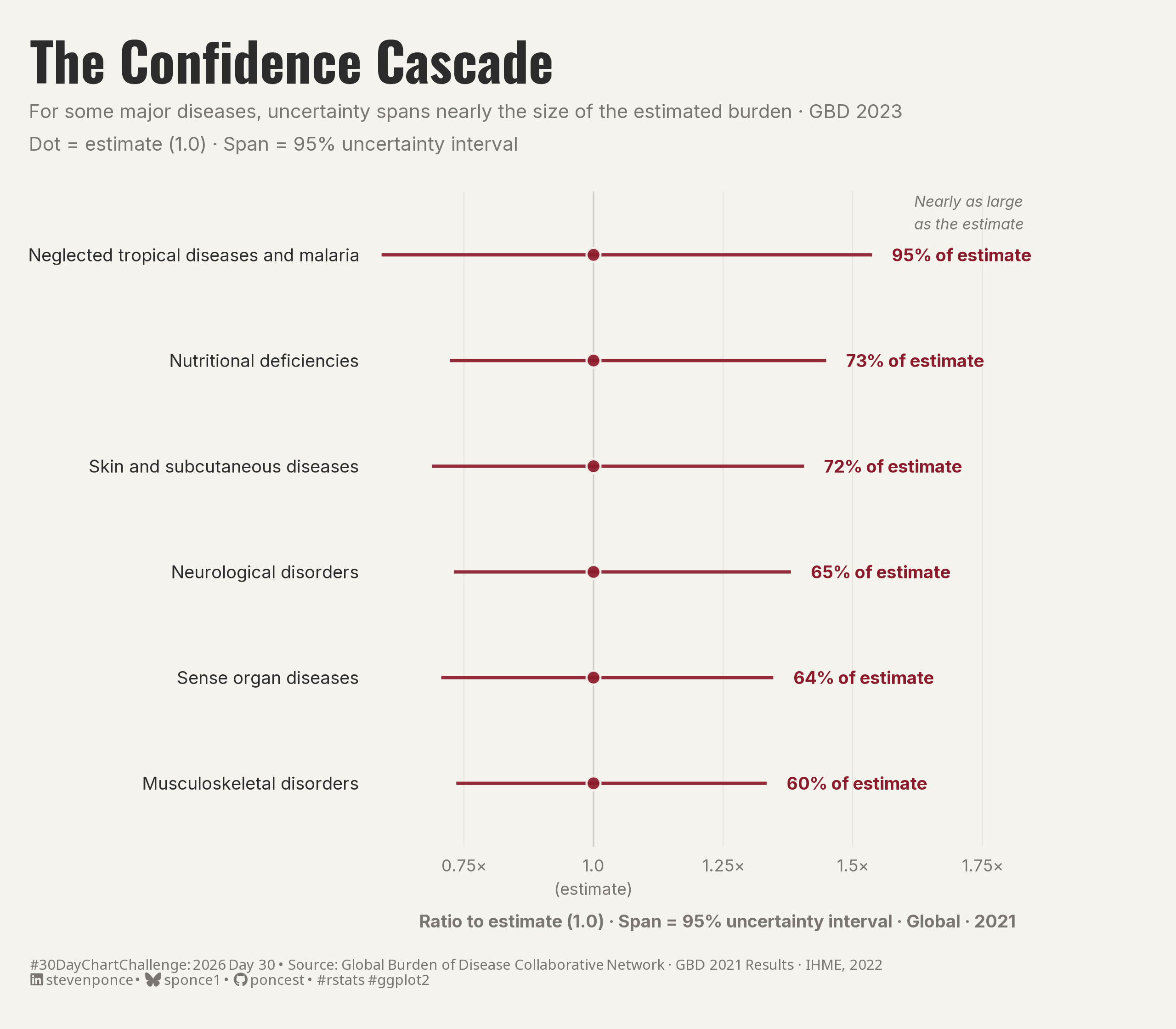
subtitle: "For some major diseases, uncertainty spans nearly the size of the estimated burden (GBD 2023). Dot = estimate (1.0), Span = 95% uncertainty interval"
description: "A point-interval chart showing the 6 global disease groups with the highest relative uncertainty in the 2021 GBD estimates. Each 95% uncertainty interval is normalized to its own central estimate, placing the dot at 1.0 and expressing the span as a ratio. Built with ggdist's geom_pointinterval in R."
date: "2026-04-30"
author:
- name: "Steven Ponce"
url: "https://stevenponce.netlify.app"
citation:
url: "https://stevenponce.netlify.app/data_visualizations/30DayChartChallenge/2026/30dcc_2026_30.html"
categories: ["30DayChartChallenge", "2026"]
tags: [
"30DayChartChallenge",
"Uncertainties",
"GHDx",
"Global Burden of Disease",
"Point-Interval Chart",
"ggdist",
"Uncertainty Visualization",
"Normalized Intervals",
"IHME",
"Global Health",
"Data Day"
]
image: "thumbnails/30dcc_2026_30.png"
format:
html:
toc: true
toc-depth: 5
code-link: true
code-fold: true
code-tools: true
code-summary: "Show code"
theme:
light: [flatly, assets/styling/custom_styles.scss]
dark: [darkly, assets/styling/custom_styles_dark.scss]
editor_options:
chunk_output_type: inline
execute:
freeze: true
cache: true
error: false
message: false
warning: false
eval: true
---
{#fig-1}
### [**Steps to Create this Graphic**]{.mark}
#### [1. Load Packages & Setup]{.smallcaps}
```{r}
#| label: load
#| warning: false
#| message: false
#| results: "hide"

## 1. LOAD PACKAGES & SETUP ----
suppressPackageStartupMessages({
pacman::p_load(
  tidyverse, ggtext, showtext, janitor,
  scales, glue, camcorder, ggdist
  )
})

### |- figure size ----
camcorder::gg_record(
  dir    = here::here("temp_plots"),
  device = "png",
  width  = 8,
  height = 7,
  units  = "in",
  dpi    = 320
)

# Source utility functions
suppressMessages(source(here::here("R/utils/fonts.R")))
source(here::here("R/utils/social_icons.R"))
source(here::here("R/utils/image_utils.R"))
source(here::here("R/themes/base_theme.R"))
```
#### [2. Read in the Data]{.smallcaps}
```{r}
#| label: read
#| include: true
#| eval: true
#| warning: false

raw_gbd <- read_csv(
  here::here("data/30DayChartChallenge/2026/gbd_2021_dalys_level2_global.csv"),
  show_col_types = FALSE
) |>
  clean_names()
```
#### [3. Examine the Data]{.smallcaps}
```{r}
#| label: examine
#| include: true
#| eval: true
#| results: 'hide'
#| warning: false

glimpse(raw_gbd)
raw_gbd |> count(cause_name)
```
#### [4. Tidy Data]{.smallcaps}
```{r}
#| label: tidy
#| warning: false

gbd <- raw_gbd |>
  rename(cause = cause_name) |>
  select(cause, val, lower, upper) |>
  mutate(
    ui_width = upper - lower,
    rel_ui = ui_width / val * 100,
    # normalize: express as ratio of central estimate
    # dot always at 1.0; span = how far the CI reaches in either direction
    val_norm = 1.0,
    lower_norm = lower / val,
    upper_norm = upper / val,
    # retain billions for caption reference
    val_b = val / 1e9,
    lower_b = lower / 1e9,
    upper_b = upper / 1e9
  ) |>
  arrange(desc(rel_ui)) |>
  mutate(rank_ui = row_number())

# Top 6 by relative uncertainty
focus_gbd <- gbd |>
  slice_head(n = 6) |>
  mutate(
    cause_plot = factor(cause, levels = rev(cause)),
    label_text = paste0(round(rel_ui, 0), "% of estimate")
  )
```
#### [5. Visualization Parameters]{.smallcaps}
```{r}
#| label: params
#| include: true
#| warning: false

### |- plot aesthetics ----
colors <- get_theme_colors(
  palette = list(
    bg     = "#F5F3EE",
    neutral = "#B0AAA2",
    accent = "#8B1A2A",
    text   = "#2C2C2C",
    subtext = "#7A7570",
    grid   = "#E4E0DA"
  )
)

# Extract scalars for annotate()
col_bg      <- colors$palette$bg
col_subtext <- colors$palette$subtext
col_accent  <- colors$palette$accent
col_grid    <- colors$palette$grid
col_text    <- colors$palette$text
col_neutral <- colors$palette$neutral

### |- titles and caption ----
title_text    <- "The Confidence Cascade"

subtitle_text <- "For some major diseases, uncertainty spans nearly the size of the estimated burden \u00b7 GBD 2023\nDot = estimate (1.0) \u00b7 Span = 95% uncertainty interval"

caption_text <- create_dcc_caption(
  dcc_year    = 2026,
  dcc_day     = 30,
  source_text = "Global Burden of Disease Collaborative Network \u00b7 GBD 2021 Results \u00b7 IHME, 2022"
)

### |- fonts ----
setup_fonts()
fonts <- get_font_families()

### |- plot theme ----
base_theme <- create_base_theme(colors)

weekly_theme <- extend_weekly_theme(
  base_theme,
  theme(
    plot.background = element_rect(fill = col_bg, color = NA),
    panel.background = element_rect(fill = col_bg, color = NA),
    plot.title = element_text(
      size = 26, face = "bold",
      family = fonts$title, color = col_text,
      margin = margin(b = 5)
    ),
    plot.subtitle = element_text(
      size       = 9.5, family = fonts$subtitle,
      color      = col_subtext,
      lineheight = 1.4, margin = margin(b = 18)
    ),
    plot.caption = element_markdown(
      size = 7.0, family = fonts$caption,
      color = col_subtext, linewidth = 1.3,
      hjust = 0, margin = margin(t = 14)
    ),
    axis.text.y = element_text(
      size = 8.5, family = fonts$text,
      color = col_text, hjust = 1
    ),
    axis.text.x = element_text(
      size = 8, family = fonts$text,
      color = col_subtext, lineheight = 1.2
    ),
    axis.title.x = element_text(
      size = 8.5, family = fonts$text,
      color = col_subtext, margin = margin(t = 8)
    ),
    axis.ticks = element_blank(),

    # vertical grid at ratio breaks — helps read the span
    panel.grid.major.x = element_line(color = col_grid, linewidth = 0.2),
    panel.grid.major.y = element_blank(),
    panel.grid.minor = element_blank(),
    plot.margin = margin(t = 20, r = 55, b = 20, l = 15)
  )
)

theme_set(weekly_theme)
```
#### [6. Plot]{.smallcaps}
```{r}
#| label: plot
#| warning: false

### |- main plot ----
p <- ggplot(
  focus_gbd,
  aes(
    y = cause_plot,
    x = val_norm,
    xmin = lower_norm,
    xmax = upper_norm
  )
) +
  # Geoms
  geom_vline(
    xintercept = 1,
    color = "#CECDCA",
    linewidth = 0.35,
    linetype = "solid"
  ) +
  geom_pointinterval(
    color = col_accent,
    point_color = col_bg,
    point_fill = col_accent,
    shape = 21,
    linewidth = 2.0,
    fatten_point = 4.5,
    alpha = 0.92
  ) +
  geom_text(
    aes(x = upper_norm, label = label_text),
    hjust = -0.15,
    family = fonts$text,
    size = 3.0,
    fontface = "bold",
    color = col_accent
  ) +

  # Annotate
  annotate(
    "text",
    x = 1.62, y = 6.4,
    label = "Nearly as large\nas the estimate",
    hjust = 0, vjust = 0.5,
    size = 2.6, family = fonts$text,
    color = col_subtext, fontface = "italic",
    lineheight = 1.25
  ) +

  # Scales
  scale_x_continuous(
    breaks = c(0.25, 0.5, 0.75, 1.0, 1.25, 1.5, 1.75, 2.0),
    labels = function(x) ifelse(x == 1, "1.0\n(estimate)", paste0(x, "\u00d7")),
    expand = expansion(mult = c(0.02, 0.28))
  ) +
  coord_cartesian(clip = "off") +

  # Labs
  labs(
    title = title_text,
    subtitle = subtitle_text,
    caption = caption_text,
    x = "Ratio to estimate (1.0) · Span = 95% uncertainty interval · Global · 2021",
    y = NULL
  )
```
#### [7. Save]{.smallcaps}
```{r}
#| label: save
#| warning: false

### |- plot image ----
save_plot(
  p,
  type = "30daychartchallenge",
  year = 2026,
  day = 30,
  width = 8,
  height = 7
  )
```
#### [8. Session Info]{.smallcaps}
::: {.callout-tip collapse="true"}
##### Expand for Session Info
```{r, echo = FALSE}
#| eval: true
#| warning: false
sessionInfo()
```
:::
#### [9. GitHub Repository]{.smallcaps}
::: {.callout-tip collapse="true"}
##### Expand for GitHub Repo
The complete code for this analysis is available in [`30dcc_2026_30.qmd`](https://github.com/poncest/personal-website/blob/master/data_visualizations/TidyTuesday/2026/30dcc_2026_30.qmd).
For the full repository, [click here](https://github.com/poncest/personal-website/).
:::
#### [10. References]{.smallcaps}
::: {.callout-tip collapse="true"}
##### Expand for References
1. **Data Sources:**
- Global Burden of Disease Collaborative Network. *Global Burden of Disease Study 2021
(GBD 2021) Results.* Seattle, United States: Institute for Health Metrics and
Evaluation (IHME), 2024. Available from: https://vizhub.healthdata.org/gbd-results/
2. **Key Datasets:**
- `gbd_2021_dalys_level2_global.csv` — DALYs (Disability-Adjusted Life Years),
Level 2 causes, Global, Both sexes, All ages, Year = 2021, Metric = Number.
Downloaded from the GBD Results Tool (IHME). 22 cause groups included.
:::
#### [11. Custom Functions Documentation]{.smallcaps}
::: {.callout-note collapse="true"}
##### 📦 Custom Helper Functions
This analysis uses custom functions from my personal module library for efficiency and consistency across projects.
**Functions Used:**
- **`fonts.R`**: `setup_fonts()`, `get_font_families()` - Font management with showtext
- **`social_icons.R`**: `create_social_caption()` - Generates formatted social media captions
- **`image_utils.R`**: `save_plot()` - Consistent plot saving with naming conventions
- **`base_theme.R`**: `create_base_theme()`, `extend_weekly_theme()`, `get_theme_colors()` - Custom ggplot2 themes
**Why custom functions?**\
These utilities standardize theming, fonts, and output across all my data visualizations. The core analysis (data tidying and visualization logic) uses only standard tidyverse packages.
**Source Code:**\
View all custom functions → [GitHub: R/utils](https://github.com/poncest/personal-website/tree/master/R)
:::
