---
title: "Gold Rallies When Real Interest Rates Turn Negative"
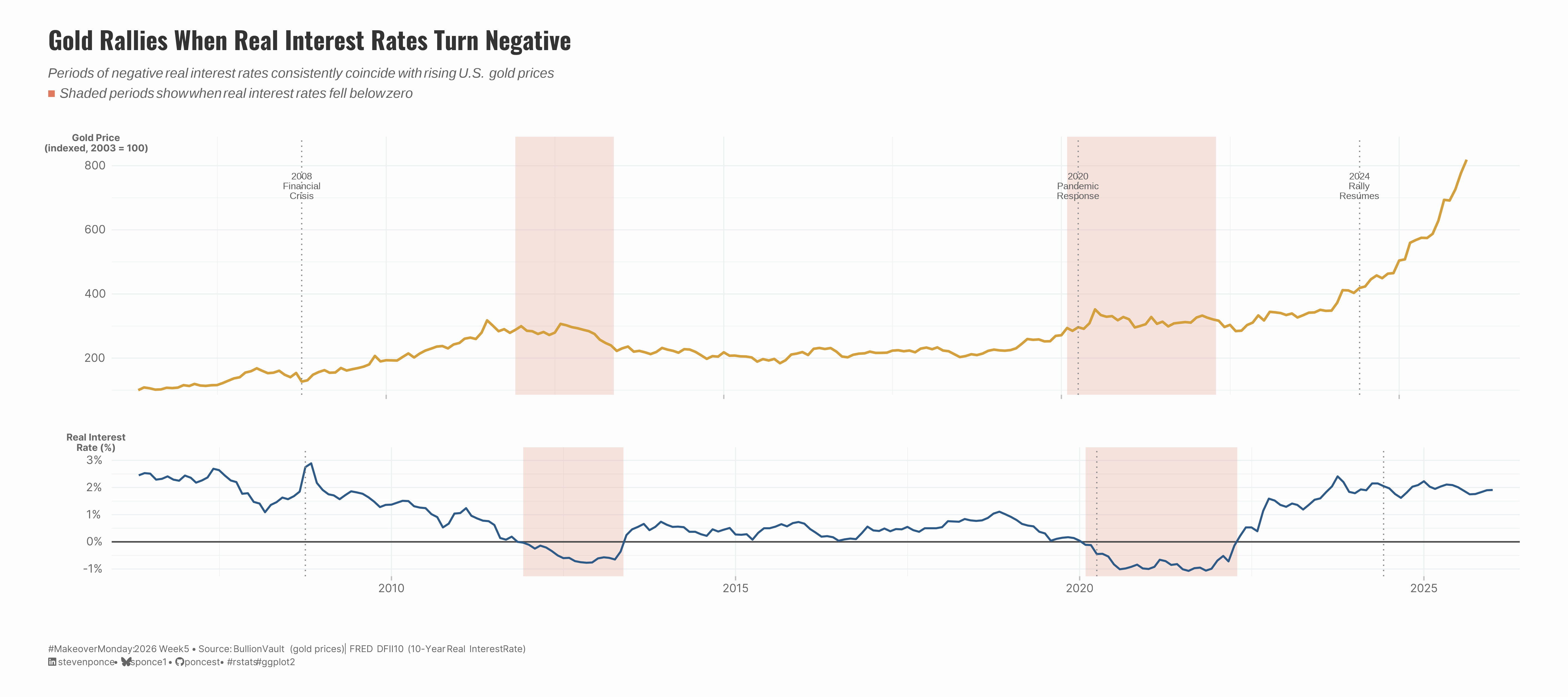
subtitle: "Periods of negative real interest rates consistently coincide with rising U.S. gold prices"
description: "A two-panel visualization exploring the inverse relationship between U.S. gold prices and real interest rates from 2003 to 2025. Shaded bands highlight periods when real rates turned negative, revealing a consistent pattern: gold rallies when holding cash loses its real value. Built with R, ggplot2, and patchwork using data from BullionVault and FRED."
date: "2026-02-01"
author:
- name: "Steven Ponce"
url: "https://stevenponce.netlify.app"
citation:
url: "https://stevenponce.netlify.app/data_visualizations/MakeoverMonday/2026/mm_2026_05.html"
categories: ["MakeoverMonday", "2026"]
tags: [
"makeover-monday",
"data-visualization",
"ggplot2",
"patchwork",
"gold-prices",
"interest-rates",
"FRED",
"economic-indicators",
"time-series",
"financial-data",
"R"
]
image: "thumbnails/mm_2026_05.png"
format:
html:
toc: true
toc-depth: 5
code-link: true
code-fold: true
code-tools: true
code-summary: "Show code"
theme:
light: [flatly, assets/styling/custom_styles.scss]
dark: [darkly, assets/styling/custom_styles_dark.scss]
editor_options:
chunk_output_type: inline
execute:
freeze: true
cache: true
error: false
message: false
warning: false
eval: true
---
```{r}
#| label: setup-links
#| include: false
# CENTRALIZED LINK MANAGEMENT
## Project-specific info
current_year <- 2026
current_week <- 05
project_file <- "mm_2026_05.qmd"
project_image <- "mm_2026_05.png"
## Data Sources
data_main <- "https://data.world/makeovermonday/2025w5-gold-prices"
data_secondary <- "https://data.world/makeovermonday/2025w5-gold-prices"
## Repository Links
repo_main <- "https://github.com/poncest/personal-website/"
repo_file <- paste0("https://github.com/poncest/personal-website/blob/master/data_visualizations/MakeoverMonday/", current_year, "/", project_file)
## External Resources/Images
chart_original <- "https://raw.githubusercontent.com/poncest/MakeoverMonday/refs/heads/master/2026/Week_05/original_chart.png"
## Organization/Platform Links
org_primary <- "https://www.bullionvault.com/gold-price-chart.do"
org_secondary <- "https://www.bullionvault.com/gold-price-chart.do"
# Helper function to create markdown links
create_link <- function(text, url) {
paste0("[", text, "](", url, ")")
}
# Helper function for citation-style links
create_citation_link <- function(text, url, title = NULL) {
if (is.null(title)) {
paste0("[", text, "](", url, ")")
} else {
paste0("[", text, "](", url, ' "', title, '")')
}
}
```
### Original
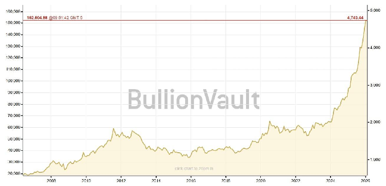
The original visualization comes from `r create_link("Gold Prices", data_secondary)`
### Makeover
{#fig-1}
### [**Steps to Create this Graphic**]{.mark}
#### [1. Load Packages & Setup]{.smallcaps}
```{r}
#| label: load
#| warning: false
#| message: false
#| results: "hide"

## 1. LOAD PACKAGES & SETUP ----
suppressPackageStartupMessages({
  if (!require("pacman")) install.packages("pacman")
  pacman::p_load(
  tidyverse, ggtext, showtext, scales, glue,
  patchwork, fredr, janitor, lubridate
)
})

### |- figure size ----
camcorder::gg_record(
    dir    = here::here("temp_plots"),
    device = "png",
    width  = 10,
    height = 8,
    units  = "in",
    dpi    = 320
)

# Source utility functions
suppressMessages(source(here::here("R/utils/fonts.R")))
source(here::here("R/utils/social_icons.R"))
source(here::here("R/utils/image_utils.R"))
source(here::here("R/themes/base_theme.R"))
```
#### [2. Read in the Data]{.smallcaps}
```{r}
#| label: read
#| include: true
#| eval: true
#| warning: false
#|

gold_prices_raw <- read_csv(
  here::here("data/MakeoverMonday/2026/MM2026 WK5 Gold Price.csv")) |>
  clean_names()

### |- Real interest rates from FRED ----
# real_rates_raw <- fredr(
#   series_id = "DFII10",
#   observation_start = as.Date("2003-01-01"),
#   observation_end = Sys.Date(),
#   frequency = "m"
# ) |>
#   select(date, value) |>
#   rename(real_rate = value)

# Read saved FRED data (instead of fredr call)
real_rates_raw <- read_csv(
  here::here("data/MakeoverMonday/2026/MM2026_WK5_fredr_real_rates.csv")) |>
  clean_names() |>
  select(date, value) |>
  rename(real_rate = value)
```
#### [3. Examine the Data]{.smallcaps}
```{r}
#| label: examine
#| include: true
#| eval: true
#| results: 'hide'
#| warning: false

glimpse(gold_prices_raw)
glimpse(real_rates_raw)
```
#### [4. Tidy Data]{.smallcaps}
```{r}
#| label: tidy
#| warning: false

### |- Clean gold prices ----
gold_clean <- gold_prices_raw |>
  mutate(
    date = case_when(
      str_detect(date, " ") ~ as.Date(str_extract(date, "^[^ ]+")),
      TRUE ~ as.Date(date)
    ),
    price_kg = close_kg
  ) |>
  filter(date >= as.Date("2003-01-01")) |>
  arrange(date)

### |- Aggregate gold to monthly ----
gold_monthly <- gold_clean |>
  mutate(year_month = floor_date(date, "month")) |>
  group_by(year_month) |>
  summarise(
    price_kg = last(price_kg),
    .groups = "drop"
  ) |>
  rename(date = year_month)

### |- Merge datasets ----
combined_data <- gold_monthly |>
  left_join(real_rates_raw, by = "date") |>
  filter(!is.na(real_rate)) |>
  mutate(
    # Index gold to base 100 (first observation)
    gold_indexed = (price_kg / first(price_kg)) * 100,
    year = year(date),
    # Flag negative rate periods
    negative_rate = real_rate < 0
  )

### |- Identify negative rate periods for shading ----
# Find continuous spans where real_rate < 0
negative_periods <- combined_data |>
  mutate(
    # Create group ID for consecutive negative periods
    neg_group = cumsum(negative_rate != lag(negative_rate, default = FALSE))
  ) |>
  filter(negative_rate) |>
  group_by(neg_group) |>
  summarise(
    xmin = min(date),
    xmax = max(date),
    .groups = "drop"
  ) |>
  # Add small buffer for visual clarity
  mutate(
    xmax = xmax + days(15)
  )

### |- Key annotations ----
annotations <- tibble(
  date = as.Date(c("2008-10-01", "2020-04-01", "2024-06-01")),
  label = c(
    "2008\nFinancial\nCrisis",
    "2020\nPandemic\nResponse",
    "2024\nRally\nResumes"
  )
)
```
#### [5. Visualization Parameters]{.smallcaps}
```{r}
#| label: params
#| include: true
#| warning: false

### |-  plot aesthetics ----
colors <- get_theme_colors(
  palette = list(
    gold          = "#D4A03E",
    gold_dark     = "#8B6914",
    rate_line     = "#2E5A87",
    negative_zone = "#E07A5F",
    text_dark     = "#2D2D2D",
    text_mid      = "#5A5A5A",
    text_light    = "#8A8A8A",
    grid          = "#E8E8E8",
    background    = "#FAFAFA",
    zero_line     = "#4A4A4A"
  )
)

### |-  Main titles ----
title_text <- "Gold Rallies When Real Interest Rates Turn Negative"

subtitle_text <- str_glue(
  "Periods of negative real interest rates consistently coincide with rising U.S. gold prices<br>",
  "<span style='color:{colors$palette$negative_zone}'>■</span> ",
  "Shaded periods show when real interest rates fell below zero"
)

caption_text <- create_mm_caption(
  mm_year = 2026, mm_week = 05,
  source_text = str_glue(
    "BullionVault (gold prices) | FRED DFII10 (10-Year Real Interest Rate)"
  )
)

### |-  fonts ----
setup_fonts()
fonts <- get_font_families()

### |-  plot theme ----

# Start with base theme
base_theme <- create_base_theme(colors)

# Add weekly-specific theme elements
weekly_theme <- extend_weekly_theme(
  base_theme,
  theme(
    # # Text styling
    plot.title = element_text(
      size = rel(1.3), family = fonts$title, face = "bold",
      color = colors$title, lineheight = 1.1, hjust = 0,
      margin = margin(t = 5, b = 10)
    ),
    plot.subtitle = element_text(
      size = rel(0.8), family = fonts$subtitle, face = "italic",
      color = alpha(colors$subtitle, 0.9), lineheight = 1.1,
      margin = margin(t = 0, b = 20)
    ),

    # Legend formatting
    legend.position = "plot",
    legend.justification = "right",
    legend.margin = margin(l = 12, b = 5),
    legend.key.size = unit(0.8, "cm"),
    legend.box.margin = margin(b = 10),

    # Axis formatting
    # axis.line.x = element_line(color = "#252525", linewidth = .1),
    # axis.ticks.y = element_blank(),
    axis.ticks.x = element_line(color = "gray", linewidth = 0.5),
    axis.title.x = element_text(
      face = "bold", size = rel(0.85),
      margin = margin(t = 10), family = fonts$subtitle,
      color = "gray40"
    ),
    axis.title.y = element_text(
      face = "bold", size = rel(0.85),
      margin = margin(r = 10), family = fonts$subtitle,
      color = "gray40"
    ),
    axis.text.x = element_text(
      size = rel(0.85), family = fonts$subtitle,
      color = "gray40"
    ),
    axis.text.y = element_markdown(
      size = rel(0.85), family = fonts$subtitle,
      color = "gray40"
    ),

    # Grid lines
    panel.grid.minor = element_line(color = "#ecf0f1", linewidth = 0.2),
    panel.grid.major = element_line(color = "#ecf0f1", linewidth = 0.4),

    # Margin
    plot.margin = margin(20, 20, 20, 20)
  )
)

# Set theme
theme_set(weekly_theme)
```
#### [6. Plot]{.smallcaps}
```{r}
#| label: plot
#| warning: false

### |- Top panel: Gold price (indexed) ----
p_top <- ggplot(combined_data, aes(x = date, y = gold_indexed)) +
  # Geoms
  geom_rect(
    data = negative_periods,
    aes(xmin = xmin, xmax = xmax, ymin = -Inf, ymax = Inf),
    inherit.aes = FALSE,
    fill = colors$palette$negative_zone,
    alpha = 0.2
  ) +
  geom_line(color = colors$palette$gold, linewidth = 1) +
  geom_vline(
    data = annotations,
    aes(xintercept = date),
    linetype = "dotted",
    color = colors$palette$text_light,
    linewidth = 0.5
  ) +
  geom_text(
    data = annotations,
    aes(x = date, y = max(combined_data$gold_indexed) * 0.95, label = label),
    size = 2.8,
    color = colors$palette$text_mid,
    lineheight = 0.85,
    hjust = 0.5,
    vjust = 1,
    family = "source"
  ) +
  # Scales
  scale_y_continuous(
    labels = comma_format(),
    expand = expansion(mult = c(0.02, 0.1)),
    breaks = seq(0, 800, 200)
  ) +
  scale_x_date(
    date_breaks = "5 years",
    date_labels = "%Y",
    expand = expansion(mult = c(0.02, 0.04))
  ) +
  # Labels
  labs(
    y = "Gold Price\n(indexed, 2003 = 100)"
  ) +
  # Theme
  theme(
    axis.title.x = element_blank(),
    axis.text.x = element_blank(),
    axis.title.y = element_text(
      size = rel(0.6),
      angle = 0,           # Makes it horizontal
      vjust = 1.01,        # Pushes it to the top of the axis
      hjust = 0.5,
      margin = margin(r = -50) # Adjusts distance from the axis
    ),
  )

### |- Bottom panel: Real interest rate ----
p_bottom <- ggplot(combined_data, aes(x = date, y = real_rate)) +
  # Geoms
  geom_rect(
    data = negative_periods,
    aes(xmin = xmin, xmax = xmax, ymin = -Inf, ymax = Inf),
    inherit.aes = FALSE,
    fill = colors$palette$negative_zone,
    alpha = 0.2
  ) +
  geom_hline(
    yintercept = 0,
    color = colors$palette$zero_line,
    linewidth = 0.6
  ) +
  geom_line(color = colors$palette$rate_line, linewidth = 0.8) +
  geom_vline(
    data = annotations,
    aes(xintercept = date),
    linetype = "dotted",
    color = colors$palette$text_light,
    linewidth = 0.5
  ) +
  # Scales
  scale_y_continuous(
    labels = label_percent(scale = 1, accuracy = 1),
    breaks = seq(-2, 3, 1),
    expand = expansion(mult = c(0.05, 0.15))
  ) +
  scale_x_date(
    date_breaks = "5 years",
    date_labels = "%Y",
    expand = expansion(mult = c(0.02, 0.02))
  ) +
  # Labels
  labs(
    x = NULL,
    y = "Real Interest\nRate (%)"
  ) +
  # Theme
  theme(
    axis.title.y = element_text(
      size = rel(0.6),
      angle = 0,
      vjust = 1.12,
      hjust = 0.5,
      margin = margin(r = -50)
    ),
  )

### |- Combine panels ----
combined_plot <- p_top / p_bottom +
  plot_layout(heights = c(2, 1)) +
  plot_annotation(
    title = title_text,
    subtitle = subtitle_text,
    caption = caption_text,
    theme = theme(
      plot.title = element_text(
        size = rel(1.45
                   ),
        family = fonts$title,
        face = "bold",
        color = colors$title,
        lineheight = 1.15,
        margin = margin(t = 5, b = 5)
      ),
      plot.subtitle = element_markdown(
        size = rel(0.8),
        family = 'sans',
        color = alpha(colors$subtitle, 0.88),
        lineheight = 1.5,
        margin = margin(t = 5, b = 10)
      ),
      plot.caption = element_markdown(
        size = rel(0.55),
        family = fonts$subtitle,
        color = colors$caption,
        hjust = 0,
        lineheight = 1.4,
      margin = margin(t = 20, b = 5)
      )
    )
  )
```
#### [7. Save]{.smallcaps}
```{r}
#| label: save
#| warning: false

### |-  plot image ----
save_plot_patchwork(
  plot = combined_plot,
  type = "makeovermonday",
  year = current_year,
  week = current_week,
  width = 18,
  height = 8
  )
```
#### [8. Session Info]{.smallcaps}
::: {.callout-tip collapse="true"}
##### Expand for Session Info
```{r, echo = FALSE}
#| eval: true
#| warning: false
sessionInfo()
```
:::
#### [9. GitHub Repository]{.smallcaps}
::: {.callout-tip collapse="true"}
##### Expand for GitHub Repo
The complete code for this analysis is available in `r create_link(project_file, repo_file)`.
For the full repository, `r create_link("click here", repo_main)`.
:::
#### [10. References]{.smallcaps}
::: {.callout-tip collapse="true"}
##### Expand for References
**Primary Data (Makeover Monday):**
1. Makeover Monday `r current_year` Week `r current_week`: `r create_link("BullionVault's Gold Price Chart", data_main)`
2. Original Article: `r create_link("BullionVault's Gold Price Chart", data_secondary)`
- Source: BullionVault
- Coverage: Monthly gold prices (USD per kg), 2003–2026
**Enhancement Data:**
3. Real Interest Rates: `r create_link("FRED DFII10 - 10-Year Treasury Inflation-Indexed Security", "https://fred.stlouisfed.org/series/DFII10")`
- Source: Board of Governors of the Federal Reserve System
- Frequency: Monthly
- Coverage: January 2003 – Present
- Citation: Board of Governors of the Federal Reserve System (US). (2026). *Market Yield on U.S. Treasury Securities at 10-Year Constant Maturity, Quoted on an Investment Basis, Inflation-Indexed [DFII10]*. Retrieved from FRED, Federal Reserve Bank of St. Louis.
:::
#### [11. Custom Functions Documentation]{.smallcaps}
::: {.callout-note collapse="true"}
##### 📦 Custom Helper Functions
This analysis uses custom functions from my personal module library for efficiency and consistency across projects.
**Functions Used:**
- **`fonts.R`**: `setup_fonts()`, `get_font_families()` - Font management with showtext
- **`social_icons.R`**: `create_social_caption()` - Generates formatted social media captions
- **`image_utils.R`**: `save_plot()` - Consistent plot saving with naming conventions
- **`base_theme.R`**: `create_base_theme()`, `extend_weekly_theme()`, `get_theme_colors()` - Custom ggplot2 themes
**Why custom functions?**\
These utilities standardize theming, fonts, and output across all my data visualizations. The core analysis (data tidying and visualization logic) uses only standard tidyverse packages.
**Source Code:**\
View all custom functions → [GitHub: R/utils](https://github.com/poncest/personal-website/tree/master/R)
:::

