---
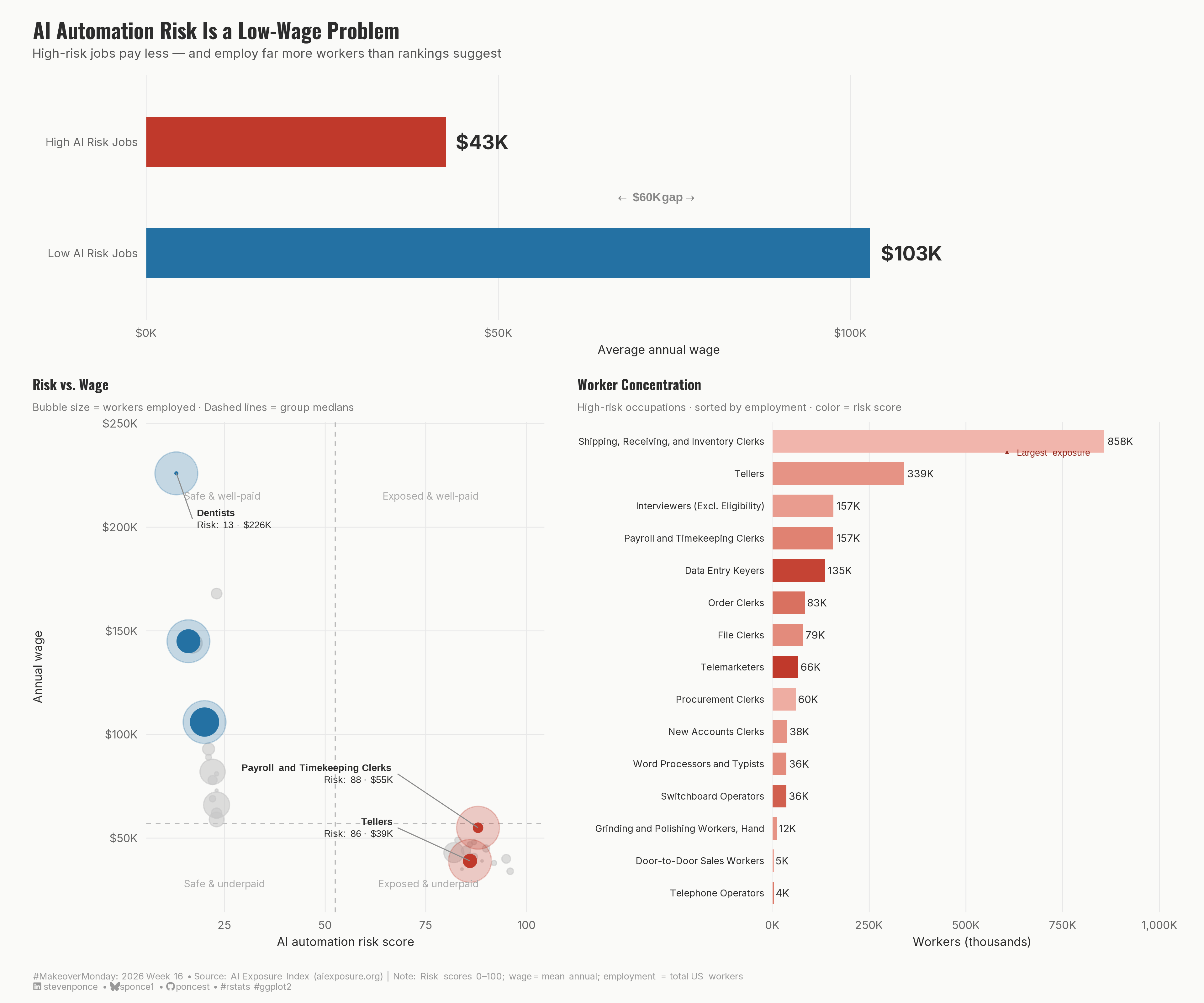
title: "AI Automation Risk Is a Low-Wage Problem"
subtitle: "High-risk jobs pay less — and employ far more workers than rankings suggest"
description: "A three-panel makeover of an AI job risk rankings table. Using a wage gap bar, risk-versus-wage scatter plot, and employment concentration chart, this redesign reveals that AI automation risk is not evenly distributed — it falls heaviest on lower-paid occupations that collectively employ hundreds of thousands of workers. Built with ggplot2 and patchwork in R."
date: "2026-04-20"
author:
- name: "Steven Ponce"
url: "https://stevenponce.netlify.app"
citation:
url: "https://stevenponce.netlify.app/data_visualizations/MakeoverMonday/2026/mm_2026_16.html"
categories: ["MakeoverMonday", "Data Visualization", "R Programming", "2026"]
tags: [
"makeover-monday",
"data-visualization",
"ggplot2",
"patchwork",
"scatter-plot",
"bar-chart",
"multi-panel",
"artificial-intelligence",
"labor-economics",
"wage-gap",
"employment",
"automation",
"2026"
]
image: "thumbnails/mm_2026_16.png"
format:
html:
toc: true
toc-depth: 5
code-link: true
code-fold: true
code-tools: true
code-summary: "Show code"
self-contained: true
theme:
light: [flatly, assets/styling/custom_styles.scss]
dark: [darkly, assets/styling/custom_styles_dark.scss]
editor_options:
chunk_output_type: inline
execute:
freeze: true
cache: true
error: false
message: false
warning: false
eval: true
editor:
markdown:
wrap: 72
---
```{r}
#| label: setup-links
#| include: false
# CENTRALIZED LINK MANAGEMENT
## Project-specific info
current_year <- 2026
current_week <- 16
project_file <- "mm_2026_16.qmd"
project_image <- "mm_2026_16.png"
## Data Sources
data_main <- "https://data.world/makeovermonday/ai-risk-rankings"
data_secondary <- "https://data.world/makeovermonday/ai-risk-rankings"
## Repository Links
repo_main <- "https://github.com/poncest/personal-website/"
repo_file <- paste0("https://github.com/poncest/personal-website/blob/master/data_visualizations/MakeoverMonday/", current_year, "/", project_file)
## External Resources/Images
chart_original <- "https://raw.githubusercontent.com/poncest/MakeoverMonday/refs/heads/master/2026/Week_16/original_chart.png"
## Organization/Platform Links
org_primary <- "https://www.aiexposure.org/rankings"
org_secondary <- "https://www.aiexposure.org/rankings"
# Helper function to create markdown links
create_link <- function(text, url) {
paste0("[", text, "](", url, ")")
}
# Helper function for citation-style links
create_citation_link <- function(text, url, title = NULL) {
if (is.null(title)) {
paste0("[", text, "](", url, ")")
} else {
paste0("[", text, "](", url, ' "', title, '")')
}
}
```
### Original
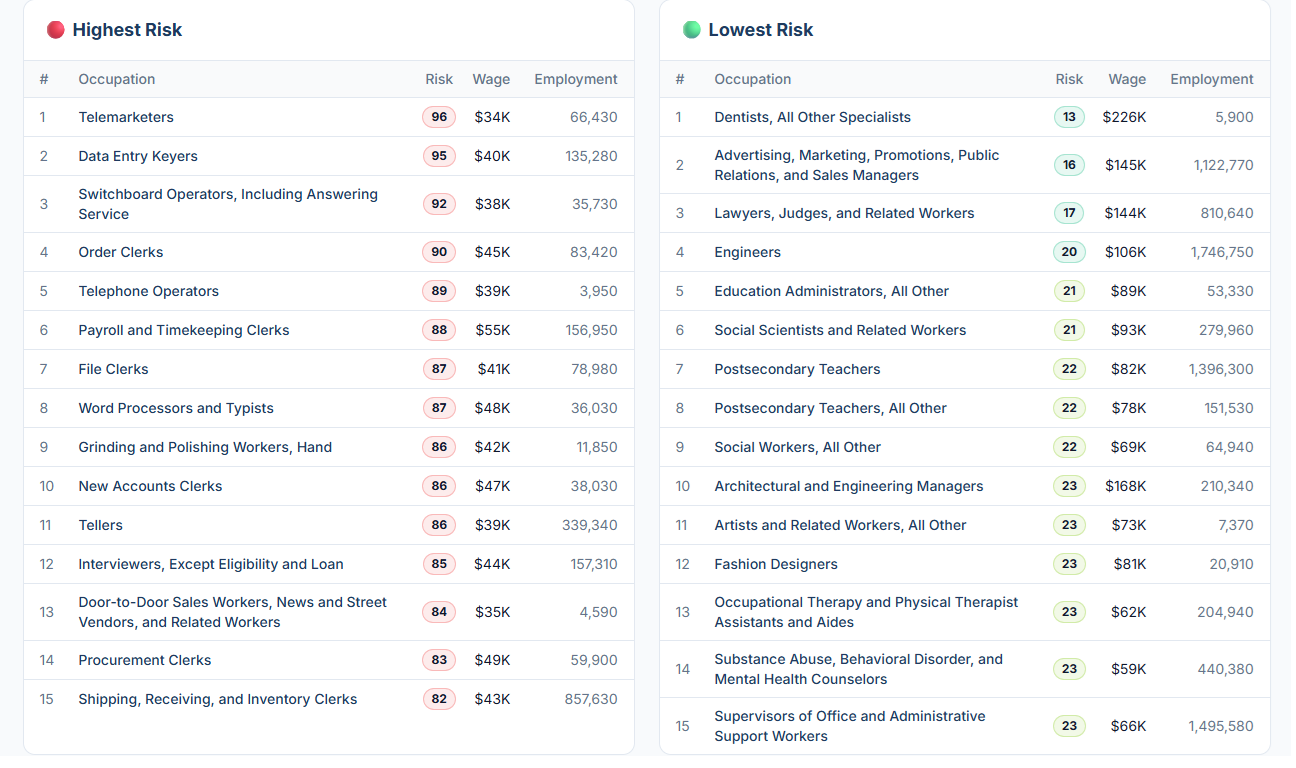
The original visualization comes from `r create_link("AI Risk Rankings", data_secondary)`
### Makeover
{#fig-1}
### [**Steps to Create this Graphic**]{.mark}
#### [1. Load Packages & Setup]{.smallcaps}
```{r}
#| label: load
#| warning: false
#| message: false
#| results: "hide"

## 1. LOAD PACKAGES & SETUP ----
suppressPackageStartupMessages({
  if (!require("pacman")) install.packages("pacman")
  pacman::p_load(
    tidyverse, ggtext, showtext, scales,
    glue, janitor, patchwork
)
})

### |- figure size ----
camcorder::gg_record(
  dir    = here::here("temp_plots"),
  device = "png",
  width  = 12,
  height = 10,
  units  = "in",
  dpi    = 320
)

# Source utility functions
suppressMessages(source(here::here("R/utils/fonts.R")))
source(here::here("R/utils/social_icons.R"))
source(here::here("R/utils/image_utils.R"))
source(here::here("R/themes/base_theme.R"))
```
#### [2. Read in the Data]{.smallcaps}
```{r}
#| label: read
#| include: true
#| eval: true
#| warning: false
#|

df_raw <- readxl::read_excel(
  here::here("data/MakeoverMonday/2026/AI Jobs Risk.xlsx")) |>
  clean_names()
```
#### [3. Examine the Data]{.smallcaps}
```{r}
#| label: examine
#| include: true
#| eval: true
#| results: 'hide'
#| warning: false

glimpse(df_raw)
skimr::skim_without_charts(df_raw)
```
#### [4. Tidy Data]{.smallcaps}
```{r}
#| label: tidy
#| warning: false

df <- df_raw |>
  mutate(
    category = factor(category, levels = c("Highest Risk", "Lowest Risk")),
    # Shorten long occupation names for plot readability
    occupation_short = case_when(
      occupation == "Advertising, Marketing, Promotions, Public Relations, and Sales Managers" ~
        "Advertising & Marketing Managers",
      occupation == "Switchboard Operators, Including Answering Service" ~
        "Switchboard Operators",
      occupation == "Door-to-Door Sales Workers, News and Street Vendors, and Related Workers" ~
        "Door-to-Door Sales Workers",
      occupation == "Occupational Therapy and Physical Therapist Assistants and Aides" ~
        "OT & PT Assistants and Aides",
      occupation == "Substance Abuse, Behavioral Disorder, and Mental Health Counselors" ~
        "Substance Abuse & MH Counselors",
      occupation == "Supervisors of Office and Administrative Support Workers" ~
        "Office & Admin Support Supervisors",
      occupation == "Interviewers, Except Eligibility and Loan" ~
        "Interviewers (Excl. Eligibility)",
      occupation == "Dentists, All Other Specialists" ~ "Dentists",
      occupation == "Lawyers, Judges, and Related Workers" ~ "Lawyers & Judges",
      occupation == "Architectural and Engineering Managers" ~ "Architectural & Engineering Mgrs",
      occupation == "Artists and Related Workers, All Other" ~ "Artists & Related Workers",
      occupation == "Postsecondary Teachers, All Other" ~ "Postsecondary Teachers (Other)",
      TRUE ~ occupation
    )
  )

### |- Act 1 summary stats ----
act1_summary <- df |>
  group_by(category) |>
  summarise(
    avg_wage = mean(wage),
    total_emp = sum(employment),
    .groups = "drop"
  ) |>
  mutate(
    avg_wage_label = dollar(avg_wage, scale = 1 / 1000, suffix = "K", accuracy = 1)
  )

wage_gap <- act1_summary |>
  summarise(gap = diff(avg_wage)) |>
  pull(gap) |>
  abs() |>
  dollar(scale = 1 / 1000, suffix = "K", accuracy = 1)

### |- Act 2 scatter data ----
# Medians for quadrant lines
risk_median <- median(df$risk)
wage_median <- median(df$wage)

# Hero occupations: anchors for the narrative
heroes <- c(
  "Tellers",
  "Payroll and Timekeeping Clerks",
  "Dentists",
  "Engineers",
  "Advertising & Marketing Managers"
)

df_scatter <- df |>
  mutate(
    is_hero = occupation_short %in% heroes,
    hero_color = case_when(
      category == "Highest Risk" & is_hero ~ "hero_high",
      category == "Lowest Risk" & is_hero ~ "hero_low",
      category == "Highest Risk" ~ "field_high",
      TRUE ~ "field_low"
    )
  )

# Extract hero coordinates for annotate() callouts
hero_coords <- df_scatter |>
  filter(is_hero) |>
  select(occupation_short, risk, wage, employment, category)

### |- Act 3 employment bars (high-risk only) ----
df_act3 <- df |>
  filter(category == "Highest Risk") |>
  arrange(desc(employment)) |>
  mutate(
    occupation_short = fct_reorder(occupation_short, employment),
    emp_label = case_when(
      employment >= 1e6 ~ paste0(round(employment / 1e6, 1), "M"),
      employment >= 1e3 ~ paste0(round(employment / 1e3, 0), "K"),
      TRUE ~ as.character(employment)
    )
  )
```
#### [5. Visualization Parameters]{.smallcaps}
```{r}
#| label: params
#| include: true
#| warning: false

### |- plot aesthetics ----
colors <- get_theme_colors(
  palette = list(
    col_high      = "#C0392B",
    col_low       = "#2471A3",
    col_hero_high = "#922B21",
    col_hero_low  = "#1A5276",
    col_field     = "#C8C8C8",
    col_bg        = "#FAFAF8",
    col_text      = "#2D2D2D",
    col_grid      = "#E8E8E8",
    col_quad      = "#BBBBBB",
    col_segment   = "gray55"
  )
)

# Convenience aliases
col_high      <- colors$palette$col_high
col_low       <- colors$palette$col_low
col_hero_high <- colors$palette$col_hero_high
col_hero_low  <- colors$palette$col_hero_low
col_field     <- colors$palette$col_field
col_bg        <- colors$palette$col_bg
col_text      <- colors$palette$col_text
col_grid      <- colors$palette$col_grid
col_quad      <- colors$palette$col_quad
col_segment   <- colors$palette$col_segment

### |- titles and caption ----
title_text    <- "AI Automation Risk Is a Low-Wage Problem"
subtitle_text <- "High-risk jobs pay less — and employ far more workers than rankings suggest"

caption_text <- create_mm_caption(
  mm_year     = 2026,
  mm_week     = 16,
  source_text = "AI Exposure Index (aiexposure.org) | Note: Risk scores 0–100; wage = mean annual; employment = total US workers"
)

### |- fonts ----
setup_fonts()
fonts <- get_font_families()

### |- base theme ----
base_theme  <- create_base_theme(colors = list(background = col_bg, text = col_text))

weekly_theme <- extend_weekly_theme(
  base_theme,
  theme(
    plot.background  = element_rect(fill = col_bg, color = NA),
    panel.background = element_rect(fill = col_bg, color = NA),
    panel.grid.major = element_line(color = col_grid, linewidth = 0.3),
    panel.grid.minor = element_blank(),
    axis.ticks = element_blank(),
    axis.text = element_text(size = 8, color = "#666666"),
    axis.title = element_text(size = 8.5, color = col_text, face = "plain"),
    plot.margin = margin(8, 12, 8, 12)
  )
)

theme_set(weekly_theme)
```
#### [6. Plot]{.smallcaps}
```{r}
#| label: plot
#| warning: false
### |- ACT 1: Wage gap headline bar ----
p1 <- act1_summary |>
mutate(
# More explicit category labels
category_label = case_when(
category == "Highest Risk" ~ "High AI Risk Jobs",
category == "Lowest Risk" ~ "Low AI Risk Jobs"
),
category_label = fct_rev(factor(category_label,
levels = c("High AI Risk Jobs", "Low AI Risk Jobs")
))
) |>
ggplot(aes(x = avg_wage, y = category_label, fill = category)) +
# Geoms
geom_col(width = 0.45, show.legend = FALSE) +
geom_text(
aes(label = avg_wage_label),
hjust = -0.2,
size = 5,
fontface = "bold",
color = col_text,
family = fonts$text
) +
# Annotate
annotate(
"richtext",
x = mean(act1_summary$avg_wage),
y = 1.5,
label = glue("<span style='color:#888888'>← <b>{wage_gap} gap</b> →</span>"),
size = 3.0,
fill = NA, label.color = NA,
color = col_text
) +
# Scales
scale_x_continuous(
labels = dollar_format(scale = 1 / 1000, suffix = "K", accuracy = 1),
expand = expansion(mult = c(0, 0.18)),
limits = c(0, max(act1_summary$avg_wage) * 1.2)
) +
scale_fill_manual(values = c("Highest Risk" = col_high, "Lowest Risk" = col_low)) +
# Labs
labs(
title = title_text,
subtitle = subtitle_text,
x = "Average annual wage",
y = NULL
) +
# Theme
theme(
panel.grid.major.y = element_blank(),
panel.grid.major.x = element_line(color = col_grid, linewidth = 0.3),
plot.title = element_text(
size = 15, face = "bold", color = col_text,
family = fonts$title, margin = margin(b = 4)
),
plot.subtitle = element_text(
size = 9, color = "#555555",
family = fonts$subtitle, margin = margin(b = 10)
)
)
### |- ACT 2: Risk × Wage scatter ----
callout_df <- hero_coords |>
mutate(
lx = case_when(
occupation_short == "Tellers" ~ risk - 18,
occupation_short == "Payroll and Timekeeping Clerks" ~ risk - 20,
occupation_short == "Dentists" ~ risk + 4,
occupation_short == "Engineers" ~ risk - 18,
occupation_short == "Advertising & Marketing Managers" ~ risk - 18,
TRUE ~ risk
),
ly = case_when(
occupation_short == "Tellers" ~ wage + 16000,
occupation_short == "Payroll and Timekeeping Clerks" ~ wage + 26000,
occupation_short == "Dentists" ~ wage - 22000,
occupation_short == "Engineers" ~ wage + 20000,
occupation_short == "Advertising & Marketing Managers" ~ wage - 22000,
TRUE ~ wage
),
hjust_val = case_when(
occupation_short %in% c(
"Tellers", "Payroll and Timekeeping Clerks",
"Engineers", "Advertising & Marketing Managers"
) ~ 1,
TRUE ~ 0
)
)
p2 <- df_scatter |>
ggplot(aes(x = risk, y = wage)) +
# Geoms
geom_vline(xintercept = risk_median, color = col_quad, linewidth = 0.4, linetype = "dashed") +
geom_hline(yintercept = wage_median, color = col_quad, linewidth = 0.4, linetype = "dashed") +
geom_point(
data = filter(df_scatter, !is_hero),
aes(size = employment),
color = col_field, alpha = 0.6, show.legend = FALSE
) +
geom_point(
data = filter(df_scatter, is_hero),
aes(size = employment),
color = ifelse(
filter(df_scatter, is_hero)$category == "Highest Risk", col_high, col_low
),
alpha = 0.25, show.legend = FALSE,
size = 14
) +
geom_point(
data = filter(df_scatter, is_hero),
aes(
size = employment,
color = category
),
show.legend = FALSE
) +
# Annotate
annotate("text",
x = 15, y = 215000, label = "Safe & well-paid",
size = 2.5, color = "#AAAAAA", hjust = 0, family = fonts$text
) +
annotate("text",
x = 88, y = 215000, label = "Exposed & well-paid",
size = 2.5, color = "#AAAAAA", hjust = 1, family = fonts$text
) +
annotate("text",
x = 15, y = 28000, label = "Safe & underpaid",
size = 2.5, color = "#AAAAAA", hjust = 0, family = fonts$text
) +
annotate("text",
x = 88, y = 28000, label = "Exposed & underpaid",
size = 2.5, color = "#AAAAAA", hjust = 1, family = fonts$text
) +
annotate("segment",
x = callout_df$risk, xend = callout_df$lx,
y = callout_df$wage, yend = callout_df$ly,
color = col_segment, linewidth = 0.35
) +
annotate("richtext",
x = callout_df$lx,
y = callout_df$ly,
label = glue::glue(
"<span style='font-size:7pt'><b>{callout_df$occupation_short}</b><br>",
"Risk: {callout_df$risk} · {dollar(callout_df$wage, scale=1/1000, suffix='K', accuracy=1)}</span>"
),
hjust = callout_df$hjust_val,
fill = NA, label.color = NA,
size = 2.5,
color = col_text
) +
# Scales
scale_color_manual(values = c("Highest Risk" = col_high, "Lowest Risk" = col_low)) +
scale_size_area(max_size = 9) +
scale_y_continuous(
labels = dollar_format(scale = 1 / 1000, suffix = "K", accuracy = 1),
limits = c(25000, 240000)
) +
scale_x_continuous(limits = c(10, 100)) +
# Labs
labs(
x = "AI automation risk score",
y = "Annual wage",
title = "Risk vs. Wage",
subtitle = "Bubble size = workers employed · Dashed lines = group medians"
) +
# Theme
theme(
plot.title = element_text(size = 10, face = "bold", color = col_text, family = fonts$title),
plot.subtitle = element_text(
size = 7.5, color = "#777777", family = fonts$subtitle,
margin = margin(b = 6)
)
)
### |- ACT 3: Employment concentration bars ----
p3 <- df_act3 |>
ggplot(aes(x = employment, y = occupation_short, fill = risk)) +
# Geoms
geom_col(show.legend = FALSE, width = 0.7) +
geom_text(
aes(label = emp_label),
hjust = -0.15,
size = 2.6,
color = col_text,
family = fonts$text
) +
# Annotate
annotate(
"richtext",
x = max(df_act3$employment) * 0.98,
y = nlevels(df_act3$occupation_short) - 0.3,
label = "<span style='font-size:6.5pt; color:#922B21'>▲ Largest exposure</span>",
hjust = 1, fill = NA, label.color = NA
) +
# Scales
scale_x_continuous(
labels = label_comma(scale = 1 / 1000, suffix = "K"),
expand = expansion(mult = c(0, 0.2))
) +
scale_fill_gradient(
low = "#F5C6C0",
high = col_high,
limits = c(80, 96)
) +
# Labs
labs(
x = "Workers (thousands)",
y = NULL,
title = "Worker Concentration",
subtitle = "High-risk occupations · sorted by employment · color = risk score"
) +
# Theme
theme(
axis.text.y = element_text(size = 6.8, color = col_text, hjust = 1),
panel.grid.major.y = element_blank(),
panel.grid.major.x = element_line(color = col_grid, linewidth = 0.3),
plot.title = element_text(size = 10, face = "bold", color = col_text, family = fonts$title),
plot.subtitle = element_text(
size = 7.5, color = "#777777", family = fonts$subtitle,
margin = margin(b = 6)
)
)
### |- Combine plots ----
layout <- "
AAAA
BBCC
"
p_final <- p1 + p2 + p3 +
plot_layout(
design = layout,
heights = c(0.8, 1.6),
widths = c(1.25, 0.9)
) +
plot_annotation(
caption = caption_text,
theme = theme(
plot.background = element_rect(fill = col_bg, color = NA),
plot.caption = element_markdown(
size = 6.5,
color = "#999999",
hjust = 0,
margin = margin(t = 8),
family = fonts$captions
)
)
)
```
#### [7. Save]{.smallcaps}
```{r}
#| label: save
#| warning: false

### |-  plot image ----
save_plot_patchwork(
  plot = p_final,
  type = "makeovermonday",
  year = current_year,
  week = current_week,
  width = 12,
  height = 10
  )
```
#### [8. Session Info]{.smallcaps}
::: {.callout-tip collapse="true"}
##### Expand for Session Info
```{r, echo = FALSE}
#| eval: true
#| warning: false
sessionInfo()
```
:::
#### [9. GitHub Repository]{.smallcaps}
::: {.callout-tip collapse="true"}
##### Expand for GitHub Repo
The complete code for this analysis is available in `r create_link(project_file, repo_file)`.
For the full repository, `r create_link("click here", repo_main)`.
:::
#### [10. References]{.smallcaps}
::: {.callout-tip collapse="true"}
##### Expand for References
**Primary Data (Makeover Monday):**
1. Makeover Monday `r current_year` Week `r current_week`: `r create_link("AI Risk Rankings", data_main)`
2. Original Chart: `r create_link("AI Exposure Index — aiexposure.org", "https://www.aiexposure.org/rankings")`
- Source: AI Exposure Index (aiexposure.org)
- Coverage: 30 occupations ranked by AI automation risk score (0–100), with mean annual wage and total US employment
**Source Data:**
3. `r create_link("AI Exposure Index Rankings", "https://www.aiexposure.org/rankings")`
- Coverage: Occupation-level AI automation risk scores, mean annual wages, and total US worker counts
- Unit: Risk score 0–100; wage = mean annual in USD; employment = total US workers per occupation
**Note:** The dataset covers 15 highest-risk and 15 lowest-risk
occupations as ranked by the AI Exposure Index. Average wages and
employment figures are reported at the occupation level. No
normalization beyond the published risk scores was applied. No
additional data sources were used.
:::
#### [11. Custom Functions Documentation]{.smallcaps}
::: {.callout-note collapse="true"}
##### 📦 Custom Helper Functions
This analysis uses custom functions from my personal module library for efficiency and consistency across projects.
**Functions Used:**
- **`fonts.R`**: `setup_fonts()`, `get_font_families()` - Font management with showtext
- **`social_icons.R`**: `create_social_caption()` - Generates formatted social media captions
- **`image_utils.R`**: `save_plot()` - Consistent plot saving with naming conventions
- **`base_theme.R`**: `create_base_theme()`, `extend_weekly_theme()`, `get_theme_colors()` - Custom ggplot2 themes
**Why custom functions?**\
These utilities standardize theming, fonts, and output across all my data visualizations. The core analysis (data tidying and visualization logic) uses only standard tidyverse packages.
**Source Code:**\
View all custom functions → [GitHub: R/utils](https://github.com/poncest/personal-website/tree/master/R)
:::

