---
title: "Democracy Has Declined–But Remains Deeply Divided"
subtitle: "Global scores have declined since 2006, while countries remain sharply divided between democratic and authoritarian systems"
description: "A two-panel redesign of the OWID Democracy Index choropleth. A line chart traces the global median score falling from 5.89 in 2006 to 5.32 in 2024, while a beeswarm chart shows how 167 countries cluster sharply at the democratic and authoritarian extremes in 2024 — with few near the middle. Built with ggplot2, ggbeeswarm, and patchwork in R."
date: "2026-04-27"
author:
- name: "Steven Ponce"
url: "https://stevenponce.netlify.app"
citation:
url: "https://stevenponce.netlify.app/data_visualizations/MakeoverMonday/2026/mm_2026_17.html"
categories: ["MakeoverMonday", "2026"]
tags: [
"makeover-monday",
"data-visualization",
"ggplot2",
"patchwork",
"ggbeeswarm",
"democracy",
"political-science",
"line-chart",
"beeswarm",
"time-series",
"global-trends",
"eiu",
]
image: "thumbnails/mm_2026_17.png"
format:
html:
toc: true
toc-depth: 5
code-link: true
code-fold: true
code-tools: true
code-summary: "Show code"
theme:
light: [flatly, assets/styling/custom_styles.scss]
dark: [darkly, assets/styling/custom_styles_dark.scss]
editor_options:
chunk_output_type: inline
execute:
freeze: true
cache: true
error: false
message: false
warning: false
eval: true
editor:
markdown:
wrap: 72
---
```{r}
#| label: setup-links
#| include: false
# CENTRALIZED LINK MANAGEMENT
## Project-specific info
current_year <- 2026
current_week <- 17
project_file <- "mm_2026_17.qmd"
project_image <- "mm_2026_17.png"
## Data Sources
data_main <- "https://data.world/makeovermonday/2026w17-2024-eiu-democracy-index/activity"
data_secondary <- "https://data.world/makeovermonday/2026w17-2024-eiu-democracy-index/activity"
## Repository Links
repo_main <- "https://github.com/poncest/personal-website/"
repo_file <- paste0("https://github.com/poncest/personal-website/blob/master/data_visualizations/MakeoverMonday/", current_year, "/", project_file)
## External Resources/Images
chart_original <- "https://raw.githubusercontent.com/poncest/MakeoverMonday/refs/heads/master/2026/Week_17/original_chart.png"
## Organization/Platform Links
org_primary <- "https://ourworldindata.org/grapher/democracy-index-eiu"
org_secondary <- "https://ourworldindata.org/grapher/democracy-index-eiu"
# Helper function to create markdown links
create_link <- function(text, url) {
paste0("[", text, "](", url, ")")
}
# Helper function for citation-style links
create_citation_link <- function(text, url, title = NULL) {
if (is.null(title)) {
paste0("[", text, "](", url, ")")
} else {
paste0("[", text, "](", url, ' "', title, '")')
}
}
```
### Original
The original visualization comes from `r create_link("AI Risk Rankings", data_secondary)`

### Makeover
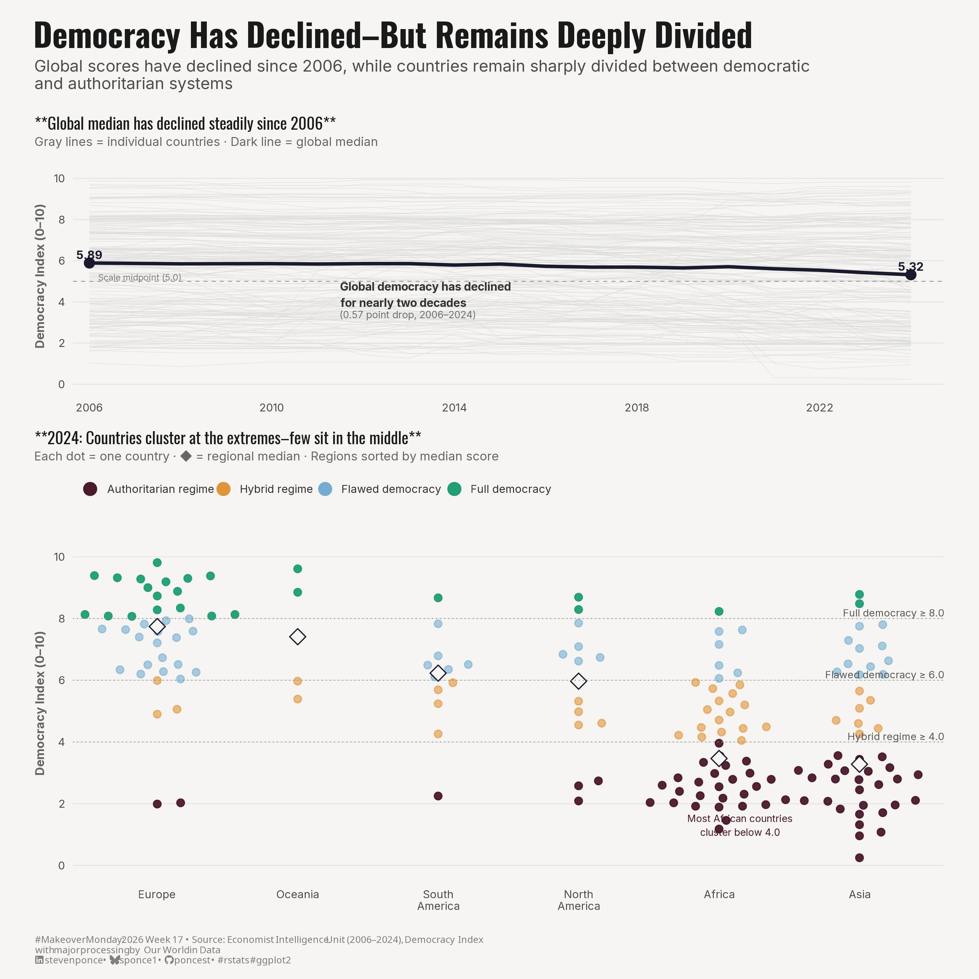{#fig-1}
### [**Steps to Create this Graphic**]{.mark}
#### [1. Load Packages & Setup]{.smallcaps}
```{r}
#| label: load
#| warning: false
#| message: false
#| results: "hide"

## 1. LOAD PACKAGES & SETUP ----
suppressPackageStartupMessages({
  if (!require("pacman")) install.packages("pacman")
  pacman::p_load(
    tidyverse, ggtext, showtext, scales,
  glue, janitor, patchwork, ggbeeswarm
)
})

### |- figure size ----
camcorder::gg_record(
  dir    = here::here("temp_plots"),
  device = "png",
  width  = 10,
  height = 10,
  units  = "in",
  dpi    = 320
)

# Source utility functions
suppressMessages(source(here::here("R/utils/fonts.R")))
source(here::here("R/utils/social_icons.R"))
source(here::here("R/utils/image_utils.R"))
source(here::here("R/themes/base_theme.R"))
```
#### [2. Read in the Data]{.smallcaps}
```{r}
#| label: read
#| include: true
#| eval: true
#| warning: false
#|

df_raw <- readxl::read_excel(
  here::here("data/MakeoverMonday/2026/2024 Democracy Index.xlsx")) |>
  clean_names()
```
#### [3. Examine the Data]{.smallcaps}
```{r}
#| label: examine
#| include: true
#| eval: true
#| results: 'hide'
#| warning: false

glimpse(df_raw)
skimr::skim_without_charts(df_raw)
```
#### [4. Tidy Data]{.smallcaps}
```{r}
#| label: tidy
#| warning: false

### |- regime type factor levels ----
regime_levels <- c(
  "Authoritarian regime",
  "Hybrid regime",
  "Flawed democracy",
  "Full democracy"
)

### |- clean and encode ----
df <- df_raw |>
  mutate(
    regime_classification = factor(regime_classification, levels = regime_levels),
    region_short = case_when(
      world_region_according_to_owid == "North America" ~ "North\nAmerica",
      world_region_according_to_owid == "South America" ~ "South\nAmerica",
      world_region_according_to_owid == "Europe" ~ "Europe",
      world_region_according_to_owid == "Asia" ~ "Asia",
      world_region_according_to_owid == "Africa" ~ "Africa",
      world_region_according_to_owid == "Oceania" ~ "Oceania",
      TRUE ~ world_region_according_to_owid
    )
  )

### |- Panel A data: global median trend ----
df_trend <- df |>
  group_by(year) |>
  summarise(
    global_median = median(democracy_index, na.rm = TRUE),
    .groups = "drop"
  )

# 2006 and 2024 endpoints for annotation
trend_2006 <- df_trend |>
  filter(year == 2006) |>
  pull(global_median)
trend_2024 <- df_trend |>
  filter(year == 2024) |>
  pull(global_median)

### |- Panel B data: 2024 cross-section with region medians ----
df_2024 <- df |>
  filter(year == 2024)

# Region medians for sorting and overlay dots
df_region_medians <- df_2024 |>
  group_by(region_short) |>
  summarise(
    region_median = median(democracy_index, na.rm = TRUE),
    .groups = "drop"
  ) |>
  arrange(desc(region_median))

# Sorted region order (highest median → top of chart after coord_flip)
region_order <- df_region_medians$region_short

df_2024 <- df_2024 |>
  mutate(region_short = factor(region_short, levels = region_order))
```
#### [5. Visualization Parameters]{.smallcaps}
```{r}
#| label: params
#| include: true
#| warning: false

## |- plot aesthetics ----
colors <- get_theme_colors(
  palette = list(
    full_dem    = "#1D9E75",
    flawed_dem  = "#74ADD1",
    hybrid      = "#E09338",
    authoritar  = "#4A1A2C",
    trend_line  = "#1A1A2E",
    country_bg  = "#D9D9D9",
    region_dot  = "#F7F5F2",
    background  = "#F7F5F2"
  )
)

# Convenience aliases
col_full_dem <- colors$palette$full_dem
col_flawed_dem <- colors$palette$flawed_dem
col_hybrid <- colors$palette$hybrid
col_authoritar <- colors$palette$authoritar
col_trend <- colors$palette$trend_line
col_country_bg <- colors$palette$country_bg
col_region_dot <- colors$palette$region_dot
col_background <- colors$palette$background

# Named vector for regime color scale
regime_colors <- c(
  "Full democracy"       = col_full_dem,
  "Flawed democracy"     = col_flawed_dem,
  "Hybrid regime"        = col_hybrid,
  "Authoritarian regime" = col_authoritar
)

### |- titles and caption ----
title_text <- "Democracy Has Declined\u2013But Remains Deeply Divided"

subtitle_text <- "Global scores have declined since 2006, while countries remain sharply divided between democratic\nand authoritarian systems"

caption_text <- create_mm_caption(
  mm_year     = 2026,
  mm_week     = 17,
  source_text = "Economist Intelligence Unit (2006–2024), Democracy Index<br>with major processing by Our World in Data"
)

### |- fonts ----
setup_fonts()
fonts <- get_font_families()

### |- base and weekly theme ----
base_theme <- create_base_theme(colors)

weekly_theme <- extend_weekly_theme(
  base_theme,
  theme(
    # Panel
    panel.background = element_rect(fill = col_background, color = NA),
    plot.background = element_rect(fill = col_background, color = NA),
    panel.grid.major.y = element_line(color = "gray88", linewidth = 0.25),
    panel.grid.major.x = element_blank(),
    panel.grid.minor = element_blank(),

    # Axes
    axis.ticks = element_blank(),
    axis.title = element_text(size = 9, color = "gray40"),
    axis.text = element_text(size = 8, color = "gray30"),

    # Legend
    legend.position = "top",
    legend.justification = "left",
    legend.title = element_blank(),
    legend.text = element_text(size = 8, color = "gray20"),
    legend.key.size = unit(8, "pt"),
    legend.key = element_rect(fill = NA, color = NA),
    legend.background = element_rect(fill = NA, color = NA),
    legend.spacing.x = unit(10, "pt"),

    # Plot margin
    plot.margin = margin(6, 10, 6, 10)
  )
)

theme_set(weekly_theme)
```
#### [6. Plot]{.smallcaps}
```{r}
#| label: plot
#| warning: false

### |- Panel A: Global Median Trend (2006–2024) ----
p_trend <- ggplot() +

  # Geoms
  geom_line(
    data = df |> filter(!is.na(democracy_index)),
    aes(x = year, y = democracy_index, group = entity),
    color = col_country_bg,
    linewidth = 0.25,
    alpha = 0.5
  ) +
  geom_line(
    data = df_trend,
    aes(x = year, y = global_median),
    color = col_trend,
    linewidth = 1.2
  ) +
  geom_point(
    data  = df_trend |> filter(year %in% c(2006, 2024)),
    aes(x = year, y = global_median),
    color = col_trend,
    size  = 3
  ) +
  geom_hline(
    yintercept = 5.0,
    linetype   = "dashed",
    color      = "gray60",
    linewidth  = 0.3
  ) +
  # Annnotate
  annotate(
    "text",
    x = 2006, y = trend_2006 + 0.4,
    label = glue("{round(trend_2006, 2)}"),
    size = 3, hjust = 0.5,
    color = col_trend,
    fontface = "bold",
    family = fonts$text
  ) +
  annotate(
    "text",
    x = 2024, y = trend_2024 + 0.4,
    label = glue("{round(trend_2024, 2)}"),
    size = 3, hjust = 0.5,
    color = col_trend,
    fontface = "bold",
    family = fonts$text
  ) +
  annotate(
    "text",
    x = 2011.5, y = 4.35,
    label = "Global democracy has declined\nfor nearly two decades",
    size = 2.9, hjust = 0,
    color = "gray20",
    fontface = "bold",
    lineheight = 1.2,
    fill = "#F7F5F2",
    label.size = 0,
    label.padding = unit(0.25, "lines"),
    family = fonts$text
  ) +
  annotate(
    "text",
    x = 2011.5, y = 3.38,
    label = glue("({round(trend_2006 - trend_2024, 2)} point drop, {min(df_trend$year)}\u2013{max(df_trend$year)})"),
    size = 2.5, hjust = 0,
    color = "gray45",
    lineheight = 1.2,
    family = fonts$text
  ) +
  annotate(
    "text",
    x = 2006.2, y = 5.19,
    label = "Scale midpoint (5.0)",
    size = 2.3, hjust = 0,
    color = "gray50",
    family = fonts$text
  ) +
  # Scales
  scale_x_continuous(
    breaks = seq(2006, 2024, by = 4),
    expand = expansion(mult = c(0.02, 0.04))
  ) +
  scale_y_continuous(
    limits = c(0, 10.5),
    breaks = seq(0, 10, by = 2),
    labels = label_number(accuracy = 1)
  ) +
  # Labs
  labs(
    x = NULL,
    y = "Democracy Index (0–10)",
    title = "**Global median has declined steadily since 2006**",
    subtitle = "Gray lines = individual countries · Dark line = global median"
  ) +
  # Theme
  theme(
    plot.title = element_text(size = 12, color = "gray10", family = fonts$title, margin = margin(b = 3)),
    plot.subtitle = element_text(size = 9, color = "gray40", family = fonts$subtitle, margin = margin(b = 6))
  )

### |- Panel B: 2024 Beeswarm by Region ----
p_beeswarm <- ggplot() +

  # Geoms
  geom_beeswarm(
    data = df_2024 |>
      mutate(dot_alpha = if_else(
        regime_classification %in% c("Full democracy", "Authoritarian regime"),
        0.95, 0.60
      )),
    aes(
      x = region_short, y = democracy_index, color = regime_classification,
      alpha = I(dot_alpha)
    ),
    size = 2.2,
    cex = 2.8,
    method = "swarm"
  ) +
  geom_point(
    data = df_region_medians |>
      mutate(region_short = factor(region_short, levels = region_order)),
    aes(x = region_short, y = region_median),
    shape = 23,
    size = 4,
    fill = col_region_dot,
    color = col_trend
  ) +
  geom_hline(yintercept = 8.0, linetype = "dotted", color = "gray55", linewidth = 0.3) +
  geom_hline(yintercept = 6.0, linetype = "dotted", color = "gray55", linewidth = 0.3) +
  geom_hline(yintercept = 4.0, linetype = "dotted", color = "gray55", linewidth = 0.3) +
  # Annotate
  annotate("text",
    x = 6.6, y = 8.18, label = "Full democracy \u2265 8.0",
    size = 2.6, hjust = 1, color = "gray35", family = fonts$text
  ) +
  annotate("text",
    x = 6.6, y = 6.18, label = "Flawed democracy \u2265 6.0",
    size = 2.6, hjust = 1, color = "gray35", family = fonts$text
  ) +
  annotate("text",
    x = 6.6, y = 4.18, label = "Hybrid regime \u2265 4.0",
    size = 2.6, hjust = 1, color = "gray35", family = fonts$text
  ) +
  annotate(
    "text",
    x = 5.15, y = 1.3,
    label = "Most African countries\ncluster below 4.0",
    size = 2.5, hjust = 0.5,
    color = col_authoritar,
    lineheight = 1.2,
    family = fonts$text
  ) +
  # Scales
  scale_color_manual(
    values = regime_colors,
    guide = guide_legend(
      override.aes = list(size = 4),
      nrow = 1
    )
  ) +
  scale_y_continuous(
    limits = c(0, 10.5),
    breaks = seq(0, 10, by = 2),
    labels = label_number(accuracy = 1)
  ) +
  # Labs
  labs(
    x = NULL,
    y = "Democracy Index (0–10)",
    title = "**2024: Countries cluster at the extremes\u2013few sit in the middle**",
    subtitle = "Each dot = one country \u00b7 \u25c6 = regional median \u00b7 Regions sorted by median score"
  ) +
  # Theme
  theme(
    plot.title = element_text(size = 12, color = "gray10", family = fonts$title, margin = margin(b = 3)),
    plot.subtitle = element_text(size = 9, color = "gray40", family = fonts$subtitle, margin = margin(b = 6)),
    legend.position = "top",
    legend.justification = "left"
  )

### |- Combined plots ----
p_combined <- p_trend / p_beeswarm +
  plot_layout(heights = c(2, 3)) +
  plot_annotation(
    title = title_text,
    subtitle = subtitle_text,
    caption = caption_text,
    theme = theme(
      plot.title = element_text(
        size = 24, face = "bold",
        color = "gray10",
        family = fonts$title,
        margin = margin(b = 4)
      ),
      plot.subtitle = element_text(
        size = 12, color = "gray30",
        family = fonts$subtitle,
        margin = margin(b = 12)
      ),
      plot.caption = element_markdown(
        size = 7, color = "gray50",
        family = fonts$caption,
        hjust = 0,
        margin = margin(t = 10)
      ),
      plot.background = element_rect(fill = col_background, color = NA),
      plot.margin = margin(16, 16, 10, 16)
    )
  )
```
#### [7. Save]{.smallcaps}
```{r}
#| label: save
#| warning: false

### |-  plot image ----
save_plot_patchwork(
  plot = p_combined,
  type = "makeovermonday",
  year = current_year,
  week = current_week,
  width = 10,
  height = 10
  )
```
#### [8. Session Info]{.smallcaps}
::: {.callout-tip collapse="true"}
##### Expand for Session Info
```{r, echo = FALSE}
#| eval: true
#| warning: false
sessionInfo()
```
:::
#### [9. GitHub Repository]{.smallcaps}
::: {.callout-tip collapse="true"}
##### Expand for GitHub Repo
The complete code for this analysis is available in `r create_link(project_file, repo_file)`.
For the full repository, `r create_link("click here", repo_main)`.
:::
#### [10. References]{.smallcaps}
::: {.callout-tip collapse="true"}
##### Expand for References
**Primary Data (Makeover Monday):**
1. Makeover Monday `r current_year` Week `r current_week`: `r create_link("2024 EIU Democracy Index", data_main)`
2. Original Chart: `r create_link("Democracy Index, 2024 — Our World in Data", "https://ourworldindata.org/grapher/democracy-index-eiu")`
- Source: Our World in Data interactive choropleth map
- Coverage: 167 countries, Democracy Index scores 0–10 (2006–2024)
**Source Data:**
3. `r create_link("Economist Intelligence Unit — Democracy Index 2024", "https://www.eiu.com/n/campaigns/democracy-index-2024/")`
- Coverage: 167 countries scored annually on five sub-indices: electoral pluralism, functioning government, political participation, democratic culture, and civil liberties
- Unit: Composite index 0–10; four regime classifications: Full Democracy (≥ 8.0), Flawed Democracy (≥ 6.0), Hybrid Regime (≥ 4.0), Authoritarian (< 4.0)
4. `r create_link("Our World in Data — Democracy Index (EIU)", "https://ourworldindata.org/grapher/democracy-index-eiu")`
- Attribution: Economist Intelligence Unit (2006–2024), with major processing by Our World in Data
**Note:** Analysis uses the composite Democracy Index score as the
primary variable. Regional medians were computed across all available
countries per region for 2024. Regime classifications follow the EIU's
published thresholds. No additional normalization was applied.
:::
#### [11. Custom Functions Documentation]{.smallcaps}
::: {.callout-note collapse="true"}
##### 📦 Custom Helper Functions
This analysis uses custom functions from my personal module library for efficiency and consistency across projects.
**Functions Used:**
- **`fonts.R`**: `setup_fonts()`, `get_font_families()` - Font management with showtext
- **`social_icons.R`**: `create_social_caption()` - Generates formatted social media captions
- **`image_utils.R`**: `save_plot()` - Consistent plot saving with naming conventions
- **`base_theme.R`**: `create_base_theme()`, `extend_weekly_theme()`, `get_theme_colors()` - Custom ggplot2 themes
**Why custom functions?**\
These utilities standardize theming, fonts, and output across all my data visualizations. The core analysis (data tidying and visualization logic) uses only standard tidyverse packages.
**Source Code:**\
View all custom functions → [GitHub: R/utils](https://github.com/poncest/personal-website/tree/master/R)
:::

