• Steven Ponce
  • About
  • Data Visualizations
  • Projects
  • Resume
  • Email

On this page

  • Original
  • Makeover
  • Steps to Create this Graphic
    • 1. Load Packages & Setup
    • 2. Read in the Data
    • 3. Examine the Data
    • 4. Tidy Data
    • 5. Visualization Parameters
    • 6. Plot
    • 7. Save
    • 8. Session Info
    • 9. GitHub Repository
    • 10. References
    • 11. Custom Functions Documentation

Traditional Park Amenities Are More Common in Cooler-Climate Cities

  • Show All Code
  • Hide All Code

  • View Source

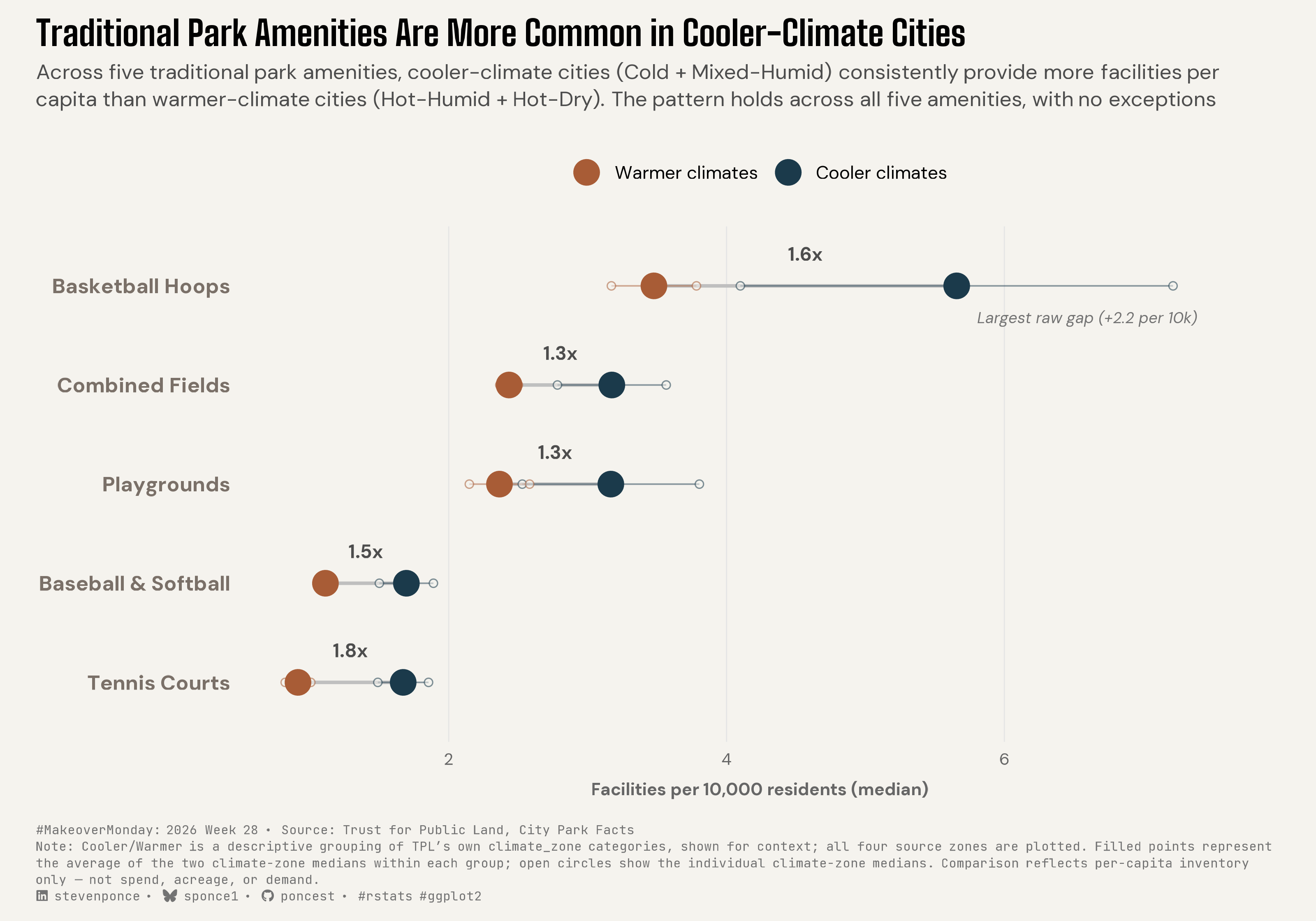
Across five traditional park amenities, cooler-climate cities (Cold + Mixed-Humid) consistently provide more facilities per capita than warmer-climate cities (Hot-Humid + Hot-Dry). The pattern holds across all five amenities, with no exceptions

MakeoverMonday
Data Visualization
R Programming
2026
A dumbbell dot plot comparing per-capita park amenity provision across U.S. climate zones. Cooler-climate cities consistently provide more traditional recreation facilities per capita than warmer-climate cities across five independent amenity types, with differences ranging from 1.3x to 1.8x. Built in R with ggplot2, ggtext, and scales, following FDR-corrected significance testing.
Author

Steven Ponce

Published

July 13, 2026

Original

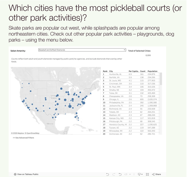
The original visualization comes from Park & Recreation Amenities

Original visualization

Makeover

Figure 1: Dumbbell dot plot titled “Traditional Park Amenities Are More Common in Cooler-Climate Cities.” For five traditional park amenities — basketball hoops, combined fields, playgrounds, baseball and softball diamonds, and tennis courts — cooler-climate U.S. cities (Cold and Mixed-Humid zones) show higher median per-capita counts than warmer-climate cities (Hot-Humid and Hot-Dry zones), with no exceptions. Ratios range from 1.3 to 1.8 times higher in cooler climates; basketball hoops show the largest raw difference, about 2.2 more hoops per 10,000 residents. Filled circles show the average of the two climate-zone medians within each group; smaller open circles show the individual underlying climate-zone medians. Data from Trust for Public Land’s City Park Facts.

Steps to Create this Graphic

1. Load Packages & Setup

Show code
```{r}
#| label: load
#| warning: false
#| message: false      
#| results: "hide"     

## 1. LOAD PACKAGES & SETUP ----
suppressPackageStartupMessages({
  if (!require("pacman")) install.packages("pacman")
  pacman::p_load(
    tidyverse, ggtext, showtext, scales, glue, 
  janitor
)
})

### |- figure size ----
camcorder::gg_record(
  dir    = here::here("temp_plots"),
  device = "png",
  width  = 10,
  height = 7,
  units  = "in",
  dpi    = 320
)

# Source utility functions
suppressMessages(source(here::here("R/utils/fonts.R")))
source(here::here("R/utils/social_icons.R"))
source(here::here("R/utils/image_utils.R"))
source(here::here("R/themes/base_theme.R"))
```

2. Read in the Data

Show code
```{r}
#| label: read
#| include: true
#| eval: true
#| warning: false
#| 

df_raw <- read_tsv(
  here::here("data/MakeoverMonday/2026/Amenities_Data__Clean.csv"),
  locale = locale(encoding = "UTF-16LE")
) |>
  clean_names()
```

3. Examine the Data

Show code
```{r}
#| label: examine
#| include: true
#| eval: true
#| results: 'hide'
#| warning: false

glimpse(df_raw)
skimr::skim_without_charts(df_raw)
```

4. Tidy Data

Show code
```{r}
#| label: tidy
#| warning: false

### |- pivot measures wide ----
df_wide <- df_raw |>
  pivot_wider(
    names_from = measure_names, 
    values_from = measure_values
    )

### |- restrict to climate zones with adequate sample size ----
usable_zones <- df_raw |>
  distinct(city, climate_zone) |>
  filter(!is.na(climate_zone)) |>
  count(climate_zone) |>
  filter(n >= 10) |>
  pull(climate_zone)

### |- the 5 amenities that survived FDR correction in Phase 0 ----
sig_amenities <- c(
  "Outdoor tennis courts, dedicated",
  "Basketball Hoops (Includes schoolyards)",
  "Combined fields and diamonds",
  "Baseball and Softball Diamonds",
  "Playgrounds (includes schoolyards)"
)

### |- analysis-ready subset with cooler/warmer grouping ----
df_climate <- df_wide |>
  filter(amenity_type %in% sig_amenities, climate_zone %in% usable_zones) |>
  mutate(
    climate_zone = factor(climate_zone,
      levels = c("Cold", "Mixed-Humid", "Hot-Humid", "Hot-Dry")
    ),
    climate_group = if_else(
      climate_zone %in% c("Cold", "Mixed-Humid"),
      "Cooler", "Warmer"
    )
  )

### |- short display labels ----
amenity_labels <- c(
  "Basketball Hoops (Includes schoolyards)" = "Basketball Hoops",
  "Outdoor tennis courts, dedicated" = "Tennis Courts",
  "Playgrounds (includes schoolyards)" = "Playgrounds",
  "Baseball and Softball Diamonds" = "Baseball & Softball",
  "Combined fields and diamonds" = "Combined Fields"
)

### |- individual zone medians ----
plot_data_zones_raw <- df_climate |>
  group_by(amenity_type, climate_zone, climate_group) |>
  summarise(median_pc = median(`Per Capita (10k)`, na.rm = TRUE), .groups = "drop")

### |- cooler/warmer group averages ----
group_avg_data <- plot_data_zones_raw |>
  group_by(amenity_type, climate_group) |>
  summarise(group_avg = mean(median_pc), .groups = "drop")

### |- effect size + row order, computed from group_avg_data only ----
effect_order <- group_avg_data |>
  pivot_wider(names_from = climate_group, values_from = group_avg) |>
  mutate(
    ratio = Cooler / Warmer,
    abs_diff = Cooler - Warmer,
    pct_diff = (Cooler - Warmer) / Warmer * 100,
    magnitude = (Cooler + Warmer) / 2
  ) |>
  arrange(desc(magnitude))

amenity_order <- effect_order$amenity_type

### |- apply shared factor levels to both plotting data frames ----
plot_data_zones <- plot_data_zones_raw |>
  mutate(
    amenity_type = factor(amenity_type, levels = rev(amenity_order)),
    amenity_label = amenity_labels[as.character(amenity_type)]
  )

plot_data_groups <- group_avg_data |>
  mutate(
    amenity_type = factor(amenity_type, levels = rev(amenity_order)),
    amenity_label = amenity_labels[as.character(amenity_type)]
  )

### |- ratio annotation for every row ----
ratio_label_data <- effect_order |>
  mutate(
    amenity_type = factor(amenity_type, levels = rev(amenity_order)),
    amenity_label = amenity_labels[as.character(amenity_type)],
    ratio_label = paste0(scales::number(ratio, accuracy = 0.1), "x"),
    x_mid = (Cooler + Warmer) / 2
  )

### |- separate callout for the largest ABSOLUTE gap (basketball) ----
abs_gap_label_data <- effect_order |>
  mutate(
    amenity_type  = factor(amenity_type, levels = rev(amenity_order)),
    amenity_label = amenity_labels[as.character(amenity_type)]
  ) |>
  slice_max(abs_diff, n = 1) |>
  mutate(callout = paste0("Largest raw gap (+", scales::number(abs_diff, accuracy = 0.1), " per 10k)"))
```

5. Visualization Parameters

Show code
```{r}
#| label: params
#| include: true
#| warning: false

### |- plot aesthetics ----
colors <- get_theme_colors(
  palette = list(
    cooler  = "#1B3A4B",
    warmer  = "#A85C36",
    neutral = "gray70"
  )
)

group_colors <- c(Cooler = "#1B3A4B", Warmer = "#A85C36")

### |- fonts ----
setup_fonts()
fonts <- get_font_families()

### |- caption ----
caption_text <- create_mm_caption(
  mm_year = 2026,
  mm_week = 28,
  source_text = paste0(
    "Trust for Public Land, City Park Facts<br>",
    "Note: Cooler/Warmer is a descriptive grouping of TPL's own climate_zone ",
    "categories, shown for context; all four source zones are plotted. Filled ",
    "points represent the average of the two climate-zone medians within each ",
    "group; open circles show the individual climate-zone medians. ",
    "Comparison reflects per-capita inventory only — not spend, acreage, or demand."
  )
)

### |- base theme ----
base_theme <- create_base_theme(colors)

### |- titles ----
title_text <- str_glue("Traditional Park Amenities Are More Common in Cooler-Climate Cities")

subtitle_text <- str_glue(
  "Across five traditional park amenities, cooler-climate cities (Cold + ",
  "Mixed-Humid) consistently provide more facilities per capita than ",
  "warmer-climate cities (Hot-Humid + Hot-Dry). The pattern holds across ",
  "all five amenities, with no exceptions"
)

### |- plot theme ----
weekly_theme <- extend_weekly_theme(
  base_theme,
  theme(
    plot.title = element_text(size = 19, face = "bold", margin = margin(b = 6), family = fonts$title_1),
    plot.subtitle = element_textbox_simple(
      size = 11.5, color = "gray30", margin = margin(b = 18), lineheight = 1.3
    ),
    plot.caption = element_textbox_simple(
      size = 7, color = "gray45", hjust = 0, margin = margin(t = 14), lineheight = 1.3, family = fonts$caption
    ),
    axis.text.y = element_text(size = 11.5, face = "bold", hjust = 1),
    axis.text.x = element_text(size = 9, color = "gray40"),
    axis.title.x = element_text(size = 9.5, color = "gray40", margin = margin(t = 8)),
    axis.title.y = element_blank(),
    axis.ticks = element_blank(),
    panel.grid.major.x = element_line(color = "gray90", linewidth = 0.3),
    panel.grid.major.y = element_blank(),
    panel.grid.minor = element_blank(),
    legend.position = "top",
    legend.title = element_blank(),
    legend.text = element_text(size = 10)
  )
)
theme_set(weekly_theme)
```

6. Plot

Show code
```{r}
#| label: plot
#| warning: false

### |- plot ----
p <- ggplot() +
  geom_segment(
    data = plot_data_groups |>
      select(amenity_type, climate_group, group_avg) |>
      pivot_wider(names_from = climate_group, values_from = group_avg),
    aes(x = Warmer, xend = Cooler, y = amenity_type, yend = amenity_type),
    color = "gray75", linewidth = 0.9
  ) +
  geom_segment(
    data = plot_data_zones |>
      left_join(
        plot_data_groups |> select(amenity_type, climate_group, group_avg),
        by = c("amenity_type", "climate_group")
      ),
    aes(
      x = median_pc, xend = group_avg, y = amenity_type, yend = amenity_type,
      color = climate_group
    ),
    linewidth = 0.4, alpha = 0.5
  ) +
  geom_point(
    data = plot_data_zones,
    aes(x = median_pc, y = amenity_type, color = climate_group),
    shape = 21, fill = "#F4F3EE", size = 1.8, stroke = 0.5, alpha = 0.55
  ) +
  geom_point(
    data = plot_data_groups,
    aes(x = group_avg, y = amenity_type, color = climate_group),
    size = 6
  ) +
  geom_text(
    data = ratio_label_data,
    aes(x = x_mid, y = amenity_type, label = ratio_label),
    nudge_y = 0.32, family = fonts$text, fontface = "bold",
    size = 3.6, color = "gray30"
  ) +
  geom_text(
    data = abs_gap_label_data,
    aes(x = Cooler, y = amenity_type, label = callout),
    nudge_y = -0.32, nudge_x = 0.15, hjust = 0,
    family = fonts$text, fontface = "italic",
    size = 3, color = "gray45"
  ) +
  scale_y_discrete(labels = amenity_labels) +
  scale_color_manual(
    values = group_colors,
    breaks = c("Warmer", "Cooler"),
    labels = c("Warmer climates", "Cooler climates")
  ) +
  scale_x_continuous(expand = expansion(mult = c(0.05, 0.12))) +
  labs(
    title = title_text, subtitle = subtitle_text, caption = caption_text,
    x = "Facilities per 10,000 residents (median)"
  )
```

7. Save

Show code
```{r}
#| label: save
#| warning: false

### |-  plot image ----  
save_plot(
  plot = p, 
  type = "makeovermonday", 
  year = current_year,
  week = current_week,
  width = 10, 
  height = 7
  )
```

8. Session Info

TipExpand for Session Info
R version 4.5.3 (2026-03-11 ucrt)
Platform: x86_64-w64-mingw32/x64
Running under: Windows 11 x64 (build 26100)

Matrix products: default
  LAPACK version 3.12.1

locale:
[1] LC_COLLATE=English_United States.utf8 
[2] LC_CTYPE=English_United States.utf8   
[3] LC_MONETARY=English_United States.utf8
[4] LC_NUMERIC=C                          
[5] LC_TIME=English_United States.utf8    

time zone: America/New_York
tzcode source: internal

attached base packages:
[1] stats     graphics  grDevices utils     datasets  methods   base     

other attached packages:
 [1] here_1.0.2      janitor_2.2.1   glue_1.8.0      scales_1.4.0   
 [5] showtext_0.9-8  showtextdb_3.0  sysfonts_0.8.9  ggtext_0.1.2   
 [9] lubridate_1.9.5 forcats_1.0.1   stringr_1.6.0   dplyr_1.2.1    
[13] purrr_1.2.2     readr_2.2.0     tidyr_1.3.2     tibble_3.3.1   
[17] ggplot2_4.0.3   tidyverse_2.0.0 pacman_0.5.1   

loaded via a namespace (and not attached):
 [1] gtable_0.3.6       xfun_0.57          htmlwidgets_1.6.4  tzdb_0.5.0        
 [5] vctrs_0.7.3        tools_4.5.3        generics_0.1.4     curl_7.0.0        
 [9] parallel_4.5.3     gifski_1.32.0-2    pkgconfig_2.0.3    skimr_2.2.2       
[13] RColorBrewer_1.1-3 S7_0.2.1           lifecycle_1.0.5    compiler_4.5.3    
[17] farver_2.1.2       textshaping_1.0.5  repr_1.1.7         codetools_0.2-20  
[21] snakecase_0.11.1   litedown_0.9       htmltools_0.5.9    yaml_2.3.12       
[25] pillar_1.11.1      crayon_1.5.3       camcorder_0.1.0    magick_2.9.1      
[29] commonmark_2.0.0   tidyselect_1.2.1   digest_0.6.39      stringi_1.8.7     
[33] labeling_0.4.3     rsvg_2.7.0         rprojroot_2.1.1    fastmap_1.2.0     
[37] grid_4.5.3         cli_3.6.6          magrittr_2.0.5     base64enc_0.1-6   
[41] withr_3.0.2        bit64_4.6.0-1      timechange_0.4.0   rmarkdown_2.31    
[45] bit_4.6.0          otel_0.2.0         ragg_1.5.2         hms_1.1.4         
[49] evaluate_1.0.5     knitr_1.51         markdown_2.0       rlang_1.2.0       
[53] gridtext_0.1.6     Rcpp_1.1.1         xml2_1.5.2         svglite_2.2.2     
[57] rstudioapi_0.18.0  vroom_1.7.1        jsonlite_2.0.0     R6_2.6.1          
[61] systemfonts_1.3.2 

9. GitHub Repository

TipExpand for GitHub Repo

The complete code for this analysis is available in mm_2026_28.qmd.

For the full repository, click here.

10. References

TipExpand for References

Primary Data (Makeover Monday):

  1. Makeover Monday 2026 Week 28: City Park Facts

    • CSV: 8,972 rows × 9 columns. Each record represents a single city × amenity × measure combination for one of 99 U.S. cities. Measures include total inventory, per-capita inventory (per 10,000 residents), population, and total investment across 24 park amenity types.

    • The original Tableau dashboard allows users to explore one amenity at a time. This makeover instead focuses on five traditional outdoor recreation amenities that were identified through exploratory analysis as showing a consistent climate-related pattern after applying data-quality, coverage, and multiple-testing checks.

    • Analysis was performed using the published per-capita inventory measure (Per Capita (10k)), rather than total facility counts, to make comparisons across cities of different population sizes.

  2. Original Chart: Which cities have the most pickleball courts (or other park activities)? — Trust for Public Land

    • An interactive Tableau dashboard allowing readers to select individual park amenities and compare cities by total inventory or per-capita provision. The original emphasizes city rankings within a chosen amenity.

    • This makeover asks a different question: rather than ranking cities, it examines whether traditional outdoor recreation amenities exhibit consistent differences across climate zones. Exploratory analysis found that five independent amenities all showed higher per-capita inventories in cooler-climate cities than in warmer-climate cities, motivating the comparative design.

Source Data:

  1. City Park Facts — Trust for Public Land

    • City Park Facts compiles standardized measures of park systems for the 100 largest U.S. cities, including park acreage, investment, accessibility, and inventories of recreational amenities.

    • This visualization uses only the published park amenity inventory data. Comparisons are based on facilities per 10,000 residents and do not evaluate park funding, acreage, service quality, maintenance, or recreational demand.

Methodological Notes:

  1. Climate categories follow Trust for Public Land’s published climate_zone classifications.

    • For visualization only, the four source climate zones were summarized into two descriptive groups:
      • Cooler climates: Cold + Mixed-Humid
      • Warmer climates: Hot-Humid + Hot-Dry
    • This grouping is a descriptive summary chosen after exploratory analysis and is not a standard climate classification. The underlying climate-zone medians remain visible in the figure.

11. Custom Functions Documentation

Note📦 Custom Helper Functions

This analysis uses custom functions from my personal module library for efficiency and consistency across projects.

Functions Used:

  • fonts.R: setup_fonts(), get_font_families() - Font management with showtext
  • social_icons.R: create_social_caption() - Generates formatted social media captions
  • image_utils.R: save_plot() - Consistent plot saving with naming conventions
  • base_theme.R: create_base_theme(), extend_weekly_theme(), get_theme_colors() - Custom ggplot2 themes

Why custom functions?
These utilities standardize theming, fonts, and output across all my data visualizations. The core analysis (data tidying and visualization logic) uses only standard tidyverse packages.

Source Code:
View all custom functions → GitHub: R/utils

Back to top

Citation

BibTeX citation:
@online{ponce2026,
  author = {Ponce, Steven},
  title = {Traditional {Park} {Amenities} {Are} {More} {Common} in
    {Cooler-Climate} {Cities}},
  date = {2026-07-13},
  url = {https://stevenponce.netlify.app/data_visualizations/MakeoverMonday/2026/mm_2026_28.html},
  langid = {en}
}
For attribution, please cite this work as:
Ponce, Steven. 2026. “Traditional Park Amenities Are More Common in Cooler-Climate Cities.” July 13. https://stevenponce.netlify.app/data_visualizations/MakeoverMonday/2026/mm_2026_28.html.
Source Code
---
title: "Traditional Park Amenities Are More Common in Cooler-Climate Cities"
subtitle: "Across five traditional park amenities, cooler-climate cities (Cold + Mixed-Humid) consistently provide more facilities per capita than warmer-climate cities (Hot-Humid + Hot-Dry). The pattern holds across all five amenities, with no exceptions"
description: "A dumbbell dot plot comparing per-capita park amenity provision across U.S. climate zones. Cooler-climate cities consistently provide more traditional recreation facilities per capita than warmer-climate cities across five independent amenity types, with differences ranging from 1.3x to 1.8x. Built in R with ggplot2, ggtext, and scales, following FDR-corrected significance testing."
date: "2026-07-13"
author:
  - name: "Steven Ponce"
    url: "https://stevenponce.netlify.app"
citation:
  url: "https://stevenponce.netlify.app/data_visualizations/MakeoverMonday/2026/mm_2026_28.html"
categories: ["MakeoverMonday", "Data Visualization", "R Programming", "2026"]
tags: [
  "makeover-monday",
  "dumbbell-chart",
  "dot-plot",
  "parks-and-recreation",
  "climate",
  "urban-planning",
  "per-capita",
  "data-visualization",
  "r-programming",
  "ggplot2",
  "ggtext",
  "2026"
]
image: "thumbnails/mm_2026_28.png"
format:
  html:
    toc: true
    toc-depth: 5
    code-link: true
    code-fold: true
    code-tools: true
    code-summary: "Show code"
    self-contained: true
    theme: 
      light: [flatly, assets/styling/custom_styles.scss]
      dark: [darkly, assets/styling/custom_styles_dark.scss]
editor_options: 
  chunk_output_type: inline
execute: 
  freeze: true
  cache: true
  error: false
  message: false
  warning: false
  eval: true
---

```{r}
#| label: setup-links
#| include: false

# CENTRALIZED LINK MANAGEMENT

## Project-specific info 
current_year <- 2026
current_week <- 28
project_file <- "mm_2026_28.qmd"
project_image <- "mm_2026_28.png"

## Data Sources
data_main <- "https://makeovermonday.vercel.app/datasets"
data_secondary <- "https://www.tpl.org/city-park-facts"

## Repository Links  
repo_main <- "https://github.com/poncest/personal-website/"
repo_file <- paste0("https://github.com/poncest/personal-website/blob/master/data_visualizations/MakeoverMonday/", current_year, "/", project_file)

## External Resources/Images
chart_original <- "https://raw.githubusercontent.com/poncest/MakeoverMonday/refs/heads/master/2026/Week_28_original_chart.png"

## Organization/Platform Links
org_primary <- "https://www.tpl.org/city-park-facts"
org_secondary <- "https://www.tpl.org/city-park-facts"

# Helper function to create markdown links
create_link <- function(text, url) {
  paste0("[", text, "](", url, ")")
}

# Helper function for citation-style links
create_citation_link <- function(text, url, title = NULL) {
  if (is.null(title)) {
    paste0("[", text, "](", url, ")")
  } else {
    paste0("[", text, "](", url, ' "', title, '")')
  }
}
```

### Original

The original visualization comes from `r create_link("Park & Recreation Amenities", data_secondary)`
![Original visualization](https://raw.githubusercontent.com/poncest/MakeoverMonday/refs/heads/master/2026/Week_28/original_chart.png)

### Makeover

![Dumbbell dot plot titled "Traditional Park Amenities Are More Common in Cooler-Climate Cities." For five traditional park amenities — basketball hoops, combined fields, playgrounds, baseball and softball diamonds, and tennis courts — cooler-climate U.S. cities (Cold and Mixed-Humid zones) show higher median per-capita counts than warmer-climate cities (Hot-Humid and Hot-Dry zones), with no exceptions. Ratios range from 1.3 to 1.8 times higher in cooler climates; basketball hoops show the largest raw difference, about 2.2 more hoops per 10,000 residents. Filled circles show the average of the two climate-zone medians within each group; smaller open circles show the individual underlying climate-zone medians. Data from Trust for Public Land's City Park Facts.](mm_2026_28.png){#fig-1}

### [**Steps to Create this Graphic**]{.mark}

#### [1. Load Packages & Setup]{.smallcaps}

```{r}
#| label: load
#| warning: false
#| message: false      
#| results: "hide"     

## 1. LOAD PACKAGES & SETUP ----
suppressPackageStartupMessages({
  if (!require("pacman")) install.packages("pacman")
  pacman::p_load(
    tidyverse, ggtext, showtext, scales, glue, 
  janitor
)
})

### |- figure size ----
camcorder::gg_record(
  dir    = here::here("temp_plots"),
  device = "png",
  width  = 10,
  height = 7,
  units  = "in",
  dpi    = 320
)

# Source utility functions
suppressMessages(source(here::here("R/utils/fonts.R")))
source(here::here("R/utils/social_icons.R"))
source(here::here("R/utils/image_utils.R"))
source(here::here("R/themes/base_theme.R"))
```

#### [2. Read in the Data]{.smallcaps}

```{r}
#| label: read
#| include: true
#| eval: true
#| warning: false
#| 

df_raw <- read_tsv(
  here::here("data/MakeoverMonday/2026/Amenities_Data__Clean.csv"),
  locale = locale(encoding = "UTF-16LE")
) |>
  clean_names()
```

#### [3. Examine the Data]{.smallcaps}

```{r}
#| label: examine
#| include: true
#| eval: true
#| results: 'hide'
#| warning: false

glimpse(df_raw)
skimr::skim_without_charts(df_raw)
```

#### [4. Tidy Data]{.smallcaps}

```{r}
#| label: tidy
#| warning: false

### |- pivot measures wide ----
df_wide <- df_raw |>
  pivot_wider(
    names_from = measure_names, 
    values_from = measure_values
    )

### |- restrict to climate zones with adequate sample size ----
usable_zones <- df_raw |>
  distinct(city, climate_zone) |>
  filter(!is.na(climate_zone)) |>
  count(climate_zone) |>
  filter(n >= 10) |>
  pull(climate_zone)

### |- the 5 amenities that survived FDR correction in Phase 0 ----
sig_amenities <- c(
  "Outdoor tennis courts, dedicated",
  "Basketball Hoops (Includes schoolyards)",
  "Combined fields and diamonds",
  "Baseball and Softball Diamonds",
  "Playgrounds (includes schoolyards)"
)

### |- analysis-ready subset with cooler/warmer grouping ----
df_climate <- df_wide |>
  filter(amenity_type %in% sig_amenities, climate_zone %in% usable_zones) |>
  mutate(
    climate_zone = factor(climate_zone,
      levels = c("Cold", "Mixed-Humid", "Hot-Humid", "Hot-Dry")
    ),
    climate_group = if_else(
      climate_zone %in% c("Cold", "Mixed-Humid"),
      "Cooler", "Warmer"
    )
  )

### |- short display labels ----
amenity_labels <- c(
  "Basketball Hoops (Includes schoolyards)" = "Basketball Hoops",
  "Outdoor tennis courts, dedicated" = "Tennis Courts",
  "Playgrounds (includes schoolyards)" = "Playgrounds",
  "Baseball and Softball Diamonds" = "Baseball & Softball",
  "Combined fields and diamonds" = "Combined Fields"
)

### |- individual zone medians ----
plot_data_zones_raw <- df_climate |>
  group_by(amenity_type, climate_zone, climate_group) |>
  summarise(median_pc = median(`Per Capita (10k)`, na.rm = TRUE), .groups = "drop")

### |- cooler/warmer group averages ----
group_avg_data <- plot_data_zones_raw |>
  group_by(amenity_type, climate_group) |>
  summarise(group_avg = mean(median_pc), .groups = "drop")

### |- effect size + row order, computed from group_avg_data only ----
effect_order <- group_avg_data |>
  pivot_wider(names_from = climate_group, values_from = group_avg) |>
  mutate(
    ratio = Cooler / Warmer,
    abs_diff = Cooler - Warmer,
    pct_diff = (Cooler - Warmer) / Warmer * 100,
    magnitude = (Cooler + Warmer) / 2
  ) |>
  arrange(desc(magnitude))

amenity_order <- effect_order$amenity_type

### |- apply shared factor levels to both plotting data frames ----
plot_data_zones <- plot_data_zones_raw |>
  mutate(
    amenity_type = factor(amenity_type, levels = rev(amenity_order)),
    amenity_label = amenity_labels[as.character(amenity_type)]
  )

plot_data_groups <- group_avg_data |>
  mutate(
    amenity_type = factor(amenity_type, levels = rev(amenity_order)),
    amenity_label = amenity_labels[as.character(amenity_type)]
  )

### |- ratio annotation for every row ----
ratio_label_data <- effect_order |>
  mutate(
    amenity_type = factor(amenity_type, levels = rev(amenity_order)),
    amenity_label = amenity_labels[as.character(amenity_type)],
    ratio_label = paste0(scales::number(ratio, accuracy = 0.1), "x"),
    x_mid = (Cooler + Warmer) / 2
  )

### |- separate callout for the largest ABSOLUTE gap (basketball) ----
abs_gap_label_data <- effect_order |>
  mutate(
    amenity_type  = factor(amenity_type, levels = rev(amenity_order)),
    amenity_label = amenity_labels[as.character(amenity_type)]
  ) |>
  slice_max(abs_diff, n = 1) |>
  mutate(callout = paste0("Largest raw gap (+", scales::number(abs_diff, accuracy = 0.1), " per 10k)"))

```

#### [5. Visualization Parameters]{.smallcaps}

```{r}
#| label: params
#| include: true
#| warning: false

### |- plot aesthetics ----
colors <- get_theme_colors(
  palette = list(
    cooler  = "#1B3A4B",
    warmer  = "#A85C36",
    neutral = "gray70"
  )
)

group_colors <- c(Cooler = "#1B3A4B", Warmer = "#A85C36")

### |- fonts ----
setup_fonts()
fonts <- get_font_families()

### |- caption ----
caption_text <- create_mm_caption(
  mm_year = 2026,
  mm_week = 28,
  source_text = paste0(
    "Trust for Public Land, City Park Facts<br>",
    "Note: Cooler/Warmer is a descriptive grouping of TPL's own climate_zone ",
    "categories, shown for context; all four source zones are plotted. Filled ",
    "points represent the average of the two climate-zone medians within each ",
    "group; open circles show the individual climate-zone medians. ",
    "Comparison reflects per-capita inventory only — not spend, acreage, or demand."
  )
)

### |- base theme ----
base_theme <- create_base_theme(colors)

### |- titles ----
title_text <- str_glue("Traditional Park Amenities Are More Common in Cooler-Climate Cities")

subtitle_text <- str_glue(
  "Across five traditional park amenities, cooler-climate cities (Cold + ",
  "Mixed-Humid) consistently provide more facilities per capita than ",
  "warmer-climate cities (Hot-Humid + Hot-Dry). The pattern holds across ",
  "all five amenities, with no exceptions"
)

### |- plot theme ----
weekly_theme <- extend_weekly_theme(
  base_theme,
  theme(
    plot.title = element_text(size = 19, face = "bold", margin = margin(b = 6), family = fonts$title_1),
    plot.subtitle = element_textbox_simple(
      size = 11.5, color = "gray30", margin = margin(b = 18), lineheight = 1.3
    ),
    plot.caption = element_textbox_simple(
      size = 7, color = "gray45", hjust = 0, margin = margin(t = 14), lineheight = 1.3, family = fonts$caption
    ),
    axis.text.y = element_text(size = 11.5, face = "bold", hjust = 1),
    axis.text.x = element_text(size = 9, color = "gray40"),
    axis.title.x = element_text(size = 9.5, color = "gray40", margin = margin(t = 8)),
    axis.title.y = element_blank(),
    axis.ticks = element_blank(),
    panel.grid.major.x = element_line(color = "gray90", linewidth = 0.3),
    panel.grid.major.y = element_blank(),
    panel.grid.minor = element_blank(),
    legend.position = "top",
    legend.title = element_blank(),
    legend.text = element_text(size = 10)
  )
)
theme_set(weekly_theme)

```

#### [6. Plot]{.smallcaps}

```{r}
#| label: plot
#| warning: false

### |- plot ----
p <- ggplot() +
  geom_segment(
    data = plot_data_groups |>
      select(amenity_type, climate_group, group_avg) |>
      pivot_wider(names_from = climate_group, values_from = group_avg),
    aes(x = Warmer, xend = Cooler, y = amenity_type, yend = amenity_type),
    color = "gray75", linewidth = 0.9
  ) +
  geom_segment(
    data = plot_data_zones |>
      left_join(
        plot_data_groups |> select(amenity_type, climate_group, group_avg),
        by = c("amenity_type", "climate_group")
      ),
    aes(
      x = median_pc, xend = group_avg, y = amenity_type, yend = amenity_type,
      color = climate_group
    ),
    linewidth = 0.4, alpha = 0.5
  ) +
  geom_point(
    data = plot_data_zones,
    aes(x = median_pc, y = amenity_type, color = climate_group),
    shape = 21, fill = "#F4F3EE", size = 1.8, stroke = 0.5, alpha = 0.55
  ) +
  geom_point(
    data = plot_data_groups,
    aes(x = group_avg, y = amenity_type, color = climate_group),
    size = 6
  ) +
  geom_text(
    data = ratio_label_data,
    aes(x = x_mid, y = amenity_type, label = ratio_label),
    nudge_y = 0.32, family = fonts$text, fontface = "bold",
    size = 3.6, color = "gray30"
  ) +
  geom_text(
    data = abs_gap_label_data,
    aes(x = Cooler, y = amenity_type, label = callout),
    nudge_y = -0.32, nudge_x = 0.15, hjust = 0,
    family = fonts$text, fontface = "italic",
    size = 3, color = "gray45"
  ) +
  scale_y_discrete(labels = amenity_labels) +
  scale_color_manual(
    values = group_colors,
    breaks = c("Warmer", "Cooler"),
    labels = c("Warmer climates", "Cooler climates")
  ) +
  scale_x_continuous(expand = expansion(mult = c(0.05, 0.12))) +
  labs(
    title = title_text, subtitle = subtitle_text, caption = caption_text,
    x = "Facilities per 10,000 residents (median)"
  )
```

#### [7. Save]{.smallcaps}

```{r}
#| label: save
#| warning: false

### |-  plot image ----  
save_plot(
  plot = p, 
  type = "makeovermonday", 
  year = current_year,
  week = current_week,
  width = 10, 
  height = 7
  )
```

#### [8. Session Info]{.smallcaps}

::: {.callout-tip collapse="true"}
##### Expand for Session Info

```{r, echo = FALSE}
#| eval: true
#| warning: false

sessionInfo()
```
:::

#### [9. GitHub Repository]{.smallcaps}

::: {.callout-tip collapse="true"}
##### Expand for GitHub Repo

The complete code for this analysis is available in `r create_link(project_file, repo_file)`.

For the full repository, `r create_link("click here", repo_main)`.
:::

#### [10. References]{.smallcaps}

::: {.callout-tip collapse="true"}

##### Expand for References

**Primary Data (Makeover Monday):**

1. Makeover Monday `r current_year` Week `r current_week`: `r create_link("City Park Facts", "https://www.tpl.org/city-park-facts")`

   - CSV: 8,972 rows × 9 columns. Each record represents a single city × amenity × measure combination for one of 99 U.S. cities. Measures include total inventory, per-capita inventory (per 10,000 residents), population, and total investment across 24 park amenity types.

   - The original Tableau dashboard allows users to explore one amenity at a time. This makeover instead focuses on five traditional outdoor recreation amenities that were identified through exploratory analysis as showing a consistent climate-related pattern after applying data-quality, coverage, and multiple-testing checks.

   - Analysis was performed using the published per-capita inventory measure (`Per Capita (10k)`), rather than total facility counts, to make comparisons across cities of different population sizes.

2. Original Chart: `r create_link("Which cities have the most pickleball courts (or other park activities)?", "https://www.tpl.org/city-park-facts")` — Trust for Public Land

   - An interactive Tableau dashboard allowing readers to select individual park amenities and compare cities by total inventory or per-capita provision. The original emphasizes city rankings within a chosen amenity.

   - This makeover asks a different question: rather than ranking cities, it examines whether traditional outdoor recreation amenities exhibit consistent differences across climate zones. Exploratory analysis found that five independent amenities all showed higher per-capita inventories in cooler-climate cities than in warmer-climate cities, motivating the comparative design.

**Source Data:**

3. `r create_link("City Park Facts", "https://www.tpl.org/city-park-facts")` — Trust for Public Land

   - City Park Facts compiles standardized measures of park systems for the 100 largest U.S. cities, including park acreage, investment, accessibility, and inventories of recreational amenities.

   - This visualization uses only the published park amenity inventory data. Comparisons are based on facilities per 10,000 residents and do not evaluate park funding, acreage, service quality, maintenance, or recreational demand.

**Methodological Notes:**

4. Climate categories follow Trust for Public Land's published `climate_zone` classifications.

   - For visualization only, the four source climate zones were summarized into two descriptive groups:
     - **Cooler climates:** Cold + Mixed-Humid
     - **Warmer climates:** Hot-Humid + Hot-Dry

   - This grouping is a descriptive summary chosen after exploratory analysis and is not a standard climate classification. The underlying climate-zone medians remain visible in the figure.

:::

#### [11. Custom Functions Documentation]{.smallcaps}

::: {.callout-note collapse="true"}
##### 📦 Custom Helper Functions

This analysis uses custom functions from my personal module library for efficiency and consistency across projects.

**Functions Used:**

-   **`fonts.R`**: `setup_fonts()`, `get_font_families()` - Font management with showtext
-   **`social_icons.R`**: `create_social_caption()` - Generates formatted social media captions
-   **`image_utils.R`**: `save_plot()` - Consistent plot saving with naming conventions
-   **`base_theme.R`**: `create_base_theme()`, `extend_weekly_theme()`, `get_theme_colors()` - Custom ggplot2 themes

**Why custom functions?**\
These utilities standardize theming, fonts, and output across all my data visualizations. The core analysis (data tidying and visualization logic) uses only standard tidyverse packages.

**Source Code:**\
View all custom functions → [GitHub: R/utils](https://github.com/poncest/personal-website/tree/master/R)
:::

© 2024 Steven Ponce

Source Issues
