• Steven Ponce
  • About
  • Data Visualizations
  • Projects
  • Email

On this page

  • Steps to Create this Graphic
    • 1. Load Packages & Setup
    • 2. Read in the Data
    • 3. Examine the Data
    • 4. Tidy Data
    • 5. Visualization Parameters
    • 6. Plot
    • 7. Save
    • 8. Session Info
    • 9. GitHub Repository

Astronaut Mission Trends and Career Paths: A Journey from Nationality to Occupation

  • Show All Code
  • Hide All Code

  • View Source

An exploration of astronaut missions over time, highlighting key periods of activity across different nationalities, and the flow of astronauts through various career stages from nationality, mission type, gender, to occupation.

SWDchallenge
Data Visualization
R Programming
2024
Author

Steven Ponce

Published

October 2, 2024

Figure 1: Dual visualization showing astronaut mission trends and career paths. The left panel is a line chart displaying the number of missions over time, segmented by nationality (Others, U.S.S.R./Russia, U.S.). Notable events like ‘The Apollo 11 Moon Landing’ and ‘The First Space Shuttle Launch’ are annotated. The right panel is an alluvial plot depicting the flow of astronauts from nationality to mission type, gender, and occupation, highlighting key career paths.

Steps to Create this Graphic

1. Load Packages & Setup

Code
```{r}
#| label: load

pacman::p_load(
  tidyverse,   # Easily Install and Load the 'Tidyverse'
  ggtext,      # Improved Text Rendering Support for 'ggplot2'
  showtext,    # Using Fonts More Easily in R Graphs
  janitor,     # Simple Tools for Examining and Cleaning Dirty Data
  skimr,       # Compact and Flexible Summaries of Data
  scales,      # Scale Functions for Visualization
  lubridate,   # Make Dealing with Dates a Little Easier
  glue,        # Interpreted String Literals
  ggalluvial,  # Alluvial Plots in 'ggplot2'
  patchwork,   # The Composer of Plots
  gghighlight  # Highlight Lines and Points in 'ggplot2'
)

### |- figure size ---- 
camcorder::gg_record( 
  dir    = here::here("temp_plots"), 
  device = "png",
  width  = 12,
  height = 8,
  units  = "in",
  dpi    = 320)

### |- resolution ---- 
showtext_opts(dpi = 320, regular.wt = 300, bold.wt = 800)
```

2. Read in the Data

Code
```{r}
#| label: read

astronaut_db <- read_csv(
  here::here("data/astronauts.csv")
  ) |>
  clean_names() |>
  glimpse()
```

3. Examine the Data

Code
```{r}
#| label: examine

glimpse(astronaut_db)
skim(astronaut_db)
colnames(astronaut_db)
```

4. Tidy Data

Code
```{r}
#| label: tidy

astronaut_db_clean <- astronaut_db |>
  mutate(
    nationality_grouped = case_when(
      nationality == "U.S." ~ "US",
      nationality == "U.S.S.R/Russia" ~ "U.S.S.R/Russia",
      TRUE ~ "Others"
    ),
    mission_type = str_to_title(military_civilian),
    gender = str_to_title(sex), 
    occupation = str_to_title(occupation),
    occupation = case_when(
      occupation == "Flight Engineer" ~ "Flight Eng.",
      occupation == "Psp" ~ "PSP",
      occupation == "Msp" ~ "MSP",
      occupation == "Spaceflight Participant" ~ "Spacefl. Part.",
      occupation == "Other (Journalist)" ~ "Journalist",
      occupation %in% c("Other (Space Tourist)", "Space Tourist") ~ "Space Tourist (Other)",
      TRUE ~ as.character(occupation)
    )
  ) |>
  select(year_of_mission, nationality_grouped, mission_type, gender, occupation) |>
  filter(!is.na(year_of_mission))
```

5. Visualization Parameters

Code
```{r}
#| label: params

### |- plot aesthetics ---- 
bkg_col      <- colorspace::lighten('#f7f5e9', 0.05)    
title_col    <- "gray20"           
subtitle_col <- "gray20"     
caption_col  <- "gray30"   
text_col     <- "gray20"    
col_palette  <- paletteer::paletteer_d("nbapalettes::cavaliers")[c(1,2,3)] 

### |-  titles and caption ----
# icons
tt <- str_glue("#SWDchallenge: OCT 2024 &bull; Source: Astronaut database (tidytuesday 2020 wk 29)<br>")  
li <- str_glue("<span style='font-family:fa6-brands'>&#xf08c;</span>")  
gh <- str_glue("<span style='font-family:fa6-brands'>&#xf09b;</span>")
mn <- str_glue("<span style='font-family:fa6-brands'>&#xf4f6;</span>")

# text
title_text   <- str_glue("Astronaut Mission Trends and Career Paths: A Journey from Nationality to Occupation") 

subtitle_text <- str_glue("An exploration of astronaut missions over time, highlighting key periods of activity 
                          across different nationalities, and the flow of <br>
                          astronauts through various career stages from nationality, mission type, gender, to occupation.")

caption_text <- str_glue("{tt} {li} stevenponce &bull; {mn} @sponce1(graphic.social) &bull; {gh} poncest &bull; #rstats #ggplot2")

### |-  fonts ----
font_add('fa6-brands', 'fonts/6.4.2/Font Awesome 6 Brands-Regular-400.otf')  
font_add_google("Oswald", regular.wt = 400, family = "title")                 
font_add_google("Quattrocento Sans", regular.wt = 400, family = "subtitle")  
font_add_google("Quattrocento Sans", regular.wt = 400, family = "text")        
font_add_google("Noto Sans", regular.wt = 400,family = "caption")
showtext_auto(enable = TRUE)  

### |-  plot theme ----
theme_set(theme_minimal(base_size = 14, base_family = "text"))                

theme_update(
  plot.title.position   = "plot",
  plot.caption.position = "plot",
  legend.position       = 'plot',
  plot.background       = element_rect(fill = bkg_col, color = bkg_col),
  panel.background      = element_rect(fill = bkg_col, color = bkg_col),
  plot.margin           = margin(t = 10, r = 20, b = 10, l = 20),
  axis.title.x          = element_text(margin = margin(10, 0, 0, 0), size = rel(1), 
                                       color = text_col, family = "text", face = "bold", hjust = 0.5),
  axis.title.y          = element_text(margin = margin(0, 10, 0, 0), size = rel(1), 
                                       color = text_col, family = "text", face = "bold", hjust = 0.5),
  axis.text             = element_text(size = rel(0.8), color = text_col, family = "text"),
  axis.line.x           = element_line(color = "gray40", linewidth = .15),
  panel.grid.minor.y    = element_blank(),
  panel.grid.major.y    = element_line(linetype = "dotted", linewidth = 0.1, color = 'gray10'),
  panel.grid.minor.x    = element_blank(),
  panel.grid.major.x    = element_blank(),
)
```

6. Plot

Code
```{r}
#| label: plot

### |-  Plot 1 ----  

#  Line Chart 
mission_summary <- astronaut_db_clean |>
  group_by(year_of_mission, nationality_grouped) |>
  summarise(num_missions = n(), .groups = "drop")

# Annotations df 
annotations <- tibble(
  year = c(1969, 1981),  
  label = c(
    "Apollo 11 Moon Landing", 
    "First Space Shuttle Launch"
  ),
  nationality_grouped = c("US", "US"),  
  y_positions = c(43, 32)  
)

p1 <- mission_summary |>
  ggplot(aes(x = year_of_mission, y = num_missions, 
             color = nationality_grouped, group = nationality_grouped)) +
  
  # Geoms
  geom_line(linewidth = 1) + 
  geom_point(size = 1.5) + 
  gghighlight::gghighlight(
    use_direct_label = FALSE,
    unhighlighted_params = list(linewidth = 0.5, size = 0.8)
  ) +
  
  # Annotations
  geom_vline(data = annotations, aes(xintercept = year), 
             linetype = "dashed", color = "darkred", linewidth = 0.2) +
  geom_text(data = annotations, aes(x = year, y = y_positions, label = label),
            size = 2.5, color = "grey30", hjust = 0, nudge_x = 0.8) +  
  
  # Scales
  scale_x_continuous() +
  scale_y_continuous(limits = c(0, max(mission_summary$num_missions) + 5)) +  
  scale_color_manual(values = col_palette) + 
  coord_cartesian(clip = 'off') +
  
  # Labs
  labs(
    title = "Number of Missions Over Time",
    x = "Year of Mission",
    y = "Number of Missions",
    color = "Nationality"
  ) +
  
  # Facet
  facet_wrap(~ nationality_grouped, ncol = 1) +
  
  # Theme
  theme(
    plot.title = element_text(
      size = rel(1),
      hjust = 0.5,
      family = "title",
      color = title_col,
      face = "bold",
      lineheight = 0.85,
      margin = margin(t = 5, b = 5)
    )
  )

### |-  Plot 2 ----  

#  Alluvial Plot 
p2 <- astronaut_db_clean |>
  count(nationality_grouped, mission_type, gender, occupation) |>
  ggplot(aes(
    axis1 = nationality_grouped, axis2 = mission_type, axis3 = gender, axis4 = occupation,
    y = n)
  ) +
  
  # Geoms
  geom_alluvium(aes(fill = nationality_grouped), alpha = 0.6) +  
  geom_stratum(width = 1/4, fill = bkg_col, linewidth = 0.4, colour = 'gray30') +  
  
  ggrepel::geom_text_repel(
    aes(label = after_stat(stratum), family = "text"),
    stat = "stratum", size = 3, direction = "y", nudge_x = -0.3, nudge_y = 1,
    color = "gray10", segment.color = "grey50"
  ) +
  
  # Scales
  scale_x_discrete(limits = c("Nationality", "Mission Type", "Gender", "Occupation"), 
                   expand = c(0.15, 0.05)) +
  scale_fill_manual(values = col_palette) +  
  
  # Labs
  labs(
    title = "Flow of Astronauts from Nationality to Occupation",
    x = "",
    y = "Count"
  ) +
  
  # Theme
  theme(
    plot.title = element_text(
      size = rel(1),
      hjust = 0.5,
      family = "title",
      color = title_col,
      face = "bold",
      lineheight = 0.85,
      margin = margin(t = 5, b = 5)
    )
  )

### |-  Combine the plots using patchwork ----

combined_plot <- (p1 | p2) +
  patchwork::plot_layout(
    ncol = 2,
    widths = c(0.75, 1.25), 
    guides = "collect"
  ) +
  
  # Labs
  plot_annotation(
    title = title_text,
    subtitle = subtitle_text,
    caption = caption_text,
    
    # Theme 
    theme = theme(
      plot.title = element_markdown(
        size = rel(1.4),
        family = "title",
        face = "bold",
        color = title_col,
        lineheight = 1.1,
        margin = margin(t = 5, b = 5)
      ),
      plot.subtitle = element_markdown(
        size = rel(1),
        family = "subtitle",
        color = subtitle_col,
        lineheight = 1.1,
        margin = margin(t = 5, b = 5)
      ),
      plot.caption = element_markdown(
        size = rel(0.65),
        family = "caption",
        color = caption_col,
        lineheight = 1.1,
        hjust = 0.5,
        halign = 1,
        margin = margin(t = 5, b = 5)
      )
    )
  )


# Show the combined plot
combined_plot
```

7. Save

Code
```{r}
#| label: save

### |-  plot image ----  

library(ggplotify)
# Convert patchwork plot to grob 
# There was some issues between patchwork and ggsave
plot_grob <- as.grob(combined_plot)

# Save the plot again
ggsave(
  filename = here::here("data_visualizations/SWD Challenge/2024/swd_2024_10.png"),
  plot   = plot_grob,
  width  =  12,
  height =  8,
  units  = "in",
  dpi    = 320
)
 
### |-  plot thumbnail----  
magick::image_read(here::here("data_visualizations/SWD Challenge/2024/swd_2024_10.png")) |> 
  magick::image_resize(geometry = "400") |> 
  magick::image_write(here::here("data_visualizations/SWD Challenge/2024/thumbnails/swd_2024_10.png"))
```

8. Session Info

Expand for Session Info
R version 4.4.1 (2024-06-14 ucrt)
Platform: x86_64-w64-mingw32/x64
Running under: Windows 11 x64 (build 22631)

Matrix products: default


locale:
[1] LC_COLLATE=English_United States.utf8 
[2] LC_CTYPE=English_United States.utf8   
[3] LC_MONETARY=English_United States.utf8
[4] LC_NUMERIC=C                          
[5] LC_TIME=English_United States.utf8    

time zone: America/New_York
tzcode source: internal

attached base packages:
[1] stats     graphics  grDevices datasets  utils     methods   base     

loaded via a namespace (and not attached):
 [1] htmlwidgets_1.6.4 compiler_4.4.0    fastmap_1.2.0     cli_3.6.4        
 [5] htmltools_0.5.8.1 tools_4.4.0       rstudioapi_0.17.1 yaml_2.3.10      
 [9] rmarkdown_2.29    knitr_1.49        jsonlite_1.8.9    xfun_0.49        
[13] digest_0.6.37     rlang_1.1.6       renv_1.0.3        evaluate_1.0.1   

9. GitHub Repository

Expand for GitHub Repo

Access the GitHub repository here

Back to top
Source Code
---
title: "Astronaut Mission Trends and Career Paths: A Journey from Nationality to Occupation"
subtitle: |
  An exploration of astronaut missions over time, highlighting key periods of activity
  across different nationalities, and the flow of astronauts through various career stages
  from nationality, mission type, gender, to occupation.
author: "Steven Ponce"
date: "2024-10-02"
categories: ["SWDchallenge", "Data Visualization", "R Programming", "2024"]
image: "thumbnails/swd_2024_10.png"

format:
  html:
    toc: true
    toc-depth: 5
    code-link: true
    code-fold: true
    code-tools: true
  
editor_options: 
  chunk_output_type: console

execute: 
  error: false
  message: false
  warning: false
  eval: false

# share:
#   permalink: "https://stevenponce.netlify.app/data_visualizations.html"
#   linkedin: true
#   twitter: true
#   email: true
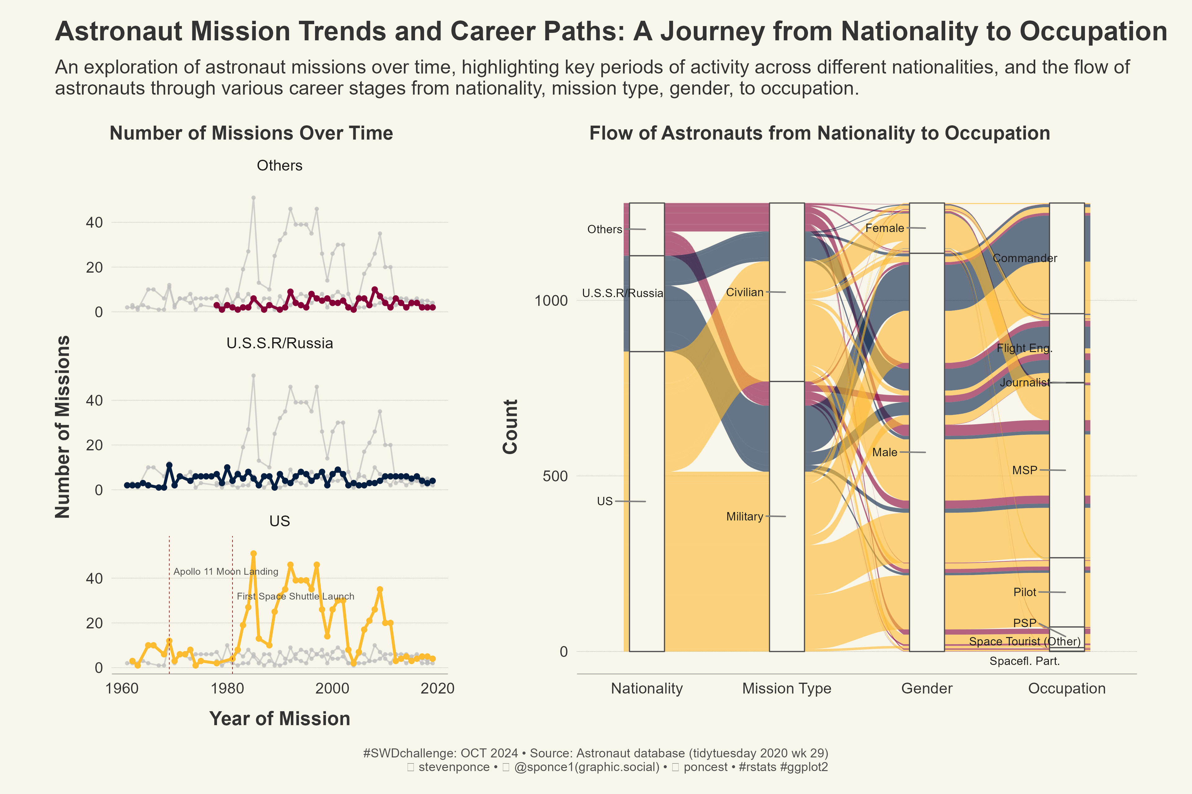
---

![Dual visualization showing astronaut mission trends and career paths. The left panel is a line chart displaying the number of missions over time, segmented by nationality (Others, U.S.S.R./Russia, U.S.). Notable events like 'The Apollo 11 Moon Landing' and 'The First Space Shuttle Launch' are annotated. The right panel is an alluvial plot depicting the flow of astronauts from nationality to mission type, gender, and occupation, highlighting key career paths.](swd_2024_10.png){#fig-1}

### <mark> __Steps to Create this Graphic__ </mark>

#### 1. Load Packages & Setup 

```{r}
#| label: load

pacman::p_load(
  tidyverse,   # Easily Install and Load the 'Tidyverse'
  ggtext,      # Improved Text Rendering Support for 'ggplot2'
  showtext,    # Using Fonts More Easily in R Graphs
  janitor,     # Simple Tools for Examining and Cleaning Dirty Data
  skimr,       # Compact and Flexible Summaries of Data
  scales,      # Scale Functions for Visualization
  lubridate,   # Make Dealing with Dates a Little Easier
  glue,        # Interpreted String Literals
  ggalluvial,  # Alluvial Plots in 'ggplot2'
  patchwork,   # The Composer of Plots
  gghighlight  # Highlight Lines and Points in 'ggplot2'
)

### |- figure size ---- 
camcorder::gg_record( 
  dir    = here::here("temp_plots"), 
  device = "png",
  width  = 12,
  height = 8,
  units  = "in",
  dpi    = 320)

### |- resolution ---- 
showtext_opts(dpi = 320, regular.wt = 300, bold.wt = 800)
```

#### 2. Read in the Data 

```{r}
#| label: read

astronaut_db <- read_csv(
  here::here("data/astronauts.csv")
  ) |>
  clean_names() |>
  glimpse()

```

#### 3. Examine the Data

```{r}
#| label: examine

glimpse(astronaut_db)
skim(astronaut_db)
colnames(astronaut_db)
```

#### 4. Tidy Data 

```{r}
#| label: tidy

astronaut_db_clean <- astronaut_db |>
  mutate(
    nationality_grouped = case_when(
      nationality == "U.S." ~ "US",
      nationality == "U.S.S.R/Russia" ~ "U.S.S.R/Russia",
      TRUE ~ "Others"
    ),
    mission_type = str_to_title(military_civilian),
    gender = str_to_title(sex), 
    occupation = str_to_title(occupation),
    occupation = case_when(
      occupation == "Flight Engineer" ~ "Flight Eng.",
      occupation == "Psp" ~ "PSP",
      occupation == "Msp" ~ "MSP",
      occupation == "Spaceflight Participant" ~ "Spacefl. Part.",
      occupation == "Other (Journalist)" ~ "Journalist",
      occupation %in% c("Other (Space Tourist)", "Space Tourist") ~ "Space Tourist (Other)",
      TRUE ~ as.character(occupation)
    )
  ) |>
  select(year_of_mission, nationality_grouped, mission_type, gender, occupation) |>
  filter(!is.na(year_of_mission))
```


#### 5. Visualization Parameters 

```{r}
#| label: params

### |- plot aesthetics ---- 
bkg_col      <- colorspace::lighten('#f7f5e9', 0.05)    
title_col    <- "gray20"           
subtitle_col <- "gray20"     
caption_col  <- "gray30"   
text_col     <- "gray20"    
col_palette  <- paletteer::paletteer_d("nbapalettes::cavaliers")[c(1,2,3)] 

### |-  titles and caption ----
# icons
tt <- str_glue("#SWDchallenge: OCT 2024 &bull; Source: Astronaut database (tidytuesday 2020 wk 29)<br>")  
li <- str_glue("<span style='font-family:fa6-brands'>&#xf08c;</span>")  
gh <- str_glue("<span style='font-family:fa6-brands'>&#xf09b;</span>")
mn <- str_glue("<span style='font-family:fa6-brands'>&#xf4f6;</span>")

# text
title_text   <- str_glue("Astronaut Mission Trends and Career Paths: A Journey from Nationality to Occupation") 

subtitle_text <- str_glue("An exploration of astronaut missions over time, highlighting key periods of activity 
                          across different nationalities, and the flow of <br>
                          astronauts through various career stages from nationality, mission type, gender, to occupation.")

caption_text <- str_glue("{tt} {li} stevenponce &bull; {mn} @sponce1(graphic.social) &bull; {gh} poncest &bull; #rstats #ggplot2")

### |-  fonts ----
font_add('fa6-brands', 'fonts/6.4.2/Font Awesome 6 Brands-Regular-400.otf')  
font_add_google("Oswald", regular.wt = 400, family = "title")                 
font_add_google("Quattrocento Sans", regular.wt = 400, family = "subtitle")  
font_add_google("Quattrocento Sans", regular.wt = 400, family = "text")        
font_add_google("Noto Sans", regular.wt = 400,family = "caption")
showtext_auto(enable = TRUE)  

### |-  plot theme ----
theme_set(theme_minimal(base_size = 14, base_family = "text"))                

theme_update(
  plot.title.position   = "plot",
  plot.caption.position = "plot",
  legend.position       = 'plot',
  plot.background       = element_rect(fill = bkg_col, color = bkg_col),
  panel.background      = element_rect(fill = bkg_col, color = bkg_col),
  plot.margin           = margin(t = 10, r = 20, b = 10, l = 20),
  axis.title.x          = element_text(margin = margin(10, 0, 0, 0), size = rel(1), 
                                       color = text_col, family = "text", face = "bold", hjust = 0.5),
  axis.title.y          = element_text(margin = margin(0, 10, 0, 0), size = rel(1), 
                                       color = text_col, family = "text", face = "bold", hjust = 0.5),
  axis.text             = element_text(size = rel(0.8), color = text_col, family = "text"),
  axis.line.x           = element_line(color = "gray40", linewidth = .15),
  panel.grid.minor.y    = element_blank(),
  panel.grid.major.y    = element_line(linetype = "dotted", linewidth = 0.1, color = 'gray10'),
  panel.grid.minor.x    = element_blank(),
  panel.grid.major.x    = element_blank(),
)
```


#### 6. Plot

```{r}
#| label: plot

### |-  Plot 1 ----  

#  Line Chart 
mission_summary <- astronaut_db_clean |>
  group_by(year_of_mission, nationality_grouped) |>
  summarise(num_missions = n(), .groups = "drop")

# Annotations df 
annotations <- tibble(
  year = c(1969, 1981),  
  label = c(
    "Apollo 11 Moon Landing", 
    "First Space Shuttle Launch"
  ),
  nationality_grouped = c("US", "US"),  
  y_positions = c(43, 32)  
)

p1 <- mission_summary |>
  ggplot(aes(x = year_of_mission, y = num_missions, 
             color = nationality_grouped, group = nationality_grouped)) +
  
  # Geoms
  geom_line(linewidth = 1) + 
  geom_point(size = 1.5) + 
  gghighlight::gghighlight(
    use_direct_label = FALSE,
    unhighlighted_params = list(linewidth = 0.5, size = 0.8)
  ) +
  
  # Annotations
  geom_vline(data = annotations, aes(xintercept = year), 
             linetype = "dashed", color = "darkred", linewidth = 0.2) +
  geom_text(data = annotations, aes(x = year, y = y_positions, label = label),
            size = 2.5, color = "grey30", hjust = 0, nudge_x = 0.8) +  
  
  # Scales
  scale_x_continuous() +
  scale_y_continuous(limits = c(0, max(mission_summary$num_missions) + 5)) +  
  scale_color_manual(values = col_palette) + 
  coord_cartesian(clip = 'off') +
  
  # Labs
  labs(
    title = "Number of Missions Over Time",
    x = "Year of Mission",
    y = "Number of Missions",
    color = "Nationality"
  ) +
  
  # Facet
  facet_wrap(~ nationality_grouped, ncol = 1) +
  
  # Theme
  theme(
    plot.title = element_text(
      size = rel(1),
      hjust = 0.5,
      family = "title",
      color = title_col,
      face = "bold",
      lineheight = 0.85,
      margin = margin(t = 5, b = 5)
    )
  )

### |-  Plot 2 ----  

#  Alluvial Plot 
p2 <- astronaut_db_clean |>
  count(nationality_grouped, mission_type, gender, occupation) |>
  ggplot(aes(
    axis1 = nationality_grouped, axis2 = mission_type, axis3 = gender, axis4 = occupation,
    y = n)
  ) +
  
  # Geoms
  geom_alluvium(aes(fill = nationality_grouped), alpha = 0.6) +  
  geom_stratum(width = 1/4, fill = bkg_col, linewidth = 0.4, colour = 'gray30') +  
  
  ggrepel::geom_text_repel(
    aes(label = after_stat(stratum), family = "text"),
    stat = "stratum", size = 3, direction = "y", nudge_x = -0.3, nudge_y = 1,
    color = "gray10", segment.color = "grey50"
  ) +
  
  # Scales
  scale_x_discrete(limits = c("Nationality", "Mission Type", "Gender", "Occupation"), 
                   expand = c(0.15, 0.05)) +
  scale_fill_manual(values = col_palette) +  
  
  # Labs
  labs(
    title = "Flow of Astronauts from Nationality to Occupation",
    x = "",
    y = "Count"
  ) +
  
  # Theme
  theme(
    plot.title = element_text(
      size = rel(1),
      hjust = 0.5,
      family = "title",
      color = title_col,
      face = "bold",
      lineheight = 0.85,
      margin = margin(t = 5, b = 5)
    )
  )

### |-  Combine the plots using patchwork ----

combined_plot <- (p1 | p2) +
  patchwork::plot_layout(
    ncol = 2,
    widths = c(0.75, 1.25), 
    guides = "collect"
  ) +
  
  # Labs
  plot_annotation(
    title = title_text,
    subtitle = subtitle_text,
    caption = caption_text,
    
    # Theme 
    theme = theme(
      plot.title = element_markdown(
        size = rel(1.4),
        family = "title",
        face = "bold",
        color = title_col,
        lineheight = 1.1,
        margin = margin(t = 5, b = 5)
      ),
      plot.subtitle = element_markdown(
        size = rel(1),
        family = "subtitle",
        color = subtitle_col,
        lineheight = 1.1,
        margin = margin(t = 5, b = 5)
      ),
      plot.caption = element_markdown(
        size = rel(0.65),
        family = "caption",
        color = caption_col,
        lineheight = 1.1,
        hjust = 0.5,
        halign = 1,
        margin = margin(t = 5, b = 5)
      )
    )
  )


# Show the combined plot
combined_plot
```

#### 7. Save

```{r}
#| label: save

### |-  plot image ----  

library(ggplotify)
# Convert patchwork plot to grob 
# There was some issues between patchwork and ggsave
plot_grob <- as.grob(combined_plot)

# Save the plot again
ggsave(
  filename = here::here("data_visualizations/SWD Challenge/2024/swd_2024_10.png"),
  plot   = plot_grob,
  width  =  12,
  height =  8,
  units  = "in",
  dpi    = 320
)
 
### |-  plot thumbnail----  
magick::image_read(here::here("data_visualizations/SWD Challenge/2024/swd_2024_10.png")) |> 
  magick::image_resize(geometry = "400") |> 
  magick::image_write(here::here("data_visualizations/SWD Challenge/2024/thumbnails/swd_2024_10.png"))
```


#### 8. Session Info

::: {.callout-tip collapse="true"}
##### Expand for Session Info

```{r, echo = FALSE}
#| eval: true

sessionInfo()
```
:::

#### 9. GitHub Repository

::: {.callout-tip collapse="true"}

##### Expand for GitHub Repo
 
[Access the GitHub repository here](https://github.com/poncest/personal-website/)
:::

© 2024 Steven Ponce

Source Issues