Visitor Distribution by Start Month at World’s Fairs
Density of visitor counts across fairs held from 1851 to 2021
TidyTuesday
Data Visualization
R Programming
2024
Author
Steven Ponce
Published
August 13, 2024
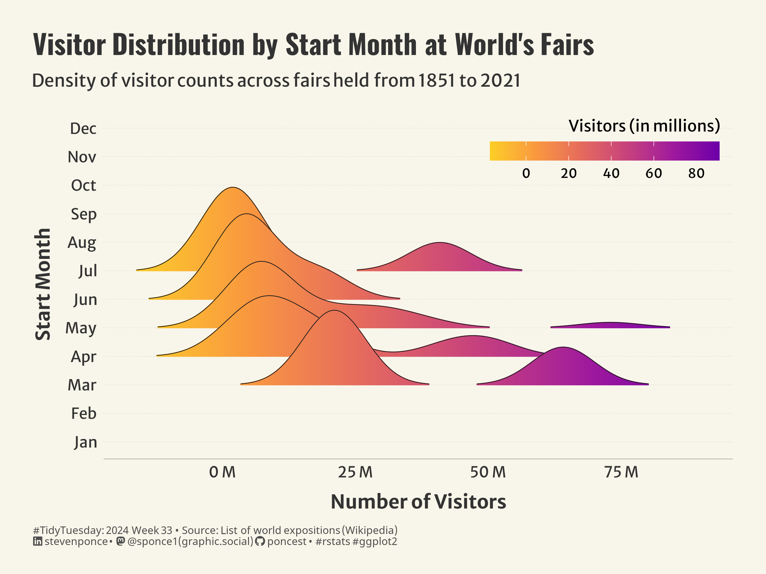
Figure 1: This is a ridge chart showing the distribution of visitors to World’s Fairs, organized by the month they started from January to December between 1851 and 2021. Each ridge represents a different month, with varying peaks indicating the number of visitors in millions. The chart uses shades of purple for higher visitor months and warmer colors for lower ones.
Steps to Create this Graphic
1. Load Packages & Setup
Code
```{r}#| label: loadpacman::p_load( tidyverse, # Easily Install and Load the 'Tidyverse' ggtext, # Improved Text Rendering Support for 'ggplot2' showtext, # Using Fonts More Easily in R Graphs janitor, # Simple Tools for Examining and Cleaning Dirty Data skimr, # Compact and Flexible Summaries of Data scales, # Scale Functions for Visualization lubridate, # Make Dealing with Dates a Little Easier MetBrewer, # Color Palettes Inspired by Works at the Metropolitan Museum of Art ggridges # Ridgeline Plots in 'ggplot2' # Ridgeline Plots in 'ggplot2' ) ### |- figure size ----camcorder::gg_record(dir = here::here("temp_plots"),device ="png",width =8,height =6,units ="in",dpi =320)### |- resolution ----showtext_opts(dpi =320, regular.wt =300, bold.wt =800)```
```{r}#| label: tidy# Tidyworlds_fairs <- worlds_fairs |>mutate(start_month =factor(start_month, levels =1:12, labels = month.abb))# Create a data frame with all monthsall_months <-data.frame(start_month =factor(month.abb, levels = month.abb))# Left join with plot_datadata_plot <- all_months |>left_join(worlds_fairs, by ="start_month")```
5. Visualization Parameters
Code
```{r}#| label: params### |- plot aesthetics ----bkg_col <- colorspace::lighten('#f7f5e9', 0.05) title_col <-"gray20"subtitle_col <-"gray20"caption_col <-"gray30"text_col <-"gray20"### |- titles and caption ----# iconstt <-str_glue("#TidyTuesday: { 2024 } Week { 33 } • Source: List of world expositions (Wikipedia)<br>")li <-str_glue("<span style='font-family:fa6-brands'></span>")gh <-str_glue("<span style='font-family:fa6-brands'></span>")mn <-str_glue("<span style='font-family:fa6-brands'></span>")# texttitle_text <-str_glue("Visitor Distribution by Start Month at World\\'s Fairs")subtitle_text <-str_glue("Density of visitor counts across fairs held from 1851 to 2021")caption_text <-str_glue("{tt} {li} stevenponce • {mn} @sponce1(graphic.social) {gh} poncest • #rstats #ggplot2")### |- fonts ----font_add("fa6-brands", "fonts/6.4.2/Font Awesome 6 Brands-Regular-400.otf")font_add_google("Oswald", regular.wt =400, family ="title")font_add_google("Merriweather Sans", regular.wt =400, family ="subtitle")font_add_google("Merriweather Sans", regular.wt =400, family ="text")font_add_google("Noto Sans", regular.wt =400, family ="caption")showtext_auto(enable =TRUE)### |- plot theme ----theme_set(theme_minimal(base_size =12, base_family ="text")) theme_update(plot.title.position ="plot",plot.caption.position ="plot",legend.position ="top",legend.justification ="right",legend.title.position ="top",legend.title.align =1, legend.box.just ="right",legend.margin =margin(5, 10, -65, 0),plot.background =element_rect(fill = bkg_col, color = bkg_col),panel.background =element_rect(fill = bkg_col, color = bkg_col),plot.margin =margin(t =20, r =25, b =20, l =25),axis.title.x =element_text(margin =margin(10, 0, 0, 0), size =rel(1.2), color = text_col, family ="text", face ="bold", hjust =0.5),axis.title.y =element_text(margin =margin(0, 10, 0, 0), size =rel(1.2), color = text_col, family ="text", face ="bold", vjust =0.5),axis.text =element_text(size =rel(0.95), color = text_col, family ="text"),axis.line.x =element_line(color ="gray40", linewidth =0.12),panel.grid.minor.x =element_blank(),panel.grid.major.x =element_blank(),panel.grid.major.y =element_line(linetype ="dotted", linewidth =0.15, color ='gray'),panel.grid.minor.y =element_blank(),) ```
6. Plot
Code
```{r}#| label: plot### |- final plot ---- p <- data_plot |>ggplot(aes(x = visitors, y = start_month, fill = start_month)) +# Geomgeom_density_ridges_gradient(scale =3,rel_min_height =0.01,gradient_lwd =1.0,aes(fill = ..x..), color ="gray10", linewidth = .25 ) +# Scalesscale_y_discrete() +scale_x_continuous(labels =label_number(suffix =" M")) +scale_fill_viridis_c(name ="Number of Visitors",option ="C",direction =-1,begin =0.2,end =0.9,guide =guide_colourbar(title ="Visitors (in millions)",title.position ="top",barwidth =12,draw.ulim =75,barheight =1,frame.colour =NA)) +coord_cartesian(clip ='off') +# Labslabs(x ="Number of Visitors",y ="Start Month",fill ="Number of Visitors",title = title_text,subtitle = subtitle_text,caption = caption_text, ) +# Themetheme(plot.title =element_markdown(size =rel(1.7),family ="title",color = title_col,face ="bold",lineheight =0.85,margin =margin(t =5, b =5) ),plot.subtitle =element_markdown(size =rel(1.1),family ="subtitle",color = title_col,lineheight =1,margin =margin(t =5, b =15) ),plot.caption =element_markdown(size =rel(.65),family ="caption",color = caption_col,lineheight =0.6,hjust =0,halign =0,margin =margin(t =10, b =0) ) ) ```