Top 20 Responses to Key Questions in the 2024 Stack Overflow Survey
Analysis of AI Tool Usage and Work Situation Across Countries
TidyTuesday
Data Visualization
R Programming
2024
Author
Steven Ponce
Published
September 2, 2024
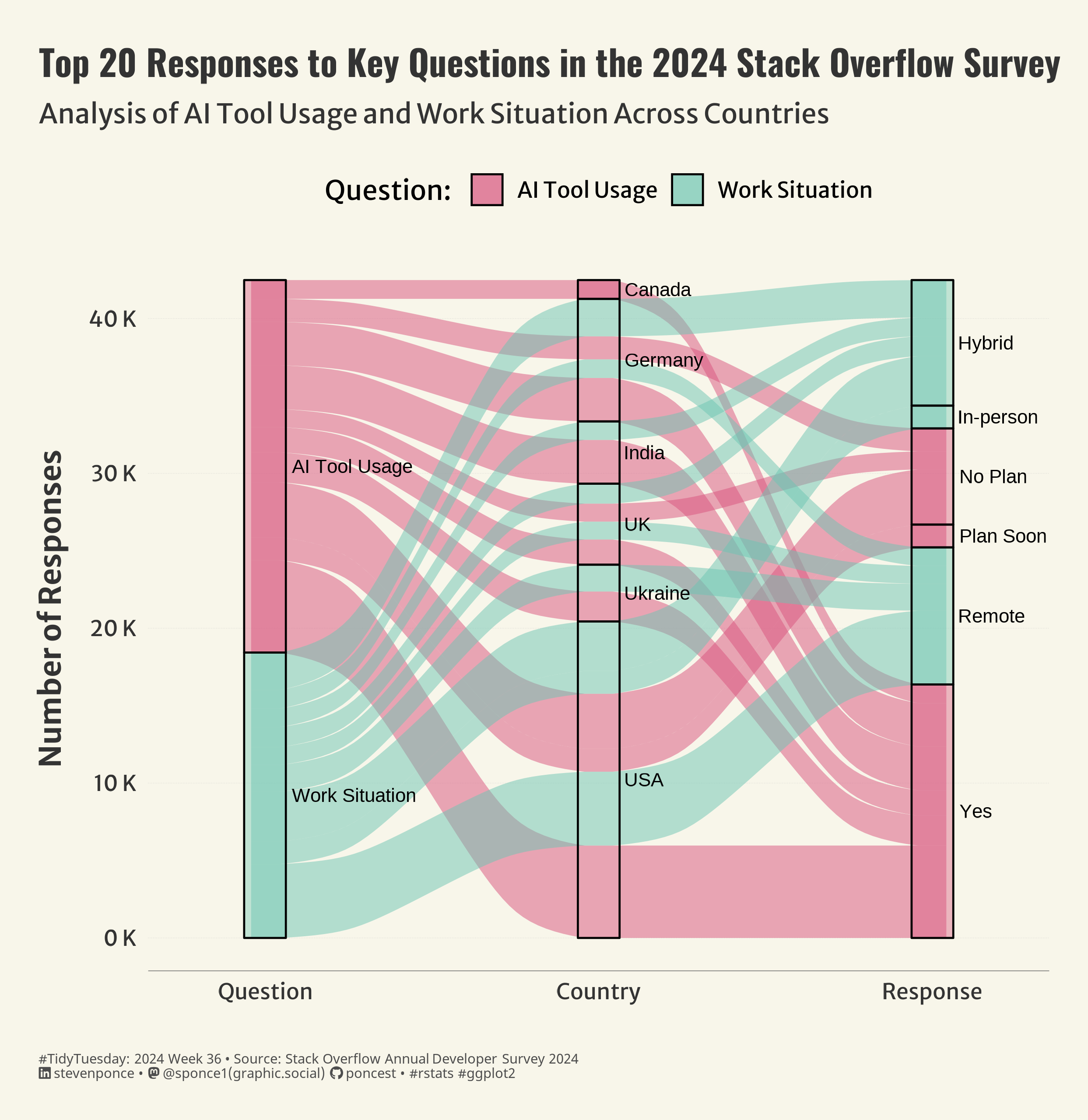
Figure 1: The Sankey diagram illustrates the top 20 responses to key questions in the 2024 Stack Overflow survey, tracking the flow of responses about AI tool usage and work situations in selected countries. The responses are divided into categories like “Yes,” “No Plan,” “Plan Soon,” “Hybrid,” “In-person,” and “Remote,” and the paths are color-coded to show different questions and responses from each country.
Steps to Create this Graphic
1. Load Packages & Setup
Code
```{r}#| label: loadpacman::p_load( tidyverse, # Easily Install and Load the 'Tidyverse' ggtext, # Improved Text Rendering Support for 'ggplot2' showtext, # Using Fonts More Easily in R Graphs janitor, # Simple Tools for Examining and Cleaning Dirty Data skimr, # Compact and Flexible Summaries of Data scales, # Scale Functions for Visualization lubridate, # Make Dealing with Dates a Little Easier MetBrewer, # Color Palettes Inspired by Works at the Metropolitan Museum of Art MoMAColors, # Color Palettes Inspired by Artwork at the Museum of Modern Art in New York City glue, # Interpreted String Literals ggalluvial, # Alluvial Plots in 'ggplot2' # Alluvial Plots in 'ggplot2' # Alluvial Plots in 'ggplot2' ggrepel, # Automatically Position Non-Overlapping Text Labels with 'ggplot2' magick # Advanced Graphics and Image-Processing in R ) ### |- figure size ----camcorder::gg_record(dir = here::here("temp_plots"),device ="png",width =7.77,height =8,units ="in",dpi =320)### |- resolution ----showtext_opts(dpi =320, regular.wt =300, bold.wt =800)```
```{r}#| label: tidy# Tidyytidy_data <- single_response |>pivot_longer(cols =-c(response_id, country, currency, comp_total, converted_comp_yearly), names_to ="qname", values_to ="response_code") |>left_join(response_crosswalk, by =c("qname", "response_code"="level")) |>left_join(survey_questions, by ="qname") |>mutate(country =case_when( country =="United Kingdom of Great Britain and Northern Ireland"~"UK", country =="United States of America"~"USA",TRUE~as.factor(country) ) ) |>drop_na(country) # Prepare data for Alluvial plotalluvial_data <- tidy_data |>filter(qname %in%c("remote_work", "ai_select")) |>count(question, country, label) |>arrange(desc(n)) |>slice_head(n =20) |>mutate(question =str_remove(question, "\\s*\\*"), # Removing the '*' from questionsquestion =case_when( question =="Do you currently use AI tools in your development process?"~"AI Tool Usage", question =="Which best describes your current work situation?"~"Work Situation",TRUE~ question ),label =case_when( label =="No, and I don't plan to"~"No Plan", label =="No, but I plan to soon"~"Plan Soon", label =="Hybrid (some remote, some in-person)"~"Hybrid",TRUE~ label ), ) |>filter(!is.na(label))# Plot dataplot_data <- alluvial_data |>filter(!is.na(question))```
5. Visualization Parameters
Code
```{r}#| label: params### |- plot aesthetics ----bkg_col <- colorspace::lighten('#f7f5e9', 0.05) title_col <-"gray20"subtitle_col <-"gray20"caption_col <-"gray30"text_col <-"gray20"col_palette <- MoMAColors::moma.colors(palette_name ="Koons", n =2, type ='discrete')### |- titles and caption ----# iconstt <-str_glue("#TidyTuesday: { 2024 } Week { 36 } • Source: Stack Overflow Annual Developer Survey 2024<br>")li <-str_glue("<span style='font-family:fa6-brands'></span>")gh <-str_glue("<span style='font-family:fa6-brands'></span>")mn <-str_glue("<span style='font-family:fa6-brands'></span>")# texttitle_text <-str_glue("Top 20 Responses to Key Questions in the 2024 Stack Overflow Survey")subtitle_text <-str_glue("Analysis of AI Tool Usage and Work Situation Across Countries")caption_text <-str_glue("{tt} {li} stevenponce • {mn} @sponce1(graphic.social) {gh} poncest • #rstats #ggplot2")### |- fonts ----font_add("fa6-brands", "fonts/6.4.2/Font Awesome 6 Brands-Regular-400.otf")font_add_google("Oswald", regular.wt =400, family ="title")font_add_google("Merriweather Sans", regular.wt =400, family ="subtitle")font_add_google("Merriweather Sans", regular.wt =400, family ="text")font_add_google("Noto Sans", regular.wt =400, family ="caption")showtext_auto(enable =TRUE)### |- plot theme ----theme_set(theme_minimal(base_size =14, base_family ="text")) theme_update(plot.title.position ="plot",plot.caption.position ="plot",legend.position ='top',plot.background =element_rect(fill = bkg_col, color = bkg_col),panel.background =element_rect(fill = bkg_col, color = bkg_col),plot.margin =margin(t =20, r =20, b =20, l =20),axis.title.x =element_text(margin =margin(10, 0, 0, 0), size =rel(1.1), color = text_col, family ="text", face ="bold", hjust =0.5),axis.title.y =element_text(margin =margin(0, 10, 0, 0), size =rel(1.1), color = text_col, family ="text", face ="bold", hjust =0.5),axis.text =element_text(size =rel(0.8), color = text_col, family ="text"),axis.line.x =element_line(color ="gray40", linewidth = .15),panel.grid.minor.y =element_blank(),panel.grid.major.y =element_line(linetype ="dotted", linewidth =0.1, color ='gray'),panel.grid.minor.x =element_blank(),panel.grid.major.x =element_blank(),) ```