White and Black Chess Ratings: A Distribution Analysis
How ratings vary between White and Black players across competitive chess matches
TidyTuesday
Data Visualization
R Programming
2024
Author
Steven Ponce
Published
September 25, 2024
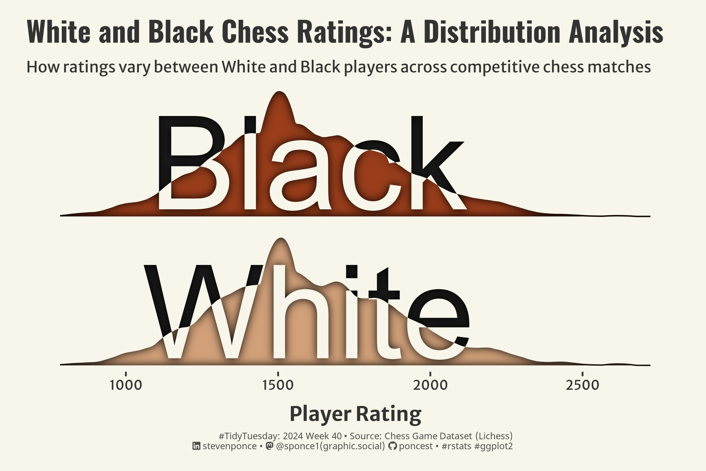
Figure 1: The image displays two overlapping kernel density plots representing the distribution of chess player ratings for “White” and “Black” players. Both distributions peak around 1500 on the x-axis and range from 500 to 3000. The graph title is “White and Black Chess Ratings: A Distribution Analysis.”
Steps to Create this Graphic
1. Load Packages & Setup
Code
```{r}#| label: load## 1. LOAD PACKAGES & SETUP ----pacman::p_load( tidyverse, # Easily Install and Load the 'Tidyverse' ggtext, # Improved Text Rendering Support for 'ggplot2' showtext, # Using Fonts More Easily in R Graphs janitor, # Simple Tools for Examining and Cleaning Dirty Data skimr, # Compact and Flexible Summaries of Data scales, # Scale Functions for Visualization lubridate, # Make Dealing with Dates a Little Easier glue, # Interpreted String Literals ggfx # Pixel Filters for 'ggplot2' and 'grid' # Pixel Filters for 'ggplot2' and 'grid' ) ### |- figure size ---- camcorder::gg_record(dir = here::here("temp_plots"),device ="png",width =7.5,height =5,units ="in",dpi =320)### |- resolution ----showtext_opts(dpi =320, regular.wt =300, bold.wt =800)```