• Steven Ponce
  • About
  • Data Visualizations
  • Projects
  • Resume
  • Email

On this page

  • Steps to Create this Graphic
    • 1. Load Packages & Setup
    • 2. Read in the Data
    • 3. Examine the Data
    • 4. Tidy Data
    • 5. Visualization Parameters
    • 6. Plot
    • 7. Save
    • 8. Session Info
    • 9. GitHub Repository
    • 10. References
    • 11. Custom Functions Documentation

Reach, Height, and Age Barely Predict a UFC Winner

  • Show All Code
  • Hide All Code

  • View Source

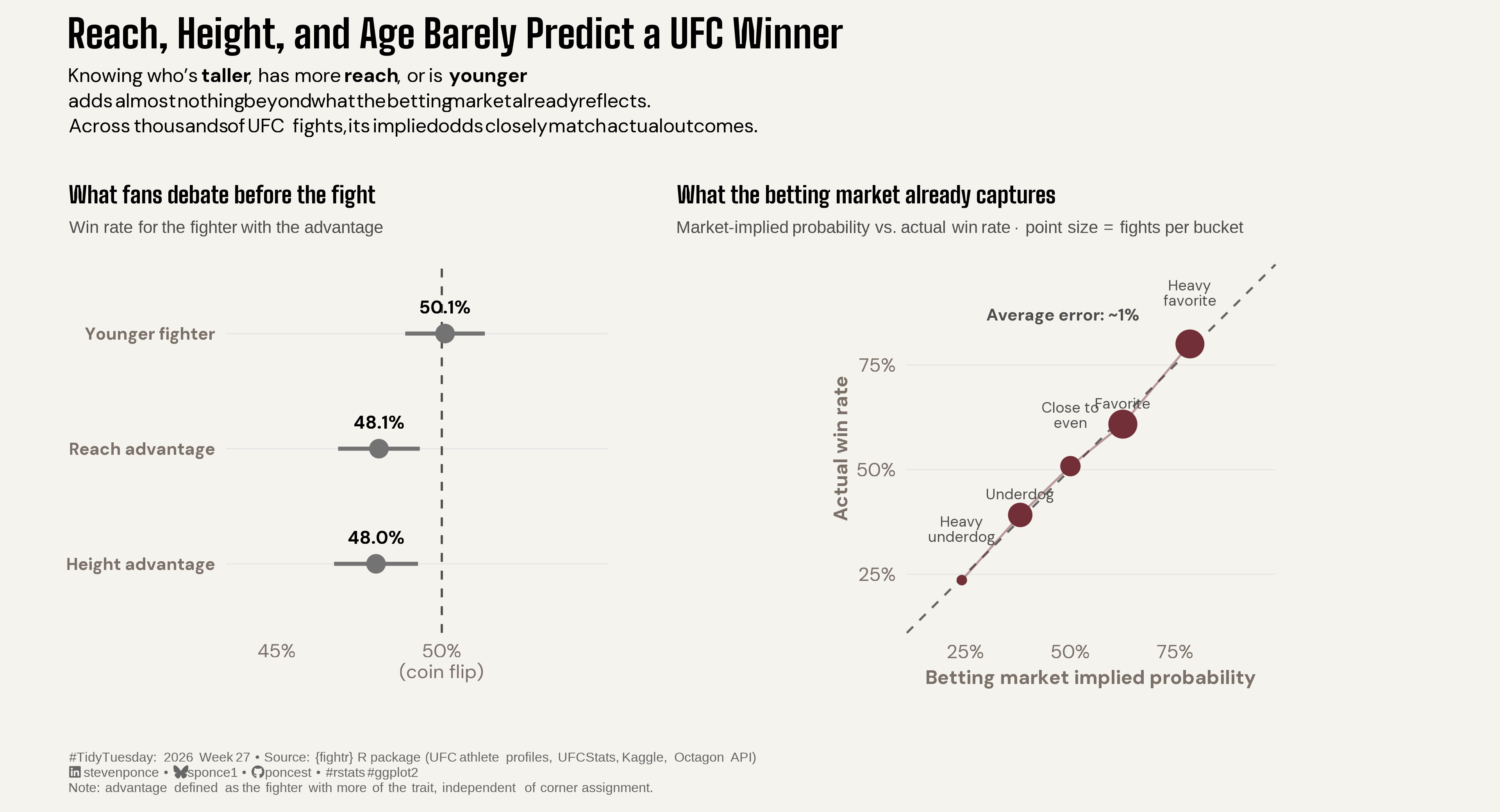
Knowing who’s taller, has more reach, or is younger adds almost nothing beyond what the betting market already reflects. Across thousands of UFC fights, its implied odds closely match actual outcomes.

TidyTuesday
Data Visualization
R Programming
2026
Physical attributes like reach, height, and age barely outperform a coin flip at predicting UFC fight winners, while the betting market’s implied odds are remarkably well-calibrated across thousands of fights. Win rates use a corner-independent advantage definition with Wilson confidence intervals; calibration is checked by probability bucket. Built in R with ggplot2, patchwork, and binom.
Author

Steven Ponce

Published

July 5, 2026

Figure 1: Two-panel chart titled “Reach, Height, and Age Barely Predict a UFC Winner.” Left panel shows win rates for the fighter with a physical advantage: reach (48.1%), height (48.0%), and youth (50.1%), all clustered near a dashed 50% coin-flip line with confidence intervals. Right panel plots betting-market implied probability against actual win rate across five buckets from heavy underdog to heavy favorite, with points falling almost exactly on the diagonal reference line and an average calibration error of about 1 percentage point. Data from the fightr R package (UFC athlete profiles, UFCStats, Kaggle, Octagon API).

Steps to Create this Graphic

1. Load Packages & Setup

Show code
```{r}
#| label: load
#| warning: false
#| message: false      
#| results: "hide"     

## 1. LOAD PACKAGES & SETUP ----
suppressPackageStartupMessages({
if (!require("pacman")) install.packages("pacman")
pacman::p_load(
    tidyverse, ggtext, showtext, janitor, ggrepel,      
    scales, glue, skimr, binom, patchwork
    )
})

### |- figure size ----          
camcorder::gg_record(
  dir    = here::here("temp_plots"),
    device = "png",
    width  = 12,
    height = 6.5,
    units  = "in",
    dpi    = 320
)

# Source utility functions
suppressMessages(source(here::here("R/utils/fonts.R")))
source(here::here("R/utils/social_icons.R"))
source(here::here("R/utils/image_utils.R"))
source(here::here("R/themes/base_theme.R"))
```

2. Read in the Data

Show code
```{r}
#| label: read
#| include: true
#| eval: true
#| warning: false

## 2. READ IN THE DATA ----
tt <- tidytuesdayR::tt_load(2026, week = 27)
ultimate_ufc_dataset <- tt$ultimate_ufc_dataset |> clean_names()
rm(tt)
```

3. Examine the Data

Show code
```{r}
#| label: examine
#| include: true
#| eval: true
#| results: 'hide'
#| warning: false

glimpse(ultimate_ufc_dataset)
```

4. Tidy Data

Show code
```{r}
#| label: tidy
#| warning: false

## |- panel A: physical-advantage win rates (corner-assignment-proof) ----
## Reach is systematically confounded with corner (Red is the betting
## favorite ~62% of the time), so advantage is defined as "did the
## fighter WITH more of the trait win," independent of corner.

adv_data <- ultimate_ufc_dataset |>
  filter(!is.na(winner)) |>
  mutate(
    reach_adv_won = case_when(
      reach_dif > 0 ~ winner == "Red",
      reach_dif < 0 ~ winner == "Blue", TRUE ~ NA
    ),
    height_adv_won = case_when(
      height_dif > 0 ~ winner == "Red",
      height_dif < 0 ~ winner == "Blue", TRUE ~ NA
    ),
    younger_won = case_when(
      age_dif < 0 ~ winner == "Red",
      age_dif > 0 ~ winner == "Blue", TRUE ~ NA
    )
  )

wilson_summary <- function(x, label) {
  x <- x[!is.na(x)]
  ci <- binom.wilson(sum(x), length(x))
  tibble(trait = label, mean = ci$mean, lower = ci$lower, upper = ci$upper, n = ci$n)
}

advantage_summary <- bind_rows(
  wilson_summary(adv_data$reach_adv_won, "Reach advantage"),
  wilson_summary(adv_data$height_adv_won, "Height advantage"),
  wilson_summary(adv_data$younger_won, "Younger fighter")
) |>
  mutate(trait = fct_reorder(trait, mean))

### |- panel B: betting-market calibration curve ----
implied_prob <- function(odds) {
  if_else(odds < 0, -odds / (-odds + 100), 100 / (odds + 100))
}

calibration_data <- ultimate_ufc_dataset |>
  filter(!is.na(r_odds), !is.na(winner)) |>
  mutate(
    r_implied = implied_prob(r_odds),
    red_won = winner == "Red",
    implied_bucket = case_when(
      r_implied < 0.30 ~ "Heavy\nunderdog",
      r_implied < 0.45 ~ "Underdog",
      r_implied < 0.55 ~ "Close to\neven",
      r_implied < 0.70 ~ "Favorite",
      TRUE ~ "Heavy\nfavorite"
    ),
    implied_bucket = fct_reorder(implied_bucket, r_implied)
  ) |>
  group_by(implied_bucket) |>
  summarise(
    n = n(),
    mean_implied = mean(r_implied),
    actual_win_rate = mean(red_won),
    .groups = "drop"
  )

avg_calibration_error <- calibration_data |>
  summarise(avg_abs_gap = mean(abs(actual_win_rate - mean_implied))) |>
  pull(avg_abs_gap)
```

5. Visualization Parameters

Show code
```{r}
#| label: params
#| include: true
#| warning: false

### |-  plot aesthetics ----
clrs <- get_theme_colors(
  palette = c("highlight" = "#722F37", "secondary" = "gray70")
)

### |- titles and caption ----

title_text <- str_glue("Reach, Height, and Age Barely Predict a UFC Winner")

subtitle_text <- str_glue(
  "Knowing who's **taller**, has more **reach**, or is **younger**<br>",
  "adds almost nothing beyond what the betting market already reflects.<br>",
  "Across thousands of UFC fights, its implied odds closely match actual outcomes."
)

caption_text <- create_social_caption(
  tt_year = 2026,
  tt_week = 27,
  source_text = "{fightr} R package (UFC athlete profiles, UFCStats, Kaggle, Octagon API)"
)

caption_text <- str_glue(
  "{caption_text}<br>",
  "Note: advantage defined as the fighter with more of the trait, independent of corner assignment."
)

### |-  fonts ----
setup_fonts()
fonts <- get_font_families()

### |-  plot theme ----
base_theme <- create_base_theme(clrs)

weekly_theme <- extend_weekly_theme(
  base_theme,
  theme(
    plot.title = element_text(
      face = "bold", family = fonts$title_1, size = rel(1.4), margin = margin(b = 6)
    ),
    plot.subtitle = element_markdown(
      family = fonts$subtitle, size = rel(0.95), lineheight = 1.2, margin = margin(b = 16)
    ),
    panel.grid.major.y = element_line(color = "gray90", linewidth = 0.3),
    panel.grid.major.x = element_blank(),
    panel.grid.minor = element_blank(),
    axis.ticks = element_blank(),
    strip.text = element_text(face = "bold", family = fonts$title, size = rel(0.9))
  )
)

theme_set(weekly_theme)
```

6. Plot

Show code
```{r}
#| label: plot
#| warning: false

### |- plot ----

### |- Panel A: physical advantage win rates ----
p_advantage <- ggplot(advantage_summary, aes(x = mean, y = trait)) +
  geom_vline(xintercept = 0.5, linetype = "dashed", color = "gray30", linewidth = 0.6) +
  geom_pointrange(
    aes(xmin = lower, xmax = upper),
    color = "gray45", fill = "gray45",
    size = 0.9, linewidth = 1.1, shape = 21
  ) +
  geom_text(
    aes(label = percent(mean, accuracy = 0.1)),
    vjust = -1.6, family = fonts$text, fontface = "bold", size = 3.6
  ) +
  scale_x_continuous(
    labels = c("45%", "50%\n(coin flip)"),
    limits = c(0.44, 0.545),
    breaks = c(0.45, 0.50)
  ) +
  coord_cartesian(clip = "off") +
  labs(
    title = "What fans debate before the fight",
    subtitle = "Win rate for the fighter with the advantage",
    x = NULL, y = NULL
  ) +
  theme(
    plot.title = element_text(size = rel(0.95), face = "bold", family = fonts$title_1),
    plot.subtitle = element_markdown(size = rel(0.7), color = "gray30", family = 'sans'),
    axis.text.y = element_text(size = rel(0.9), face = "bold")
  )

### |- Panel B: calibration curve ----
p_calibration <- ggplot(calibration_data, aes(x = mean_implied, y = actual_win_rate)) +
  geom_abline(slope = 1, intercept = 0, linetype = "dashed", color = "gray40", linewidth = 0.6) +
  geom_line(color = "#722F37", linewidth = 0.6, alpha = 0.45) +
  geom_point(aes(size = n), color = "#722F37") +
  geom_text(
    aes(label = implied_bucket),
    vjust = -1.5, family = fonts$text, size = 3, lineheight = 0.85, color = "gray30"
  ) +
  annotate(
    "text",
    x = 0.30, y = 0.87,
    label = str_glue("Average error: ~{percent(avg_calibration_error, accuracy = 1)}"),
    family = fonts$text, fontface = "bold", size = 3.4, color = "gray30", hjust = 0
  ) +
  scale_x_continuous(labels = percent_format(accuracy = 1), limits = c(0.15, 0.95)) +
  scale_y_continuous(labels = percent_format(accuracy = 1), limits = c(0.15, 0.95)) +
  scale_size_continuous(range = c(2, 7), guide = "none") +
  coord_fixed(clip = "off") +
  labs(
    title = "What the betting market already captures",
    subtitle = "Market-implied probability vs. actual win rate  ·  point size = fights per bucket",
    x = "Betting market implied probability",
    y = "Actual win rate"
  ) +
  theme(
    plot.title = element_text(size = rel(0.95), face = "bold", family = fonts$title_1),
    plot.subtitle = element_markdown(size = rel(0.7), color = "gray30", family = 'sans'),
    axis.title = element_text(size = rel(0.8))
  )

### |- combine plots ----
combined_plot <- p_advantage + p_calibration +
  plot_layout(widths = c(0.72, 1.28)) +
  plot_annotation(
    title = title_text,
    subtitle = subtitle_text,
    caption = caption_text,
    theme = theme(
      plot.title = element_text(
        face = "bold", family = fonts$title_1, size = rel(1.6),
        margin = margin(b = 6)
      ),
      plot.subtitle = element_markdown(
        family = fonts$subtitle, size = rel(0.8), lineheight = 1.3,
        margin = margin(b = 18)
      ),
      plot.caption = element_markdown(
        family = 'sans', size = rel(0.55), color = "gray40",
        hjust = 0, margin = margin(t = 14), lineheight = 1.15
      )
    )
  )
```

7. Save

Show code
```{r}
#| label: save
#| warning: false

### |-  plot image ----  
save_plot_patchwork(
  plot = combined_plot, 
  type = "tidytuesday", 
  year = 2026, 
  week = 27, 
  width  = 12,
  height = 6.5
  )
```

8. Session Info

TipExpand for Session Info
R version 4.5.3 (2026-03-11 ucrt)
Platform: x86_64-w64-mingw32/x64
Running under: Windows 11 x64 (build 26100)

Matrix products: default
  LAPACK version 3.12.1

locale:
[1] LC_COLLATE=English_United States.utf8 
[2] LC_CTYPE=English_United States.utf8   
[3] LC_MONETARY=English_United States.utf8
[4] LC_NUMERIC=C                          
[5] LC_TIME=English_United States.utf8    

time zone: America/New_York
tzcode source: internal

attached base packages:
[1] stats     graphics  grDevices utils     datasets  methods   base     

other attached packages:
 [1] here_1.0.2      patchwork_1.3.2 binom_1.1-1.1   skimr_2.2.2    
 [5] glue_1.8.0      scales_1.4.0    ggrepel_0.9.8   janitor_2.2.1  
 [9] showtext_0.9-8  showtextdb_3.0  sysfonts_0.8.9  ggtext_0.1.2   
[13] lubridate_1.9.5 forcats_1.0.1   stringr_1.6.0   dplyr_1.2.1    
[17] purrr_1.2.2     readr_2.2.0     tidyr_1.3.2     tibble_3.3.1   
[21] ggplot2_4.0.3   tidyverse_2.0.0 pacman_0.5.1   

loaded via a namespace (and not attached):
 [1] tidyselect_1.2.1   farver_2.1.2       S7_0.2.1           fastmap_1.2.0     
 [5] gh_1.5.0           digest_0.6.39      timechange_0.4.0   lifecycle_1.0.5   
 [9] rsvg_2.7.0         magrittr_2.0.5     compiler_4.5.3     rlang_1.2.0       
[13] tools_4.5.3        yaml_2.3.12        knitr_1.51         labeling_0.4.3    
[17] htmlwidgets_1.6.4  bit_4.6.0          curl_7.0.0         xml2_1.5.2        
[21] camcorder_0.1.0    repr_1.1.7         RColorBrewer_1.1-3 tidytuesdayR_1.3.2
[25] withr_3.0.2        grid_4.5.3         gitcreds_0.1.2     cli_3.6.6         
[29] rmarkdown_2.31     crayon_1.5.3       generics_0.1.4     otel_0.2.0        
[33] rstudioapi_0.18.0  tzdb_0.5.0         commonmark_2.0.0   parallel_4.5.3    
[37] ggplotify_0.1.3    base64enc_0.1-6    vctrs_0.7.3        yulab.utils_0.2.4 
[41] jsonlite_2.0.0     litedown_0.9       gridGraphics_0.5-1 hms_1.1.4         
[45] bit64_4.6.0-1      systemfonts_1.3.2  magick_2.9.1       gifski_1.32.0-2   
[49] codetools_0.2-20   stringi_1.8.7      gtable_0.3.6       pillar_1.11.1     
[53] rappdirs_0.3.4     htmltools_0.5.9    R6_2.6.1           httr2_1.2.2       
[57] textshaping_1.0.5  rprojroot_2.1.1    vroom_1.7.1        evaluate_1.0.5    
[61] markdown_2.0       gridtext_0.1.6     snakecase_0.11.1   Rcpp_1.1.1        
[65] svglite_2.2.2      xfun_0.57          fs_2.0.1           pkgconfig_2.0.3   

9. GitHub Repository

TipExpand for GitHub Repo

The complete code for this analysis is available in tt_2026_27.qmd.

For the full repository, click here.

10. References

TipExpand for References
  1. Data Source:
    • TidyTuesday 2026 Week 27: UFC Athletes and Fight Data

11. Custom Functions Documentation

Note📦 Custom Helper Functions

This analysis uses custom functions from my personal module library for efficiency and consistency across projects.

Functions Used:

  • fonts.R: setup_fonts(), get_font_families() - Font management with showtext
  • social_icons.R: create_social_caption() - Generates formatted social media captions
  • image_utils.R: save_plot() - Consistent plot saving with naming conventions
  • base_theme.R: create_base_theme(), extend_weekly_theme(), get_theme_colors() - Custom ggplot2 themes

Why custom functions?
These utilities standardize theming, fonts, and output across all my data visualizations. The core analysis (data tidying and visualization logic) uses only standard tidyverse packages.

Source Code:
View all custom functions → GitHub: R/utils

Back to top

Citation

BibTeX citation:
@online{ponce2026,
  author = {Ponce, Steven},
  title = {Reach, {Height,} and {Age} {Barely} {Predict} a {UFC}
    {Winner}},
  date = {2026-07-05},
  url = {https://stevenponce.netlify.app/data_visualizations/TidyTuesday/2026/tt_2026_27.html},
  langid = {en}
}
For attribution, please cite this work as:
Ponce, Steven. 2026. “Reach, Height, and Age Barely Predict a UFC Winner.” July 5. https://stevenponce.netlify.app/data_visualizations/TidyTuesday/2026/tt_2026_27.html.
Source Code
---
title: "Reach, Height, and Age Barely Predict a UFC Winner"
subtitle: "Knowing who's taller, has more reach, or is younger adds almost nothing beyond what the betting market already reflects. Across thousands of UFC fights, its implied odds closely match actual outcomes."
description: "Physical attributes like reach, height, and age barely outperform a coin flip at predicting UFC fight winners, while the betting market's implied odds are remarkably well-calibrated across thousands of fights. Win rates use a corner-independent advantage definition with Wilson confidence intervals; calibration is checked by probability bucket. Built in R with ggplot2, patchwork, and binom."
date: "2026-07-05"
author:
  - name: "Steven Ponce"
    url: "https://stevenponce.netlify.app"
citation:
  url: "https://stevenponce.netlify.app/data_visualizations/TidyTuesday/2026/tt_2026_27.html"
categories: ["TidyTuesday", "Data Visualization", "R Programming", "2026"]
tags: [
  "TidyTuesday",
  "UFC",
  "MMA",
  "sports-analytics",
  "betting-markets",
  "calibration-curve",
  "patchwork",
  "binom",
  "wilson-confidence-interval",
  "ggplot2",
  "dot-plot",
  "scatter-plot",
  "2026"
]
image: "thumbnails/tt_2026_27.png"
format:
  html:
    toc: true
    toc-depth: 5
    code-link: true
    code-fold: true
    code-tools: true
    code-summary: "Show code"
    self-contained: true
    theme: 
      light: [flatly, assets/styling/custom_styles.scss]
      dark: [darkly, assets/styling/custom_styles_dark.scss]
editor_options: 
  chunk_output_type: inline
execute: 
  freeze: true
  cache: true
  error: false
  message: false
  warning: false
  eval: true
---
![Two-panel chart titled "Reach, Height, and Age Barely Predict a UFC Winner." Left panel shows win rates for the fighter with a physical advantage: reach (48.1%), height (48.0%), and youth (50.1%), all clustered near a dashed 50% coin-flip line with confidence intervals. Right panel plots betting-market implied probability against actual win rate across five buckets from heavy underdog to heavy favorite, with points falling almost exactly on the diagonal reference line and an average calibration error of about 1 percentage point. Data from the fightr R package (UFC athlete profiles, UFCStats, Kaggle, Octagon API).](tt_2026_27.png){#fig-1}

### [**Steps to Create this Graphic**]{.mark}

#### [1. Load Packages & Setup]{.smallcaps}

```{r}
#| label: load
#| warning: false
#| message: false      
#| results: "hide"     

## 1. LOAD PACKAGES & SETUP ----
suppressPackageStartupMessages({
if (!require("pacman")) install.packages("pacman")
pacman::p_load(
    tidyverse, ggtext, showtext, janitor, ggrepel,      
    scales, glue, skimr, binom, patchwork
    )
})

### |- figure size ----          
camcorder::gg_record(
  dir    = here::here("temp_plots"),
    device = "png",
    width  = 12,
    height = 6.5,
    units  = "in",
    dpi    = 320
)

# Source utility functions
suppressMessages(source(here::here("R/utils/fonts.R")))
source(here::here("R/utils/social_icons.R"))
source(here::here("R/utils/image_utils.R"))
source(here::here("R/themes/base_theme.R"))
```

#### [2. Read in the Data]{.smallcaps}

```{r}
#| label: read
#| include: true
#| eval: true
#| warning: false

## 2. READ IN THE DATA ----
tt <- tidytuesdayR::tt_load(2026, week = 27)
ultimate_ufc_dataset <- tt$ultimate_ufc_dataset |> clean_names()
rm(tt)

```

#### [3. Examine the Data]{.smallcaps}

```{r}
#| label: examine
#| include: true
#| eval: true
#| results: 'hide'
#| warning: false

glimpse(ultimate_ufc_dataset)
```

#### [4. Tidy Data]{.smallcaps}

```{r}
#| label: tidy
#| warning: false

## |- panel A: physical-advantage win rates (corner-assignment-proof) ----
## Reach is systematically confounded with corner (Red is the betting
## favorite ~62% of the time), so advantage is defined as "did the
## fighter WITH more of the trait win," independent of corner.

adv_data <- ultimate_ufc_dataset |>
  filter(!is.na(winner)) |>
  mutate(
    reach_adv_won = case_when(
      reach_dif > 0 ~ winner == "Red",
      reach_dif < 0 ~ winner == "Blue", TRUE ~ NA
    ),
    height_adv_won = case_when(
      height_dif > 0 ~ winner == "Red",
      height_dif < 0 ~ winner == "Blue", TRUE ~ NA
    ),
    younger_won = case_when(
      age_dif < 0 ~ winner == "Red",
      age_dif > 0 ~ winner == "Blue", TRUE ~ NA
    )
  )

wilson_summary <- function(x, label) {
  x <- x[!is.na(x)]
  ci <- binom.wilson(sum(x), length(x))
  tibble(trait = label, mean = ci$mean, lower = ci$lower, upper = ci$upper, n = ci$n)
}

advantage_summary <- bind_rows(
  wilson_summary(adv_data$reach_adv_won, "Reach advantage"),
  wilson_summary(adv_data$height_adv_won, "Height advantage"),
  wilson_summary(adv_data$younger_won, "Younger fighter")
) |>
  mutate(trait = fct_reorder(trait, mean))

### |- panel B: betting-market calibration curve ----
implied_prob <- function(odds) {
  if_else(odds < 0, -odds / (-odds + 100), 100 / (odds + 100))
}

calibration_data <- ultimate_ufc_dataset |>
  filter(!is.na(r_odds), !is.na(winner)) |>
  mutate(
    r_implied = implied_prob(r_odds),
    red_won = winner == "Red",
    implied_bucket = case_when(
      r_implied < 0.30 ~ "Heavy\nunderdog",
      r_implied < 0.45 ~ "Underdog",
      r_implied < 0.55 ~ "Close to\neven",
      r_implied < 0.70 ~ "Favorite",
      TRUE ~ "Heavy\nfavorite"
    ),
    implied_bucket = fct_reorder(implied_bucket, r_implied)
  ) |>
  group_by(implied_bucket) |>
  summarise(
    n = n(),
    mean_implied = mean(r_implied),
    actual_win_rate = mean(red_won),
    .groups = "drop"
  )

avg_calibration_error <- calibration_data |>
  summarise(avg_abs_gap = mean(abs(actual_win_rate - mean_implied))) |>
  pull(avg_abs_gap)

```

#### [5. Visualization Parameters]{.smallcaps}

```{r}
#| label: params
#| include: true
#| warning: false

### |-  plot aesthetics ----
clrs <- get_theme_colors(
  palette = c("highlight" = "#722F37", "secondary" = "gray70")
)

### |- titles and caption ----

title_text <- str_glue("Reach, Height, and Age Barely Predict a UFC Winner")

subtitle_text <- str_glue(
  "Knowing who's **taller**, has more **reach**, or is **younger**<br>",
  "adds almost nothing beyond what the betting market already reflects.<br>",
  "Across thousands of UFC fights, its implied odds closely match actual outcomes."
)

caption_text <- create_social_caption(
  tt_year = 2026,
  tt_week = 27,
  source_text = "{fightr} R package (UFC athlete profiles, UFCStats, Kaggle, Octagon API)"
)

caption_text <- str_glue(
  "{caption_text}<br>",
  "Note: advantage defined as the fighter with more of the trait, independent of corner assignment."
)

### |-  fonts ----
setup_fonts()
fonts <- get_font_families()

### |-  plot theme ----
base_theme <- create_base_theme(clrs)

weekly_theme <- extend_weekly_theme(
  base_theme,
  theme(
    plot.title = element_text(
      face = "bold", family = fonts$title_1, size = rel(1.4), margin = margin(b = 6)
    ),
    plot.subtitle = element_markdown(
      family = fonts$subtitle, size = rel(0.95), lineheight = 1.2, margin = margin(b = 16)
    ),
    panel.grid.major.y = element_line(color = "gray90", linewidth = 0.3),
    panel.grid.major.x = element_blank(),
    panel.grid.minor = element_blank(),
    axis.ticks = element_blank(),
    strip.text = element_text(face = "bold", family = fonts$title, size = rel(0.9))
  )
)

theme_set(weekly_theme)

```

#### [6. Plot]{.smallcaps}

```{r}
#| label: plot
#| warning: false

### |- plot ----

### |- Panel A: physical advantage win rates ----
p_advantage <- ggplot(advantage_summary, aes(x = mean, y = trait)) +
  geom_vline(xintercept = 0.5, linetype = "dashed", color = "gray30", linewidth = 0.6) +
  geom_pointrange(
    aes(xmin = lower, xmax = upper),
    color = "gray45", fill = "gray45",
    size = 0.9, linewidth = 1.1, shape = 21
  ) +
  geom_text(
    aes(label = percent(mean, accuracy = 0.1)),
    vjust = -1.6, family = fonts$text, fontface = "bold", size = 3.6
  ) +
  scale_x_continuous(
    labels = c("45%", "50%\n(coin flip)"),
    limits = c(0.44, 0.545),
    breaks = c(0.45, 0.50)
  ) +
  coord_cartesian(clip = "off") +
  labs(
    title = "What fans debate before the fight",
    subtitle = "Win rate for the fighter with the advantage",
    x = NULL, y = NULL
  ) +
  theme(
    plot.title = element_text(size = rel(0.95), face = "bold", family = fonts$title_1),
    plot.subtitle = element_markdown(size = rel(0.7), color = "gray30", family = 'sans'),
    axis.text.y = element_text(size = rel(0.9), face = "bold")
  )

### |- Panel B: calibration curve ----
p_calibration <- ggplot(calibration_data, aes(x = mean_implied, y = actual_win_rate)) +
  geom_abline(slope = 1, intercept = 0, linetype = "dashed", color = "gray40", linewidth = 0.6) +
  geom_line(color = "#722F37", linewidth = 0.6, alpha = 0.45) +
  geom_point(aes(size = n), color = "#722F37") +
  geom_text(
    aes(label = implied_bucket),
    vjust = -1.5, family = fonts$text, size = 3, lineheight = 0.85, color = "gray30"
  ) +
  annotate(
    "text",
    x = 0.30, y = 0.87,
    label = str_glue("Average error: ~{percent(avg_calibration_error, accuracy = 1)}"),
    family = fonts$text, fontface = "bold", size = 3.4, color = "gray30", hjust = 0
  ) +
  scale_x_continuous(labels = percent_format(accuracy = 1), limits = c(0.15, 0.95)) +
  scale_y_continuous(labels = percent_format(accuracy = 1), limits = c(0.15, 0.95)) +
  scale_size_continuous(range = c(2, 7), guide = "none") +
  coord_fixed(clip = "off") +
  labs(
    title = "What the betting market already captures",
    subtitle = "Market-implied probability vs. actual win rate  ·  point size = fights per bucket",
    x = "Betting market implied probability",
    y = "Actual win rate"
  ) +
  theme(
    plot.title = element_text(size = rel(0.95), face = "bold", family = fonts$title_1),
    plot.subtitle = element_markdown(size = rel(0.7), color = "gray30", family = 'sans'),
    axis.title = element_text(size = rel(0.8))
  )

### |- combine plots ----
combined_plot <- p_advantage + p_calibration +
  plot_layout(widths = c(0.72, 1.28)) +
  plot_annotation(
    title = title_text,
    subtitle = subtitle_text,
    caption = caption_text,
    theme = theme(
      plot.title = element_text(
        face = "bold", family = fonts$title_1, size = rel(1.6),
        margin = margin(b = 6)
      ),
      plot.subtitle = element_markdown(
        family = fonts$subtitle, size = rel(0.8), lineheight = 1.3,
        margin = margin(b = 18)
      ),
      plot.caption = element_markdown(
        family = 'sans', size = rel(0.55), color = "gray40",
        hjust = 0, margin = margin(t = 14), lineheight = 1.15
      )
    )
  )

```

#### [7. Save]{.smallcaps}

```{r}
#| label: save
#| warning: false

### |-  plot image ----  
save_plot_patchwork(
  plot = combined_plot, 
  type = "tidytuesday", 
  year = 2026, 
  week = 27, 
  width  = 12,
  height = 6.5
  )
```

#### [8. Session Info]{.smallcaps}

::: {.callout-tip collapse="true"}
##### Expand for Session Info

```{r, echo = FALSE}
#| eval: true
#| warning: false

sessionInfo()
```
:::

#### [9. GitHub Repository]{.smallcaps}

::: {.callout-tip collapse="true"}
##### Expand for GitHub Repo

The complete code for this analysis is available in [`tt_2026_27.qmd`](https://github.com/poncest/personal-website/blob/master/data_visualizations/TidyTuesday/2026/tt_2026_27.qmd).

For the full repository, [click here](https://github.com/poncest/personal-website/).
:::

#### [10. References]{.smallcaps}

::: {.callout-tip collapse="true"}
##### Expand for References
1.  **Data Source:**
    -   TidyTuesday 2026 Week 27: [UFC Athletes and Fight Data](https://github.com/rfordatascience/tidytuesday/blob/main/data/2026/2026-07-07/readme.md)

:::


#### [11. Custom Functions Documentation]{.smallcaps}

::: {.callout-note collapse="true"}
##### 📦 Custom Helper Functions

This analysis uses custom functions from my personal module library for efficiency and consistency across projects.

**Functions Used:**

-   **`fonts.R`**: `setup_fonts()`, `get_font_families()` - Font management with showtext
-   **`social_icons.R`**: `create_social_caption()` - Generates formatted social media captions
-   **`image_utils.R`**: `save_plot()` - Consistent plot saving with naming conventions
-   **`base_theme.R`**: `create_base_theme()`, `extend_weekly_theme()`, `get_theme_colors()` - Custom ggplot2 themes

**Why custom functions?**\
These utilities standardize theming, fonts, and output across all my data visualizations. The core analysis (data tidying and visualization logic) uses only standard tidyverse packages.

**Source Code:**\
View all custom functions → [GitHub: R/utils](https://github.com/poncest/personal-website/tree/master/R)
:::

© 2024 Steven Ponce

Source Issues